Data Study on New York City Park Crimes
The skills the author demoed here can be learned through taking Data Science with Machine Learning bootcamp with NYC Data Science Academy.
Background:
In this leading age of science and technology, security is a major concern for all people. People have limited time to spend with family and friends due to busy life. Whatever time is available they want to spend on peace and secure place. I made this web application for people who want to spent more time in the New York City parks . This data application allows user to investigate crimes in various parks in the New York City by numbers, year, borough, and crime types and alert them about crimes in parks around them.
The Data Set:
Park crime data is released every quarter in NYC open data and was downloaded from this link. For building this application, data from 2014, 2015, 2016, 2017, and 2018 (two quarters) were used. The original data was 1.5 Mb.
Overview:
This application contained various visualization tabs under overview tab which are described below:
a) Crime counts by year and park:
This tab provides user to visualize total number of crimes in various parks by year and borough. Here is an example of visualization, in Queens in 2016 the total crimes in Flushing meadows Corona park was 80 which was the highest number of crimes among all parks in Queens. Similarly, user can select other borough to visualize total crimes in parks.
b) Crimes by borough:
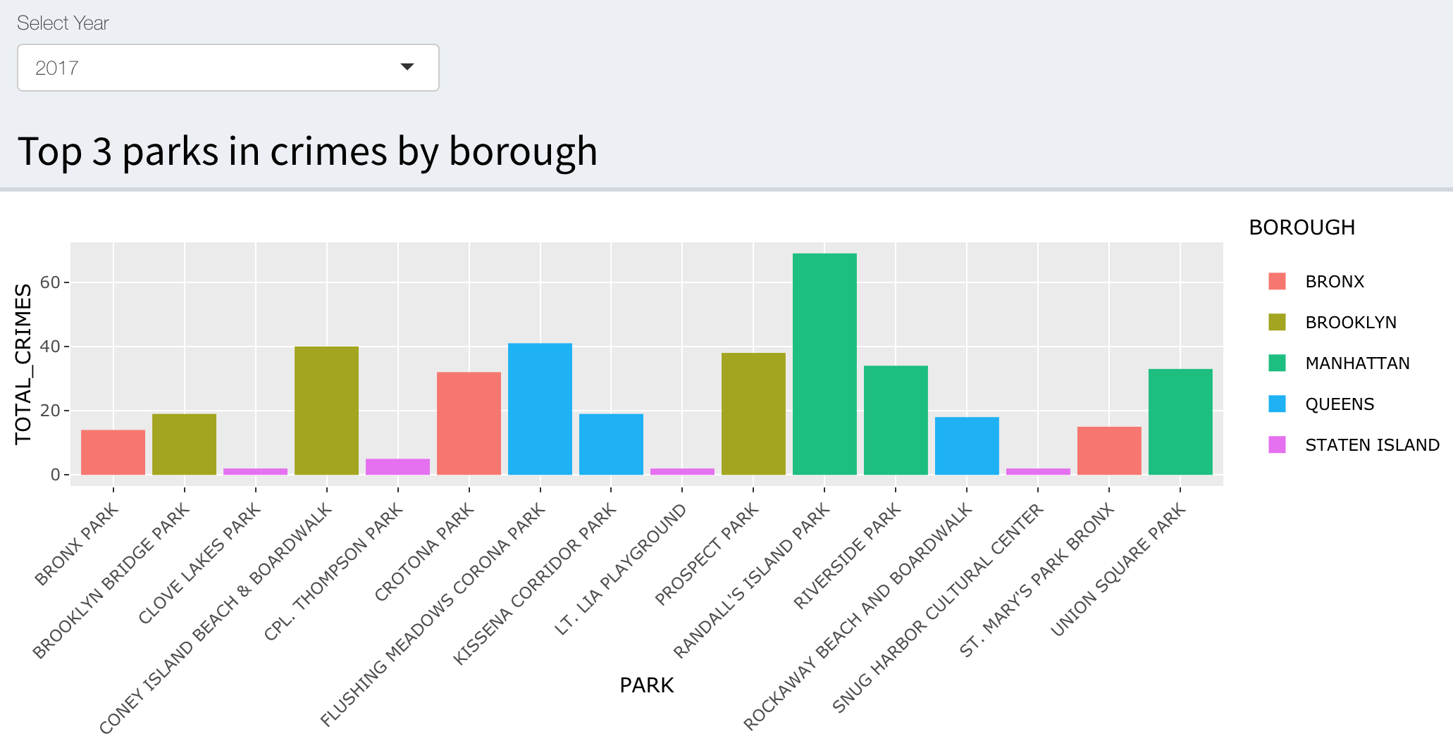
This tab provides user to select top three crime parks in various borough by year and number of crimes. Please find visualization example, in 2017 top three parks with highest number of crimes in Manhattan were Randall's island park, Riverside park, and Union Square park; in Queens were Flushing meadows Corona park, Kissena Corrider park, and Rockway Beach and Broadway park.
c) Total crimes by years and quarters:
This tab visualizes total crimes by year in various quarters. From the histogram plot, it was observed that the crimes increases in third quarter which is the season of good weather and people spend more time in parks. This tab allows user to select total crimes by borough too. Here is an illustrative example for Manhattan borough.
d) Distribution of crimes:
In this tab, user can visualize piechart distribution of various crimes in parks. This is a pie chart distribution of crimes in Manhattan in year 2014. Similarly, use can select various borough id different years to visualize crimes in parks in the New York City.
e) Scatter plot:
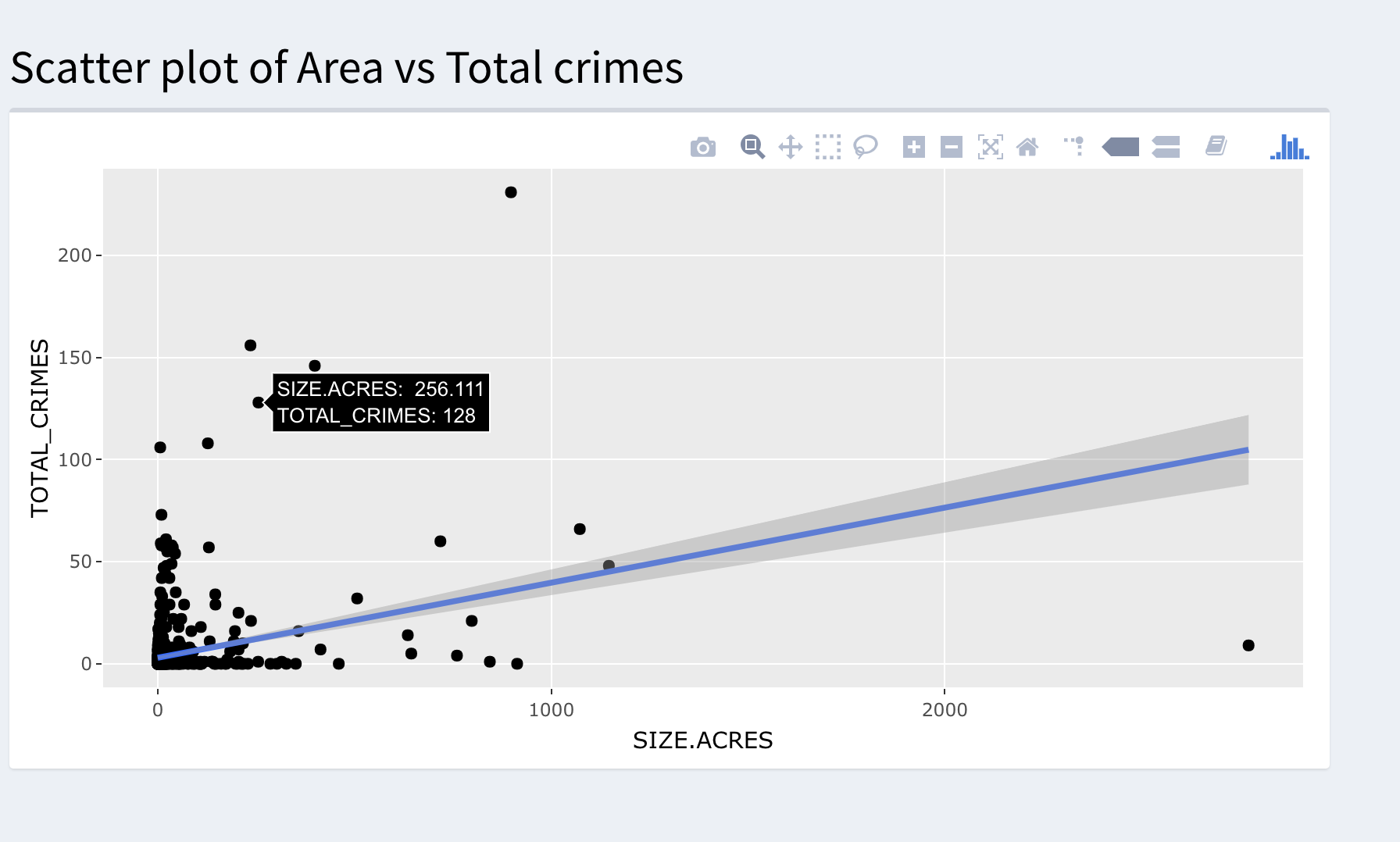
This tab allows user to investigate a correlation between size of park with total crimes. The correlation between total crimes and size of parks was found insignificant.
Future directions:
In future, it would be nice to figure out safe zones with safe park by combining park crime data with NYC crime data.
Please find all my codes to process the data in this link - https://github.com/basantdhital/shiny_project2
Shiny app link: https://basant.shinyapps.io/Park_crime_final1/


