Fortune 500 data: Making a Comparative Tool for Customers
Project GitHub | LinkedIn: Niki Moritz Hao-Wei Matthew Oren
The skills we demoed here can be learned through taking Data Science with Machine Learning bootcamp with NYC Data Science Academy.
 Photo by Pepi Stojanovski on Unsplash
ABOUT
My name is Stella Kim and I am data scientist interested in helping businesses make data-driven decisions by leveraging customer relations to improve sales.
Here is the link to the Shiny application, and here is the link my GitHub where you can find the associated code.
DATASET
The Fortune 500 is a list compiled and published annually by Fortune Magazine, which ranks the largest public and private corporations in the United States by their total revenue. Fortune also maintains the Fortune 1000 and Fortune 100, which is the superset and the subset, respectively, of the Fortune 500 list.
Additionally, Fortune has expanded into global markets, publishing the annual Fortune Global 2000 list to account for companies based in non-US countries. If you are a interested in learning more about Fortune Magazine and the Fortune 500, you can click here to search through the magazine and here to check out the list and get a comprehensive breakdown of each company.
The dataset that I used contains information from the Fortune 1000 and can be found on Kaggle here. The raw dataset includes the current and previous (2017) ranking, CEO, revenues and profits for the fiscal year, change in revenues and profits, asset value, market value, number of employees, sector, industry, years on the Fortune 500 list, location (city and state), and GPS coordinates for each company. For my project, I chose to subset and focus on Fortune 500 data. After a brief glance at the data, I converted several of the columns from character columns to numeric columns, to ease calculations and plotting.
APPLICATION
I created a web application that provides a general overview of Fortune 500 companies. This visualization tool allows for streamlined comparative analyses across multiple companies, sectors, states.
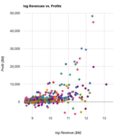
One of the most straight-forward and easiest analyses to visualize is a company's revenues versus profits. Upon first glance, I am quite perplexed at Fortune's methodology in ranking, since profits seem to be a better way to assess a company's financial health. Despite being their statuses as Fortune 500 corporations, there are a shocking number of companies running at a negative profit.
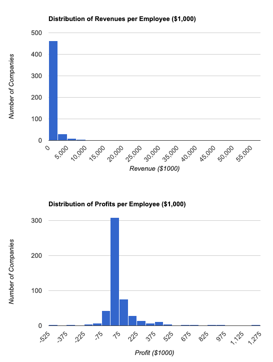
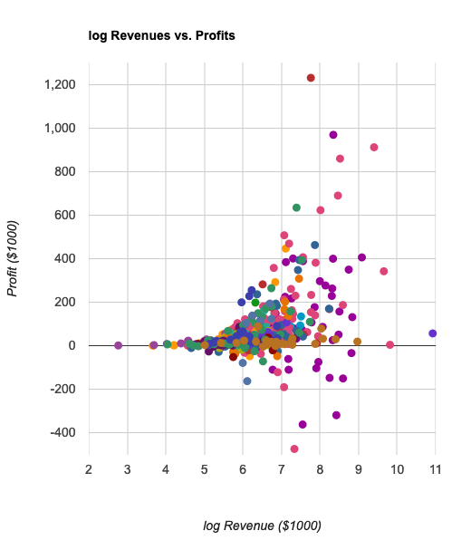
However, I have a limited finance background, and there may be many other reasons that companies choose to operate at such levels. In line with this cursory analysis, I also calculated the revenues and profits per employee, which can be viewed as general measures of productivity and performance. Walmart is a clear outlier when assessing revenue alone, but upon normalizing by the number of employees, the differences in revenues and profits between companies seem to become much smaller, which could be useful to assess the impact of employee size on financial well-being of a company.
 Distribution of revenues and profits across all companies.
 Distribution of revenues per employee and profits per employee across all companies.
 Scatterplot of revenue and profit of each company.
 Scatterplot of revenue per employee and profit per employee of each company.
While looking at the data, I noticed (thanks to Devon Blumenthal), that the "Years on Fortune 500 List" ranged from 0 to 24. This seemed quite odd, considering the list was first published in the 1950s (well past 24 years ago). Upon a quick internet search, I learned that there was a massive overhaul in the methodology of the Fortune 500 in 1995, allowing "service" companies, including Wal-Mart, AT&T, and McDonald's, to obtain the prestigious title.
Next, the web application can be used to compare two different companies together. This includes company name, CEO, current and change in rank (from the previous year), sector and industry, revenues and profits (and percent changes), assets, market values, number of employees, and years on the list. As I work on this application, I plan on adding more descriptive details, as well as interactive features to ease comparison of the two corporations.
 Comparison between companies, including rank, change in rank from 2017, revenue, profit, change in revenue from 2017, and change in profit from 2017.
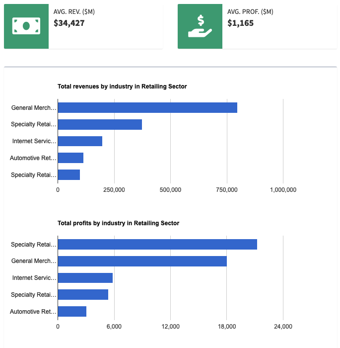
Similarly, this tool can be used to compare the breakdown of two different sectors, to see their industry breakdown as well as their financial performances.
 Breakdown of Fortune 500 companies by sector
 Breakdown of financials in Retailing sector by industry
I was initially interested in this dataset because it included latitudinal and longitudinal information for each company's headquarters. However, I quickly realized that the GPS coordinates were not specific to the address of the actual company, but were actually coordinates for the city.
This only became evident when I looked at the companies based in NYC (58 companies), which were all overlaid on top of each other. While the information to break down the data by city and state was still usable, I was unable to use Leaflet in the way that I preferred. I may try and incorporate company HQ information at a future point, but don't know whether this would add value at this point. Despite this small snafu, I was still able to provide a breakdown of the financials by state.
 Distribution of revenues and profits in by state.

The Future is Female:
Last but not least, I included a section to highlight the female CEOs of the Fortune 500. As a woman (in STEM) myself, this is an important issue that I deal with on a daily basis. Out of this list of 500, there are only 25 female CEOs. I provided a small biography, with a link in the description of each female CEO if the user is interested. I hope that this will shed some light on this topic and that we can improve in the future!
FUTURE
As with any project and analysis, there is always more that can be done.
(1) Adding more simple visualizations and quantitative analyses that can be applied to the list as a whole. One suggestion from my colleague Davy Brostowitz (formerly worked with financial data in Sony) was to divide the revenue versus profits plots into quadrants, essentially providing a new way to profile these companies.
More (not quite specific) information can be found here and here. I am also interested in looking more into how to maximize profits, and profits per employee (sign of internal productivity). I may also include the option to remove Wal-Mart from the graphs, because it makes it difficult to look at the other companies.
(2) Updating UI/UX of the application, generally. One aspect that I would specifically like to work on is adding colors to the company profile comparison (i.e. green or red to indicate increase or decrease, respectively).
(3) I would like to include more timepoints, to allow users to see how companies shift throughout the years.
(4) I am working on the Future is Female tab to improve the appearance and include references where necessary.


