Data Analysis on Colorado COVID vs. Demographics
The skills I demoed here can be learned through taking Data Science with Machine Learning bootcamp with NYC Data Science Academy.
https://datatodavid.shinyapps.io/Colorado_COVID_vs_Demographics/ https://github.com/datatodavid/CO_COVID
Why build a COVID website for Colorado?
Building a COVID data visualization website in 2020 runs the risk of being a redundant task. With the world gripped by this continuing pandemic, thousands of data scientists have tackled how to visualize the impact of this novel virus in the last six months. However, most of the existing COVID visualizations available are national / global in scale, not highly interactive, and limited to examining COVID data exclusively.
In creating a Colorado-focused interactive COVID website, I attempted to create a website that is local in scale, highly interactive, and includes county background demographic data in order to analyze which factors might correlate to COVID outcomes. By combining ggplot’s vast visualization library, girafe’s hover and download features, and DT’s table filtering/exporting buttons into R’s Shiny website platform, I was able to build the dynamic website needed for this project.
COVID DASHBOARD:
Using County Data to Generate Actionable Insights for Colorado Residents and Visitors
By narrowing the focus to a more detailed county-by-county level, those living in and visiting Colorado can use this website to inform on-the-ground decision making. As many cases of COVID are asymptomatic, it is hard to assess in-person how many people may have the virus near you. Using this website, one can help individuals visualize the risk of exposure and make more informed decisions.
Making Safe Choices – Using a Heat Map to See Which Counties Have Lower Rates

The first visualization one can use to help make informed decisions is a statewide COVID Heat Map (figure 1). One way this map can be used is to decide which mountain destinations are safest to visit in the pandemic. For instance, at the time of this post, Rocky Mountain National Park (RMNP) is nearly three times safer to visit than Vail, which is easy to see with the blue-to-red color scale.
On a more everyday note, let’s say someone living in Denver needs non-urgent medical care, but isn’t sure which clinic is safest. By viewing this statewide Heat Map, one can compare COVID rates in both Denver and neighboring counties, and choose to schedule their visit in a county with a lower rate. Douglass County is just south of Denver and has a 3.6% positive test rate – far lower than Denver’s 5.1% rate, and less than half of the 8.3% percentage for Adams county north/east of Denver.
This interactive map can be adjusted to visualize 14 different COVID metrics and sorted by most recent value, highest value in a date range, or average value in a date range. By using this interactive map to explore COVID prevalence, one can significantly reduce the risk of contracting COVID.
Monitoring the health of your County (and Colorado) since the beginning of the pandemic

The Trend Analysis Time Series allows detailed visual snapshots of how state-mandated closings and re-openings affected COVID outcomes on both the state and individual-county level. This tool’s adjustable Date Range allows one to explore how things looked in the month of May, or how counties have fared since schools reopened.
Wondering whether your college-age child should return for in-person classes at the University of Colorado Boulder? This time series shows how new cases have skyrocketed since the return of in-person classes (right-most green line), as well as how recent safety measures taken by the university have proven somewhat effective.
We can also use this visualization to see that Boulder had a big leap in cases soon after Memorial Day weekend that was not seen at the state-wide level, suggesting that an influx of vacation-weekend visitors and reopening restaurants to 50% capacity (left-most yellow line) may have contributed to an increase in cases specific to a tourist-heavy county like Boulder.
USING COLORADO AS A Data CASE STUDY:
Examining COVID Outcome Correlations to Background Demographic Factors
Why should I care about Colorado data?
Colorado is uniquely positioned to serve as a sandbox in which to test assumptions about COVID in the United States. Colorado has reliable COVID data published daily, has managed to avoid any hospital bed or ventilator shortages through proactive planning, has been a leader among states in COVID testing availability, and has a wide variety of population, income, and urban/rural densities among its 64 counties. These factors allow Colorado’s data to be analyzed without potentially confounding factors that cloud the data of many other U.S. states.
How do I explore 100 Demographic Categories?
The “COVID vs. Demographics” section of the website contains 100 county demographic measures collected from three different data sources and 5 COVID outcomes that are updated daily (Tests Rate, Cases Rate, Death Rate, Positive Tests Percentage, Mortality Percentage). The information for these demographic measures were collected within the last 1-6 years, providing a more accurate snapshot of Colorado’s present-day picture than 2010 Census Data. Together, there are 500 correlations that one can explore among all of Colorado’s 64 counties.

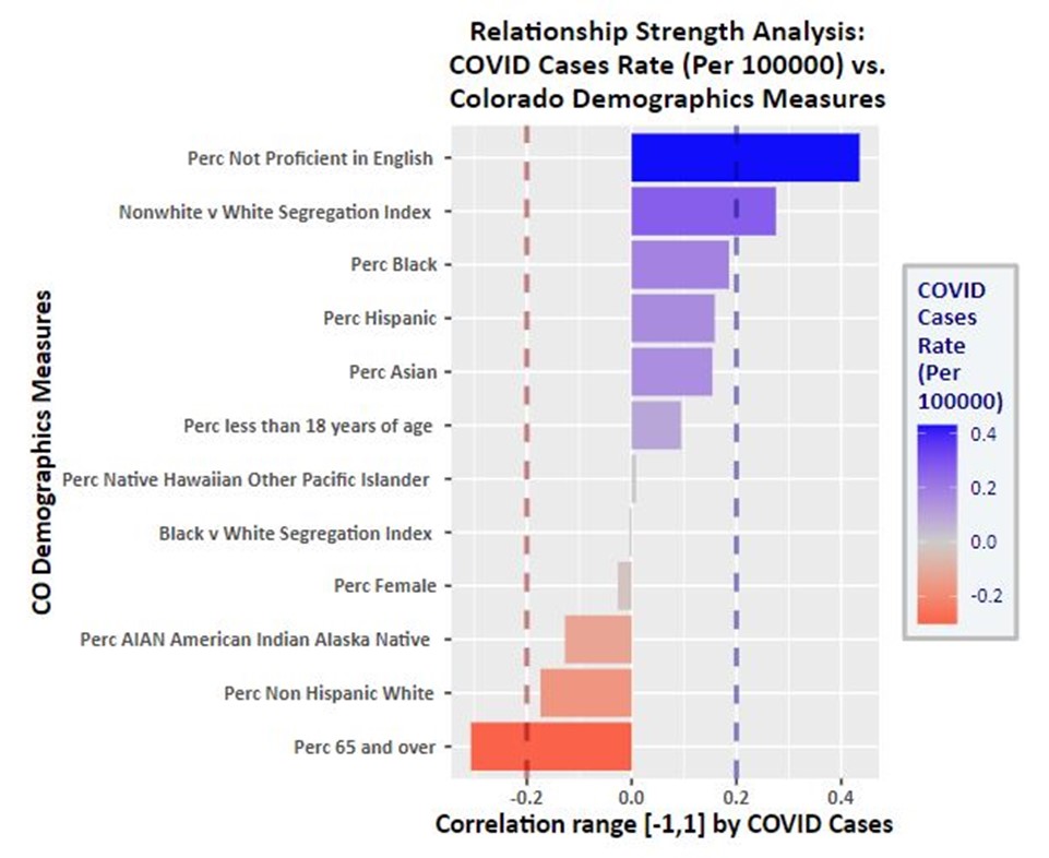
To make this abundance of information more manageable, these 100 demographic measures are broken into eight categories: Demographics, Healthcare Access, Home, Income/Education, Lifestyle, Mortality/Morbidity, Prior Medical History, and Summary Scores. The Relationship Strength Bar Chart (above) in the “Category Explorer” tab allows one to examine correlations for all demographic measures in each category quickly, as to determine which measures warrant further examination.
Exploring Expected and Unexpected Correlations by County Type Filters
Some correlations fit expectations: as employment is often tied to health insurance, it makes sense that counties with a higher level of unemployment have a higher COVID mortality percentage. Some correlations dispel assumptions: many assumed smokers would be more affected by COVID due to its effect on the lungs, but higher cigarette use actually correlated to lower county COVID case rates.
Finally, some correlations are surprising: COVID case rates and death rates are lower in Colorado counties with a higher percentage of people aged 65 and over. Since COVID has been shown to affect the elderly more severely, this seems contradictory and warrants further investigation.
COVID Rates by Country

Influencing Factors
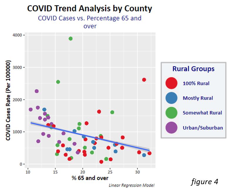
To explore what is causing this surprising result, we can visit the “Filter Group Explorer” tab, where a Linear Regression Trend Analysis can break down by three filter measures: COVID Caseload, Median Income, and Rural level. When looking at this scatterplot (figure 4), we see that the Colorado counties with older populations tend to be rural.

Since we know that rural environments have a strong negative correlation to COVID outcomes, we will want to explore if this unexpected result can be explained away due to the rural aspect of these counties. A quick glance at the summary bar chart (figure 5) shows that there is a far higher percentage counties with a strong negative correlation than a strong positive correlation, regardless of how rural the county is.
Colorado COVD Data

In order to see if this negative correlation holds, I created a “Statewide Data” tab where users can apply these filters on the county-by-county level (figure 6).
By limiting our data to counties that are less than 50% rural, we can see that the COVID case rate still maintains a significant negative correlation (-0.29) to an older population, suggesting this relationship is worth further study and is not only found in rural counties. This is also visually apparent in the bar chart, as counties with a higher percentage of seniors are primarily blue (low COVID rates), while counties with a lower percentage of seniors are primarily red (high COVID rates).
As for a reason: it could be that areas with larger elderly populations are taking the virus more seriously and engaging in fewer social gatherings than those counties with younger residents. Unlike the COVID case rate, when we apply this rural county filter to the COVID death rate, the negative correlation with older county population vanishes, suggesting that this relationship of larger older populations to lower COVID deaths may be better explained by rural factors. Nevertheless, these results present interesting avenues for continued exploration.
Comparing Race/Ethnic Group Outcomes

The final breakdown one can do is to see how COVID outcomes differ based on Race/Ethnic groups in Colorado. There are ten demographic measures that contained demographic breakdowns in the datasets used for this website. The “Race/Ethnicity Comparisons” tab allows one to see how these ten measures compare to our five COVID outcomes for American Indian / American Native (AIAN), Asian, Black, Hispanic, and White groups. Counties are represented as data points and linear regression with confidence windows are shown for each (figure 7).
In the example below, we can see there appears to be a slightly positive, but not significant, correlation between Median Household Income and COVID Death Rate (“ALL” column). However, this correlation is not the identical across our subgroups, with a significant negative correlation between these measures in the Black community and a decidedly larger positive correlation in the AIAN community.
As one can see from the confidence window, there are a limited number of county data points to model a line of best fit, so the results – as well as any suggestion of direct correlation or causation – should be taken with a grain of salt. However, this tool can suggest relationships that may be worth exploring in greater depth, as well as help illuminate inequalities in COVID outcomes.
Conclusion and More Information
Together, these tools can help people make informed decisions while gaining a more detailed picture of how COVID is affecting the counties they live, work, and vacation in. All data sources are open access to the public and one can download any visualization or table on the website. The website was updated daily with the newest CDPHE COVID data until the end of COVID restrictions throughout the majority of the state on May 17, 2021.
For more info, please contact datatodavid@gmail.com or visit https://www.linkedin.com/in/david-gottlieb-a351bb3b/
R SHINY WEBSITE: https://datatodavid.shinyapps.io/Colorado_COVID_vs_Demographics/
CODE:
https://github.com/datatodavid/CO_COVID

