Data Analysis on Infant Natality & Mortality Rates
The skills the author demoed here can be learned through taking Data Science with Machine Learning bootcamp with NYC Data Science Academy.
Reach out to us via LinkedIn
View the Github repo for this project here
Introduction
The Center for Disease Control (CDC) annually publishes material related to the birth rates and death rates of infants born in the United States. They gather a tremendous amount of data relevant to the child, including categories such as the education of the parents, age, health status, and tobacco use. Other categories include the health status of the new born, APGAR score, delivery method used, etc.
There is countless material gathered for every child born in the United States. Due to the large volume of data available, it can be hard to keep track of it all. That being said, we as a team of Data Scientists dove right into this data in an attempt to uncover any interesting relationships between maternal health (i.e. mother's BMI and smoking habits) and subsequent infant natality and mortality rates.
Goal
The goal of this project was two-fold:
- To analyze and interpret the data collected from the CDC website on infant natality and mortality rates
- To develop a user-friendly application that aims to educate expecting mothers about the potential impacts their lifestyle choices may have on the health of their future child.
Please follow along with our custom Shiny App as you peruse through the rest of this blog post.
Data Acquisition
All of the data used in this analysis was collected through the CDC website, which includes:
- Infant Natality Data, 2016-18
- Period Linked Infant Birth & Death Data, 2016-17
Since the original dataset from the CDC was quite large (~3.8 million observations and 90+ variables per year of data), we built a custom parser to only extract data that was relevant to our scope of work. Exploratory data analysis (EDA) was conducted in both Python and R.
Our team focused on the following maternal factors which include, but are not limited to:
-
- Demographics
- Age
- Education Level
- Race
- Maternal Health
- BMI (weight)
- Infections (e.g. syphilis)
- Risk Factors (e.g. pre-pregnancy diabetes)
- Tobacco Use
- Infant Health
- Gestation Period (in weeks)
- Birth Weight
- APGAR Score
- Infant Survival
- Demographics
Once the data was cleansed of missing data values and irrelevant variables, our team created several visualizations based on our analysis of the key factors listed above. We then built an interactive web application via R Shiny where expecting mothers or couples wishing to start a family can explore national statistics as well as customized statistics based on their own demographic or current health conditions.
Exploratory Data Analysis
Data presented in the app includes, but is not limited to as follows:
- The graph below represents the death toll of infants born in relation to the average age of the mother; mothers aging with 15-19 and 45-49 are shown to have the highest level of death rates.
- The graph represents the average BMI level of the mother in regards to the gestation period of the infant in weeks, it is shown that mothers with lower BMI levels are expected to have higher gestation periods compared to those with high BMI levels.
1st Trimester Data
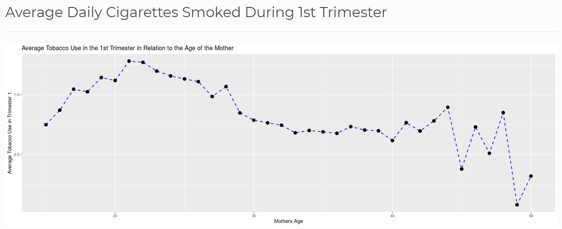
- This plot shows the relationship between the daily rate of cigarettes the mother smoked during the 1st trimester of their pregnancy and their respective ages.
- The first two trimesters show a similar trend in what is occurring with the mother regarding their level of smoking. The rates do not go above 1.5 in either trimester, however, there does appear to be significant variance within smoking trends especially for mothers that are in their 40s.
2nd Trimester Data
- This plot shows the relationship between the daily rate of cigarettes the mother smoked during the 2nd trimester of their pregnancy and their respective ages.
- The first two trimesters show a similar trend in what is occurring with the mother regarding their level of smoking. The rates do not go above 1.5 in either trimester, however, there does appear to be significant variance within smoking trends especially for mothers that are in their 40s.
3rd Trimester Data
- This plot shows the relationship between the daily rate of cigarettes the mother smoked during the 3rd and final trimester of their pregnancy and their respective ages.
- The third trimester is interesting in that it starts off with a high smoking rate, but then sharply drops and stays at about 1, and stays relatively flat up until the mother is in their 40s.
- A big consistency shown here is that mothers in their 40s tend to smoke the most while being pregnant.
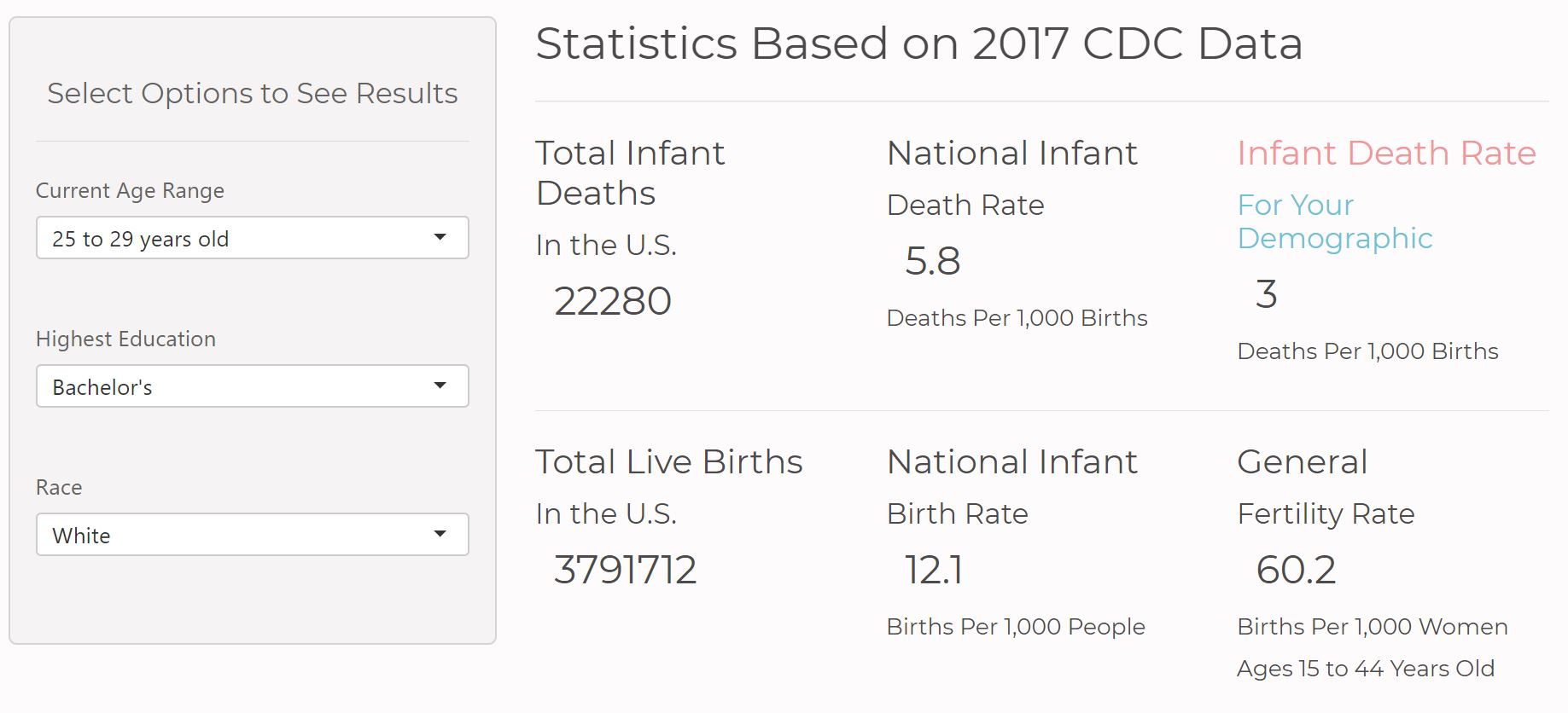
- Above is an example of what the app would show the mother based on the data that we have gathered and applied to the app based on the CDC data implemented.
- As exemplified, a mother between the ages of 25-29 holding a bachelors degree who is Caucasian has an infant mortality rate of 3 deaths per 1,000 births.
Further Development
So far the app applies data implemented together that helps gives mothers the correct information they need for their child. Further development would include applying useful information for hospitals and doctors to use in order for them to understand what is needed for the infant, what health recommendations they could give to the to the mother, to the father, etc.
Given more time and resources, our team's next steps would be to find other maternal factors beyond maternal weight and tobacco use while possibly making predictions using a machine learning model. These tools could be used to find further insights such as:
-
- The variables that are the strongest predictors of an infant's overall survival rate
- The effect (if any) that geographic region (mother's state/county of residence) has on infant natality and mortality
- Differences in an infant's health conditions based on the mother's and father's demographic background
Thank you for the taking the time to read our blog post! Please don't hesitate to reach out to us with any questions, comments or concerns regarding this project.


