Data Analysis on Leading Causes of Mortality by U.S. County
The skills I demoed here can be learned through taking Data Science with Machine Learning bootcamp with NYC Data Science Academy.
LinkedIn | GitHub | Email | Data | Web App
Venit Mors Velocitor
Introduction
Why would it be helpful to know the data on the leading causes of mortality of a given population at a granular level and how they have been trending? Well, does it come into play when considering places to live or travel? Would having a large sample size not aid one’s research or clinical trial(s)? And what about for curiosity’s sake?
Despite these possible motivations, this was not my first project idea. Some others I attempted to find data to support the visualization of were:
- The worldwide concentration and dispersion of natural resources over time.
- The interactions amongst a country’s poverty level, happiness ranking and corruption index.
When I decided to pursue deaths by region, the functionality I desired to provide included allowing the user to input their sex, U.S. county, age, race, and potentially other relevant demographic information. The idea was to use those variables to identify which cause of death would most pertain to the user.
Alas, it was not to be since obtaining such a detailed dataset, or any recent, substantial mortality dataset for that matter, seemed to involve a lengthy process with the CDC. As I settled into this topic, I thought about the visualizations and information I wished to display, adjusted my expectations, and decided to focus on the map as my central feature. Unfortunately, I did not foresee the difficulties I would have with creating a working, snappy version. I will touch upon these problems later on.
R Shiny App Overview
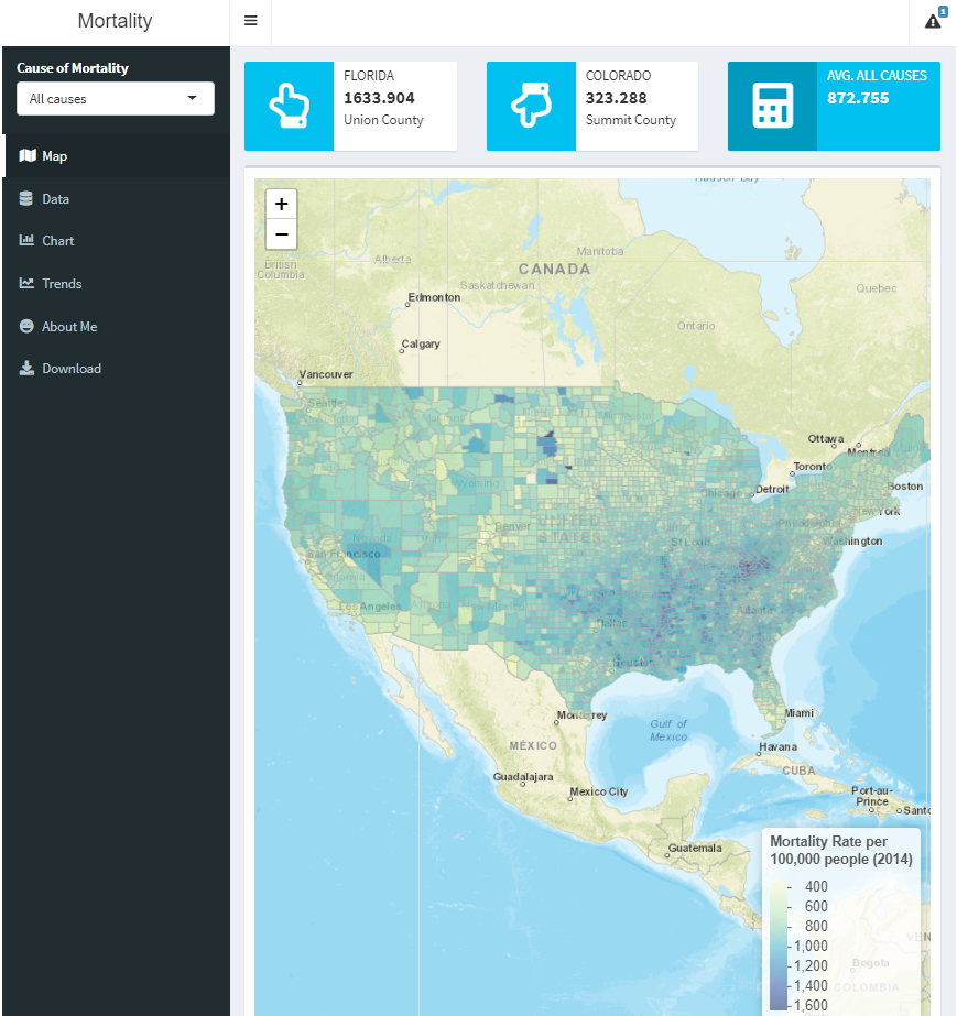
The data is too large to be hosted with a free shinyapps.io account but the code for my app can be accessed via my GitHub link included above. When running the app, you will be greeted by the following screen:

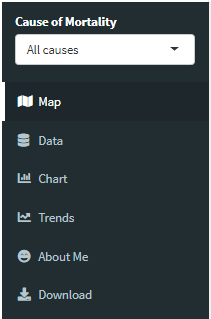
The main navigation will occur via the sidebar menu on the left hand side. The different selections on the menu determine what’s displayed on the central panel, e.g. a map (by default), a data table, etc.

The input box on the sidebar menu labeled “Cause of Mortality” affects what is displayed or selected on the map, data table, bar chart, and the first two line graphs on the “Trends” panel. The third graph on the “Trends” panel has its own input box allowing for multiple mortality causes to be selected simultaneously. The “About Me” and “Download” panels are self-explanatory.
R is generally the most popular programming language among data scientists after Python. Delving into Shiny is a natural step of learning R. “Shiny is an open source R package that provides an elegant and powerful web framework for building web applications using R. Shiny helps you turn your analyses into interactive web applications without requiring HTML, CSS, or JavaScript knowledge” (https://rstudio.com/products/shiny/).
Data Trends
Country-wide trends from 1980 to 2014:
All Causes ↓
Cardiovascular Diseases ↓
Chronic Respiratory Diseases ↑
Cirrhosis And Other Chronic Liver Diseases ↓
Communicable, Maternal, Neonatal, And Nutritional Diseases ↓
Diabetes, Urogenital, Blood, And Endocrine Diseases ↑
Diarrhea, Lower Respiratory, And Other Common Infectious Diseases ↓
Digestive Diseases ↓
Forces Of Nature, War, And Legal Intervention (spike on Sept. 11 2001) ↓
HIV/AIDS And Tuberculosis ↑
Injuries ↓
Maternal Disorders ↑
Mental And Substance Use Disorders ↑
Musculoskeletal Disorders ↑
Neglected Tropical Diseases And Malaria ↑
Neonatal Disorders ↓
Neoplasms ↓
Neurological Disorders ↑
Non-Communicable Diseases ↓
Nutritional Deficiencies ↓
Other Communicable, Maternal, Neonatal, And Nutritional Diseases ↓
Other Non-Communicable Diseases ↓
Self-Harm And Interpersonal Violence ↓
Transport Injuries ↓
Unintentional Injuries ↓
Mortality Rates
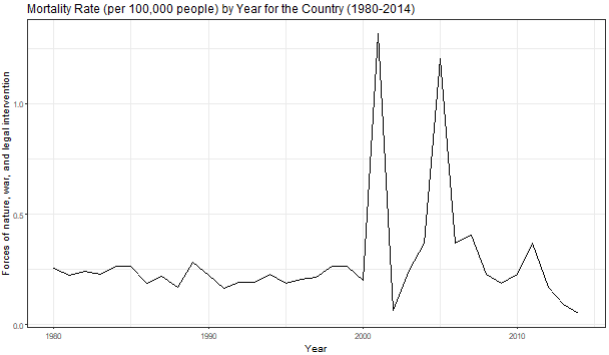
Simply knowing whether a cause of mortality has been trending upwards or downwards overtime does not tell the whole story. Take, for instance, the following graph:

Some categories have large spikes that cannot simply be ignored. Diving a little deeper we can determine the states in which the forces of nature, war, and/or legal intervention took place.

Of the four states clearly impacted by some events, we see that primary contributors to the spikes are New York and Louisiana.

The spike in New York (and New Jersey) can be traced back to the September 11 attacks on the morning of Tuesday, September 11, 2001. Part of the attacks saw two planes crash into the World Trade Center in New York City. They are the deadliest terrorist attacks in world history (https://en.wikipedia.org/wiki/September_11_attacks).
The spike in Louisiana (and Mississippi) can be attributed to Hurricane Katrina, which occurred in August 2005. Much of the destruction occurred in the city of New Orleans. Katrina is the 7th most intense Atlantic Hurricane on record and is tied as the costliest tropical cyclone on record (https://en.wikipedia.org/wiki/Hurricane_Katrina).
Data Outliers?
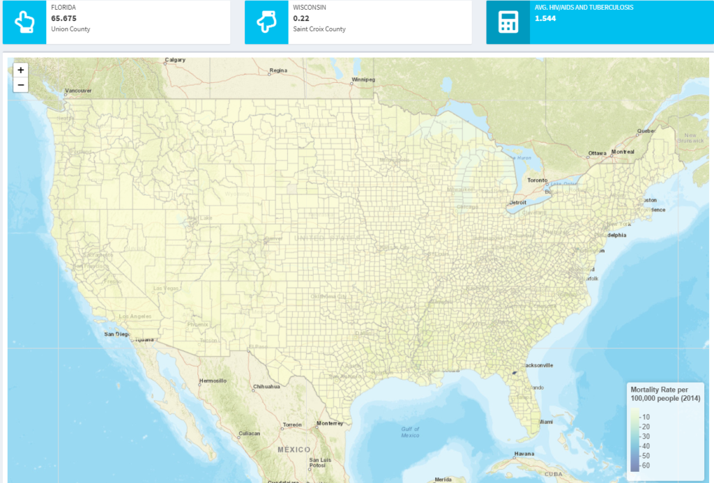
One particular instance led me to question the veracity of the data. I was visualizing various mortality causes on the map and noticed something strange after selecting “HIV/AIDS and tuberculosis”: The entire country of the United States was different shades of pale yellow except for a purple section in the State of Florida. Clicking it revealed “Union Country.”


How could the average mortality rate amongst all counties in the USA be 1.544 but be 65.675 in Union County, Florida? Things did not add up, especially when upon closer inspection Union County also had the highest mortality rate in other categories:
- Communicable, Maternal, Neonatal, And Nutritional Diseases
- Neoplasms
- Other Communicable, Maternal, Neonatal, And Nutritional Diseases
Understanding the composition of Union County’s population and some external problems it faced gave me some insight. It turns out that a third of its population consists of inmates of the Union Correctional Institution. That alone explains a lot since prison populations are disproportionately sicker than the general population. The county also lacks government funding and features a high percentage of poverty (read://https_www.businessinsider.com/?url=https%3A%2F%2Fwww.businessinsider.com%2Funion-county-is-least-healthy-in-us-2017-10).
The ability to create insightful visualizations and tell interesting stories about them is a fundamental aspect of Data Science.
Difficulties
The map proved to be a major challenge that cost countless hours. Some of the resources I utilized are below:
http://zevross.com/blog/2015/10/14/manipulating-and-mapping-us-census-data-in-r-using-the-acs-tigris-and-leaflet-packages-3/#interactive-plotting-with-the-leaflet-package-not-leafletr
https://rstudio.github.io/leaflet/choropleths.html
https://shiny.rstudio.com/gallery/superzip-example.html
https://nycdatascience.edu/blog/student-works/interactive-geospatial-data-digestion-framework-implemented-r-shiny-us-county-example/
*https://github.com/rstudio/leaflet/issues/496#issuecomment-650122985
When I finally had a working map, I found that in addition to the load time when starting the app, there would be a load time whenever a different mortality cause was selected, making the app nearly unusable. I was ultimately able to greatly reduce the load time when selecting new causes with a mentor's help. He pointed me to a solution that utilized JavaScript that would allow the map to change the colors of the polygons without redrawing all the polygons after each cause was selected.
However, I would not be able to display the new mortality rates with the popup information that would show after clicking a county. That tradeoff was fine; the user could get a good idea of the mortality rate by using the legend.
Updates
R Shiny app available online: http://soapboxai.com/alpha/tyrone/mortality/

