Data Study on New York City Street Trees in Shiny
The skills the author demoed here can be learned through taking Data Science with Machine Learning bootcamp with NYC Data Science Academy.
Contributed by Belinda Kanpetch. She is currently in the NYC Data Science Academy 12 week full time Data Science Bootcamp program taking place between April 11th to July 1st, 2016. This post is based on her second class project - Shiny (due on the 4th week of the program).
New York City Street Trees
For our second project, building a Shiny app, I chose to continue with the subject addressed in our first project, Exploratory Visualization, because I intuitively felt there was more to be learned though an interface like Shiny. Also, as an urban designer I am fascinated by ways in which coding and data analytics can inform the design process. For this project I will be expand beyond the scope of Manhattan to include all 5 boroughs.
The Data Set
The dataset was downloaded from NYC Open Data Portal and was collected as part of TreeCount!2015, a street tree census maintained by the NYC Department of Parks and Recreation. The firs census was collected in 1995 and has been conducted by trained volunteers every 10 years since its inception.
Similar to the Exploratory Visualization project, the data had to be cleaned and parsed. There were missing values for species, community districts, tree condition and geospatial information required for mapping. Observations with missing values in the species, community district, or tree condition fields were not dropped from the analysis but grouped and represented accordingly. Observations with missing latitude or longitude were removed only in the dataset used to create the map because Leaflet would not map any points after it encountered its first observation with missing geospatial data.
Designing and deploying the app
When designing this app, I imagined it being a tool for fellow design colleagues who rely on visualization of spatial relationships to inform design. In addition, the capability of exploring the dataset itself was also important. Play with the app here or see the code on github.
Having the data accessible through an interactive interface like Shiny allowed for a more fluid analysis of the data. I could quickly and easily produce graphs visualizing different parameters and then compare them to the map for spatial analysis.
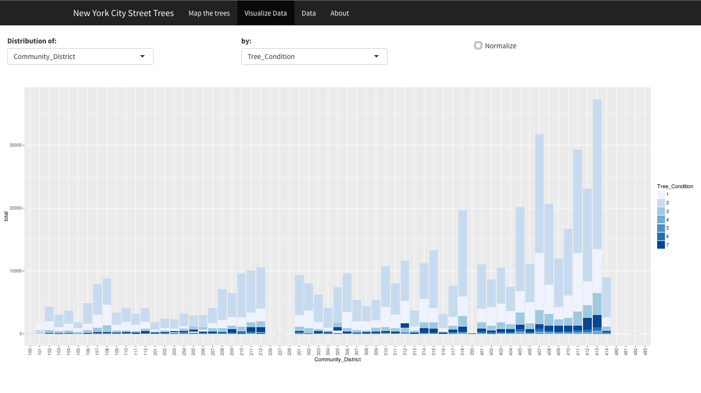
Inspecting the graph of tree count per community district showed some CDs in the Bronx had little to no trees. Toggling back to the map revealed that this made sense since those CDs with no street trees were predominantly parkland.
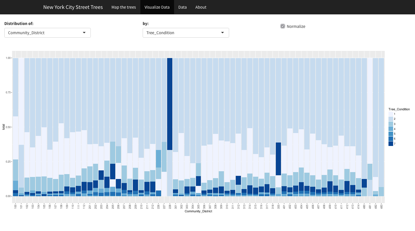
During the Exploratory Visualization project it was unclear why there are so many trees with missing values for species. After deploying the Shiny app, it became clear that missing values for species was due to the tree condition (#6 and 7) in which they were categorized as Stumps or Empty Tree Pits. This makes sense as it is difficult to identify a tree if it is missing or just a stump.
It was also helpful to have the ability to normalize the data at the check of a box. In the example below we see the tree count per community district by tree condition and then the same data normalized.
Conclusions and next steps
This was a fun project to design and produce. Although there are aspects that need to be worked out, it is very clear how powerful Shiny can be in communicating ideas through accessible data visualization. Mapping and visualization are integral in the urban design field yet a lot of designers lack the access to robust software like GIS. But with a little coding experience, Shiny makes its possible to visualize the data which informs the design process.
Aspects I'd like to work on:
- Map legend. Because there are 168 species, choosing a color palette has been challenging
- Graph legend to be reactive to what is being graphed
- Tree species decoded to common names
- Community Districts decoded to include Borough names


