Data Visualization on Stocks Earnings Announcements
The skills the author demoed here can be learned through taking Data Science with Machine Learning bootcamp with NYC Data Science Academy.
Few financial events garner as much attention as stock earnings announcements, and for good reason. They are the time in which a company discloses its sales, profits and its outlook for the near future. Traders are interested because data shows the announcements have the potential for large price movements.
Of course, big fluctuations happen all the time; however, in this case, the date is known well in advance. Given that, it is possible to capitalize on this event in ways in which may not be possible for more sudden events.As with any trading strategy, the analysis should be rigorous. The Earnings Analysis Tool I built can help bring important stock valuation factors to light. It can be seen here: https://mks212.shinyapps.io/earnings_shiny.
What Does It Show?
The app provides visual summary statistics for the prior 9 earnings announcements for each company in the S&P 500. Starting on the left, you find the stock selector by ticker and the slider to choose the number of trading days to analyze. Five days is one week’s worth of prices, and 22 is approximately one month.

On the top are 3 boxes, showing the average return after the selected number of days, the number of times the return was positive and the number of times it was negative, respectively.


Data
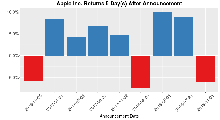
Moving to the charts, the top left shows the most popular statistic usually quoted, how the stock performed after its announcement.

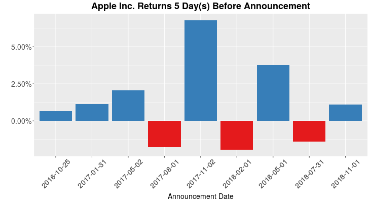
On the bottom left, we can see how Apple performed leading up to each event. There are traders who prefer to trade during this period as stocks tend to be more stable than afterwards.

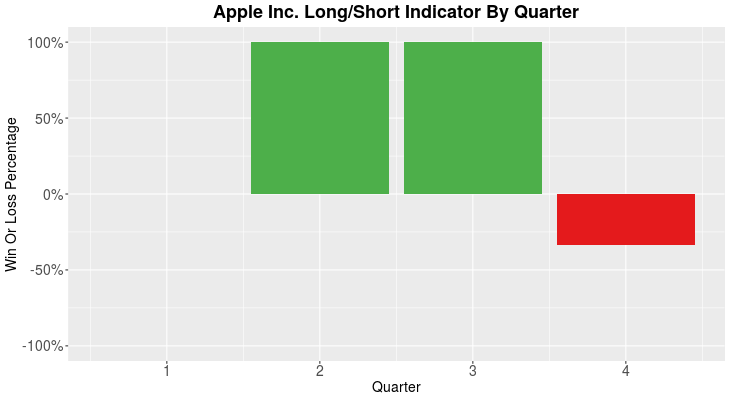
The final chart checks for seasonality. Before we go any further, it is crucial to point out that only 9 events have been considered, so any conclusions based on this chart will need to be confirmed with more data. With that being said, the chart indicates that Apple has been up in each announcement in the 2nd and 3rd quarters in the time period examined. This type of analysis can be helpful for stocks that we expect to have seasonal patterns. We no longer need to simply guess; we can look and see if the pattern actually plays out.

Case Study 1: Tiffany
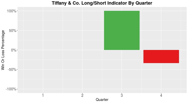
The financial news is abuzz with retail stocks doing well in the 4th quarter due to holiday sales. Is it true? Let’s have a look at Tiffany’s performance 1 day after its earnings announcements:

The graph does not support this view. However, it does appear that TIF can do well in the 3rd quarter announcement. Why? Maybe most of the company’s orders come in the 2nd quarter, so when profits are announced in the summer, investors are happy. This is only one possible explanation, though. Again, it is worth mentioning, about two years of data is analyzed, so making full conclusions at this point is premature. Instead, this is only meant to serve as the basis for further research.
Case Study 2: IBM
To move outside the boundaries of seasonality, let’s look at a stock that seems to be moving in a similar direction regardless of season.

Looking at this chart, one can see that IBM tends to disappoint traders after most earnings announcements. While this may not be compelling enough to take a short position on IBM, it should make a trader think twice before betting that the stock will go up.
Next Steps
As mentioned before, this tool does not have enough data to reach strong conclusions; therefore, the first step will be to provide more data and statistically robust analysis along with it. Second, trading around earnings is often done in the options markets which adds another dimension to the positions that one can take. Therefore, incorporating this information will be very helpful. Lastly, it would be useful to tie in the actual earnings announcement data and how it relates to estimates. There are many instances when a stock announces a strong report only to drop, even when accounting for estimates. For this reason, an earnings report’s value may be limited, though it is certainly worth investigating.

