Flood Claim Payout: Are FEMA’s Finances Leaking?
The skills I demoed here can be learned through taking Data Science with Machine Learning bootcamp with NYC Data Science Academy.
RShiny App | LinkedIn | GitHub
Summary (2 min read) :
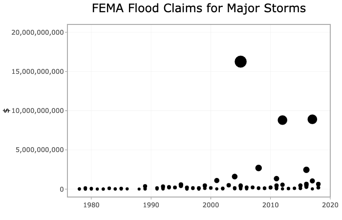
Hurricane Katrina, Sandy, and Harvey were unprecedented in their financial impact. The 2005, 2012, and 2017 hurricane seasons yielded a total flood claim payout of $38 billion. As of 2019, the claims from these three hurricane seasons accounted for 55% of the payments made throughout FEMA's National Flood Insurance Program (NFIP’s) history.
An online dashboard, which can be found here, was created to inform insurance program managers and U.S. officials on the history of flood insurance claims in hopes of preparing their expectations for an increasingly expensive future. The dashboard offers data interactivity through a variety of plots that can be filtered based on dates of interest, geographical boundaries (state, region, county, etc.), and whether the claims originated from the 100 or 500-yr floodplain.
Conclusions
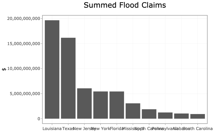
Three major conclusions emerge from the dashboard. First, residents of the south, in particular Louisiana and Texas, are responsible for the majority of flood insurance claims. Second, the majority of FEMA claim payouts are tied to modern mega-storm catastrophes like Hurricanes Katrina, Sandy, and Harvey. Third, the average flood claim expense of major storms has steadily increased throughout program history.
The first few sentences of this summary are shocking in content. But the description alone cannot tell the story of the data. Through regression analysis and data visualization, this dashboard conveys what the aforementioned statements cannot. If hurricanes on the level of Katrina, Sandy, and Harvey persist in plaguing our coast, it is inevitable that financial losses will continue to grow exponentially.
Gallery of Graphs (visit App here for dynamic graphs) :
Data used:
- Flood Claims - FIMA NFIP Redacted Claims Data Set
- Major Storms - FEMA Significant Flood Events
Skills Displayed:
- R
- Shiny
- Data Visualization
- Regression Analysis
Detailed Project Overview (6 min read):
FEMA, the agency tasked with preparing our nation for floods and issuing flood insurance, is faced with an unsustainable financial future. FEMA’s pre-Katrina borrowing authority was $1.5 billion. Due to the number of paid claims from Hurricanes Katrina, Wilma, and Irma, Congress raised the agency’s borrowing authority from $1.5 to $18.5 billion in 2005 and to $20.8 billion in 2006. In like manner, Hurricane Sandy necessitated congressional leaders to raise the borrowing authority to $30.4 billion.
Their $30.4 billion borrowing authority was exceeded in recent years due to claims paid on Hurricanes Harvey, Irma, and Maria necessitating Congress to forgive the agency an outlay of $16 billion. Storms of the last 15 years (Katrina, Harvey, Sandy, etc.) have come with a large price tag. If these storms are here to stay, FEMA’s flood insurance program cannot stay afloat.
Target Audience:
- FEMA National Flood Insurance Program Managers
- Senators / Congresswomen
Objective:
Analyze a tsunami of insurance claim data to inform flood insurance program managers, senators, and congressmen of the spatial and temporal trends in U.S. flood claims. With this information, federal agents can effectively identify which parts of the country are disproportionately responsible for financial leaks.
Technical Process:
At a high-level the FEMA redacted claims dataset was:
- cleaned and transformed to focus on salient information (location, year of loss, claim amount)
- merged with state name, county name, census regions/divisions, and flood zone lookup tables
- grouped by various features to prepare the data for visualization
- regressed to predict future financial losses
Anyone who has ever worked with large governmental datasets knows that variable names and codes abound. This dataset was not an anomaly. There were 39 variables and codes and approximately 2 million observations. For the purposes of this analysis I only cared about the 'where', 'when', and 'how much' variables. Specifically, I wanted to know in which state/county and what area of the floodplain the claim was filed, what year was the flood claim filed, and how much money was paid out on that flood claim.
All of the aforementioned variable were available except for total amount paid out on a given claim. I had to feature engineer a new "total amount paid" variable that summed the value of the building claim, content content, and increased cost of compliance claim (where applicable).
Next I had to join this 5 feature and 2 million observation dataset with a variety of lookup tables. These lookup tables included: abbreviations & state names , FIPS county codes & county names, FEMA flood zone keys & interpretable floodplain names, and states & census regions/divisions. Italicized items represent what was inherent in the original dataset.
Inherent in Original Dataset
Items that are underlined represent what was not inherent in the original dataset. In nearly all cases, these lookup tables were either not available or were in a format incompatible for merging. I created and/or reformatted the above lookup tables and joined them with the claims dataset.
Using the R dplyr library I grouped features together to cut down on the number of observations in the dataset. I aggregated the sum total of flood claims by state, year of loss, flood zone, region, and division which resulted in a 10,000 observation dataset. This dataset was small enough to upload to the R Shiny server. I experimented with grouping by counties as well, but the size of this dataset was prohibitively large for an online hosted dashboard.
While building the R Shiny dashboard I wanted to create four tabs that focused on 1. introducing the user to the topic, 2. allowing the user to explore national flood claim trends, 3. allowing the user to explore state and county flood claim trends, and 4. presenting national trends in a digestible and scientific manner. Additionally, I used the ggplotly library to enhance interactivity between the user and the graphs.
Business Value:
Administering a flood mitigation program for a nation of 328 million people is daunting. If FEMA were to make wide-sweeping program changes without consulting this data and dashboard, they would likely apply changes to the whole country. For instance, if FEMA’s floodplains were deemed scientifically inaccurate, a non-data driven approach would lead FEMA to re-do all floodplains irrespective of historical claims rather than focusing on a few key states.
After consulting this dashboard, they can assess their financial future and can rapidly determine which states require correction and which do not. Additionally, this dashboard provides simple and intuitive graphics which can help the NFIP managers lobby for additional funding from Congress. With additional funding, FEMA can be proactive in modifying their flood insurance program in anticipation of the next Katrina, Sandy, or Harvey.


