Data Study on Subway Station Examiner
The skills the author demoed here can be learned through taking Data Science with Machine Learning bootcamp with NYC Data Science Academy.
Introduction
In 2014, the city of Boston held a data visualization challenge asking data scientists to pour over three years of ridership data along their subscriber bike share system, Hubway. Some of the results of that challenge are incredible, and as an avid cyclist myself, I wanted to take a shot at building my own.
The aim of this project was to build a tool to allow station managers to analyze who is riding a Hubway bike, where they are riding to/from and when. This project was coded in R and launched as a live Shiny web app to shinyapps.io.
Analyzing the Data
Hubway published three years of ridership, however, due to the memory constraints of shinyapps.io, I constrained my dataset to only consider rides taken in 2012, leaving 528,202 rides, from 141 stations in the Greater Boston Area. Hubway did not publish user specific information, however they do specify if a ride is taken by a Registered or Casual user.
Throughout 2012, there were twice as many rides taken by registered users as there were to casual, and three times as many rides taken by males to females. This fits Hubway's business model in that they aim to help commuters get to and from work. For a newly released transportation system, it would appear that working age males are the quickest to adopt it.
-

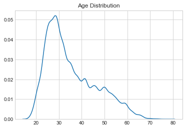
Distribution of Ages -

Subscriber Breakdown -

Gender Breakdown
Data from App Features
The target audience of this interactive app is the managers who maintain and balnace the Hubway System. At a glance, the app provides detailed information on three aspects of ridership usage.
- The net flow of trips to and from the station.
- The breakdown of rider types (subscription)
- The gender of riders using that station.
All of this information can be analyzed on a per hour, weekday or month basis to demonstrate different trends. (Note: those stations that appear to be missing the first months in the year, or stations that became active at that time.)
The design of the app was intended to mimic a console on a desktop display. Managers can easily and quickly change stations by dragging the map and clicking the desired icon. The app changes its display to reflect the change.

Lastly, the lines emanating from the selected station identify the 5 most paired stations to and from, with red being from, blue being to and purple being the overlap.
Conclusion
This app demonstrates very quickly the relevant information a station manager might need to make more informed decisions.
- Understanding who is using the station provides more data on how to advertise to its users. For example: casual-centric stations should be identified by companies promoting recreation and tourism.
- Understanding when users use the station informs them when bikes need to be present and how rebalancing may need to occur.
There is a lot of information and potential to be tapped by this dataset. I hope to revisit it and expand the app to show information on how the bikes move throughout the city by tracking individual bikes during their lifetime.
I encourage you to play with the app yourself. It's live at: Hubway Station Examiner. You can also see the code behind this project (and others) at my Github.

