Little Rascals - A View of Pre-K Schools in NYC
The skills I demoed here can be learned through taking Data Science with Machine Learning bootcamp with NYC Data Science Academy.
Focus
I designed a reporting dashboard project examined the locations of pre-school (“Pre-K”) locations throughout the New York City (NYC) metro area. The project focused on identifying areas which had a lower footprint based upon capacity in terms of number of slots.
The end goal of this analysis was to aid city or state officials in determining which locations were in greatest need of additional expansion.
Background
Before getting into the core of the analysis, we will touch upon a brief history of the public Pre-K program in NYC and discuss the geographical segmentation utilized for the analysis.
New York City initially rolled out its universal Pre-K program in September 2014. Being achieved within the first year of mayor Bill de Blasio’s first term, this start date marked an expedient start to an ambitious initiative. Initially, the program encompassed only four-year old children. Four years later, for the 2018-2019 school year, the program was expanded to include three-year old children as well.
The lowest level at which population information is available is the segmentation utilized by the U.S. Census Bureau, which is referred to as the census tract. New York City, for population forecasting purposes, utilizes a slightly more aggregate segmentation called the Neighborhood Tabulation Area (“NTA”). Because NTAs represent combinations of entire census tracts put together, census population information can easily be aggregated by city government from the census tract to the NTA level.
For my initial structuring of the analysis, NTAs represented a nice middle ground between something at a high-level such as an entire NYC borough and the very detailed census angle.
Analysis setup
The analysis of Pre-K coverage in NYC was performed at the NTA level utilizing population information from the most recently completed census in 2010 and school location information from September 2018. At the time of this article (February 2020) a new census tabulation was in process and I am eager to see how much the analysis changes with more recent population information.
Seat coverage was determined according to two metrics, the first a gross metric representing total Pre-K seats for a given NTA and the second being a ratio of seats scaled to 1,000 population.
Viewing lens
The primary vehicle for examining Pre-K coverage throughout NYC was facilitated through an R Shiny application. The use of the popular map library, Leaflet, was also instrumental in creating a dynamic, interactive map.
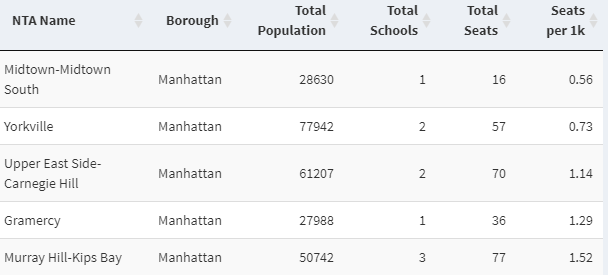
Below is the initial landing page of the application. The side panel includes four items for user input and the main panel includes a heat map and a table that itemizes the information that underpins the map.
The first input is what type of seat metric is being charted, either total seats or the seat ratio discussed earlier. The second option allows either all boroughs to be viewed at once or individual ones to be selected one at a time. The third is an option to highlight in red a certain number of areas that were the lowest based upon the metric and borough being examined.
Given that the heat map utilizes a color scheme where darker shades represent a higher relative amount of either total seats or seat ratio and lighter shades represent the lower end of this spectrum, the highlighting feature helps to visually call-out areas with relatively less seat coverage.
The final metric is population threshold, which is particularly useful for excluding the impact of a disproportionately small denominator for areas such as the airports or parks that do not have a high living population but do have some seats.
The final metric is population threshold, which is particularly useful for excluding the impact of a disproportionately small denominator for areas such as the airports or parks that do not have a high living population but do have some seats.
Some general observations
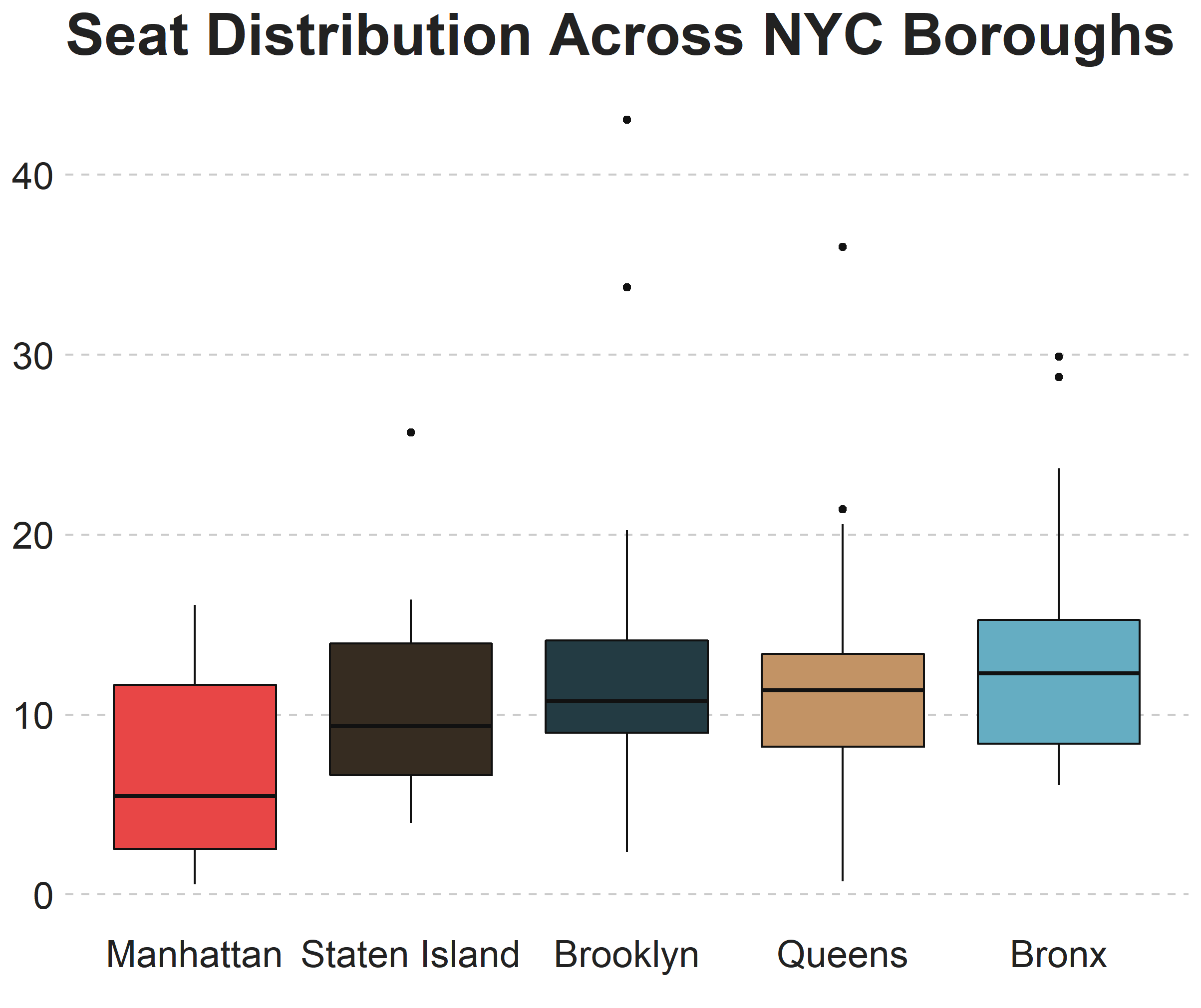
Most NTAs have a concentration in the 5 to 15 range with a heavier concentration of areas with fewer than 10 seats per 1,000 than there are areas at the high end of the range.
Looking at range of seats per population across the five boroughs most of them fall in a similar band, with Manhattan a little bit on the lower end.
In revisiting the main app page, my hunch for this distinction is perhaps due to Manhattan having a higher concentration of commercial areas relative to its population size. We see that a lot of the lower end of the spectrum are areas such as Midtown and Upper East Side.
Future Ideas
While a good start, I have some ideas for refinements that I would like to incorporate. One idea is to have a measure of population that is a more appropriate proxy for seat capacity demand. The current iteration utilizes a simple total count for the population, but different areas may have differing proportions made up by families or children in the target range for Pre-K schools.
The other main area that I would like to update is allowing for the metrics to be determined at the school district level. This segmentation may be more appropriate for education officials and would give credit for NTAs that are within the same school district, which the current analysis does not in examining these areas on an individual basis.


