Creating an End-to-End Machine Learning Pipeline for a Nation-wide Homebuilder
The skills the authors demonstrated here can be learned through taking Data Science with Machine Learning bootcamp with NYC Data Science Academy.
Background Data
A nation-wide home construction company in operation for over 50 years approached our data science team to collaborate in creating a pricing analytics tool. Their research and sales teams needed a way to benchmark the prices of homes they build to the overall market.
Our team’s assignment was to help create an end-to-end machine learning pipeline that incorporated the following three features:
(1) data extraction from public multiple listing services (MLS)
(2) data cleaning and storage on Azure cloud
(3) Machine learning predictions on both the price of houses and the desirability of living in certain geographic areas
The final deliverable was an easy-to-use interactive application for the stakeholder's teams. A public version of the app is located here.
Data Extraction
The client gave us a list of 7000 target ZIP codes to cover the range of the eight states in which it operates. We obtained data on houses in those ZIP codes from public multiple listing services (MLS) sites such as Zillow, Redfin, Trulia, etc. by writing scraping bots that automatically downloaded csvs. Individual house data included features such as listing price, bedrooms, bathrooms, square footage, etc.
To further enrich data and to be able to create a desirability score for geographical areas, we obtained the following Metro Area or ZIP code level data:
- School zone ratings scraped from Greatschools.org
- Census.gov population and other demographic data
- Personal income data from U.S. Bureau of Economic Analysis API
- Economic and Home Price Index data from the Federal Reserve (FRED) API
- Zillow House Value Index
Exploratory Data Analysis
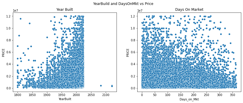
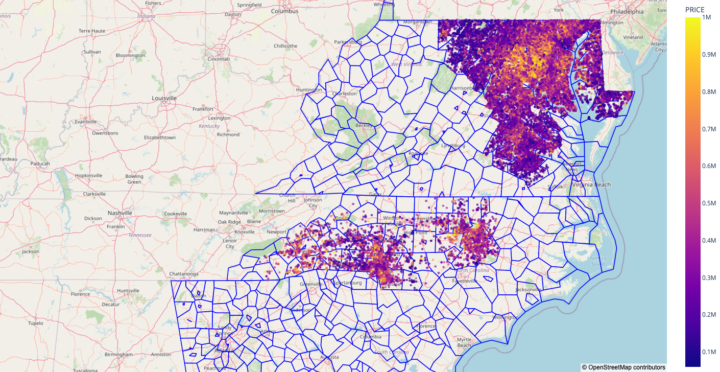
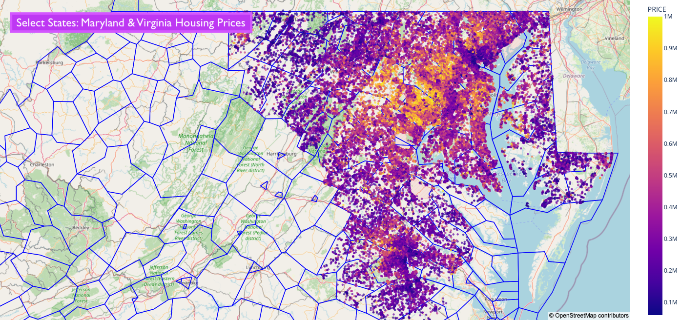
For the exploratory data analysis and mapping portions of our project, we worked with two underlying Redfin datasets* — both scraped via Selenium — one with current active listings (left) and the other with historical transactions (right, from last 3 years)
Due to state specific guidance, some states’ (ex: Florida) historical sale data is not available or ready to download by csv on Redfin.
Visualizing Active Listings
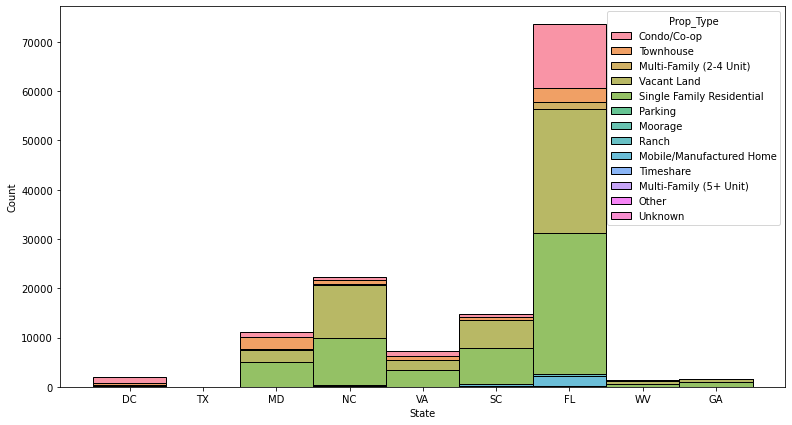
Distribution of active listings on Redfin by State and Property Type as of Dec 2021
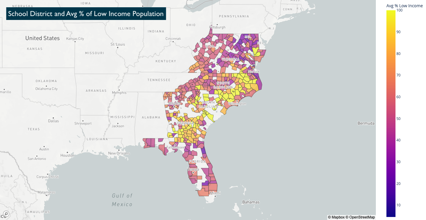
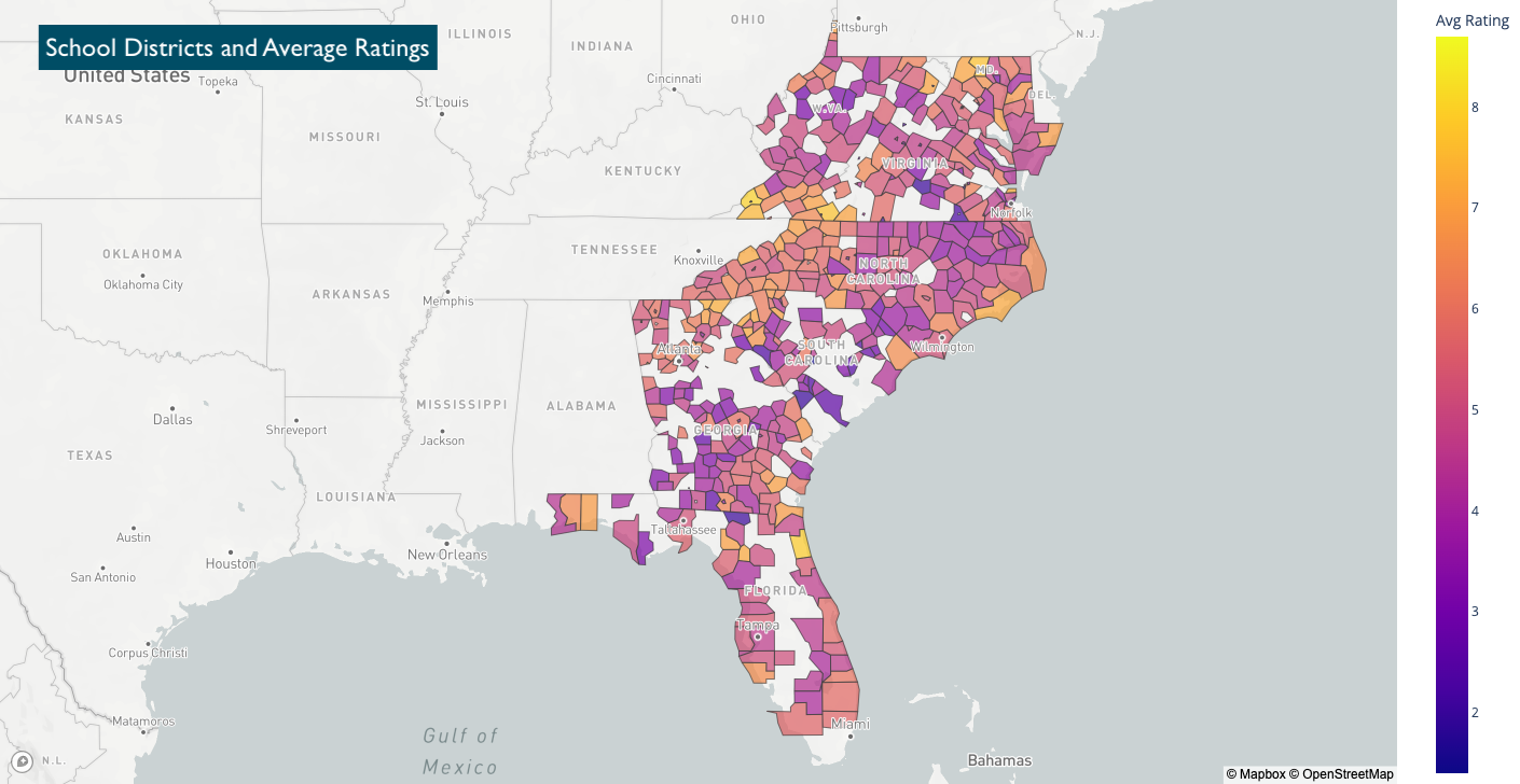
Visualizing Relevant School Districts
In order to make the most meaning out of available information regarding school districts, our team synthesized two sources of data to create a series of mapping visualizations:
- School District Boundaries data in JSON form from NCES
- Information at the individual school level on enrollment, rating, % of low income population as well as the parent school district that each school belongs to — originally scraped from GreatSchools.org for the 7000 zip codes of interest
Although the school district names were not a one-to-one match between the two datasets, we were able to join the two sets of information through some data processing and cleaning. That allowed us to visualize patterns of enrollment and socioeconomic status grouped by the school districts recognized by the NCES.
Combining School District Data with existing Redfin Data
With the insights that datasets (1) and (2) generated, next, the team looked into layering our collected data from Redfin on historical and active listings to visualize the relationship or any patterns between the quality of school district and the listing price.
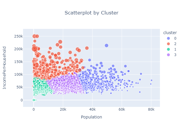
Creating the Desirability Score
In order to create a desirability score and understand the characteristics of different geographical areas, we decided to use K-Means clustering using zip code level data. K-Means would allow us to group by similar variables and analyze how the different clusters are unique from one another. In order to successfully create these clusters, we used data from the sources mentioned above and tested many different combinations. Ultimately, the best combination for creating clusters was using population data, median household income data and average house value per zip code.
After scaling these features using MinMaxScaler, we created four clusters using K-Means. Below is a scatterplot of the results with the x-axis representing population, the y-axis representing income per household and the size representing average house value.
In addition, we can easily understand the characteristics of each ZIP code with the following chart:
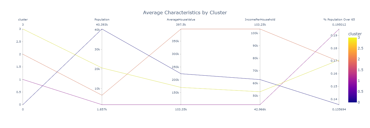
After analyzing the two above charts, we ranked the desirability of each area by the ZIP codes. Below is a representation of how we interpreted each cluster. This interpretation allowed us to better understand and rank the desirability of each ZIP code.
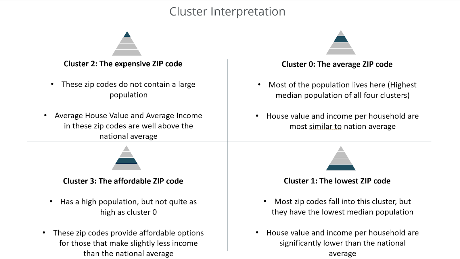
The above analysis and interpretation allows end users at the stakeholder company to better understand the areas in which they are pricing homes. In addition, further analysis can allow for these clusters to aid in price optimization and opportunity identification. The sales team can determine the price elasticity of each group based on the above characteristics and even use the clusters to identify where they can build their next homes to maximize profit.
The Affordability Index Data
The client asked us to develop an app feature that acted as an affordability index. The home prices and home prices scraped from Redfin made up the data used in this index. The end goal was to deliver an index that showed the stakeholder where their houses were too expensive.
The crux of this index was calculating the difference between Redfin house prices and the client’s house prices. If Redfin house prices were higher than the client’s house prices, we would consider that area affordable, and vice versa. Rather than directly comparing house prices, we chose to compare the premium of a house, which took depreciation into account. The client provided us with a premium guide for Redfin houses.
After getting the stakeholder and Redfin premium for a specified area, we would output an affordability ranking. If the stakeholder’s premium was higher than the Redfin premium the app would output the area as unaffordable for the stakeholder’s developments
Building the Machine Learning Data Model
The final piece of the interactive dashboard was a machine learning model used by the sales team to price new building projects, trained on competitor MLS pricing information as well as the ZIP code level data on neighborhood desirability. We started with a base model including only basic house features (SF, beds, baths, etc) and ZIP code, which will be used as a benchmark for all other models.
As the ZIP code feature is categorical, and there were thousands of codes in the dataset, the train-test splitting had to be manually coded such that each set of data points per ZIP code was split (test size = 0.25).Results using Linear Regression, Random Forest, and Gradient Boosting (Catboost) are summarized in table 1. Since train-test splitting needed to be manually coded, k-fold cross-validation was also manually performed by running the model multiple times after randomizing the split. The scores below are the average R2 values of all iterations.
| Base Model Scores | Linear Regression | Random Forest | Gradient Boosting |
| Train R2 | 0.758 | 0.832 | 0.816 |
| Test R2 | 0.664 | 0.757 | 0.791 |
Gradient Boosting (GB) resulted in the best score as well as the smallest difference between train and test scores. Random Forest (RF) had the best train score but a lower test score than GB which is a sign of overfitting (Note: As train-test splitting was a manual process, RF hyper-parameter tuning was also performed manually. Since RF scores did not come close to beating the GB model scores, and Catboost’s GB model does not require parameter tuning, going forward we no longer model using Random Forest).
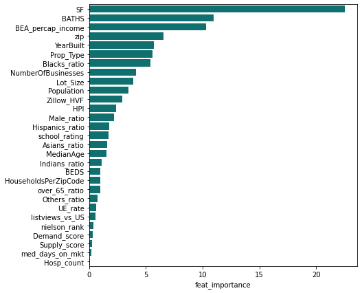
Next, we created a ‘full’ model which included all house and ZIP code level data. The feature importances based on the GB model are shown in the following chart:
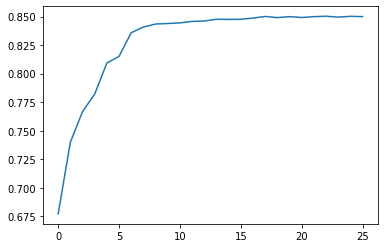
We ran the same model multiple times, starting with only the single most important feature and iteratively adding features one by one. Chart 2 below graphs the test scores for each model iteration and shows that after 10 or so features there are marginal returns to R2 for any additional feature.
In order to simplify the model and overcome issues with multicollinearity of features, we consolidated the Zip code level information using k-means clustering and principal component analysis (PCA) and added the resulting data on top of the base model features (model scores shown in table 2).
| Model | Details | Linear Model Test Score | Gradient Boost Test Score |
| Base + Cluster | Clustered on all ZIP code Level Data | 0.718 | 0.793 |
| Base + Cluster | 4 Clusters (Pop, Econ, Age, FRED) | 0.674 | 0.827 |
| Base + 7 PCAs | 4 PCA sets (Pop, Econ, Age, FRED) | 0.709 | 0.850 |
| Base + 5 PCAs | 5 PCAs for All ZIP Level Data | 0.733 | 0.839 |
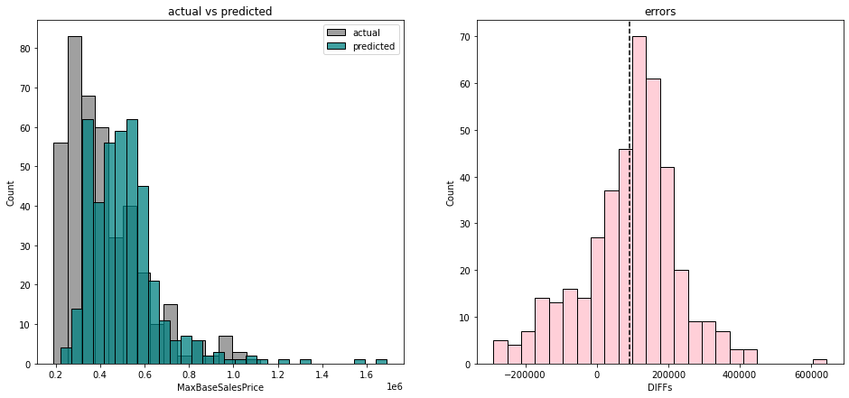
The selected model was the GB model using base features plus 5 principal components as it was the simplest model but had a test score just as high as the full model and a mean absolute percentage error of roughly 22%. We then performed another model test on the stakeholder’s newest projects (about 400 houses). Chart 3 below depicts the distributions of actual vs. predicted prices on the left, as well as the density plot of prediction errors on the right. The model tended to overprice the stakeholder’s homes and had an average absolute error of +$90,000.
We believe this is due to the stakeholder standing by its mission statement of providing “affordable homes” to the communities in which it operates. Furthermore, the training dataset used scraped MLS listings containing expensive condominiums or luxury homes, which skewed the model. The stakeholder was made aware of the discrepancy but advised us to retain all the original data.
Conclusion
Overall, our work for the stakeholder proved to add value for the sales and pricing team by providing insights and accurate benchmarking. The tools we created will help a variety of teams in the following ways:
- The price recommendation model will provide a price range based on user input, similar houses in the dataset, and geographical areas for the pricing team to use as a reference point.
- The affordability index allows the sales team to understand different geographical areas and the cost of living in each area.
- The desirability index will allow the pricing and sales teams to understand where and why people want to live where they do. This information will help guide pricing decisions based on the price elasticity in each cluster.
- The data visualization and school district breakdown allows for competitive analysis and opportunity identification from the sales team.
The work done by our group will help the stakeholder in the above ways and can be expanded upon for further work. It is also an example of how data science can be used in the real estate industry to help optimize prices, understand the characteristics of different geographical areas, and identify opportunities.