New York City Weather and Vehicle Collision Data Analysis
This work is a continuation of the previous work of New York City motor vehicle collision data visualization. While the previous work is focused on analysis of the collision data set only, in this work, I further include the weather data of New York City (NYC) and investigate their correlations. Specifically, the objective of the project is to practice web scraping and data analysis using Python. I scraped 2013-2017 NYC hourly weather data from the “Weather Underground” website (high quality, reliable data by Central Park weather station), and studied correlations between the weather data and motor vehicle collisions data to find some good features to predict/model vehicle collisions.
Potential Business Values and Big Technical Plan
The ultimate outcome of the project would be a model to predict the number of vehicle collisions for the whole city, a borough or various different areas/spots of the city, etc., given weather and some other data sets, e.g. traffic volume data. The possible practical applications are:
- “Safe Routing”: if well built/performed, the collision model can be used to provide Safe Routing product/service for drivers on the road, and help yield less stressful driving experience.
- “Proactive police arrangement”: the model can also be used for police department to proactively arrange police forces more on higher risk spots/areas than the others, to help better reduce/prevent collisions/risks.
To achieve these business goals, a big technical project plan would include or further consider:
- Besides weather, we need also consider road traffic (e.g. volume/intensity, history and real-time, etc.) information for effective collision modeling.
- For better “Safe Routing” product/service, besides vehicle collisions, we may further consider NYC crime distribution data, etc.
- All the factors of vehicle collisions and crime distribution, etc. need to be well trade-offed w/ total driving time/distance estimates for final routing decisions.
Web Scraping and Weather Data Set
I found and scraped high quality hourly NYC weather data on the “Weather Underground” website, followed its “robots.txt” rule. The website is well organized and I mostly just followed lab-demoed scraping techniques using Scrapy, and didn't encounter much new/unexpected technical challenges in practice.
The finally collected data set is high quality and reliable NYC hourly weather data from 2013 to 2017 observed by Central Park weather station. The data set includes:
- 2 categorical variables:
- Weather conditions: 16 detailed condition values are categorized/aggregated into: "clear", "cloudy", "fog", "rain", "snow", for analysis convenience and potentially better correlation result.
- Wind direction: 18 detailed values are aggregated into "Calm", "Variable", "East", "South", "West", "North".
- These two categorical variables are finally converted into dummy variables to be able to perform correlation analysis.
- 6 numeric variables:
- Visibility, temperature, humidity, pressure, dew point, wind speed (denoted respectively as "visi", "temp", "humi", etc. in the following result graphs).
Data Preparation
Weather Data
To get the originally downloaded weather data set ready for analysis, I first did the following data preparation tasks.
- Data cleaning: including: replacing undesirable strings (e.g. poorly typed/composed), dropping unwanted columns, renaming columns, changing column data types (from default Python Pandas read-in data type of "object" into appropriate types), sorting by index, etc.
- Missing data handling: analyzed and properly handled missing data.
- Dropped 4 columns with too many missing data (> 50%), e.g. "precipitation", "gust speed", "event", etc.
- Imputed 6 numeric variables w/ time-interval linear interpolation from Pandas interpolate().
- Imputed 2 categorical variables w/ simple forward fill and then backward fill
- Studied more advanced imputing methods such as KNN and MICE, from "fancyimpute" package, but finally decided not using them, as they are very time consuming, and not necessary in the current situation.
- Problem: some hours have more than one record, while some others have none. To solve this problem, I
- Grouped data into date-hours: picking mean and most common one for numeric and categorical variables, respectively.
- Grouped motor vehicle collision data into hours and merged into weather data, imputed the missing hours weather data similarly as before.
Vehicle Collision Data
To get collision data set ready for analysis, I did some similar work on data cleaning, and some different tasks as follows.
- Problem: In the data set, there are 5 columns on causes, and 5 columns on involved types of vehicles, which are not easy to operate. To solve this issue:
- Consolidated the columns into one single column for causes and vehicles, respectively.
- Used Python's Count() and most_common() function calls to pick the top 30 causes and top 15 vehicles (i.e. covering the majority of the total data) to re-define the desired categorical levels.
- Converted top causes and top vehicles into dummy variables for correlation analysis.
- Problem: there are quite a few columns on the number of injured, killed persons in terms of total, pedestrian, cyclist, and motorist, respectively. Similarly,
- Consolidated data: “Injured” and “Killed” into one single “Victim” variable
- Consolidated information: defined a new quantity: severity index = 1, if no hurt (i.e. num_injured and num_killed both are 0s), 2.55*num_injured (if num_injured not 0, and num_killed is 0), 7.55*num_of_killed (if num_killed not 0). To see if this new quantity has better correlation with other factors, than that of the simple original quantity of the total number of collisions.
- Merge: grouped collision records into hours, and merged into hourly weather data frame.
Python Data Analysis
With the two data sets ready, I then calculated and drew collisions-per-hour frequency graphs to check different weather factors’ impact on collisions (using the basic Matplotlib plot).
To check correlations, I tried/tested w/ several different plotting tools.
- Seaborn heatmap() vs Matplotlib matshow(): Prefer Seaborn’s heatmap for better looking overall. Moreover, it can put table/matrix numbers/values on top of the heatmap, which is more informative and sometimes very helpful.
- Pandas scatter_matrix() vs Seaborn pairplot(): to check each individual variable density/histogram and each pair of variables’ scatter plot, prefer Pandas scatter_matrix(), for better rendering/looking.
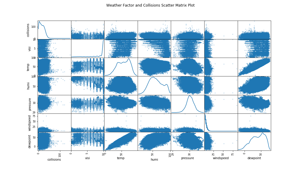
For example, a nice looking Pandas scatter matrix plot is shown below, which shows scatter plots and kernel density estimates of the number of collisions and different weather factors between them and by each variable itself, respectively. We can see some clearly significant positive correlation exists between temperature and dew point.
Frequency Graphs
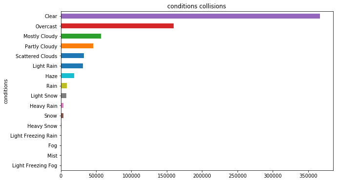
While "Clear" and "Overcast" have the two largest number of collisions, they are also occurred most of the time. Therefore, for a more fair check of each weather condition's impact on collisions, I divided total number of collisions by total number of occurring hours, i.e. the collisions per hour graph. Herein, heuristically, set minimum hours threshold = 10 (for now).
The more steep slopes/variations we see in a frequency graph, the higher impact that weather factor may have on collisions. Herein, roughly, we can see that: snow and humidity has more significant impact than that of temperature and visibility.
Note that herein in order to calculate total occurring hours of a continuous variable, we have to properly binning them so as to treat them the same way as for categorical variables. Also, the result of pressure and wind speed is not shown here, as the simple binning between min and max is not working well w/ them and I need better binning approach to handle many outliers of them. As for the result of dew point and wind direction, there is no much steep variation slope and hence no much potential impact observed, which is also omitted herein.
Severity Index helps ?
The frequency graphs w/ the consolidated severity index quantity show a slight promising difference with those w/ the simple total number of collisions graphs, where we can see a little more steep variation herein than that w/ the number of collisions. However, whether or not or how much this much difference can help on modeling/prediction performance is a problem that definitely needs a careful check/comparison in actual modeling practice.
Correlation Analysis
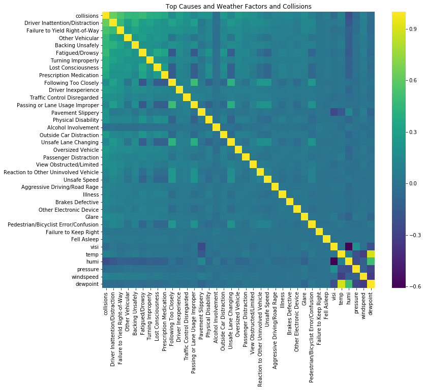
Overall, it is unfortunate that: from the graphs, we cannot see any significant correlation coefficients between different weather factors and collisions. Herein, the actual question is: how we should interpret this result properly. Esp, e.g. for snow factor, for which we observed significant impact in frequency graphs.
In fact, this result of very low correlation coefficient is not so surprising, given the nature of the snow condition variable a dummy/binary variable, and occurring not very often in time. But then, how can we properly measure their relevant/concerned correlation impact on modeling? And how to effectively make use of these weather variables for better modeling?... All these questions/problems need further thinking/studies in the future.
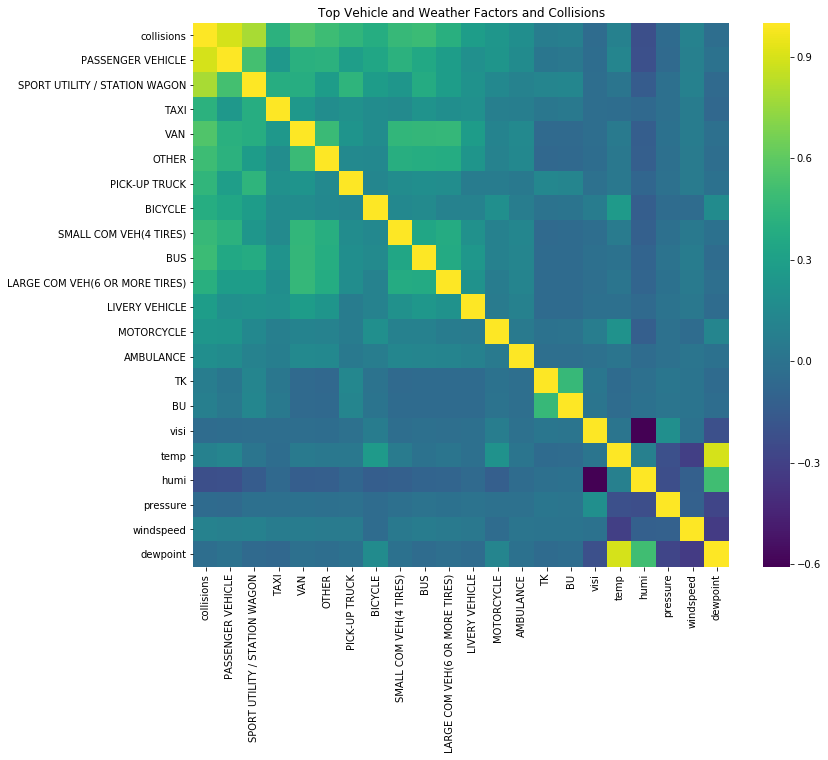
To collect more insights either on collisions data itself or on its correlation with the weather factors, I also checked the correlation plots involving top collision causes and/or top involved vehicles.
Some interesting observations are highlighted as follows.
- High positive correlation exists between top causes/vehicles and collisions, and between top causes and top involved types of vehicles.
- Some noticeable significant positive correlation spots are:
- ("following too closely", "passing or lane usage improperly", "unsafe lane changing") among each other, and for them to be with ("reaction to other vehicle", "unsafe speed") and ("pedestrian/bicyclist error/confusion").
- ("van", "other") and ("small commercial", "bus", "large commercial", "livery vehicle") with ("fatigued/drowsy", "lost consciousness", "prescription medication")
- ("van", "other") with ("small commercial", "bus", "large comm")
- Note: "taxi" is pretty much O.K. (i.e. not seen as problematic), with lower correlation with the other factors, while for "pick-up truck", we can see it's more problematic by having higher correlation w/ ("sport utility/station wagon", "oversized vehicle") and ("following too closely", "passing or lane usage improperly", "unsafe lane changing").
As for the correlation plot between top involved types of vehicles and weather factors, some noticeable significant correlation spots are:
- ("humidity") has negative correlation with top 8 causes ("Driver Inattention/Distraction", ..., "Prescription Medication")
- ("temperature") has positive correlation with ("bicycle", "motorcycle")
What next?
In the future, the project can be further pursued in the following several directions.
- Try further group hourly weather data into daily record, i.e. with higher value variations of variables, and re-check correlation to see if it gets any higher/more significant or not.
- Further study how to effectively make use of binary dummy variables in modeling.
- Try some modeling approaches and see the performance, anyway ...
Thank you! 🙂


