NYC Noise Complaint Visualization
Contributed by Joe Eckert. John took NYC Data Science Academy 12 week full time Data Science Bootcamp program between Sept 23 to Dec 18, 2015. The post was based on his first class project(due at 2nd week of the program).
September 30, 2015
Introduction
This was the first project with the NYC Data Science Academy. The purpose of this project was to gain a foundational understanding of data collection, data munging and data visualization. This project visualizes the noise complaint data within the NYC 311 Call Dataset. Source data used for this project was the NYC 311 Call Dataset from 2010 to September 2015 filtered on complaint types containing “noise”. In addition, the 2010 Census population data by zip code was used to control for population density across zip codes.
Data Preparation
Load required packages
library(dplyr)

library(tidyr)

library(ggplot2)

library(ggmap)

library(openair)

library(zipcode)
Import source data
noiseData <- read.csv('noise.csv', stringsAsFactors = FALSE)
Convert data to tbl_df
noise <- tbl_df(noiseData)
Remove rows with missing location data
noise <- filter(noise, !is.na(Latitude) | !is.na(Longitude))
Remove unneeded columns
noise <- select(noise, -Closed.Date, -Incident.Address, -Street.Name, -Cross.Street.1, -Cross.Street.2, -Intersection.Street.1, -Intersection.Street.2, -Address.Type, -City, -Landmark, -Facility.Type, -Due.Date, -Resolution.Description, -Resolution.Action.Updated.Date, -X.Coordinate..State.Plane., -Y.Coordinate..State.Plane., -Park.Facility.Name, -Park.Borough, -School.Name, -School.Number, -School.Region, -School.Code, -School.Phone.Number, -School.Address, -School.City, -School.State, -School.Zip, -School.Not.Found, -School.or.Citywide.Complaint, -Vehicle.Type, -Taxi.Company.Borough, -Taxi.Pick.Up.Location, -Bridge.Highway.Name, -Bridge.Highway.Direction, -Road.Ramp, -Bridge.Highway.Segment, -Garage.Lot.Name, -Ferry.Direction, -Ferry.Terminal.Name)
Convert created date to POSIXlt object for using date elements
noise$Created.Date <- as.POSIXlt(noise$Created.Date, "%m/%d/%Y %I:%M:%S %p", tz = "EST")
Create date fields to be used for time series analysis
noise <- mutate(noise, year = noise$Created.Date$year + 1900)
noise <- mutate(noise, month = noise$Created.Date$mon + 1)
noise <- mutate(noise, day = noise$Created.Date$mday)
noise <- mutate(noise, wkDay = noise$Created.Date$wday + 1)
noise <- mutate(noise, hour = noise$Created.Date$hour)
Round lat/lon to 3 decimals, to allow for density calculation based on location
This was needed because the latitude and longitude data were too granular to properlly map complaint density
noiseRnd <- mutate(noise, latRnd = signif(noise$Latitude, 5))
noiseRnd <- mutate(noiseRnd, lonRnd = signif(noise$Longitude, 5))
noiseRnd <- mutate(noiseRnd, areaCoord = paste0(noiseRnd$latRnd, ",", noiseRnd$lonRnd))
Distribution of Complaints by Borough
As expected, Manhattan, with a majority of the population in NYC generates roughly 42% of the noise complaints to 311.
Compare distribution of complaints by borough
boroughAnly <- group_by(select(noiseRnd, -Created.Date), Borough, year)

boroughAnly <- summarise(boroughAnly, count = n())

boroughAnly <- ungroup(boroughAnly)

boroughAnly <- filter(boroughAnly, boroughAnly$Borough != "Unspecified")
yearAnly <- group_by(select(noiseRnd, -Created.Date), year)
yearAnly <- summarise(yearAnly, total = n())
boroughAnly <- left_join(boroughAnly, yearAnly, by = "year")
boroughAnly$perc <- (boroughAnly$count / boroughAnly$total) * 100
boroughAnly <- group_by(boroughAnly, year)
Plot distribution of calls by borough
boroughCalls <- qplot(boroughAnly$year, boroughAnly$perc, boroughAnly, fill = boroughAnly$Borough, geom = "bar", stat = "identity")
boroughCalls <- boroughCalls + ggtitle("Distribution of Complaints by Borough")
boroughCalls <- boroughCalls + xlab("Year") + ylab("Percent of Complaints")
boroughCalls <- boroughCalls + guides(fill=guide_legend(title="Borough"))
boroughCalls <- boroughCalls + theme_bw() + theme(legend.position = "bottom")
boroughCalls <- boroughCalls + scale_fill_brewer(palette = "Set2")
boroughCalls <- boroughCalls + geom_text(aes(label = paste0(round(boroughAnly$perc,2),"%")), size = 4, hjust = 0.5, vjust = 2, position = "stack")
boroughCalls
Heat Map of Complaints by Year
Here you can see that over time the number of complaints generated in the borough of Brooklyn is increasing over time. This is likely due to population increases in these neighborhoods.
Set map coordinates and download Google map
nycMapCoord <- c(-74.30,40.45, -73.65, 40.95)

nycMap <- get_map(location = nycMapCoord, source="google", maptype="roadmap")

noiseGrp <- group_by(select(noiseRnd, -Created.Date), areaCoord)
Plot heat map by year
mapYear <- ggmap(nycMap)
mapYear <- mapYear + stat_density2d(aes(x=lonRnd, y=latRnd, fill="red", alpha=..level.., size=0), data=noiseGrp, geom = 'polygon')
mapYear <- mapYear + facet_wrap(~ year) + ggtitle("Frequency of Noise Complaints by Location")
mapYear <- mapYear + theme(axis.ticks = element_blank(), axis.text.x = element_blank(), axis.text.y = element_blank(), legend.position="none")
mapYear <- mapYear + xlab("") + ylab("")
mapYear
Heat Map of Complaints by Year
However, when controlling for population density by zip code we see that there is less of a disparity between the number of complaints being generated by Manhattan versus the outer boroughs.
Population by Zip Code
popzipData <- read.csv('popzip.csv', skip =1)

popzip <- select(popzipData, Geography, Geographic.area.1, Population)

popzip <- mutate(popzip, zipcode = substr(Geographic.area.1, 6, 11))

popzip$zipcode <- as.integer(popzip$zipcode)

popzip <- filter(popzip, !is.na(zipcode))

popzip <- tbl_df(popzip)

names(popzip)[4] <- "zip"
data(zipcode)
zipcode <- tbl_df(zipcode)
zipcode$zip <- as.numeric(zipcode$zip)
Summarise noise data by zip and year
noiseZip <- group_by(select(noiseRnd, -Created.Date), year, Incident.Zip)
noiseZip <- summarise(noiseZip, count = n())
names(noiseZip)[2] <- "zip"
noiseZip <- tbl_df(noiseZip)
noiseZip <- left_join(noiseZip, popzip, by = "zip")
noiseZip <- left_join(noiseZip, zipcode, by = "zip")
noiseZip <- select(noiseZip, -Geography, -Geographic.area.1, -city, -state)
noiseZip <- filter(noiseZip, !is.na(Population))
noiseZip$Population <- as.numeric(noiseZip$Population)
noiseZip$callpercap <- (noiseZip$count / noiseZip$Population)
Plot frequency of complaints per capita
mapYearPop <- ggmap(nycMap)
mapYearPop <- mapYearPop + stat_density2d(aes(x=longitude, y=latitude, fill= "callpercap", alpha=..level.., size=0), data=noiseZip, geom = 'polygon')
mapYearPop <- mapYearPop + facet_wrap(~ year)
mapYearPop <- mapYearPop + ggtitle("Frequency of Complaints Per Capita (2010 Census)")
mapYearPop <- mapYearPop + theme(axis.ticks = element_blank(), axis.text.x = element_blank(), axis.text.y = element_blank(), legend.position="none")
mapYearPop <- mapYearPop + xlab("") + ylab("")
mapYearPop
Daily Complaint Volume (2010 - September 2015)
When looking at the total number of daily calls over time we see a large spike in 2015. This is likely due to increased utilization of the 311 service rather than an increase in actual noise incidents. The City of New York has been marketing the 311 service more and has recently been providing more ways to access the system to report incidents (i.e. smartphone apps, twitter, text and web submission).
Prepare data for daily analysis
dataforcal <- select(noise, Created.Date, Unique.Key)

dataforcal <- mutate(dataforcal, Created.Date = as.character(Created.Date))

dataforcal <- mutate(dataforcal, Created.Date = substr(Created.Date, 0, 10))

dataforcal <- group_by(dataforcal, Created.Date)

dataforcal <- summarise(dataforcal, count = n())

names(dataforcal)[1] <- "date"

dataforcal$date <- as.POSIXct(dataforcal$date)
Noise complaint volume 2010 - 2015
compVol <- qplot(date, count, data = dataforcal, geom = "smooth", xlab = "Date", ylab = "Daily Complaints", main = "Daily Complaints 2010 - September 2015") + theme_bw()
compVol
A Daily View of 2014
The calendar below shows the level of calls by day throughout 2014. As expected, the summer months generate more complaints with Saturdays and Sundays having the highest complaint volume.
Plot 2014 data on a calendar heatmap
calPlot <- calendarPlot(dataforcal, "count", year = 2014, main = "Noise Complaints by Day 2014", cols = "increment")
Monthly Complaints for 2014
The graph below shows complaints by month, further supporting the argument that there is a higher frequency of noise complaints during the summer months.
Complaints by month
noiseMonth <- group_by(select(noiseRnd, -Created.Date), month)

noiseMonth <- filter(noiseMonth, year == 2014)

noiseMonth <- summarise(noiseMonth, count = n())

monthlyComp <- qplot(noiseMonth$month, noiseMonth$count, noiseMonth, geom = "bar", stat = "identity")

monthlyComp <- monthlyComp + ggtitle("Frequency of Complaints by Month 2014")

monthlyComp <- monthlyComp + xlab("Month") + ylab("Number of Complaints")

monthlyComp <- monthlyComp + theme_bw()

monthlyComp <- monthlyComp + scale_x_discrete(limits = noiseMonth$month, labels = c("January", "February", "March", "April", "May", "June", "July", "August", "September", "October", "November", "December"))

monthlyComp <- monthlyComp + theme(axis.text.x=element_text(angle=-45))

monthlyComp
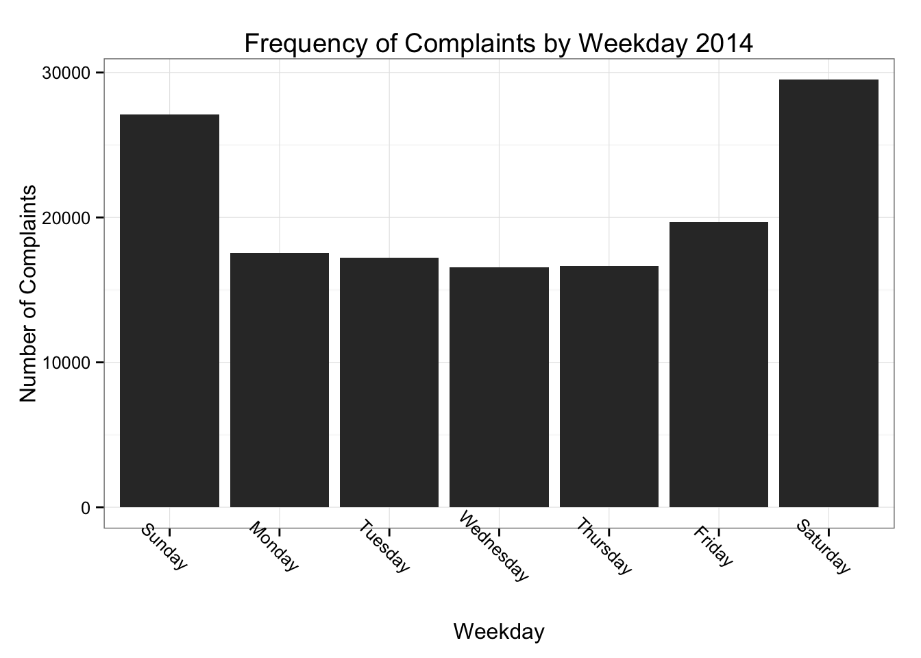
2014 Complaints by Weekday
The graph below shows complaints by weekday. This shows that there is a higher frequency of noise complaints generated over the weekends.
Complaints by weekday
noiseWkdy <- group_by(select(noiseRnd, -Created.Date), wkDay)

noiseWkdy <- filter(noiseWkdy, year == 2014)

noiseWkdy <- summarise(noiseWkdy, count = n())
wkdyComp <- qplot(noiseWkdy$wkDay, noiseWkdy$count, noiseWkdy, geom = "bar", stat = "identity")
wkdyComp <- wkdyComp + ggtitle("Frequency of Complaints by Weekday 2014")
wkdyComp <- wkdyComp + xlab("Weekday") + ylab("Number of Complaints")
wkdyComp <- wkdyComp + theme_bw()
wkdyComp <- wkdyComp + scale_x_discrete(limits = noiseWkdy$wkDay, labels = c("Sunday", "Monday", "Tuesday", "Wednesday", "Thursday", "Friday", "Saturday"))
wkdyComp <- wkdyComp + theme(axis.text.x=element_text(angle=-45))
wkdyComp
Frequency of Complaints by Type
The graph below breaks down the 2014 complaint data by complaint type. “Loud Music” and “Banging/Pounding” are the two most common complaints.
Comparison of complaint types
type <- group_by(select(noiseRnd, -Created.Date), Complaint.Type, Descriptor)

type <- summarise(type, count = n())
Manual mapping of complaint types to a common category
type$typeClean <- c(rep(NA, length(type$Complaint.Type)))
type$typeClean[grepl('music', type$Descriptor, ignore.case = TRUE)] <- "Loud Music"
type$typeClean[grepl('talking', type$Descriptor, ignore.case = TRUE)] <- "Loud Talking"
type$typeClean[grepl('construction|hammer', type$Descriptor, ignore.case = TRUE)] <- "Construction"
type$typeClean[grepl('dog|animal', type$Descriptor, ignore.case = TRUE)] <- "Animal"
type$typeClean[grepl('banging', type$Descriptor, ignore.case = TRUE)] <- "Banging/Pounding"
type$typeClean[grepl('horn|vehicle|truck|engine', type$Descriptor, ignore.case = TRUE)] <- "Vehicle"
type$typeClean[grepl('alarm', type$Descriptor, ignore.case = TRUE)] <- "Alarm"
type$typeClean[grepl('air con', type$Descriptor, ignore.case = TRUE)] <- "HVAC Equipment"
type$typeClean[type$Complaint.Type == "Noise - Helicopter"] <- "Aircraft"
type$typeClean[is.na(type$typeClean)] <- "Other"
type <- ungroup(type)
noiseType <- left_join(select(noiseRnd, -Created.Date), type, by = c("Complaint.Type", "Descriptor"))
noiseTypeP <- group_by(noiseType, month, typeClean)
noiseTypeP <- filter(noiseTypeP, year == 2014)
noiseTypeP <- summarise(noiseTypeP, count = n())
noiseTypePlot <- qplot(noiseTypeP$month, noiseTypeP$count, noiseTypeP, geom = "bar", fill = noiseTypeP$typeClean, stat = "identity")
noiseTypePlot <- noiseTypePlot + ggtitle("Frequency of Complaints by Month & Type 2014")
noiseTypePlot <- noiseTypePlot + xlab("Month") + ylab("Number of Complaints")
noiseTypePlot <- noiseTypePlot + theme_bw()
noiseTypePlot <- noiseTypePlot + scale_x_discrete(limits = noiseMonth$month, labels = c("January", "February", "March", "April", "May", "June", "July", "August", "September", "October", "November", "December"))
noiseTypePlot <- noiseTypePlot + theme(axis.text.x=element_text(angle=-45))
noiseTypePlot$labels$fill <- "Complaint Type"
noiseTypePlot
Heat Map of Complaints by Type (2014)
The maps below show a heat map for each type of common noise complaint and the frequency of those complaints throughout the city.
Plot 2014 heat map by complaint type
noiseType_map <- group_by(filter(noiseType, year == 2014), typeClean, areaCoord)

mapType <- ggmap(nycMap)

mapType <- mapType + stat_density2d(aes(x=lonRnd, y=latRnd, fill = "red", alpha=..level.., size=0), data=noiseType_map, geom = 'polygon')

mapType <- mapType + facet_wrap(~ typeClean) + ggtitle("Frequency of Noise Complaints by Type (2014)")

mapType <- mapType + theme(axis.ticks = element_blank(), axis.text.x = element_blank(), axis.text.y = element_blank(), legend.position="none")

mapType <- mapType + xlab("") + ylab("")

mapType
Loud Music Complaints
A look at loud music noise complaints from 2010 - 2015. It is interesting to see how the density of noise complaints has moved away from Midtown Manhattan towards Harlem and Brooklyn.
Plot 2014 heat map for Loud Music
noiseType_map <- group_by(filter(noiseType, typeClean == "Loud Music"), year, areaCoord)

mapType <- ggmap(nycMap)

mapType <- mapType + stat_density2d(aes(x=lonRnd, y=latRnd, fill = "red", alpha=..level.., size=0), data=noiseType_map, geom = 'polygon')

mapType <- mapType + facet_wrap(~ year) + ggtitle("Frequency of Loud Music Complaints by Year")

mapType <- mapType + theme(axis.ticks = element_blank(), axis.text.x = element_blank(), axis.text.y = element_blank(), legend.position="none")

mapType <- mapType + xlab("") + ylab("")

mapType

Alarm Complaints
It is interesting to see here that in 2014 there was a large increase in alarm complaints in the Kew Gardens neighborhood relative to other locations.
Plot 2014 heat map for Alarms
noiseType_map <- group_by(filter(noiseType, typeClean == "Alarm"), year, areaCoord)

mapType <- ggmap(nycMap)

mapType <- mapType + stat_density2d(aes(x=lonRnd, y=latRnd, fill = "red", alpha=..level.., size=0), data=noiseType_map, geom = 'polygon')

mapType <- mapType + facet_wrap(~ year) + ggtitle("Frequency of Alarm Complaints by Year")

mapType <- mapType + theme(axis.ticks = element_blank(), axis.text.x = element_blank(), axis.text.y = element_blank(), legend.position="none")

mapType <- mapType + xlab("") + ylab("")

mapType
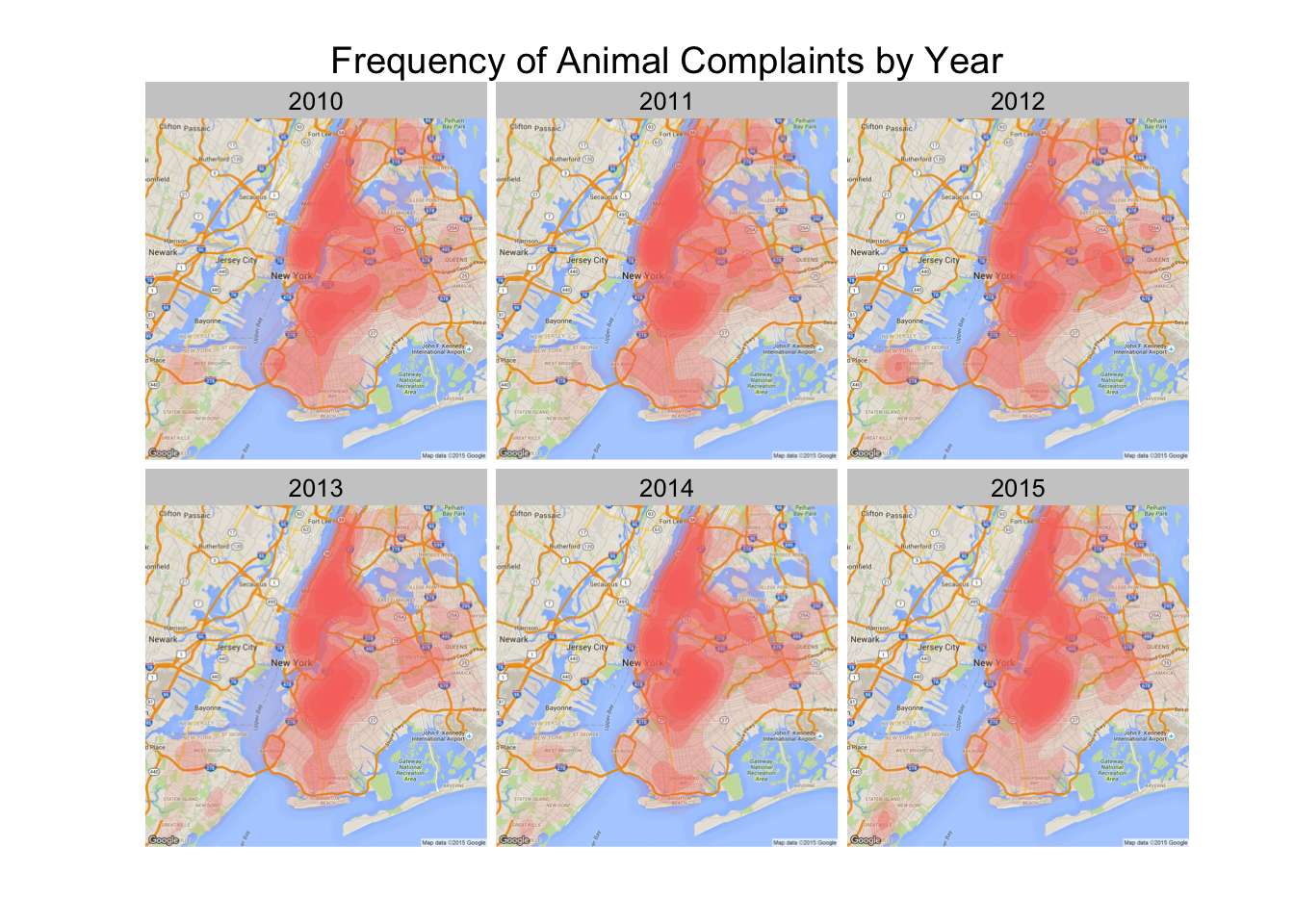
Animal Complaints
Of all the complaint types, animal noise complaints are the most evenly distributed throughout the city.
Plot 2014 heat map for Animals
noiseType_map <- group_by(filter(noiseType, typeClean == "Animal"), year, areaCoord)

mapType <- ggmap(nycMap)

mapType <- mapType + stat_density2d(aes(x=lonRnd, y=latRnd, fill = "red", alpha=..level.., size=0), data=noiseType_map, geom = 'polygon')

mapType <- mapType + facet_wrap(~ year) + ggtitle("Frequency of Animal Complaints by Year")

mapType <- mapType + theme(axis.ticks = element_blank(), axis.text.x = element_blank(), axis.text.y = element_blank(), legend.position="none")

mapType <- mapType + xlab("") + ylab("")

mapType


