Predicting NYC Yellow Cab Taxi Fare

Introduction
As technology continues to push the bar for information, one area in NYC that's lagging behind is its iconic Yellow Cab. With Uber, Lyft, Via, and other ride-hailing apps setting the pace, Yellow Cab's has teamed up with Google to become more data-centric. Yellow cab has asked Google to figure out how to predict the estimated fare amount by using a few features to determine the expected fare amount. The information that Google has obtained from yellow cab are past taxi rides that include:
- Pickup Time/Date
- Pickup Latitude/Longitude
- Dropoff Latitude/Longitude
- Passenger Count
- Fare Amount
Goal
Yellow Cab, Google, and Kaggle have teamed up together in creating a playground type competition to allow people to view this dataset and create a machine learning algorithm that predicts the expected fare amount. Our goal is to analyze the dataset, manipulate, and create functions to allow new data run through our code and machine learning algorithm to eventually offer an expected fare price.
Exploring the Data
To create an effective ML model, they're a few things that we have to do before inputting our data into a model for it to be accurate. By having domain expertise in NYC Yellow Cabs, certain issues become more apparent then someone whose knowledge is limited. To get a better understanding of our dataset, I did some research on Yellow Cabs. Understanding how you are charged when a cab picks you up is crucial. Some of my findings include:
- Initial charge: $2.50
- Mileage: 40 cents per 1/5 mile
- Waiting charge: 40 cents per 120 seconds
- JFK flat fare: $45. (was $35)
- Newark surcharge: $15. (was $10) 4 p.m.–8 p.m. weekday.
Now that I have a better understanding of the cost structure, I dove deeper into the dataset, getting a better understanding of whether the time of day affects the price. Before I get into the time of day, I wanted to understand the distribution of the fare amount before I manipulated the dataset.

As we see, our fare amount is heavily distributed. This tells us that our dataset contains a lot of outliers or abnormalities.
Once I removed the outliers from out fare amount feature, the graphs below gives us a better understanding of the distribution of fare price in NYC
We can see by removing our outliers from the dataset, our fare price is bounced from $2.50 to $40
After exploring the pickup and dropoff locations and correcting any incorrect information, it was time to begin diving in the time of day aspect of fare price.
From the graphs above, we can see that Friday, Saturday, and Thursday have the highest count of taxi rides given. This makes sense as people are doing more traveling for the weekend. People are traveling, seeing friends, going out, etc. As we look at the average price of a given day, we can see there isn't too much of a difference between any day.
The graph below also shows us the average fare price at any given hour during the day. The x-axis represents a 24-hour clock.

Now taking a looking a the count of passengers, I see that something doesn't make sense. Unless Yellow cab is trying to enter the clown car market, maximum compacity for yellow cabs is 7 people. But looking at the data, we have such few instances of 7 people in a cab at once that we can just filter out any count of passenger greater than and 6. I also see that our dataset contains 0 passengers, which doesn't make sense, so we can filter out any 0 occurrences.

After filtering out 0 passengers and passengers > 6, I can now see a better and more realistic picture.
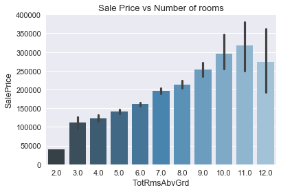
As we can see from the bar graph below, there isn't too large of a difference between the number of passengers and the fare price.

Interesting Insight
Now taking a step back from the time of day, I wanted to get a better understanding of how the price of a taxi ride has gone up over the years. I copied our dataset and changed our index to a sorted Year-Month column. From there I was able to see how the price of a taxi ride would compare over the years.
Looking at the graph above, we can see that there's a spike around 2012- 2013. The graph below depicts the monthly average price.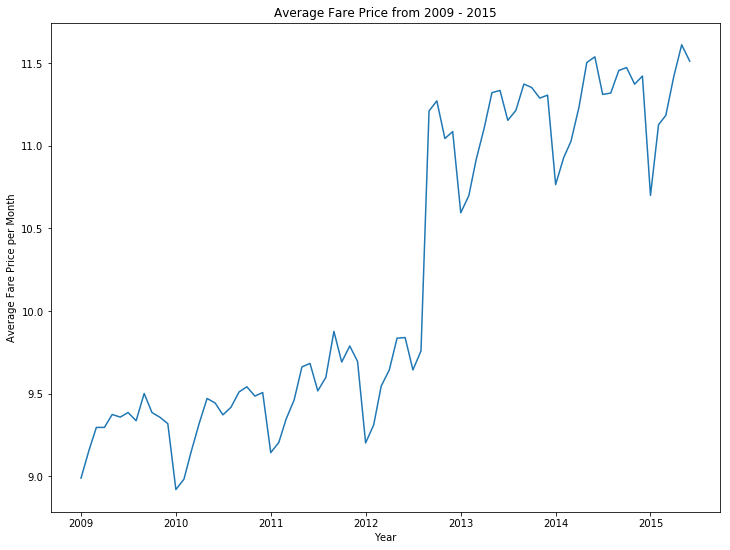
As we can see, there is certainly something going on with the price of a taxi ride from 2012 -2013. As a data scientist, this is the type of information we like to uncover. I quickly googled "increase NYC taxi fare 2012" and the first link to pop up was a New York Times article. The article was written on September 3, 2012, by Matt Flegenheimer
To give a quick summary of the article:
- The city’s Taxi and Limousine Commission announced that operators of yellow taxis would be allowed to put the new fares — which increase rates by about 17 percent
- Base fee charged before a ride begins will remain unchanged
- Cost for each fifth of a mile traveled, or each 60 seconds in stopped or slow traffic, will rise to 50 cents, from 40 cents
- Trips between Kennedy International Airport and Manhattan will rise by $7, to $52 plus tolls
- The surcharge on rides to Newark Liberty International Airport will also rise, to $17.50, from $15
Machine Learning
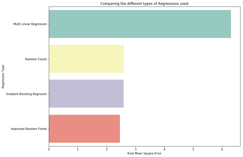
Once I cleaned our data, removed any outliers, removed any errors, and featured engineered our pickup location and dropoff location to get the distance between the two points, it was time to implement our data into a Machine Learning Model. I used three types of Machine Learning Models. I used a multilinear regression, a random forest regressor, and a gradient boosting regression.
I used RMSE, which stands for root mean square error, to identify which model preformed the best. Before I show the models rmse, I wanted to show the difference between a randome forest model and a gradient boost model. For random forest, the key feature used to predict fare price was the haversine_dist, which is the distance between pickup location and dropoff location. We see that every other feature isn't as important.

For my gradient boost regression model, haversine_dist is an important feature but also our pickup location and dropoff location are important to the model as well.
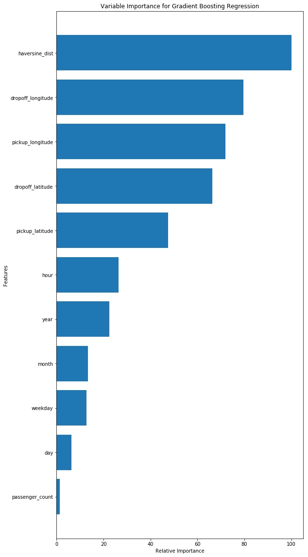
For both random forest and gradient boost, passenger count seems to be unimportant in determining the fare price. I guess our graph on average passenger fare was correct in showing there's no difference.
Now to see which regression model performed the best, the graph below shows that our improved random forest model produced the best results. The RMSE for the improved random forest was around 2.418, which basically means that once our model spits out a predicted fare price, that price can differ by $2.418.
Additional Work
Some additional work can be done to improve the results shown above. For example, if I featured engineered the distance to airports, we would be able to identify which taxi trips went to an airport vs. non-airport travel. Along with that, it would be interesting to plot all our coordinates to see where everyone is going in the NYC greater area.
Github
If you want to check out the code behind all these stunning visualizations and look at some of the machine learning models used, check out my GitHub account.

