Data Analysis and Visualization of Crime in Chicago
The skills the author demoed here can be learned through taking Data Science with Machine Learning bootcamp with NYC Data Science Academy.
Data shows Chicago has often been in national headlines for fluctuations in violent crime. Documentaries and TV shows like "Chiraq" from Vice and “The Chi” on Showtime have also given a glimpse and feel of the overall nature of the south side of the city . The south side of Chicago is notoriously known for being riddled with high violent crime rates.
In particular, Chicago was in the nation's spotlight in 2016 for raising the nation’s crime rate overall because of the large uptick in crimes from 2015 - 2016. There is speculation that the significant jump in violent crime circled around the case involving Laquan Mcdonald and the subsequent release of the video that recorded the incident. My Shiny app will help to visualize and confirm the uptick in crime rate and where/when crime is happening in Chicago.
The application can be found here and the corresponding code can be found here on my github.
The Data
I used the Chicago crime dataset from Kaggle spanning from 2012 - 2017. The data included information such as date/time when the crime happened, block where the crime occurred, type of crime, location description, whether there was an arrest, and location coordinates.
I removed data from 2017 as this data was not complete for the whole year so in any year over year analysis, this would have made for an inaccurate comparison. Some additional columns I added were for the type of charge (felony or misdemeanor) the crime fell under in Chicago, general location buckets based off the location description, and also some parts of date and time parsed out in order to view the data by different aspects of time such as year, month, hour, etc.
Exploring the Data: R Shiny App
The dashboard consists of three different tabs you can click on the sidebar:
- Heatmap (a map of Chicago that visualizes density of crime in different areas filtering by charge (misdemeanor or felony), location, and year range.)
- Cluster Map (this map helps visualize crime by showing crime counts clustered by area. When you zoom into a specific location/pin, you are able to see the crime type, date of crime, whether an arrest was made, and type of location.)
- Time (this tab consists of various analyses over time)
- Data (consists of full dataset)
Note: Unfortunately due to ShinyApps.io limitations and the size of the dataset, I had to limit my data to just the years between 2014 - 2016 so that it could be hosted on its servers.
The Heat Map:
The heatmap displays a high level overview of crimes happening in various areas of Chicago. It allows the user to see the density in crimes by crime type, location, and year. Filtering by "Felony" and "Residence" below, one can see in general a higher concentration of red in the southern half of the city.

The Cluster Map:
The cluster map depicts crimes by the numbers filtered by crime type, location, and year. The clusters move apart as you zoom into a particular location and allow you to see specifics of a crime when zoomed in far enough to its location.

You can see below the details for crime type, date of crime, whether there was an arrest, and location type that you see once zoomed into a particular area and point. Here we are zoomed into Englewood which is a neighborhood with one of the highest crime rates in Chicago. This particular cluster situated near a school shows a high volume of crime clustered in the same area.
Crime Trends Over Time
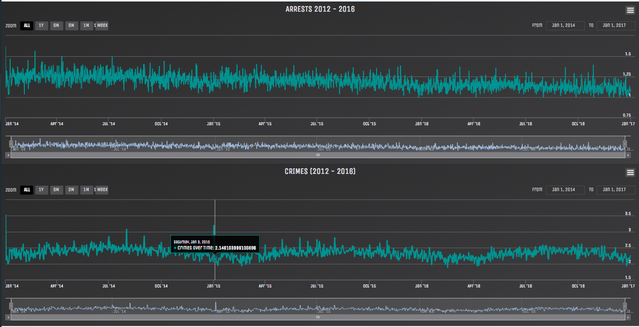
In the two time series below, we can see trends in the number of crimes and arrests overall in Chicago. With arrests we see a general decrease from 2014-2016 aligning with the spike in crime rate following the Laquan Mcdonald case. In the crimes series, there are a couple distinct spikes which seem to be occurring on New Years day of each year.
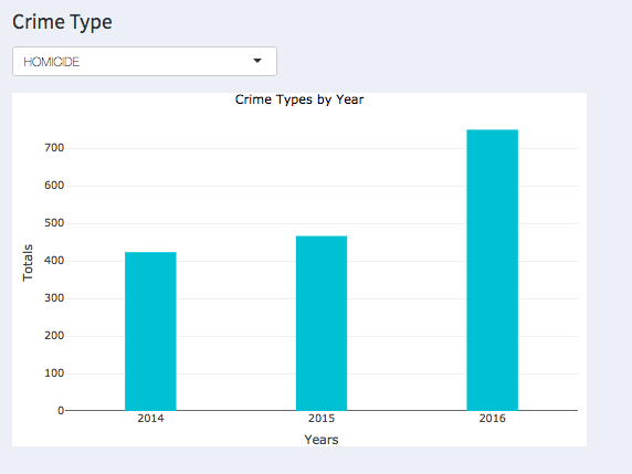
We can then see crime types by year. The below shows the spike in homicide counts from 2015 - 2016.
Further, we see the crime rate by crime type normalized by Chicago’s population (2.7MM). Even with the data normalized, there is still a large increase in homicide rate between 2015 - 2016. Chicago actually joined Memphis at this time as the only cities with a double-digit increase in murder rate in 2016.
Finally we can see crimes and locations by hour which allows users to see the hour at which a crime is more prevalent during the day. Here we see that homicides happen mostly from late afternoon 4 PM to 3 AM at night. In terms of location, the below shows crimes happening at schools/religious locations mostly during the day, likely during typical school hours (7 AM - 3 PM).
Further Exploration
As I continue to add to the application I would like to add additional datasets such as spending on social initiatives in Chicago and evaluating the impact. Also taking a look at the distribution in ages of people committing these crimes. If it has been a younger demographic, perhaps this indicates a need for a more aggressive approach to social spending and initiatives. Overall the goal would be to see how the trends in crime can start reversing by honing in on the actual triggers and running regressions to see the effect of education spending, income inequality, and age on crime rates by each neighborhood.


