Data Study on Bay Area Bike Share
The skills the author demoed here can be learned through taking Data Science with Machine Learning bootcamp with NYC Data Science Academy.
Introduction
This post is about the first of the four projects we are supposed to deliver at the NYC Data Science Academy Data Science Bootcamp program. The requirements were:
For this project, you are not only expected to lead your audience through data insights
gleaned from visual representations, but also required to build an interactive Shiny
application that can create and modify such graphics on-the-fly.You must find the balance of the correct level of interactivity and simplicity that allows an outside user to
both understand your points and also uncover their own insights without getting
distracted by excess accoutrements.
I chose to work on data provided by Bay Area Bike Share. This is a "bike sharing system with 700 bikes and 70 stations across the [Bay Area] region [...]. Intended to provide Bay Area residents and visitors with an additional transportation option for getting around the region, the Bay Area Bike Share is fun, easy, and affordable."
Source Data
I sourced the data from the Bay Area Bike Share Open Data page and downloaded the datasets for year 2 (Sep 2014 - Aug 2015) and year 3 (Sep 2015 - Aug 2016) in order to create a new dataset containing all the data for the year 2015. The following data was used in this project:
Stations
| station_id | name | lat | long | dockcount | landmark | installation |
Trips
| Trips ID | Duration | Start Date | Start Station | Start Terminal | End Date | End Station | End Terminal | Bike No | Subscriber Type | ZIP Code |
Weather
| ZIP | Date | Max. Temperature F | Mean Temperature F | Min. Temperature F | Cloud Cover |
The data was in very good quality so that I had to do almost no cleaning.
For the temperature there were a few missing values for one day where there was no data recorded. Because this data was not too important for the overall application but I did not want to have gaps in the data, I used the zoo library to copy values that already existed for the a variable to the empty cells of the same variable. All of the other data was basically 100% complete so that this part could be indeed kept to a minimum. All the data was converted from CSV to the for R optimized RDS data format to save space and improve the loading speed in R.
Data Aggregates
Having established the data source to use for my project and acquainted myself with it, I created various aggregations per dataset (cf. Source Data) to be able to calculate various measurements on different groupings of the data. They are:
Based on Trips
- routes: Grouping of trips per route, i.e. Start Station to End Station, with various measurements, such as total amount of trips taken on that route, durations (min, max, avg) of these trips, ..., for both the cases that direction does and does not matter, i.e. Start - End != End - Start and Start - End = End - Start.
- bikes: Grouping of trips per bike number with various measurements, such as total amount of trips taken on that bike or the number of days each bike was in use.
- stations by start/end hour/date: Usage of stations as start or end point of a trip by hour of day or day of year in total amount of trips.
- zipStartByDate: Total amount of trips per day of year the trip was started on and ZIP of the station the trip was started at.
- cust: Total amount and total duration of trips per subscriber type, i.e. Subscriber (annual or 30-day member) or Customer (24-hour or 3-day member).
Based on Stations
- docks: Grouping of stations per city (landmark) with the measurements stationCount and dockCount.
Based on Weather
- weatherTrips: Weather per day of year and ZIP in combination with the amount of trips from zipStartByDate.
Data Visualization in Shiny
The visualization of the data had to be done in Shiny, which is a "web application framework for R [to] turn [...] analyses into interactive web applications". Furthermore, I used Shiny Dashboard to create a management dashboard-esque application.
Start
As you can see on the image below, on the menu on the left I created various items to thematically group the charts and maps I was going to implement. These are Stations, Trips, Bikes, Customers, and Weather (cf. Data Aggregates). I will go on to explain them in detail.
Stations
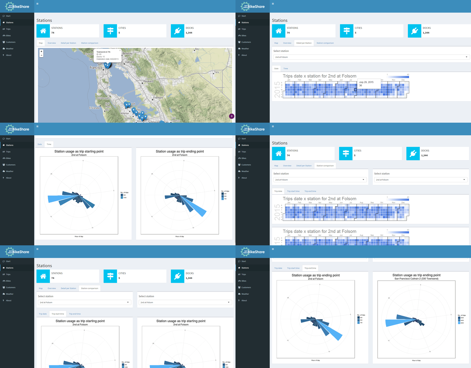
This tab delivers various insights into the data on station level. It starts with showing a map where all the stations are shown at their actual position. The overview tab then shows the user in which city how many stations and docks are positioned.
For each of these stations, detailed statistics about their usage either throughout the year, i.e. per date, or throughout the day, i.e. on a 24h clock, can be found. The stations can also be compared in terms of the aforementioned characteristics.
Trips
The next item on the menu is the trips tab. This allows access to detailed statistics about all the trips taken on the Bay Area Bike Share network. It begins with the map the user already knows from the stations tab, but this time they are able to print routes on the map, for both the cases that direction does and does not matter. The default threshold for routes to display is set to 1,000, i.e. there must have been at least 1,000 trips on a route for it to be drawn on the map. The user can change this setting, and the line width corresponds to the amount of trips taken on a certain route.
On the next tab, the sankey chart gives a good overview of the most important routes and stations of the system by indicating by means of line width and node width from left to right - start to end - which trips were popular in the year 2015. Finally, the table shows various statistics for each of the routes.
Bikes
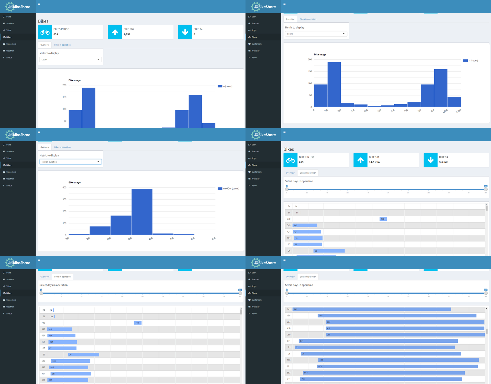
In terms of bikes, the user is presented with a histogram that shows bike usage in three metrics - total amount of usage, total duration of usage and median duration of usage. It becomes immediately clear that some bikes are heavily used while others seem to be barely touched at all.
On the next tab, the timeline displays for each bike exactly how many days it was in operation in 2015, i.e. during which time period it was used for trips. The dual slider on top lets the user filter the range of operation days which the timeline should show.
Customers
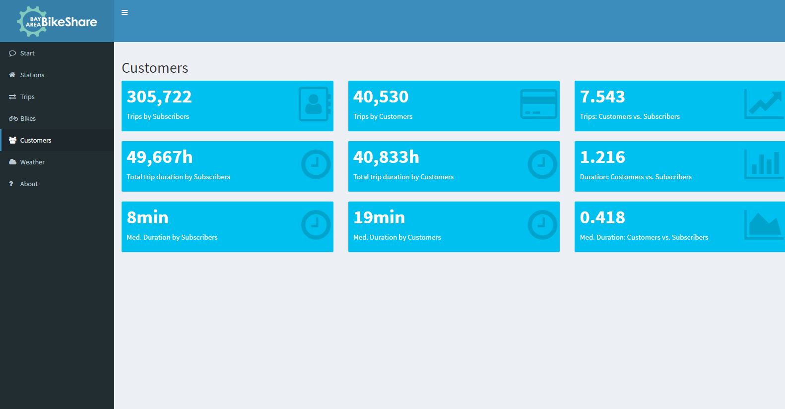
The content of this tab does not react to any user input. It basically shows a bunch of value boxes that compare the two customer types, Subscriber and Customer.
Weather
This tab allows the user to take a look at the temperatures in F, C, and the cloud cover per day of the year for each of the five cities and compare it to the trips started on that day on any of the stations in each city.
Conclusion
In terms of actual findings within the data, nothing was too surprising:
- Some routes are more popular than others
- In cities with more stations there is a higher frequency of trips taken on the network
- It seems to be the case that trips to and from Caltrain stations are more popular than others
- Longer trips are taken by ad-hoc customers - tourists (?) - than subscribers, who are probably mostly commuters
- A bit astonishing: not all bikes seem to be in use the whole year. Some were only on the streets for a few days while others were used throughout the whole year.
- Temperature and cloud cover do not seem to affect the amount of trips taken at all. Although there was data about on which days it rained or where there even was a thunderstorm, it was not taken into consideration as it was only listed per day and broken not down to hours of the day.
This dataset, although only consisting of a few files, makes for a good showcase about the possibilities of a Shiny application. Basic capabilities - info and values boxes, and ggplot charts - were used as well as more advanced features, such as Google Charts and Leaflet Maps. It was a valuable experience to get an overall look at R this way - loading and working with data, creating various plots in different engines, and combining it all together into a single dashboard.
As for Shiny in particular, this project helped me very much in understanding how to exactly use the different files ui.R, server.R, global.R and helpers.R, and how to create an app out of all these building blocks.
As stated above, code and data can be found on GitHub, while the app itself is online at shinyapps.io.


