NYC Data Science Academy| Blog
Bootcamps
Lifetime Job Support Available Financing Available
Bootcamps
Data Science with Machine Learning Flagship ๐Ÿ† Data Analytics Bootcamp Artificial Intelligence Bootcamp New Release ๐ŸŽ‰
Free Lesson
Intro to Data Science New Release ๐ŸŽ‰
Find Inspiration
Find Alumni with Similar Background
Job Outlook
Occupational Outlook Graduate Outcomes Must See ๐Ÿ”ฅ
Alumni
Success Stories Testimonials Alumni Directory Alumni Exclusive Study Program
Courses
View Bundled Courses
Financing Available
Bootcamp Prep Popular ๐Ÿ”ฅ Data Science Mastery Data Science Launchpad with Python View AI Courses Generative AI for Everyone New ๐ŸŽ‰ Generative AI for Finance New ๐ŸŽ‰ Generative AI for Marketing New ๐ŸŽ‰
Bundle Up
Learn More and Save More
Combination of data science courses.
View Data Science Courses
Beginner
Introductory Python
Intermediate
Data Science Python: Data Analysis and Visualization Popular ๐Ÿ”ฅ Data Science R: Data Analysis and Visualization
Advanced
Data Science Python: Machine Learning Popular ๐Ÿ”ฅ Data Science R: Machine Learning Designing and Implementing Production MLOps New ๐ŸŽ‰ Natural Language Processing for Production (NLP) New ๐ŸŽ‰
Find Inspiration
Get Course Recommendation Must Try ๐Ÿ’Ž An Ultimate Guide to Become a Data Scientist
For Companies
For Companies
Corporate Offerings Hiring Partners Candidate Portfolio Hire Our Graduates
Students Work
Students Work
All Posts Capstone Data Visualization Machine Learning Python Projects R Projects
Tutorials
About
About
About Us Accreditation Contact Us Join Us FAQ Webinars Subscription An Ultimate Guide to
Become a Data Scientist
    Login
NYC Data Science Acedemy
Bootcamps
Courses
Students Work
About
Bootcamps
Bootcamps
Data Science with Machine Learning Flagship
Data Analytics Bootcamp
Artificial Intelligence Bootcamp New Release ๐ŸŽ‰
Free Lessons
Intro to Data Science New Release ๐ŸŽ‰
Find Inspiration
Find Alumni with Similar Background
Job Outlook
Occupational Outlook
Graduate Outcomes Must See ๐Ÿ”ฅ
Alumni
Success Stories
Testimonials
Alumni Directory
Alumni Exclusive Study Program
Courses
Bundles
financing available
View All Bundles
Bootcamp Prep
Data Science Mastery
Data Science Launchpad with Python NEW!
View AI Courses
Generative AI for Everyone
Generative AI for Finance
Generative AI for Marketing
View Data Science Courses
View All Professional Development Courses
Beginner
Introductory Python
Intermediate
Python: Data Analysis and Visualization
R: Data Analysis and Visualization
Advanced
Python: Machine Learning
R: Machine Learning
Designing and Implementing Production MLOps
Natural Language Processing for Production (NLP)
For Companies
Corporate Offerings
Hiring Partners
Candidate Portfolio
Hire Our Graduates
Students Work
All Posts
Capstone
Data Visualization
Machine Learning
Python Projects
R Projects
About
Accreditation
About Us
Contact Us
Join Us
FAQ
Webinars
Subscription
An Ultimate Guide to Become a Data Scientist
Tutorials
Data Analytics
  • Learn Pandas
  • Learn NumPy
  • Learn SciPy
  • Learn Matplotlib
Machine Learning
  • Boosting
  • Random Forest
  • Linear Regression
  • Decision Tree
  • PCA
Interview by Companies
  • JPMC
  • Google
  • Facebook
Artificial Intelligence
  • Learn Generative AI
  • Learn ChatGPT-3.5
  • Learn ChatGPT-4
  • Learn Google Bard
Coding
  • Learn Python
  • Learn SQL
  • Learn MySQL
  • Learn NoSQL
  • Learn PySpark
  • Learn PyTorch
Interview Questions
  • Python Hard
  • R Easy
  • R Hard
  • SQL Easy
  • SQL Hard
  • Python Easy
Data Science Blog > Data Visualization > Visualization of Red Tide in the Gulf of Mexico

Visualization of Red Tide in the Gulf of Mexico

Laura Elliott
Posted on Aug 12, 2019

The skills we demoed here are taught in NYC Data Science Academy's Data Science with Machine Learning bootcamp.

The Red Tide Visualization App  offers a quick, interactive snapshot of harmful algae blooms, or 'Red Tide,' observed in the Gulf of Mexico from 2000 to 2018.  (App is down for minor editing.) This app allows the user to examine 6,000 algal blooms recorded by the National Oceanic and Atmospheric Association's harmful algae bloom observation system and their corresponding water temperatures, water salinities, and cell counts by year.


Red Tide Visualization App

Introduction

Kerenia brevis is a species of microscopic algae that lives almost exclusively along the coasts of the Gulf of Mexico. In recent years, however, larger then normal blooms of the algae have been observed along the gulf coasts of Florida, Texas. It has also been detected along the atlantic coast as far north as North Carolina. While algal blooms may seem trivial, blooms of Kerenia brevis, commonly referred to as 'Red Tide,' have detrimental effects on local marine life and human life.

Red Tide not only depletes the ocean of oxygen, suffocating nearby fish and plant life, it also releases a type of neurotoxin called a brevetoxin. These toxins interfere with nerve transmission and also cause immune depression, bronchial constriction, and haemolysis (1). Brevetoxins represent one of the most common environmental stressors impacting the areas in which they are released. The consequenses of brevetoxins include massive fish and marine mammal kills, increased sea turtle and sea bird mortality, as well as decreased plant and coral life in areas where toxins are present.

Red Tide

It is not recommended to swim in areas that are  threatened by Red Tide because of the dangers associated with brevetoxins. Even out of the water, humans are vulnerable to their harmful effects. Brevetoxins can contaminate seafood and can also be broken up by the natural movement of the ocean and aerosolized, which can cause respiratory irritation for those living near a bloom. Finding a way to control harmful blooms of Kerenia brevis is important for maintaining a healthy ocean and coastal environment in areas that are most affected.

The purpose of this shiny app is to offer a simple visualization of common locations of Red Tide blooms from 2000 to 2018 and some associated characteristics. In the future, more in depth analyses will be conducted to explore the statistical relationships between large Kerenia brevis blooms and environmental conditions like water temperature and salinity. 

Data Visualization 

Data were collected from the National Oceanic and Atmosphereic Administration's (NOAA)  harmful algal blooms observing system which is a distribution system for harmful algal bloom (HAB) information. The dataset includes algal cell counts, water temperature, water salinity, loction, and date time associated with HABs observed in the Gulf of Mexico beginning in August 1953 (N > 100,000). Below is a map generated by the NOAA of the data points associated with this set.
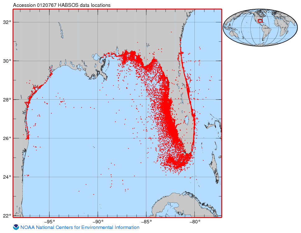
The data were imported into R and cleaned using dplyr and tidyverse. This app focuses of visualizing high cell count blooms (cells/L) of Kerenia brevis and their associated

  • Water Temperature (Degrees F)
  • Salinity (ppt)
  • Location ( latitude and longitude)
  • Year of measurement

Due to a high number of missing values in earlier years, only observations made after the year 2000 were included in this application. The data set was reduced further because of missing water temperature values for many HAB observations. The resulting data set had 6,000 HABs with complete information on the above factors of interest. 

Visualization App Features

With the cleaned data, the shiny app was built using multiple data visualization packages offered in R.  To explore common Red Tide locations, latitude and longitude points from the data were used to plot exact locations of each bloom on an interactive leaflet map pictured below.  The map allows the user to see all of the algae blooms recorded in a given year and learn more about the environmental conditions associated with a given bloom by hovering over a specific point.

Interactive map

The 'Explorer' panel (pictured below) allows the user to select a year of interest or to animate across the years to quickly see changes in HAB characteristics by year. The panel also includes a plot, generated using ggplot2 in R, that easily summarizes the salinity levels associated with high cell counts. Interactive plotly plots will be added once the app is updated. 


Explorer panel

Future Visualization Additions

While the app does offer an easy visualization of the charactaristics of HABs oberved in the Gulf of Mexico from 2000 to 2018, it does not give any visualization of statistical relationships between large cell counts, water temperature, and salinity. In the future, more tabs and analyses will be added to the app to give a better representation of the factors that contribute to the increase in size and frequency of Red Tide blooms in the gulf. 


Interested in the code? Visit my Github by clicking HERE!


References:

(1) Pierce RH, Henry MS. (2009). Harmful algal toxins of the Florida red tide (Karenia brevis): natural chemical stressors in South Florida coastal ecosystems

About Author

Laura Elliott

Laura Elliott is an experienced data analyst and epidemiologist who specialized in the distribution of mental health disorders, specifically adolescent anxiety. Now pursuing data science, Ms. Elliott intends to improve business practices through her extensive knowledge of mental...
View all posts by Laura Elliott >

Related Articles

Capstone
Catching Fraud in the Healthcare System
Data Analysis
Car Sales Report R Shiny App
Data Analysis
Injury Analysis of Soccer Players with Python
Capstone
The Convenience Factor: How Grocery Stores Impact Property Values
Capstone
Acquisition Due Dilligence Automation for Smaller Firms

Leave a Comment

Cancel reply

You must be logged in to post a comment.

meritking May 27, 2023
Visualization of Red Tide in the Gulf of Mexico http://www.k-marumo.co.jp/
Laura Elliott August 26, 2019
I apologize, the app has been taken down for some editing. I will make sure to update the link on my blog. I will let you know when the app is back up
Molly August 16, 2019
The link to the app isn't working. How do we access the app?

View Posts by Categories

All Posts 2399 posts
AI 7 posts
AI Agent 2 posts
AI-based hotel recommendation 1 posts
AIForGood 1 posts
Alumni 60 posts
Animated Maps 1 posts
APIs 41 posts
Artificial Intelligence 2 posts
AWS 13 posts
Banking 1 posts
Big Data 50 posts
Branch Analysis 1 posts
Capstone 206 posts
Career Education 7 posts
CLIP 1 posts
Community 72 posts
Congestion Zone 1 posts
Content Recommendation 1 posts
Cosine SImilarity 1 posts
Data Analysis 5 posts
Data Engineering 1 posts
Data Engineering 3 posts
Data Science 7 posts
Data Science News and Sharing 73 posts
Data Visualization 324 posts
Events 5 posts
Featured 37 posts
Function calling 1 posts
FutureTech 1 posts
Generative AI 5 posts
Hadoop 13 posts
Image Classification 1 posts
Innovation 2 posts
Kmeans Cluster 1 posts
LLM 6 posts
Machine Learning 364 posts
Marketing 1 posts
Meetup 144 posts
MLOPs 1 posts
Model Deployment 1 posts
Nagamas69 1 posts
NLP 1 posts
OpenAI 5 posts
OpenNYC Data 1 posts
pySpark 1 posts
Python 16 posts
Python 458 posts
Python data analysis 4 posts
Python Shiny 2 posts
R 404 posts
R Data Analysis 1 posts
R Shiny 560 posts
R Visualization 445 posts
RAG 1 posts
RoBERTa 1 posts
semantic rearch 2 posts
Spark 17 posts
SQL 1 posts
Streamlit 2 posts
Student Works 1687 posts
Tableau 12 posts
TensorFlow 3 posts
Traffic 1 posts
User Preference Modeling 1 posts
Vector database 2 posts
Web Scraping 483 posts
wukong138 1 posts

Our Recent Popular Posts

AI 4 AI: ChatGPT Unifies My Blog Posts
by Vinod Chugani
Dec 18, 2022
Meet Your Machine Learning Mentors: Kyle Gallatin
by Vivian Zhang
Nov 4, 2020
NICU Admissions and CCHD: Predicting Based on Data Analysis
by Paul Lee, Aron Berke, Bee Kim, Bettina Meier and Ira Villar
Jan 7, 2020

View Posts by Tags

#python #trainwithnycdsa 2019 2020 Revenue 3-points agriculture air quality airbnb airline alcohol Alex Baransky algorithm alumni Alumni Interview Alumni Reviews Alumni Spotlight alumni story Alumnus ames dataset ames housing dataset apartment rent API Application artist aws bank loans beautiful soup Best Bootcamp Best Data Science 2019 Best Data Science Bootcamp Best Data Science Bootcamp 2020 Best Ranked Big Data Book Launch Book-Signing bootcamp Bootcamp Alumni Bootcamp Prep boston safety Bundles cake recipe California Cancer Research capstone car price Career Career Day ChatGPT citibike classic cars classpass clustering Coding Course Demo Course Report covid 19 credit credit card crime frequency crops D3.js data data analysis Data Analyst data analytics data for tripadvisor reviews data science Data Science Academy Data Science Bootcamp Data science jobs Data Science Reviews Data Scientist Data Scientist Jobs data visualization database Deep Learning Demo Day Discount disney dplyr drug data e-commerce economy employee employee burnout employer networking environment feature engineering Finance Financial Data Science fitness studio Flask flight delay football gbm Get Hired ggplot2 googleVis H20 Hadoop hallmark holiday movie happiness healthcare frauds higgs boson Hiring hiring partner events Hiring Partners hotels housing housing data housing predictions housing price hy-vee Income industry Industry Experts Injuries Instructor Blog Instructor Interview insurance italki Job Job Placement Jobs Jon Krohn JP Morgan Chase Kaggle Kickstarter las vegas airport lasso regression Lead Data Scienctist Lead Data Scientist leaflet league linear regression Logistic Regression machine learning Maps market matplotlib Medical Research Meet the team meetup methal health miami beach movie music Napoli NBA netflix Networking neural network Neural networks New Courses NHL nlp NYC NYC Data Science nyc data science academy NYC Open Data nyc property NYCDSA NYCDSA Alumni Online Online Bootcamp Online Training Open Data painter pandas Part-time performance phoenix pollutants Portfolio Development precision measurement prediction Prework Programming public safety PwC python Python Data Analysis python machine learning python scrapy python web scraping python webscraping Python Workshop R R Data Analysis R language R Programming R Shiny r studio R Visualization R Workshop R-bloggers random forest Ranking recommendation recommendation system regression Remote remote data science bootcamp Scrapy scrapy visualization seaborn seafood type Selenium sentiment analysis sentiment classification Shiny Shiny Dashboard Spark Special Special Summer Sports statistics streaming Student Interview Student Showcase SVM Switchup Tableau teachers team team performance TensorFlow Testimonial tf-idf Top Data Science Bootcamp Top manufacturing companies Transfers tweets twitter videos visualization wallstreet wallstreetbets web scraping Weekend Course What to expect whiskey whiskeyadvocate wildfire word cloud word2vec XGBoost yelp youtube trending ZORI

NYC Data Science Academy

NYC Data Science Academy teaches data science, trains companies and their employees to better profit from data, excels at big data project consulting, and connects trained Data Scientists to our industry.

NYC Data Science Academy is licensed by New York State Education Department.

Get detailed curriculum information about our
amazing bootcamp!

Please enter a valid email address
Sign up completed. Thank you!

Offerings

  • HOME
  • DATA SCIENCE BOOTCAMP
  • ONLINE DATA SCIENCE BOOTCAMP
  • Professional Development Courses
  • CORPORATE OFFERINGS
  • HIRING PARTNERS
  • About

  • About Us
  • Alumni
  • Blog
  • FAQ
  • Contact Us
  • Refund Policy
  • Join Us
  • SOCIAL MEDIA

    ยฉ 2025 NYC Data Science Academy
    All rights reserved. | Site Map
    Privacy Policy | Terms of Service
    Bootcamp Application