Spotify Metrics. Do you know them?

Introduction
When listening to music on Spotify, you're likely not thinking about how your favorite streaming service categorizes each song on various characteristics. In fact, who knows what kinds of song traits there might be without formal music theory training? Spotify measures each song on features such as danceability (how suitable a track is for dancing), energy (the intensity and activity of a song), and valence (how happy a song makes you feel) among a host of other metrics geared towards an algorithm compatible with user preferences. By exploring these measurements Spotify determines, we can begin to understand what features are related towards driving music that's considered happy and popular.
Home
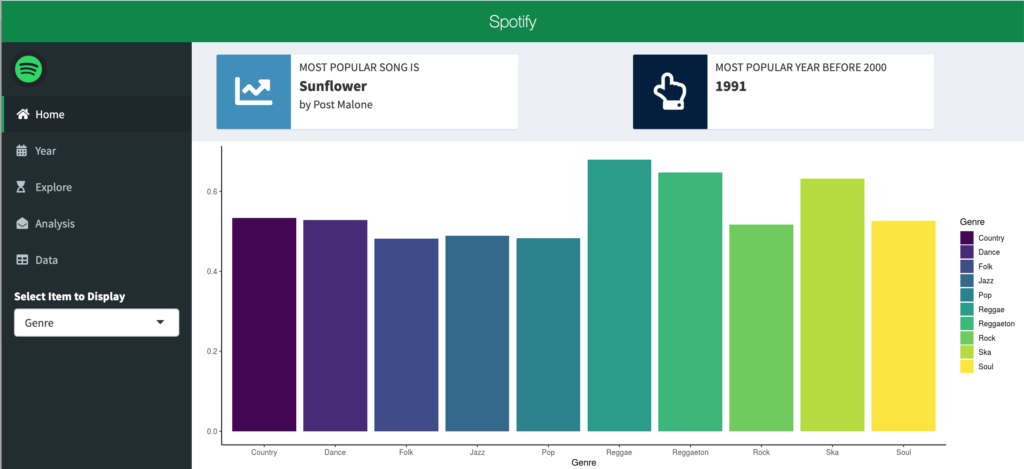
When opening the app, you'll be starting at the home page, which outlines the 10 genres with the highest average valence, alongside information detailing the most popular song and the most popular year before 2000.

Dataset + Methodology
Spotify offers an API for developers that allows for extraction of this data for existing songs. However, the dataset used for this app consists solely of Billboard 200 songs in the database since the early 1960s. A glossary of all metrics used in Spotify's analysis can be found here. In an effort to explain uncharacteristic observations, I primarily have analyzed the following variables: valence (how happy a song makes you), popularity (how popular a song is considered to be), speechiness (valuation of spoken word by song), and instrumentalness (lack of vocalness, otherwise interpreted as acousticness).
The app is designed to explore relationships and trends between these four variables, in addition to providing an analysis of what other Spotify measures are correlated with them.
Data
On the last tab of the app, the user can explore and filter the data based on the search field, if anything in particular strikes them further.

The App + Findings
Time-Series
The app's second tab, Year, begins with a visual time-series line graph showing the average valence and popularity by year for the entire dataset.

Scrolling down on this same Year tab, can explore the same relationship between speechiness and instrumentalness.

We can see that both valence and instrumentalness trended downwards over time, while popularity and speechiness increased. Have songs become more lyrical over time? Why would music today convey less happiness than it used to?
Explore
The explore tab allows the user to look at where each unique input of their own stands in relationship to its average valence/instrumentalness and popularity/speechiness. Categorizing similar trending variables over time give the user an idea of what effect unique values that match their personal preferences may have on the overall standing within the subset of data they choose to evaluate.


Analysis
The final interactive tab takes outlines correlation coefficients for the four variables we graphed in the year tab. The user can hover over each point to find the coefficient value and determine what variable is measured against our four of interest.

In reviewing this tab, there are irregularities we would assume to be false given what we had seen in the time-series graph. The exact same three variables (energy, danceability, and loudness) are most highly rated for both valence and popularity, which we've seen move in opposite directions in the Year tab. Valence and popularity are also least correlated with acousticness, which as expected is most correlated with instrumentalness. Other characteristics are open for exploration by the user simply by hovering over the points or looking at the legend.
Future Work
This plot presents an analysis of correlation that opens the door for additional analysis into causation for our variables of interest, something correlation can't imply. As I develop this app, I look to provide additional insight into our time-series trends. For now, we can begin asking if lyrics make songs more popular? Does acousticness and pure sound convey happiness? Whether it's yes or no, why?

