The One-Stop Data Research Tool for NYC Public Schools (K-8)
The skills I demoed here can be learned through taking Data Science with Machine Learning bootcamp with NYC Data Science Academy.
Github
See the app here
Background
Our little man was growing up and it was time to enroll him in the NYC public school system. So like all responsible parents we began our data search to come up with a shortlist of ten schools - the recommended amount when submitting our application. It quickly became apparent that the research was going to be cumbersome. Simple queries like how one school compared to other schools in a district, or how our district compared to other districts required a lot of note-taking (we didn't have a printer), many browser windows, and a lot of toggling.
My Shiny application takes much of the friction out of researching NYC public schools in order to help all NYC parents, who always have too much on their plates, save time and make more informed decisions.
The Data
The data was sourced from New York City's Department of Education's (DOE) website. It covers grades K-8 for academic years 2015-2019.
The App
The app has four key sections: school level, district level, city level, and insights.
School Level Dashboard
This is where all key information (testing scores, quality, demographics, attendance, etc.) about a specific school are brought together in a simple and digestible format. Jumping around to other districts or to schools within the district is simple and effortless.

Data on District Level Snapshot
This section enables the user to view all the schools across an entire district in a single snapshot. With all schools on the same scale and visual alignment, it becomes much easier to compare schools using key attributes such as quality ratings, testing, and demographics.

City Level Data and Analysis
For those wanting to know how the entire system was doing, users can see how math and language testing performance has been changing over time. Another very helpful section are the boxplots where each box represents a district with colors indicating borough. This graphical format enables one to quickly spot underperforming and outperforming districts.

Data Insights: Quality vs. Testing
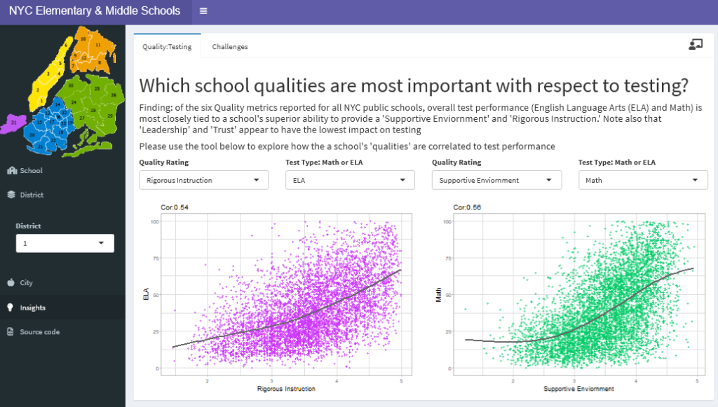
A school's quality ratings on attributes such as leadership, trust, teacher collaboration, etc. are crucially important when evaluating a school. The other key metric to consider is a school's testing performance. This section sought to answer the question of which quality metrics are most correlated to testing performance? Using the pull-downs, the user can explore and experiment with different combinations of quality ratings to test type, and having the side-by-side scatter plots further eases comparisons.

Insights: Socioeconomic Challenges
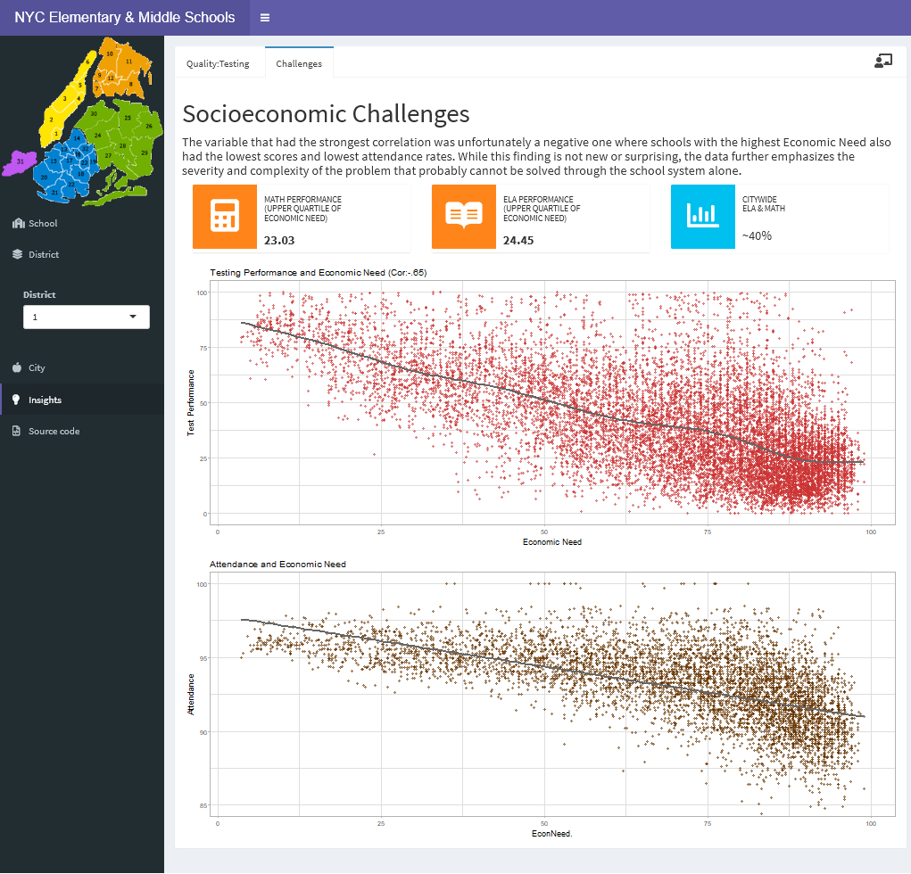
The variable that had the strongest correlation was, unfortunately, a negative one where schools with the highest Economic Need also had the lowest scores and lowest attendance rates. While this finding is not new or surprising, the data further emphasizes the severity and complexity of the problem that probably cannot be solved through the school system alone.

Conclusion
This was an amazing and satisfying project where I learned so much about NYC's public schools in the process. Presenting the data through a Shiny app provides terrific functionality and interaction with the user while the visual format conveys large amounts of data in a way that's straightforward to digest and compare. I feel empowered and informed with this tool, and I am eager to share it with other NYC parents!


