U.S. Commodity Trade Statistics
Background
America's thirty year convention of laissez-faire trade policy has come to a screeching halt. Free trade has been the United State's dominant economic paradigm for the last five presidential administrations as the U.S. expanded its reach into foreign markets. In an age of populism, all of that is set to change. Senator Bernie Sanders and his outspoken criticism of the Trans-Pacific Partnership sent shockwaves through the Democratic party during the 2016 primaries. Candidate and now-President Trump bucked the world economic order and called for a renewed policy of protectionism for American industry. The United States is now rethinking its relationship with NAFTA, the WTO, and many Free Trade Agreements.
In my project, I focus on the commodities market. Commodities are tangible assets like agricultural products or raw materials that serve as the basis for all finished goods. An understanding of historical commodity trade figures can shed light on the consequences of past policies and what it might mean going forward.
I will seek to identify and visualize trends in the commodity trade market between the U.S. and its major trading partners. I hope this data analysis will enable exploration of broad relationships between trade deficits and policy.
Data
I downloaded the "Global Commodity Trade Statistics" dataset off of www.kaggle.com. The United Nations Statistics Division published this dataset to provide import and export volumes for 5,000 commodities worldwide over a period that extends over three decades.
The data provides an exhaustive list of commodity transactions by name, category, weight, and trade amount in USD. The data did not explicitly list the accompanying parties of any transaction (i.e. the countries purchasing or selling the commodity being exported or imported, respectively). For the purposes of this project, I decided to focus my attention on the US and its three major trading partners: Canada, China, & Mexico.
Code
I began engaging with the dataset by tidying my data. My priorities were as follows:
- filtering down to desired countries
- eliminating unnecessary variables
- changing column names to eliminate underscores ('_')
- recategorizing data ('Re-Export' & 'Re-Import')
- changing factors into characters ('Category' column)
The dataset was over 1.24GB so filtering for just the four countries mentioned above was a necessary first step. I then proceeded to remove unnecessary columns such as commodity code, weight, and quantity that do not feed into any of my calculations or graphs. For seamless processing of the data, I replaced any underscores in a column name with periods. I also had to do some cleaning with respect to category definitions (I lumped Re-Imported items in with Imported items and Re-Exported items in with Exported items).
After tidying my data, I began analyzing and synthesizing data with dplyr functions in order to mutate, group, and summarize data. All of my graphs relied heavily on ggplot for data visualization purposes. In order to construct my graphical output on my server, I employed Shiny & ShinyDashboard. Aside from these standard software packages, I pulled from resources like googlevis and the 'rworldmap' library in order to build a heat map and I used the DT library when constructing my data table tab.
Shiny App
I strove for functionality, variability, and interactiveness when coding my app. My first page and tab is a heat map representation of global trade balances (Exports minus Imports) for the four countries under investigation.

Global Commodity Trade Balances for 2016
In the next tab, I built a drop down menu for two pages, each containing a graph. The first graph is an interactive bar chart that allows the user to select a particular year and commodity category. The result is a the sum trade of each relevant country grouped by "Export" and "Import."

Bar Graph
The next chart I displayed is a histogram that counts the number of instances countries hit a certain sum total commodity transactions (in USD) over a given year.

Histogram
I also wanted to include some statistical data, encapsulated by the following linear regression model that allows the user to select a country and observe the historical trend in total commodity transactions by year.

Regression Lines of Sum Commodity Transaction by Year
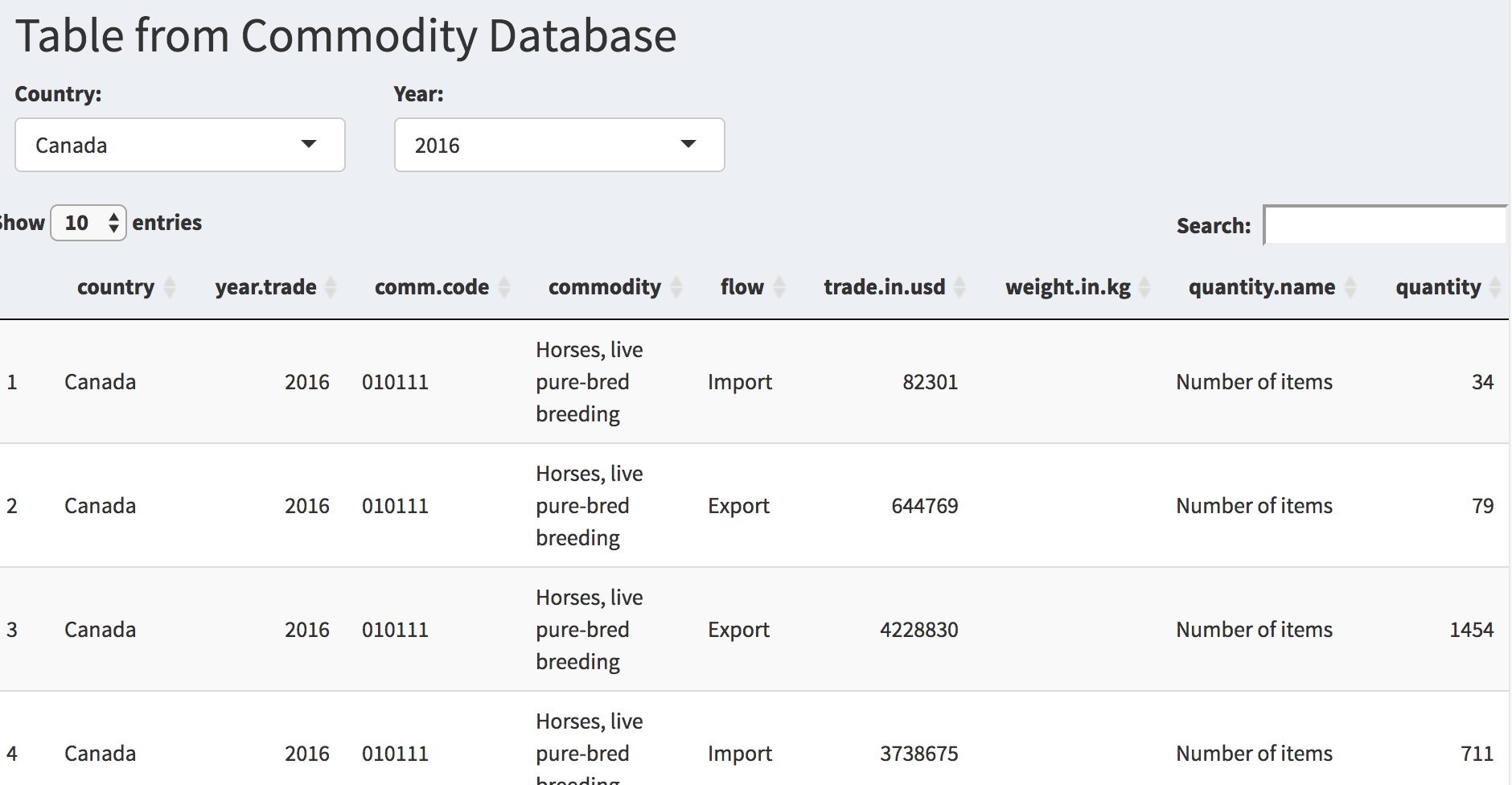
Finally, in order to ensure that the user could interface with the data on a more granular level, I included a table page complete with filtering criteria ("Country" & "Year") and a search function.

Search Table Database

