Using NYC Citi Bike Data to Help Bikers Find their Mates
The skills the author demoed here can be learned through taking Data Science with Machine Learning bootcamp with NYC Data Science Academy.
There is no shortage of data analyses on the NYC bike share system. Most of them aim at predicting the demand for bikes and balancing bike stock, i.e forecasting when to remove bikes from fully occupied stations, and refill stations before the supply runs dry.
This is why I decided to take a different approach and use the Citi Bike data to help riders find each other; a kind of Tinder for bike riders...
If you want to skip the analysis, you can check out the app here.
The Challenge
 As a bike enthusiast, I wish I had a platform where I could have spotted like-minded people who did ride a bike (and not just pretend they did).
The goal of this project was to turn the Citi Bike data into an app where a rider could identify the best spots and times to meet other Citi Bike users and cyclists in general.
The Data
 As of March 31, 2016, the total number of annual subscribers to Citi Bike was 163,865, and its riders took an average of 38,491 rides per day in 2016 (source: Wikipedia)
That adds up to more than 14 million rides in 2016!
I used the Citi Bike data for the month of May 2016 (approximately 1 million observations). Citi Bike provides the following variables:
- Trip duration (in seconds).
- Timestamps for when the trip started and ended.
- Station locations for where the trip started and ended (both the names and coordinates).
- Rider’s gender and birth year - this is the only demographic data we have.
- Rider’s plan (annual subscriber, 7-day pass user or 1-day pass user).
Data on Riders per Age Group
Before moving ahead with building the app, I was interested in exploring the data and identifying patterns in relation to gender, age and day of the week. Answering the following questions helped identify which variables influence how riders use the Citi Bike system and form better features for the app:
- Who are the primary users of Citi Bike?
- What is the median age per Citi Bike station?
- How do the days of the week impact biking behaviours?
As I expected, based on my daily rides from Queens to Manhattan, 75% of the Citi Bike trips are taken by males. The primary users are 25 to 24 years old.
Riders per Age Group
Data Distribution of Riders per Hour of the Day (weekdays)
However, while we might expect these young professionals to be the primary users on weekdays between 8am-9am and 5pm-6pm (when they commute to and from work), and the older users to take over the Citi Bike system midday, this hypothesis proved to be wrong. Also, tourists seemed to have little impact on usage as the short term customers only represent 10% of the dataset.
Distribution of Riders per Hour of the Day (weekdays only)
Median Age per Departure Station
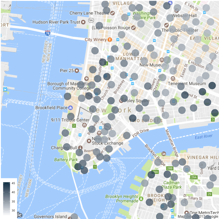
Looking at the median age of the riders for each station departure, we see the youngest riders in East Village, while older riders start their commute from Lower Manhattan (as shown in the map below). The age trends disappear when mapping the station arrival, above all in the financial district (in Lower Manhattan), which is populated by the young wolves of Wall Street (map not shown).
The map also confirms that the Citi Bike riders are mostly between 30 and 45 years old.
Median Age per Departure Station
Rides by Hour of the Day
Finally, when analyzing how the days of the week impacted biking behaviours, I was surprised to see that Citi Bike users didn’t ride for a longer period of time during the weekend: the median trip duration is 19 minutes for each day of the week.
Trip Duration per Gender and Age Group
However, as illustrated below, there is a difference in peak hours. While the peak hours during the weekdays are around 8am-9am and 5pm-7pm when riders commute to and from work, on the weekends, riders hop on a bike later during the day, with most of the rides happening midday.
Number of Riders per Hour of the Day (weekdays vs. weekends)
The App
Where does this analysis leave us?
- The day of the week and the hour of the day are meaningful variables that we need to take into account in the app.
- Most of the users are between 30 and 45 years. This means that the age groups 25-34 and 35-44 won’t be granular enough when app users need to filter their search. We will let them filter by age instead.
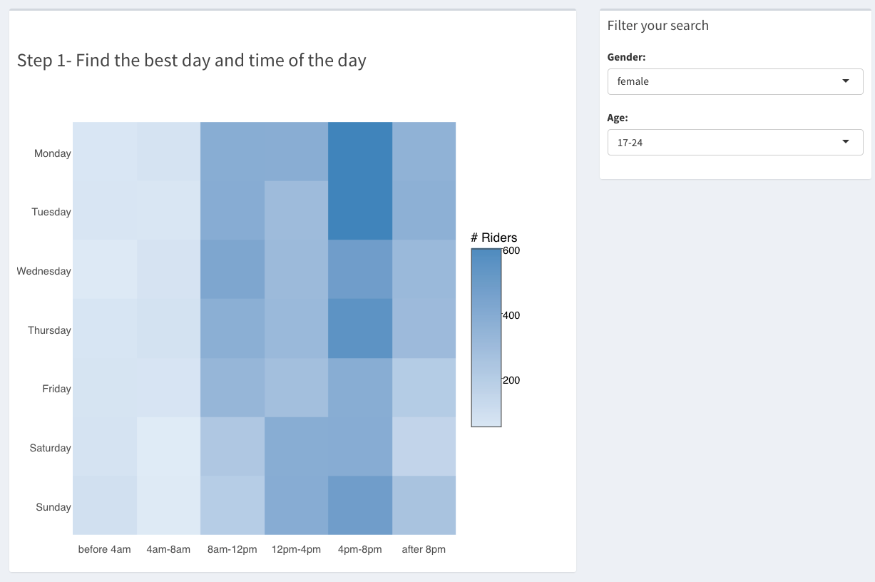
The Citi Tinder app in a few words and screenshots.
There are 3 steps to the app:
- The "when": find the times and days where your ideal mate is more likely to ride.
- The "where": once you know the best times and days, filter out the location by day of the week, time of the day, gender and age. You can also select if you want to spot where they arrive or depart.

- The "how': the final step is to grab a Citi Bike and get to those hot spots. The app calls the Google Maps API to show the directions with a little extra: you can compare the time estimated by Google to connect two stations versus the average time it took Citi Bike users. I believe the latter is more accurate because it factors in the time of the day and day of the week (which the app let you filter).

Although screenshots are nice, the interactive app is better so head to the first step of the app to get started!
Would Have, Should Have, Could Have
This is the first of the four projects from the NYC Data Science Academy Data Science Bootcamp program. With a two-week timeline and only 24 hours in a day, it was impossible to cover every data angle. Below is a quick list of the analysis I could have, would have and should have done if given more time and data:
- Limited scope : I only took the data from May 2016. However, I expect the Citi Bike riders to behave differently depending on the season, temperature, etc. Obviously, the bigger the sample size the more reliable the insights are.
- Missing data : There was no data on the docks available per station that could be scraped from the Citi Bike website. The map would have been more complete if the availability of docks had been displayed.
- Limited number of variables : I would have liked to have more demographics data (aside from gender and age); a dating app with only the age and gender as filters is restrictive...
- Incomplete filters : With more time, I'd have added a filter 'speed' in the second step of the app (the 'where' part) to enable the hard core cyclists to filter the fastest ones...
- Sub-optimal visualization : I am aware that the map in the introduction page (with the dots displaying the median age per station) is hard to read and with more time, I'd have used polygons instead to group by neighbourhoods.
- Finally, I would have liked to track unique users. Although users don't have a unique identifier in the Citi Bike dataset, I could have identified unique users by looking at their gender, age, zip and usual start/end stations.


