Tiny Life: Visualizing the Ecological Affect on Going Tiny
Project GitHub | LinkedIn: Niki Moritz Hao-Wei Matthew Oren
The skills we demoed here can be learned through taking Data Science with Machine Learning bootcamp with NYC Data Science Academy.
MyGithub | TinyShinyApp
Introduction
I’ve always been a fan of the tiny-house movement. It’s simple, cheap, and efficient. I imagine myself designing my own someday and customizing a space around a simple lifestyle. As a matter of fact, my brother is living in a tiny house that his girlfriend, Jill, built herself! (Check out a clip of her house in Maryland and her tiny house village directory site.) It was a conversation with them that lead me to my shiny app topic.

Jill introduced me to Maria Saxton, a Ph.D. candidate in environmental design and planning at Virginia Tech, who is pioneering research on how an individual’s ecological footprint and behaviors are influenced by downsizing to tiny homes. It has been generally assumed that going tiny is environmentally friendly, but in Saxton’s dissertation, she explains that there are gaps in academic knowledge regarding quantitative measurements of ecological impact and which behaviors contribute to these outcomes.

What is an Ecological Footprint?
Following Saxton’s lead, let’s go with the definition by The Global Footprint Network:
"The term Ecological Footprint, capitalized, is a proper name referring to a specific research question: how much of the biological capacity of the planet is required by a given human activity or population?"
How is it calculated?
"The Ecological Footprint of a person is calculated by adding up all of people’s demands that compete for biologically productive space, such as cropland to grow potatoes or cotton, or forest to produce timber or to sequester carbon dioxide emissions. All of these materials and wastes are then individually translated into an equivalent number of global hectares.”
Therefore, the Ecological Footprint (EF) for an individual is basically the area of land needed to produce everything they consume or use (inputs) and to absorb their waste (outputs).
Slightly terrifying fun fact: The average American has an EF of 8.4 global hectares (gha’s), while the land in the US only has enough biocapacity to sustain an average EF of 3.6 gha’s per person. Globally, lest we run an ecological deficit like we have been since the 1970s, we’re shooting for an average of 1.7 gha’s. Yikes! (Have fun with The Global Footprint Network’s free public data here.)

The Study
Saxton’s study included a survey from 80 participants who downsized to homes under 400 square feet. The questions in the survey asked about demographics and five main behavioral influencers of an ecological footprint (choice of shelter, transportation, food, recycling, and purchasing) before and after they moved into their tiny house.
Considering the number of variables that was included in this study, it seemed to be a great fit for visual exploration through a tiny shiny app.

The App
The first page of the app is devoted to generalized findings. You see a brief description, the total number of participants and the average percent decrease in EF. You also see the average previous EF of the downsizers to answer the question: “Were these downsizers more ecologically friendly before they downsized?” It turns out that they were!

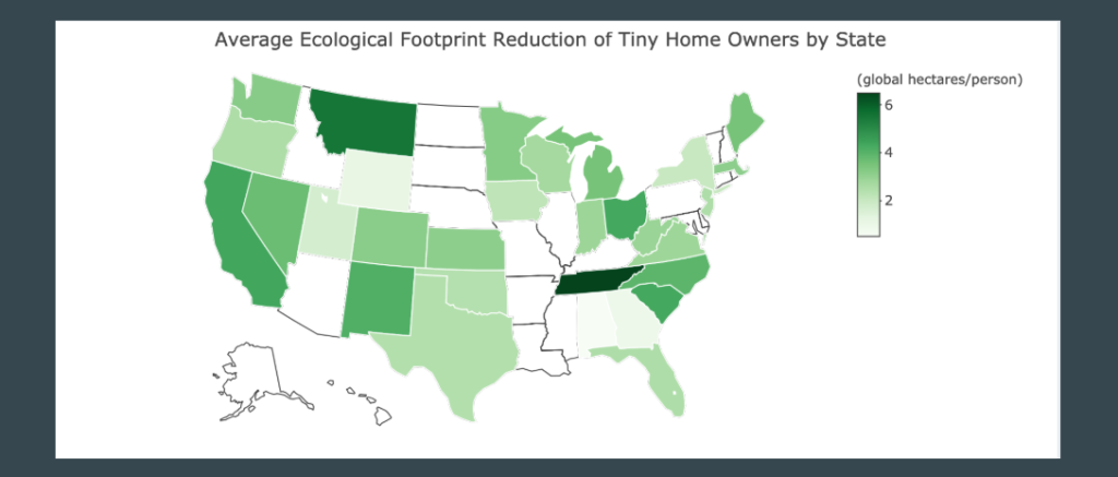
Below the value boxes, I included a choropleth map of the US which is colored by the average change in EF per state. When you hover over each state in the app, you can see the decrease by each subcategory and how many participants were included in that state’s average.

If you scroll down, you see a boxplot of the five subcomponents, showing a major finding of Saxton’s research: Not only did she observe a decrease in EF in the shelter component, participants on average decreased their EF in all five subcategories! I found that the average decrease in each subcategory was statistically significant in a two-sample t-test.

The next tab in the shiny app displays the following lovely infographic, included in Saxton’s dissertation. How could I not? It’s beautiful.

But wait... There’s more!
Under the demographics tab, I provided a collection of visuals to geek out on. First, we have the standard bar chart, which acts like a histogram because the height represents the count, of age, ethnicity, income, and employment status. Also, it can be subcategorized by any of the same factors! From a quick browse, one can see the large majority of participants identify as white and there are a fair number of millennials and baby boomers. You can also view these as percentages, if you were curious about proportions.

Moving on to the “Relocation” tab, I included a Sankey Diagram and a toggle choropleth map, showing migration patterns as participants were going tiny. Most remained in their previous state, but states like California showed a few fleeing to neighboring states.

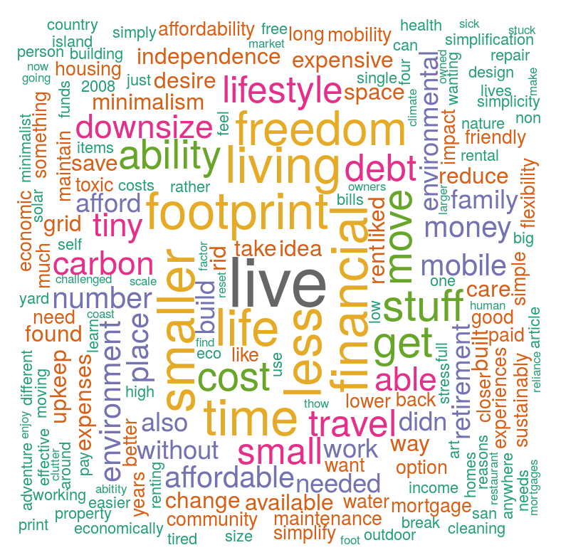
The “Reason” tab is a word map of the written answers to “Why did you decide to move into a tiny home?” I used some Natural Language Processing techniques to clean up the text and remove stop words, including common words like “home,” “house,” and “wanted.”

A few words that stick out to me are freedom, financial, footprint, and time. These themes tend to match well with the popularized reasons of going tiny seen on TV, which include reducing financial burden, going green, and spending more time doing what you love.
Using a similar method, I made two more word clouds for participant’s responses to what their job title and fields were before and after they downsized. I imputed their employment status if there was no response. From the looks of it, perhaps retirement was a call-to-action for downsizing.

Under Construction
I have yet to complete the Lifestyle Changes section, which delves into the habits attributed to a smaller average EF. I imagine this would be a fun practice in making more barplots, boxplots, and barplots for likert-type items!
Go Explore!
If you’re curious about your own Ecological Footprint, you can calculate it here!
Want to see my code? Look at my github repo.

