GreatSchools: How schools fail to serve African American communities
The skills I demoed here can be learned through taking Data Science with Machine Learning bootcamp with NYC Data Science Academy.
What is this all about?
GreatSchools is the most popular school rating site for parents seeking information about public schools in the PK-12 space. Recently, GreatSchools has been criticized by education advocates for, “effectively penaliz[ing] schools that serve largely low-income students and those serving largely black and Hispanic students,” by giving these schools, “significantly lower ratings than schools serving more affluent and more white and Asian students (source).”
While I am unconvinced by this analysis that GreatSchools is responsible for adversely influencing property values, as a former educator that has spent the majority of his career working with low-income schools, I am interested to see what factors are correlated with Great Schools' ratings. The issue of how to assess and communicate school quality is important for public policy. Rating sites like GreatSchools fill a void of information created by poorly understood and communicated school quality assessments provided by departments of education.
Originally, I wanted to compare GreatSchools' ratings with my own analysis of student achievement, as measured by growth on test scores from one year to the next. While matching each school's rating on GreatSchools with data on student growth provided by New York State proved to be too time-consuming of a task for this specific project, my analysis of GreatSchools' ratings, when paired with basic income and demographic data available online, offer some insights relevant to the current debate on the expansion of charter schools.
What data did was used for the analysis?
I scraped GreatSchools to acquire basic information about every public school in New York State. The data I obtained contained each school's name; full address; GreatSchools rating; and additional information about the school's type (district or charter), enrollment numbers, and grades served.
I then combined this data with publicly available data from the IRS that contains tax return information by zip code. I also downloaded demographic data organized by zip code and combined it with the GreatSchools and IRS data.
What insights were gleaned?
I first wanted to see what the distribution of ratings looked like in terms of schools by GreatSchools' rating and total students in schools by GreatSchools' rating. In the graphs below, you'll find a fairly normal distribution of both schools by rating and students in schools by rating. This means that GreatSchools' ratings don't skew one way or another for all New York schools.
I next wanted to examine how economic and demographic variables correlated with GreatSchools' ratings. To do so, I first grouped all schools by their ratings (just like in the graphs above). Then, for each grouping of schools, I plotted the distribution of household incomes for residents that live in these zip codes. I repeated this process to also plot the distribution of African American residents living in each zip code.
The graphs above show that there's a positive relationship between the average household income of a zip code and the ratings of schools within the zip code. There also appears to be a negative relationship between school ratings and zip codes with a higher percentage of African American residents. These relationships are summarized by the table of Pearson coefficients below.
The variable most highly correlated with GreatSchools' ratings was income per household, followed closely by the percent of tax returns for a given zip code that were joint filings, which acts as a proxy for the percent of married households in the zip code. Aside from median age, the top-5 correlation values all had to do with income.
Insights
All of the insights gleaned from the analysis above are not particularly interesting. They reinforce what other analyses have already found: the quality of a child's education is influenced by the level of affluence or deprivation in their local community. However, the data became more interesting once I started to dig into the ratings of district vs charter schools.
The plot above shows the household income distribution for all schools by rating, and it differentiates between income levels for zip codes served by district or charter schools. The plot shows that if you are student who lives in a low-income zip code, the only highly rated schools that you have access to are charter schools. Conversely, if you live in an affluent zip code, your local district school is likely to be higher performing than local charter schools.
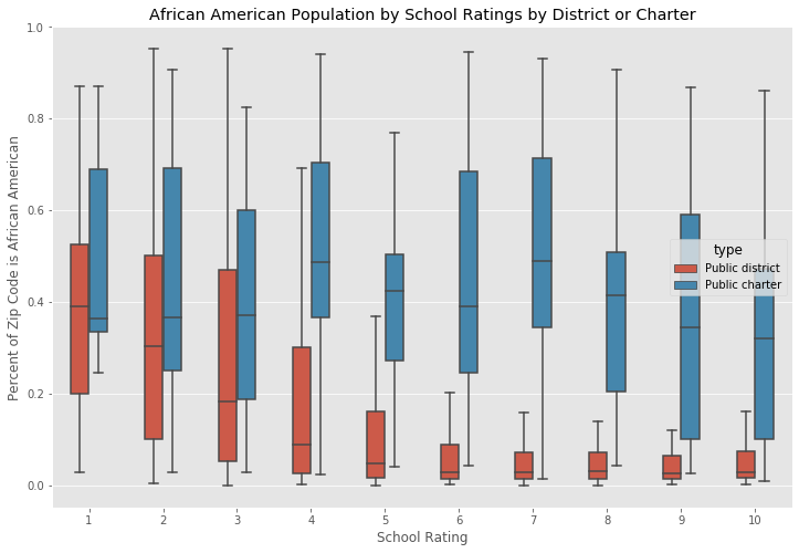
When the same analysis is applied to the distribution of African American residents by zip code, a similar conclusion can be drawn. As the plot above shows, if you are an African American student in New York State that wants to attend a highly rated school, it is more than likely that you will have to attend a charter school because there are few high performing district schools in predominately African American communities.
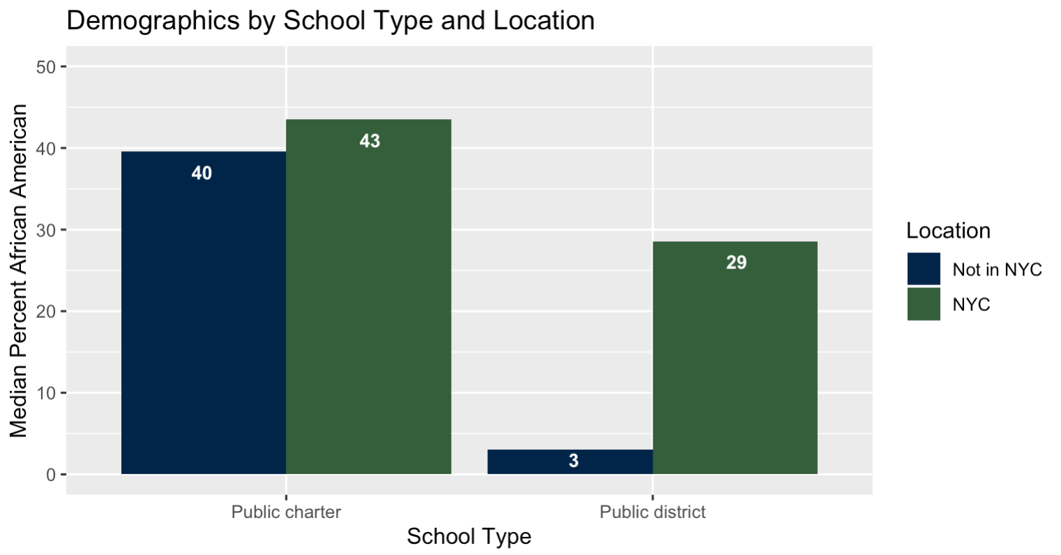
Additional analysis of district and charter schools, when looked at through the lenses of economics, race, and location, reveal other differences. Because the debate around district versus charter schools disproportionately affects NYC students, the series of graphs below also show the differences between NYC schools and non-NYC schools.
On average, the highest school ratings were given to charter schools located in NYC.
District schools, by and large, serve more affluent, more rural students than do public charter schools. Charter schools tend to serve lower income students.
On average, public charter schools serve communities that have higher population densities of African Americans than do public district schools.
What conclusions can be drawn?
There is a moderate positive correlation between income and school ratings. This is not surprising as the achievement gap correlates to levels of wealth. The more affluent a zip code, the more likely that the schools in that zip code are higher performing than schools in a zip code that is less wealthy.
The achievement gap also shows itself in GreatSchools' ratings when you look at the data through the lens of race. The percentage of a zip code's population that identifies as African American is negatively correlated to the quality of schools in that zip code. Conversely, the percent of a zip code's population that identifies as white is positively correlated to the quality of schools in that zip code. These conclusions speak to structural problems within our society and shed no new light on the achievement gap.
The findings that are most interesting to me are the differences in ratings for charter and district schools when viewed through the lenses of income and race. If you are a student in a high performing school in an affluent district, you likely attend a district school. However, if you're a student in a high performing school in a low-income zip code, you're likely to attend a charter school. And, if you live in a zip code with a population that is 20% or higher African American, the only high quality schools are likely to be charter schools.
Political debate
A political debate over which type of school serves students best, district or charter, has been going on for over a decade. Legislation that imposes new caps on the number of charter schools was recently signed by Governor Cuomo. Education advocates on both the right and left argue that charter schools take funding from district schools without producing substantively different student outcomes.
While a much more detailed analysis that looks at more than simple demographic factors and ratings given to schools by a ratings website is needed to understand whether or not charter schools are better or worse than district schools, my analysis suggests that charter schools are serving a vital function in low income and African American communities.
Normal district schools in these zip codes are rated much lower that charter schools in these zip codes, and any legislation that seeks to curb their expansion seems to limit the opportunities for students that need them the most. Furthermore, there is evidence to suggest that the outcomes produced by charter schools are better than the outcomes produced by district schools, especially when these charter schools serve low-income and communities of color in NYC.
Conclusion
Lastly, I want to note that all of the analysis above is built on the assumption that the ratings assigned by GreatSchools are valid and relevant. While the conversation about the validity of GreatSchools' ratings is inherently political, there is a clear verdict about the relevancy of the site.
Because the site gets a significant amount of traffic – reportedly 43 million unique visitors in 2018 (source) – the public has collectively decided that the site's ratings matter. Until education officials can do a more effective job of assessing school quality and communicating this information to the public, GreatSchools ratings will continue to have an influence over where parents send their children to school.
For more info about this project, including source code, check out the GitHub repo.
For more info about the author, go to LinkedIn.


