R Shiny Visualization and Insight of MTA Fare Swipe History
“Welcome to New York. This is a MetroCard City.”. This is what we often hear when boarding a New York City MTA Bus. In fact, MTA (Metropolitan Transportation Authority) is largest public transportation system in North America. 1 Everyday, million of people, both residents and tourists, reach their destinations on the MTA system. The subway alone comprises 24 lines throughout 5 boroughs. There are more than 19 options for fare types to fit the various needs, ranging from of daily commuters to people just visiting for the day. Now, the biggest question is how to deliver a better service to the MTA passengers while maximize the profit for shareholders, as well as the local business as a whole?
First of all, MTA need to collect enough data to understand the problems and then solve them. They already have access to the data from their fare card swipes in each subway station, MTA bus, Air Train, and Tram. Every day, there is large set of fare card swipe records are loaded into the backyard of MTA database. Some of the datasets are available to public, and we can use the data to note trends in subway ridership and discover more business opportunities surrounding subway stations.
Data Sources
There are two sources you can download the Fare Card History data starting from May 2010.
One is the the MTA website:http://web.mta.info/developers/fare.html and the other is NY state open data website:
https://data.ny.gov/Transportation/Fare-Card-History-for-Metropolitan-Transportation-/v7qc-gwpn.
Either way, you can get the latest dataset up to the previous week. For the shiny app, the raw data set were downloaded at July 11th 2017. Since most of the downstream analysis are performed based on annual result, only data from 2011 to 2016 are used for current R shiny development.
Understanding the Data
To understand the dataset, I tried to figure out the dimension, resolution and limitation of the data table. The MTA fare card history file, contains mainly the date of swipe (first week day), fare type, subway station ID, station name and total swipe count aggregated by week. It is intriguing that the fare type in some degree provide demographical information of its user, for example, the Senior/disable fare type apply only to the Senior or Handicapped Rider, while 30 days unlimited type is best for daily commuters. The analysis will focus on weekly activity.
Potential user or Stakeholder
One way to narrow down the questions shiny app can possibly answer is to target the potential user or shark holder. By creating interactive data visualization, I am targeting the user who is interested in swipe count information for any form of decision making. For example, the app can help the manager determine whether to add extra service or/and maintenance to meet actual usage needs in a subway station. Another potential target stark holder would be the local business owner near a station who might benefit from adapting the business to according to the passenger demographical information.

Shiny app and Visualization
Here I designed an R shiny monitoring application to visualize the fare card swipe data in an intuitive way.
Click the links to open shiny:
https://wanggene.shinyapps.io/mta_fare_card_history/,
and source code at my repository: https://github.com/wanggene/MTA.

First, I made an overall manual tab which contains a bar plot of both annual total subway fare card swipes and average monthly swipes from 2010 to 2016. After calculating the total swipe count in each subway station or each fare type, stations or fare types are ranked based on total swipe counts. Consequently, it becomes much easier to find the top station or most common fare type using the ranked bar plots.
There is access to information of each subway station or specific fare type. Click Station ~ Fare Type tub, and use the filter menu to select individual station or fare type. Year based comparison are displayed at each quadrant.
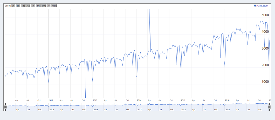
The next menu tab “Timeline” is designed to check a specific time window between 2011 and 2016, and provide a detailed view if needed. The shiny app also made it easy to look at the swipe count changes through the years, both overall and in specific fare types and specific station.

Finally, the raw dataset is provided for further analysis.
Insight and Business Recommendation
This shiny app made it easy to extract MTA fare card swipe count information based on user's criteria. For example, the overall card swipe count showed a slow increase of usage from 2011 to 2016. While there wasa slight drop during 2015, that may have been due to the fare hike in November 2015. However, checking by fare type reveals a clear decrease of Full fare type usage since 2011. There was increased usage of Senior/Disable fare and Mail/Unlimited fare type from 2011 to 2016.
For businesses, since there are more Senior and disabled rider using MTA subway, it is highly recommended to add more elevator service or maintenance and additional seats inside the subway station. For additional revenue, I recommend discount coupons, flyers or other forms of business promotion can be mailed along with fare card to Mail/unlimited card user. Small business owner who mainly rely on the subway commuter should pay attention to population shifts at their neighboring station.
Conclusion
Overall, MTA fare card data provided a straight approach to explore the MTA subway activity. Using the shiny app, it become easier to monitor the passage volume change for a specific card type or in a specific subway station, thus helps the decision making using filtered data and plot for both MTA, passengers and business owner.
Reference
[1] http://web.mta.info/mta/network.htm


