A Look at Grocery Store Tabs
A Look at Customer Grocery Tabs
Open Produce is small grocery store on the south side of Chicago. The owners wrote their own Point-of-Sale (POS) system to collect data relating to deveries, inventory, sales, and other aspects of the business. Shortly after opening in 2008, Open Produce began to offer interest-free credit lines (aka “tabs”) to regular customers. Open Produce tracked these customer tabs over time using their in-house POS system. Steven Lucy, Open Produce’s owner, shared the tab data with me for the period November 2009 to September 2012 for use in my first NYC Data Science Academy project.
I received the data as a .tst file, which I read into R as a data frame. After installing the R packages dplyr and ggplot2, I commenced data formatting. I removed one column that was an SQL artifact; I removed data that Mr. Lucy said said were used only for in-house operational heuristics, and did not represent customers with tabs; and I reformatted the date/time information so that it would be intelligible to R:
library(dplyr)
library(ggplot2)

tab_log = read.csv("/Users/adamcone/Desktop/Project1Visualization/tables/tab_log.tst",
                   header = FALSE,
                   sep = "\t")

names(tab_log) = c("ID",
                   "CustomerID",
                   "OldBalance",
                   "NewBalance",
                   "WhenLogged"
                   )

spec_cust = unique(tab_log %>%
                     filter(., NewBalance > 500) %>%
                     select(., CustomerID)
                   )

tab_reg = tab_log %>%
          filter(., !(CustomerID %in% spec_cust$CustomerID)
                 )

DateTime = strptime(tab_reg$WhenLogged,
                    format = "%Y-%m-%d %H:%M:%S",
                    tz = "CST6CDT"
                    )

tab_df = data.frame(DateTime = DateTime,
                    CustomerID = tab_reg$CustomerID,
                    OldBalance = tab_reg$OldBalance,
                    NewBalance = tab_reg$NewBalance
                    )

tab_df[50:54,]
## DateTime CustomerID OldBalance NewBalance
## 50 2009-11-24 12:38:37 4 157.22 162.97
## 51 2009-11-24 18:20:52 88 248.24 148.24
## 52 2009-11-24 18:33:04 4 162.97 164.97
## 53 2009-11-24 20:01:55 75 17.00 28.25
## 54 2009-11-24 21:21:38 88 148.24 155.99This formatted data frame was then ready for analysis. Each data frame row represents a single tab transaction, with a customer either increasing a tab (purchasing products on credit) or decreasing a tab (giving money to Open Produce to decrease an existing tab or to build credit). The data span from November 2009 to September 2012, and include 21,767 tab transactions (rows) from 475 different customers. The tabs vary from -$344.31 (credit from Open Produce) to $498.50 (debt to Open Produce).
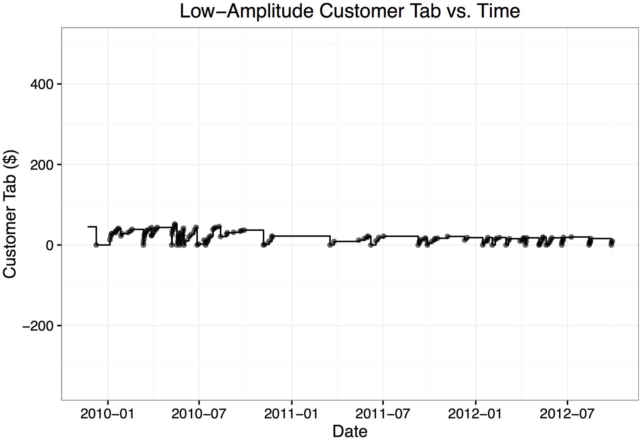
The tabs of different customers varied significantly. For example, here is the tab of a customer who’s tab never exceeded $53:
cust = 5
x_data_point = tab_df$DateTime[tab_df$CustomerID == cust]
y_data_point = tab_df$NewBalance[tab_df$CustomerID == cust]
x_data_step = c(min(tab_df$DateTime),
           tab_df$DateTime[tab_df$CustomerID == cust],
           max(tab_df$DateTime)
           )
y_data_step = c(tab_df$OldBalance[arrange(tab_df, DateTime)$CustomerID == cust][1],
           tab_df$NewBalance[tab_df$CustomerID == cust],
           tab_df$NewBalance[arrange(tab_df, DateTime)$CustomerID == cust]
           [length(tab_df$NewBalance[arrange(tab_df, DateTime)$CustomerID == cust])])
ggplot() +
geom_point(mapping = aes(x = x_data_point,
                         y = y_data_point
                         ),
           size = 1.25,
           alpha = 0.5) +
geom_step(mapping = aes(x = x_data_step, y = y_data_step)) +
theme_bw() +
labs(x = "Date", y = "Customer Tab ($)") +
ggtitle("Low-Amplitude Customer Tab vs. Time") +
coord_cartesian(xlim = c(min(tab_df$DateTime), max(tab_df$DateTime)),
                ylim = c(min(tab_df$NewBalance), max(tab_df$NewBalance))
)
Here is the plot of a tab that decreased below $0, indicating that the customer had credit with Open Produce:
cust = 27
x_data_point = tab_df$DateTime[tab_df$CustomerID == cust]
y_data_point = tab_df$NewBalance[tab_df$CustomerID == cust]
x_data_step = c(min(tab_df$DateTime),
                tab_df$DateTime[tab_df$CustomerID == cust],
                max(tab_df$DateTime)
)
y_data_step = c(tab_df$OldBalance[arrange(tab_df, DateTime)$CustomerID == cust][1],
                tab_df$NewBalance[tab_df$CustomerID == cust],
                tab_df$NewBalance[arrange(tab_df, DateTime)$CustomerID == cust]
                [length(tab_df$NewBalance[arrange(tab_df, DateTime)$CustomerID == cust])])
ggplot() +
  geom_point(mapping = aes(x = x_data_point,
                           y = y_data_point
  ),
  size = 1.25,
  alpha = 0.5) +
  geom_step(mapping = aes(x = x_data_step, y = y_data_step)) +
  theme_bw() +
  labs(x = "Date", y = "Customer Tab ($)") +
  ggtitle("Customer Tab with Credit vs. Time") +
  coord_cartesian(xlim = c(min(tab_df$DateTime), max(tab_df$DateTime)),
                  ylim = c(min(tab_df$NewBalance), max(tab_df$NewBalance))
  )

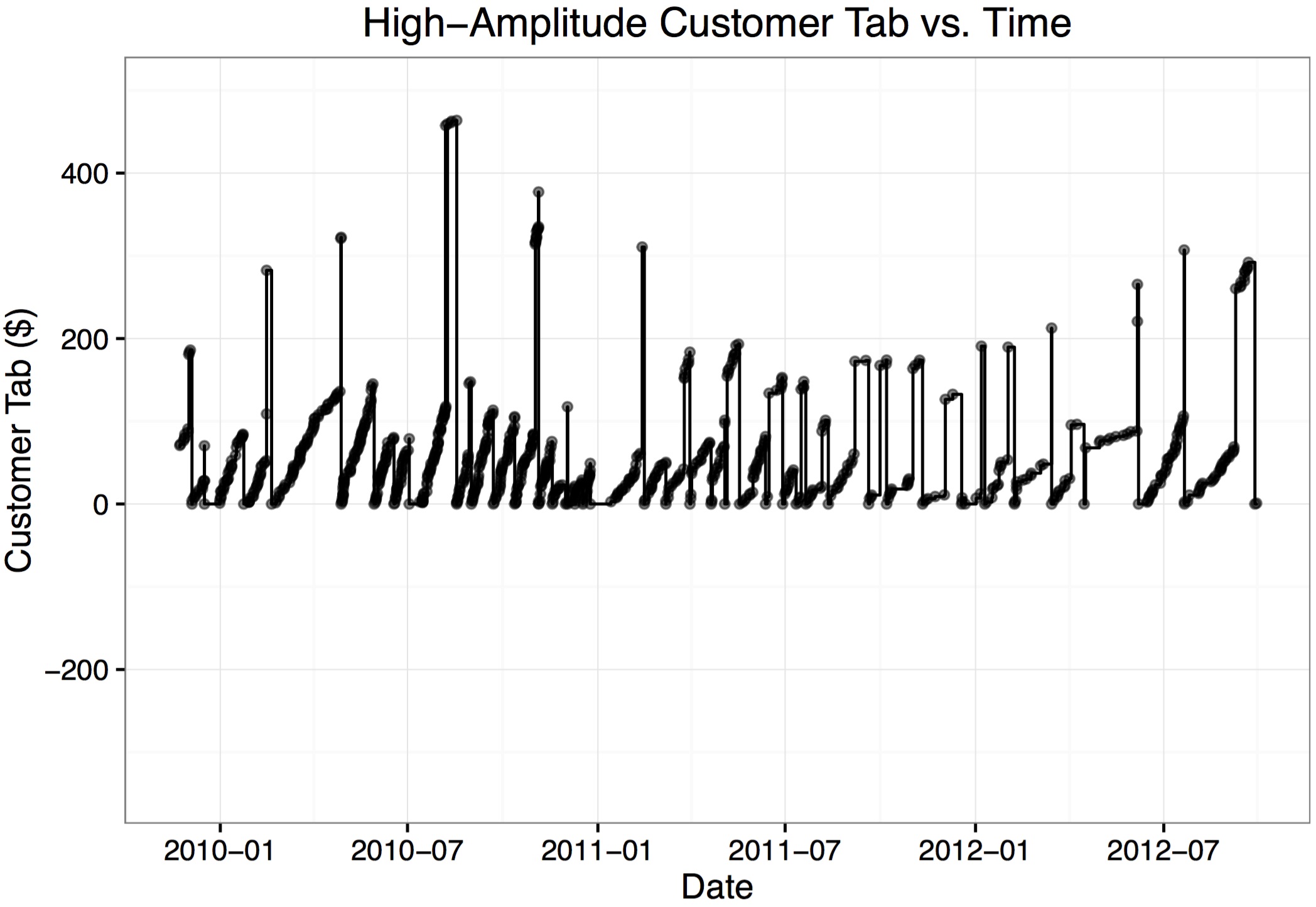
Here’s an example of a high-frequency, high-value customer tab:
cust = 51
x_data_point = tab_df$DateTime[tab_df$CustomerID == cust]
y_data_point = tab_df$NewBalance[tab_df$CustomerID == cust]
x_data_step = c(min(tab_df$DateTime),
                tab_df$DateTime[tab_df$CustomerID == cust],
                max(tab_df$DateTime)
)
y_data_step = c(tab_df$OldBalance[arrange(tab_df, DateTime)$CustomerID == cust][1],
                tab_df$NewBalance[tab_df$CustomerID == cust],
                tab_df$NewBalance[arrange(tab_df, DateTime)$CustomerID == cust]
                [length(tab_df$NewBalance[arrange(tab_df, DateTime)$CustomerID == cust])])
ggplot() +
  geom_point(mapping = aes(x = x_data_point,
                           y = y_data_point
  ),
  size = 1.25,
  alpha = 0.5) +
  geom_step(mapping = aes(x = x_data_step, y = y_data_step)) +
  theme_bw() +
  labs(x = "Date", y = "Customer Tab ($)") +
  ggtitle("High-Amplitude Customer Tab vs. Time") +
  coord_cartesian(xlim = c(min(tab_df$DateTime), max(tab_df$DateTime)),
                  ylim = c(min(tab_df$NewBalance), max(tab_df$NewBalance))
  )

When I spoke with Mr. Lucy about Open Produce’s tabs, he said that some customers didn’t pay their tabs and the store simply lost that money. I found evidence to support the existence of such customers:
cust = 89
x_data_point = tab_df$DateTime[tab_df$CustomerID == cust]
y_data_point = tab_df$NewBalance[tab_df$CustomerID == cust]
x_data_step = c(min(tab_df$DateTime),
                tab_df$DateTime[tab_df$CustomerID == cust],
                max(tab_df$DateTime)
)
y_data_step = c(tab_df$OldBalance[arrange(tab_df, DateTime)$CustomerID == cust][1],
                tab_df$NewBalance[tab_df$CustomerID == cust],
                tab_df$NewBalance[arrange(tab_df, DateTime)$CustomerID == cust]
                [length(tab_df$NewBalance[arrange(tab_df, DateTime)$CustomerID == cust])])
ggplot() +
  geom_point(mapping = aes(x = x_data_point,
                           y = y_data_point
  ),
  size = 1.25,
  alpha = 0.5) +
  geom_step(mapping = aes(x = x_data_step, y = y_data_step)) +
  theme_bw() +
  labs(x = "Date", y = "Customer Tab ($)") +
  ggtitle("Outstanding Debt Customer Tab vs. Time") +
  coord_cartesian(xlim = c(min(tab_df$DateTime), max(tab_df$DateTime)),
                  ylim = c(min(tab_df$NewBalance), max(tab_df$NewBalance))
  )
As I looked at the tab data, I became curious about whether having the tab option for regular customers was profitable, since the store is extending multiple, flexible, interest-free loans. Since only customers with tabs are tracked by Open Produce’s POS system, I had no control group to determine whether customers without tabs spent more or less money. Furthermore, since a customer is only tracked when the customer starts a tab, I had no control for determining whether giving a customer a tab changed a customer’s spending behavior.
I tried, instead, to benchmark how much additional profit the tab customers would have to generate to justify the tab system. While there’s no way to know if the customers do in fact generate this income, I figured it might be interesting and perhaps make a soft management decision a little firmer.
To do this, I tracked the total of all customer tabs over time. I calculated the initial tab total, created a new data frame with dplyr arrangement by DateTime, calculated the money exhanged in each transaction, then used a for-loop to generate a new column TotalTab:
previous_tabs = tab_df %>%
                group_by(., CustomerID) %>%
                filter(., DateTime == min(DateTime)) %>%
                filter(., OldBalance != 0)

orig_tab = sum(previous_tabs$OldBalance)
run_tab = rep(NA, nrow(tab_df))

tab_chrono = tab_df %>% arrange(., DateTime)
tab_chrono = tab_chrono %>%
             mutate(., TabChange = NewBalance - OldBalance)

run_tab[1] = orig_tab + tab_chrono[1, "TabChange"]
for (i in 2:length(run_tab)) {
  run_tab[i] = run_tab[i - 1] + tab_chrono[i, "TabChange"]
}

tab_chrono = tab_chrono %>% mutate(., TotalTab = run_tab)

tab_chrono[50:54,]
## DateTime CustomerID OldBalance NewBalance TabChange TotalTab
## 50 2009-11-24 12:38:37 4 157.22 162.97 5.75 1548.65
## 51 2009-11-24 18:20:52 88 248.24 148.24 -100.00 1448.65
## 52 2009-11-24 18:33:04 4 162.97 164.97 2.00 1450.65
## 53 2009-11-24 20:01:55 75 17.00 28.25 11.25 1461.90
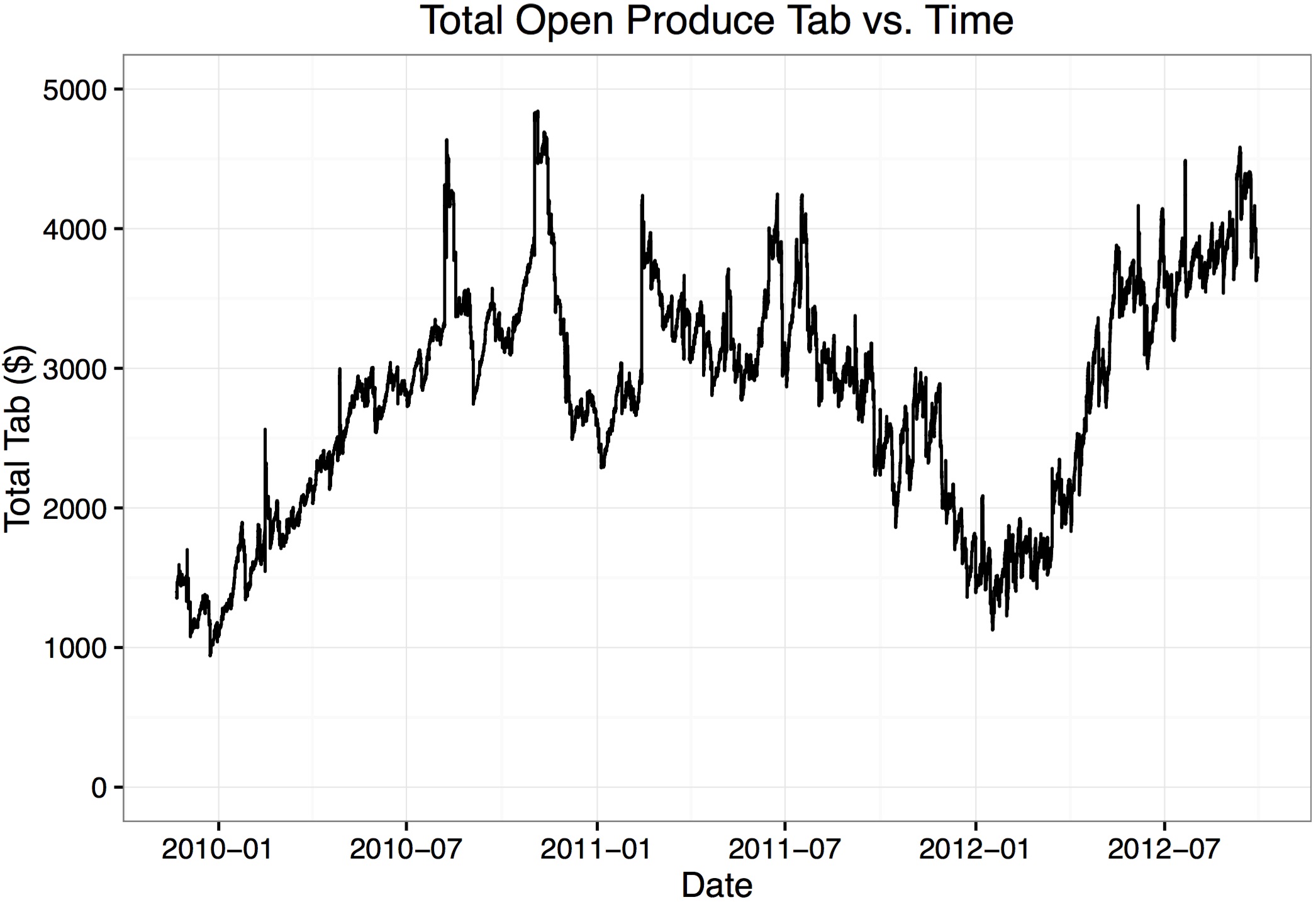
## 54 2009-11-24 21:21:38 88 148.24 155.99 7.75 1469.65With this analysis complete, plotted Open Produce’s total tab over time:
ggplot() +
  geom_step(data = tab_chrono,
            mapping = aes(x = DateTime,
                          y = TotalTab)
            ) +
  theme_bw() +
  labs(x = "Date", y = "Total Tab ($)") +
  ggtitle("Total Open Produce Tab vs. Time") +
  coord_cartesian(ylim = c(0,5000))

I had the sense that it cost Open Produce some few thousand dollars to keep this tab open for the customers since, at any given time, Open Produce didn’t have the money that the tab customers had borrowed. I wanted a single, representative value for the amount of money Open Produce typically had unavailable to tabs. To this end, I wrote an error minimization scheme that factored in both what the total tab was at a given time, and how long that balance was active. For example, a $1,000 balance active for two days would factor in twice as much a $1,000 balance that was active for one day.
TabTime = NULL

for (i in 1:(nrow(tab_chrono) - 1)) {
  TabTime[i] = difftime(tab_chrono$DateTime[i + 1],
                        tab_chrono$DateTime[i],
                        tz = "CST6CDT",
                        units = "secs"
                        )
}

TabTime[nrow(tab_chrono)] = 0
tab_chrono = tab_chrono %>% mutate(., TabTime_s = TabTime)

tab_error = function(tab_est) {
  stopifnot(class(tab_est) == "numeric")
  total_error = sum(abs(tab_est - tab_chrono$TotalTab) * tab_chrono$TabTime)
  return(total_error)
}

guess = c(0, 5000, 2500)

while (abs(guess[3] - guess[2]) > 0.1) {
  guess_error = sapply(guess, tab_error)
  errors = sapply(guess, tab_error)
  if (abs(errors[3] - errors[2]) < abs(errors[3] - errors[1])) {
    new_guess = median(guess[2:3])
  } else if (abs(errors[3] - errors[2]) > abs(errors[3] - errors[1])) {
    new_guess = median(c(guess[1], guess[3]))
  } else if (abs(errors[3] - errors[2]) == abs(errors[3] - errors[1])) {
    new_guess = guess[3]
  }
  guess[1] = guess[2]
  guess[2] = guess[3]
  guess[3] = new_guess
}

new_guess
## [1] 2901.84So, a representative total tab for Open Produce was $2,901.84. Adding this representative value line to the total tab plot:
ggplot() +
  geom_step(data = tab_chrono,
            mapping = aes(x = DateTime,
                          y = TotalTab)
  ) +
  geom_hline(yintercept = new_guess, color = "red") +
  theme_bw() +
  labs(x = "Date", y = "Total Tab ($)") +
  ggtitle("Total Open Produce Tab vs. Time") +
  coord_cartesian(ylim = c(0,5000))

To roughly benchmark the additional value these tabs would have to generate to be worth an ongoing investment of about $2,901.84, I asked Mr. Lucy what his largest outstanding loan interest rate was. He replied “8%”, which I assumed was an annual interest rate, compounded monthly. In that case, instead of keeping a tab open for customers, Open Produce could have spend $2,901.84 paying off the 8% loan. The payoff in reduced interest on that investment over the time covered by the data (about 34 months) would then have been roughly
2901.84 * ((1 + 0.08/12)^34 - 1)## [1] 735.5248So, one way of gauging whether the tab policy at Open Produce is worth the money tied up in tabs is to compare any anticipated gains in profit over the analyzed 34 months with the $735.52 in saved interest over that period. In other words, does this policy bring Open Produce at least $21.63 per month more than it would make without the policy?
One thing I grew to appreciate during this analysis is the importance of identifying customers. The lack of data for customers without tabs (both tab customers before their tabs opened and customers who never had tabs) made determining the effectiveness of this policy so speculative. Customer identification for every sale would be first on my wish list. Also, I am curious to know how much employee time is spent organizing tabs and following-up with customers’ outstanding tabs. This could also be included in the cost of the tab policy.


