Bachelor's Degrees and Earnings
Contributed by Ismael Jamie Cruz. He is currently in the NYC Data Science Academy 12 week full time Data Science Bootcamp program taking place between April 11th to July 1st, 2016. This post is based on his second class project - Shiny (due on the 4th week of the program)
Joining the bootcamp allowed me to meet people from a wide variety of backgrounds including graduates from physics, computer science, finance, and architecture. In addition, there was diversity in origin with some classmates not only from New York but from the West Coast and other countries. With such a mix of people in one classroom, I became interested in how this looked like throughout the U.S.
I set out to explore datasets on bachelor's degrees (BD) with the curiosity of seeing educational attainment per state. My initial questions included what state had the most bachelor's degrees and how this looked depending on the field of bachelor's degrees. Like most data endeavours, these questions led to more questions, particularly with salaries of occupations that were degree-related. I wanted to see whether there was anything interesting relating bachelor's degrees and salaries in a particular state. I did this exploration through R and the Shiny package in order to develop an interactive web application.
Datasets
All datasets are from the U.S. Census Bureau, 2014 American Community Survey 1-Year Estimates, obtained through the American Fact Finder.
- Field of Bachelor's Degrees for First Major for the Population 25 Years and Over (2014)
- Educational Attainment (2014)
- Occupation by Median Earnings in the Past 12 Months (2014)
The App
The Shiny web application or web app I designed shows three visualisations: bachelor's degrees as a choropleth, breakdown of bachelor's degrees, and earnings by occupation, both as bar charts. Bachelor's degrees per state are measured as a percent of the population. Breakdown of bachelor's degrees are also represented as a percent while earnings by occupation are median figures. The app also has three features by which to manipulate the graphs. The user can choose the field of bachelor's degrees, the U.S. state, and the particular occupation.
The app can be accessed here.
All Fields
Starting with all fields of bachelor's degrees (BD):
- Colorado (CO) has the highest percentage of state population with BD at 24.1% in 2014
- Next two top states are Massachusetts (MA) and New Jersey (NJ) at 23.2% and 23.1%, respectively
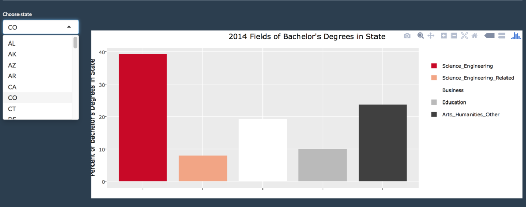
Choosing state as CO:
- The breakdown of 2014 BD in the CO state in the snapshot above shows that Science and Engineering (SE) fields take majority at 39.2% followed by Arts and Humanities (AH) at 23.7% and Business (BU) at 19.2%
- Similarly choosing MA, the breakdown of BD is as follows: SE at 39.1%, AH at 25%, and BU at 18.2%
- Surprisingly, choosing NJ shows SE at 36.6% while AH and BU have a smaller spread at 21.2% and 22%, respectively
Moving on to occupations in CO:
- The snapshot above shows that top median earnings in CO in 2014 are from occupations classified as legal (LE), computer and mathematical (CM), and architecture and engineering (AE) with all slightly above $80,000
- In the MA state, the top earnings by occupation turn out to be different and more spread out: LE at more than $100,000, followed by CM at $91,000 and health diagnosing and treating (HDT) at around $85,000
- In the NJ state, the top is still LE at $97,000, followed by management (MGT) at $92,000 and CM at $91,000
The difference in earnings for similar occupations, such as LE, across states led me to wonder whether the amount of degrees in that state had a relationship with the earnings in a degree-related occupation. My hypothesis was that states that had a low amount of degrees in a particular field might have higher earnings in a degree-related occupation. The logic I thought was that a low supply of talent might see increased demand in the form of higher earnings. I was particularly curious to see this in the BU field.
Business Field
Choosing the business field of bachelor's degrees:
- States with the most BD in the field of BU seem to be in the east coast as seen by the predominant green color
- The top states with the most BD in the field of BU as a percent of population include Florida (FL) and Georgia (GA)
- The bottom states include Oregon (OR) and Wyoming (WY)
Earnings by occupation in GA:
- Looking into BU degree-related occupations such as management and financial, median earnings in 2014 were about $67,000 and $57,000, respectively
Earnings by occupation in OR:
- The earnings in the same occupations in OR show about the same figures at $66,000 and $55,000, respectively
Conclusion
Although it was interesting to see the breakdown of earnings by occupation for certain U.S. states, the graphs alone were not sufficient to answer my last question of whether there was a relationship between amount of bachelor's degrees as measured by percent of population and earnings in a degree-related occupation. For example, the comparison of business occupation earnings between Georgia and Oregon show similar figures despite having a big difference in business bachelor's degrees. Hence in order to dig deeper into my question I may have to proceed with some statistical analysis. In light of this, while the graphs are able to give a general idea about the distribution of bachelor's degrees in the U.S., further analysis is required in order to pursue deeper questions.
Questions for Future Analysis
Some questions I would like to explore for future analysis:
- Is there a relationship between amount of bachelor's degrees and earnings by degree-related occupation?
- How was the growth of educational attainment over time?
- How was the growth of earnings by occupation over time?


