Identifying Provider Fraud For Healthcare Insurers
Photo by Bermix Studio on Unsplash
GitHub Repository | LinkedIn: Lucas Kim, Ryan Park, Sita Thomas
Background
This project examines healthcare fraud from hospital or clinic data, which is where a medical service claim is either completely fake, or a real claim is altered to reap greater payment from a medical insurance company to a provider. Healthcare fraud can involve providers, doctors, patients, and even people within the insurance company itself. It can be the actions of an individual or the actions of a network. Also, healthcare fraud is difficult to identify, and medical insurers pay for fraud if it goes undiscovered. By exploring patterns in medical claims, fraud can be identified and addressed.
For this project, we imagined that we work for a healthcare insurance company who wants us to identify and flag potentially fraudulent providers, so that claims from those providers can undergo a review process. In order to do this, we needed to build a predictive machine learning algorithm to detect as much potential fraud as possible. As a secondary goal, we wanted to understand the factors that go into flagging a potentially fraudulent provider and generate insights into how those variables could be used in order to reduce costs for the company. The following figure introduces the workflow of this project.

Pre-Processing: Claims Dataframe
Our data came in four CSV files containing patient and insurance claim information from mostly the year 2009, as well as a yes or no Potential Fraud flag. The combined dataframe has 56 features and over five hundred fifty thousand claims. Given the nature of the dataset, we needed to build a new dataframe with rows by provider rather than by rows by claim, because Potential Fraud was flagged by provider, not by claim. As a result, our features would also have to change orientation. To choose the best features for the Providers dataframe, we needed to do Exploratory Data Analysis (EDA) on the Claims dataframe.
Some of the features in the Claims dataframe include claim dates and codes, doctors, insurance payment amounts, and patient indicators for chronic diseases like Alzheimer’s or osteoporosis. As for EDA, we focused on exploring the relationships between explanatory variables and Potential Fraud. For example, the plot below shows the number of unique US states in which claims were filed for providers by potential fraud flag.
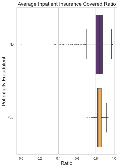
Most of our EDA showed a pattern among inpatient claims, which is discussed later in this article. Along with EDA on the original predictors, we engineered 15 new features for the Claims dataframe, such as each patient’s number of chronic conditions and each claim’s duration.

Assumptions
It should be noted that we made three assumptions about the Claims Dataframe:
- First, chronic conditions came encoded with a 1 or 2. We studied the proportions of each per condition to determine if it was possible to confidently interpret the encoding. For example, cancer and stroke are relatively rare in the general American population while diabetes and ischemic heart disease are common. The encoding appear to reflect these population trends, therefore we assume an encoding of 1 means that the patient has the condition.
- Second, if a claim shares the same set of codes with another claim, we assume it is a duplicated claim rather than a legitimate claim that coincidentally happens to share the same set of codes.
- Lastly, we assume missing values are Missing Not at Random due to simply not being applicable for that claim, such as a 9th Diagnosis Code or, because the claim was for an outpatient visit, a missing admission date.
Converting the Claims dataframe into the Providers dataframe required creating all new predictors containing mostly summary statistics. The first iteration of the Providers dataframe has 87 features and five thousand four hundred ten Providers.
Model Scoring Metrics

Before modeling, we chose two scoring measures by which we would evaluate performance.
We needed to detect as much potential fraud as possible, so we chose model recall score as our first metric, but we also needed to balance that metric's sensitivity against the cost of doing extra reviews.
Then, we calculated the cost of doing a single extra review based on three things: this dataset’s average reimbursement per claim of roughly $1,000, the average Claims Adjuster salary of $28 per hour according to indeed.com, and an arbitrary assumption that it takes 3 hours to review a claim.
Using these numbers and confusion matrices for each model, we calculated our second scoring measure, which is how much money a model can save the insurer despite the cost of checking claims that were flagged as potential fraud but turn out to be legitimate and therefore do not recoup any money.
Classification Models

The first model we tried was Logistic Regression, because we wanted to use the L1-norm penalty for two reasons: to explore the impact of each of the features we created and to gain insights into what features most strongly affect the classification. Lasso Logistic Regression reduced the coefficients from 87 down to 13. Then, Ridge Classifier was used to explore the reduced features; it better classified positive features, resulting in fewer false alarms.
Next, we wanted to explore a highly interpretable model, so we followed up with K-nearest Neighbors (KNN). This model scored the highest because it generated the fewest false negatives, however had about twice as many false positives as the other models.
For the same reasons we tried KNN, we attempted Gaussian Naive Bayes, or GNB. Gaussian Naive Bayes makes the assumption that all features are independent of each other, so we hoped it would highlight features considered less important to other models. However, GNB was our worst-performing model by a large margin.
We then explored Random Forest, because it is a more complex model than the previous three, captures non-linear relationships, and can be used for feature selection as well as gaining insights into which variables explain a flagged provider. Following Random Forest, we attempted Gradient Boosting, more difficult to tune and computationally more expensive. However, Gradient Boosting scored better than Random Forest and classified more accurately, especially false positives.
The last classifier we tried was Support Vector Machine (SVM) because it is not limited by the feature space of linear models and avoids the bias/variance tradeoff of non-linear models. SVM scored the same as Gradient Boosting, but had worse classification results.
In the end, most of our models fit well after parameter tuning and most of them had overall scores within hundreds of each other, indicating that the limitation in recall score was due to feature engineering, not the model choice or model tuning.
Modeling Iterations 2 and 3


As shown above, there were many overlapping highly ranked features from Logistic Regression and Gradient Boosting. We used these features to build new non-linear predictors, hoping recall score and classification would improve.
31 predictors were added in our 2nd iteration of feature engineering, and the scores dropped by 2% across all models, demonstrating the multicollinearity caused by the new variables. But, some of the new variables were highly ranked in feature importance. Therefore, for the third iteration of feature engineering, some of the new features were added to the original 87 features. Scores on the third iteration were 1% better than the second iteration but still 1% worse than the first iteration.
Modeling Results

The bar chart above (please note that the scale starts at 60%) summarizes the training and test recall scores for all models from the first iteration of feature engineering. As you can see, the training and test scores for each model all fit within three percentage points at most, and all models score within 10 percentage points of each other. Ultimately, we chose two models from Iteration 1 to present as candidates for production: K-nearest Neighbors and Gradient Boosting. We chose two models because they each satisfy our scoring goals in two different ways, and therefore each serve the company in different ways.
Confusion Matrices and Revenue Loss
As mentioned previously, KNN had the highest recall score by generating the fewest false negatives, shown below in the bottom right of each matrix as a percentage share of classifications. Although, KNN had over twice the share of false positives as Gradient Boosting, shown in the top right of each matrix. This is where our second scoring measure came in, calculating that KNN would save about eighty six thousand dollars for the test set claims, by preventing money being paid out on fraudulent claims.

(TP) x ($1,000 Average Claim Cost) - (FP + TP) x ($28 Hourly Wage) x (3 Hours) -
(FN) x ($1000 Average Claim Cost)
In contrast, Gradient Boosting had a lower recall score, but its confusion matrix showed that it would save about one hundred thousand dollars for the test set claims. Gradient Boosting saves more money than KNN because there is a cost to review every single flagged claim, while money is only recouped on the flagged claims that actually turn out to be fraudulent. Because KNN flags more false alarms, the cost of reviewing those false alarms offsets the money recouped from identifying actual fraud.
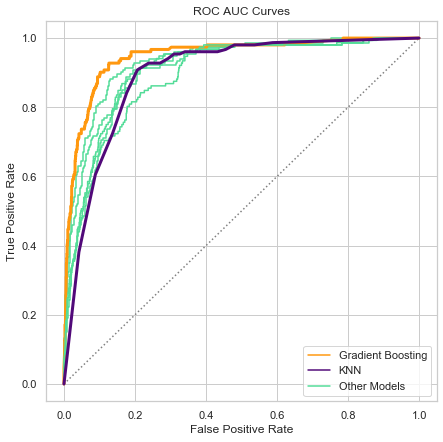
Further, the difference between Gradient Boosting and KNN scores can be visually captured through an ROC/AUC curve plot. As shown below, Gradient Boosting has the highest score because it best identifies which providers should or should not be flagged as potentially fraudulent. KNN scores significantly lower because while it is excellent at stopping potential fraud from being missed, it frequently raises false alarms.
Considering our scoring goals, KNN is the most effective model for capturing as much potential fraud as possible, while Gradient Boosting nets the most money saved. Therefore, both of these models are useful in production, but for different purposes.
Insights: Patients
To better understand the behavior of potentially fraudulent providers based on the 10 features shown previously, we returned to our original EDA to explain the direction of impact, because unfortunately the feature importances only explain that there is an impact, but not what that impact means.

The box plots above suggest that potentially fraudulent providers have both more unique inpatients and outpatients. Patient counts are the first and third most important features in our Gradient Boosting model, confirming the pattern that we saw in these box plots during EDA.
In the above plot, we see that flagged providers tend to have a higher number of claims per patient, but a more narrow range for the number of claims, suggesting potentially fraudulent providers either deliberately try to make their claims look as average as possible, or are simply uncreative.
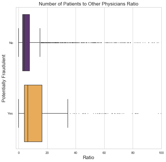
There is a similar behavior pattern, shown below, for the number of patients to Other Physicians, who are physicians that are not the Attending nor Operating Physician on a claim, but an additional doctor. Other Physicians who work for potentially fraudulent providers tend to have more patients, possibly in connection with the pattern showing that flagged providers have more unique patients in general. Perhaps these extra unique patients do not exist and are seeing doctors who also do not exist.
Insights: Duration
When it comes to duration-related features, patients of potentially fraudulent providers have claims that stay open slightly longer on average, as shown on the chart above in the left-hand side. Similarly on the chart in the right-hand side, the same pattern can be seen among inpatients of flagged providers - they have slightly longer admission durations on average. On both the plots here, we see the hiding or lack-of-creativity behavior again. Flagged providers typically submit claims that have a narrower range of durations, while providers likely to be legitimate have a steady stream of outliers, which more likely reflects reality.
Insights: Cost
If the general patterns of the plots above look familiar, it is because potentially fraudulent providers have shown themselves to be fairly predictable. Again, repeating the pattern of hiding or being uncreative, the plots above show more narrow ranges and fewer outliers among potentially fraudulent providers. Claims from flagged providers tend to cost more overall, likely because flagged providers receive slightly more in reimbursements than unflagged providers.
Further Insights
After examining the strongest predictors of potential fraud, we know the most important behaviors that potentially fraudulent providers engage in. Given this, when reviewing claims, the claims adjusters can focus on those 10 areas to make the process more efficient.
We also have several data-driven suggestions on how to address fraud beyond claims reviews. In order to minimize losses, the insurance company can take the following steps:
- Limit the number of contracts with providers that offer inpatient services.
- Evaluate all existing providers and cancel contracts with those that reveal a history of fraudulent behavior.
- Regularly audit all providers for those ten signs of potential fraud mentioned before.
- Recruit the doctors who work for providers to review claims they appear on, in order to catch fraud before it even arrives to the company.
- Recruit patients to review their own claims, perhaps by offering an incentive such as a discount on their premium.
Future Work
While this dataset has a rich array of insights, it has limitations and opportunities for improvement. This dataset is over 10 years old. Some fraudulent providers likely still engage in the patterns we have seen here, but fresh data would confirm or update what we know. Data from a greater number of providers and more features would likely improve both the recall scores of Gradient Boosting and the classification accuracy of KNN.
More information about the size and nature of providers could be informative as well, such as:
- The number of doctors registered with the provider
- Specific types of services offered (such as cancer care or dermatology)
- The number of beds and pieces of specialty equipment (like MRI machines)
- The length of time the provider has been in operation
We also suggest more data on duplicates, like a potential fraud flag on individual claims where diagnosis and procedure code combinations are suspicious, like when a procedure occurs but the diagnosis is unrelated. This requires a level of domain knowledge we do not have, so we did not explore code relationships in depth for this project.
Summary
In this article we have described what healthcare fraud is and what this project planned to achieve. We introduced the two dataframes that served as the baseline for predicting whether a provider receives a Potential Fraud flag. Also, we explored seven different predictive models, and selected two that each serve different purposes to the company. And we shared our insights into how to spot and prevent potential fraud and minimize financial losses as a result, and lastly, we described the next steps that can be taken to address fraud even more effectively.
The skills I demoed here can be learned through taking Data Science with Machine Learning bootcamp with NYC Data Science Academy.


