Data Analysis on 2015 Health Insurance Marketplace
The skills the author demoed here can be learned through taking Data Science with Machine Learning bootcamp with NYC Data Science Academy.
Contributed by Ruonan Ding. She is currently in the NYC Data Science Academy 12 week full time Data Science Bootcamp program taking place between April 11th to July 1st, 2016. This post is based on her first class project - R visualization (due on the 2nd week of the program).
Introduction
The Affordable Care Act, aka ObamaCare, is a federal statue that was signed by President Obama on 3/23/2010. Data shows the healthcare industry has gone through various changes ever since. The health insurance marketplace is a virtual marketplace that is provided by private insurance carriers. If someone is not eligible for the government health program (Medicare and Medicaid) or not covered by the employer's plan, health insurance marketplace
 is the all-in-one marketplace to shop.
The dataset is hosted by The Centers for Medicare & Medicaid Services (CMS). The Consumer Information and Insurance Oversight (CCIIO) within CMS is committed to increasing transparency in the Health Insurance Marketplace. The Health Insurance Marketplace Public Use Files (Marketplace PUF) are available for plan years 2014 and 2015 to support timely benefit and rate analysis.
The Marketplace PUF includes data from states participating in the Federally Facilitated Marketplaces (FFM). The Marketplace PUF does not contain any data on plans offered in states that established and operate their own Marketplace (State-based Marketplace). For this purpose of this analysis, we used filed Rate and BenefitsAttributes files and focused on the plan year of 2015 Individual plans only.
Data
The median monthly premium distribution gives a brief overview of the monthly premium being offered by state. It shows a quite wide range of the median premium range. That inspires a series of research questions.
I. Plan Coverage Type
Plans in the Health Insurance Marketplace are presented in 4 "metal” categories: Bronze, Silver, Gold, and Platinum. Catastrophic is also available for some people. Metal categories are based on how you and your plan split the costs of your health care. They have nothing to do with quality of care. But it standardizes the various plans out on the market to one platform.
The boxplot of premium distribution by the metal coverage categories shows the difference in premium levels by plans. Note that High and Low are for Dental insurance only. In this graph we can see that Platinum plans has the widest range of middle 25% to 75% premium with the highest median premium over $500/month. Catastrophic has the lowest premium with the most narrow distribution in the 25%-75% percentile.
The other interesting fact is that the range of outliers in every plan is quite large, which means that there are various premium points being offered. The red dots in every box is the mean of the metal category. The premium distribution is all skewed to the right because the median is less the mean, which means that most of the plans are offered in the lower price range. We can conclude that plan metal coverages affect the premium.
II. Plan Premium By Age
The next questions we want to assess is how the premium varies with the increase of age. Intuitively the older you are, the more risk you potentially carry for any health related issues. Therefore, an upward trend is expected in their case.
There are a couple interesting facts that show up in their graph. First, we noticed that 42-45 is where the speed of increase in the price start to pick up. It also means that when you are older than 42-45 , the premium is more penalized every additional year you age. This pattern is consistent through all metal categories plans. The other interesting fact is that prior to age 42-45, the mean premium between different plans are roughly fixed that is, on the graph, parallel on the graph. After the turning point, the more comprehensive the plan is, the more you need to pay as age grows. The parallel curves do not hold. They start to fan out after age 43.
III. State of Residency
The next thing we want to inspect is whether the state residency will make a significant different in the premium level too. In order to assess this more effectively, we make two assumptions. First, we assume people in certain states just have less plans to choose from so that they need to pay more premium. Second, since insurance industry falls under the statutory regulation, is it possible that certain states have a higher barrier to entry? In that case, every single type of plans will carry a higher minimum premium.
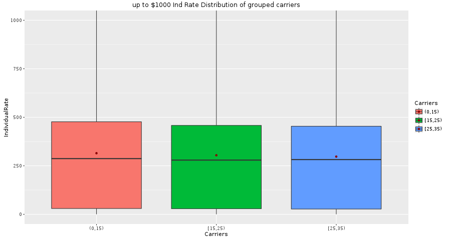
The next two graphs assess our assumption 1: whether the number of plans available will affect the premium level.
From the first graph, states are ordered from the most plans available to the least. The coloring indicates the number of participating insurance carriers are available in that state. It shows the relationship that the more participating carriers there are in a state, the more different plans were designed. However, the next graph shows that the number of participating carrier in state does not affect the premium level very much. The three boxes actually has very similar distribution regardless the number of carriers.
Average Minimum By States
We validate the second assumption now: whether some states just have a higher barrier to enter. In order to visualize this, we look at the average minimum premium by states.
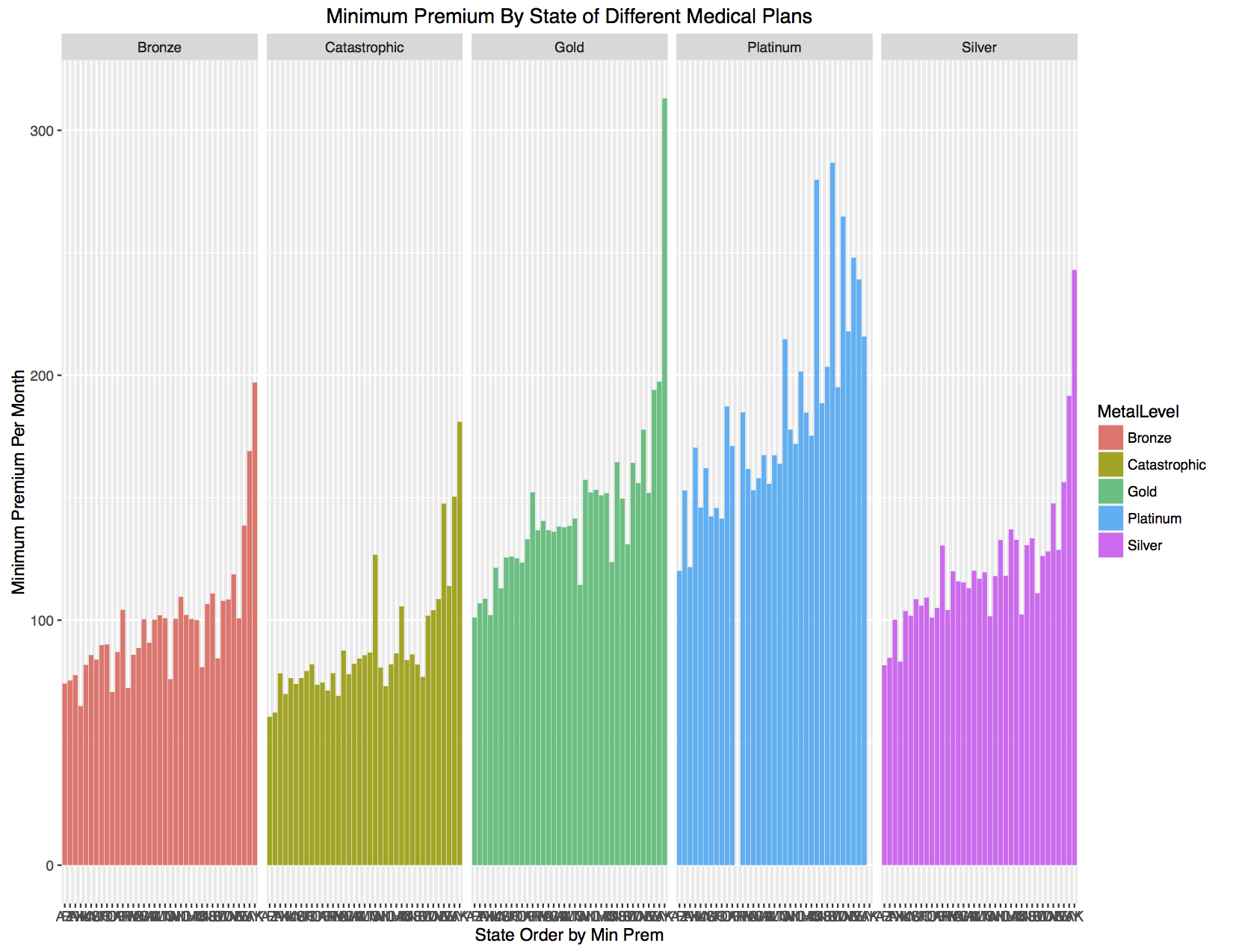
 First graphs is to rank the states by the average minimum premium. Second graph's goal is to check whether the premium trend hold for different metal level plans while maintaining the same state rank from previous slide. In this case, we validate that the premium trend holds regardless the metal level. Therefore, it confirms our assumption that there are more expensive states to enter.
Conclusion
In conclusion, my analysis confirms that there are at least three variables that affects premium levels: benefit type (metal level), age, and state of residency. To follow up this research in the future, we can also do premium price distribution fitting so that both of insured and insurers can now where they in terms of price in the overall market place for a specific type of plan.


