Data Analysis on Healthcare Fraud
The skills I demoed here can be learned through taking Data Science with Machine Learning bootcamp with NYC Data Science Academy.
Github
Introduction
Healthcare fraud is a type of white-collar crime wherein dishonest claims are filed to gain a profit. Fraud influences the healthcare system not only financially, but also places a significant burden on the perceived integrity and data value of the system.
The Centers for Medicare & Medicaid Services, part of the Department of Health and Human Services, reported that the national health expenditure grew 4.6%, to 3.6 trillion dollars, in 2018. This figure translated to $11,172 per person, for billions of claims. Furthermore, the National Healthcare Anti-Fraud Association estimated that approximately tens of billions of dollars are lost due to healthcare fraud each year.
This immense financial loss places the responsibility of recovery on insurance companies, but more importantly, on patients. Patients are cheated into compensating for the cost in primarily two ways: payment of fraudulent copays and higher insurance premiums. Thus, it is pertinent to determine the patterns in healthcare fraud and take preventative measures against such crimes.
Objectives
- Analyze health insurance data at the level of the providers and uncover the methods used to commit fraud by detecting any patterns of inconsistencies within the data
- Build a predictive model for identifying potential fraud to minimize patients’ financial losses
Data Description
The data used in this project was retrieved from: https://www.kaggle.com/rohitrox/healthcare-provider-fraud-detection-analysis
The data in its original form comprised of eight different csv files. Four of these files belonged to the dataset labeled with potentially fraudulent providers: train beneficiary, train outpatient, train inpatient, and train providers flagged. The remaining four files belonged to the unlabeled dataset (providers not tagged as potentially fraudulent) : test beneficiary, test outpatient, test inpatient, and test providers. The labeled data contained a total of 558,211 claims and 5,410 providers. The unlabeled data contained a total of 135,392 claims and 1,353 providers.
Exploratory data analysis, feature engineering, and supervised machine learning were performed on the labeled dataset. The unlabeled dataset was used only for unsupervised K-means clustering.
Exploratory Data Analysis (EDA)
Before conducting any analysis, the outpatient, inpatient, and beneficiary datasets were combined. With the data combined, we decided to first examine the dataset at the level of the patients and claims considering that this was also the natural format of the data. Following is a sample from the questions we asked, which provided us with some of the more crucial insights:
-
Do the number of doctors and patients affect the probability of encountering potentially fraudulent providers?
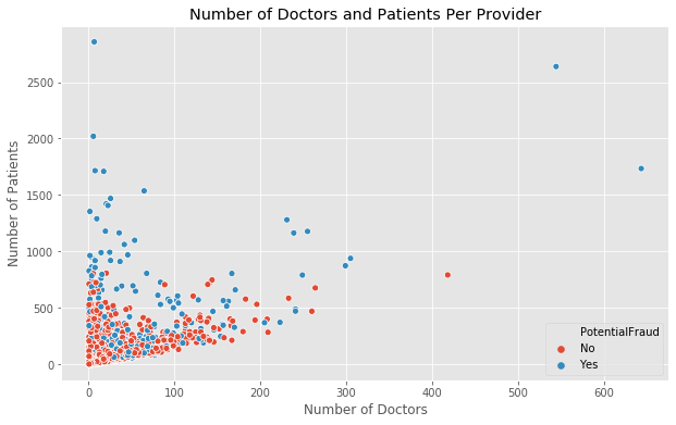
According to the scatter plot above, we found that with a greater number of patients, doctors, or both, the probability of the provider being potentially fraudulent increased. As the number of patients and doctors decreased, there were less cases of providers being potentially fraudulent. This indicates that the larger providers (bigger hospitals with greater networks) might be more likely to be fraudulent.
-
Would patients with more chronic conditions have greater number of claims filed in contrast to patients with less chronic conditions?

Although we expected that the number of chronic conditions a patient has and the number of claims filed for the patient would share a positive correlation, we instead found that the highest number of claims were filed for patients with 4-6 chronic conditions; the graph shows a normal distribution.
-
How are deductible amounts and insurance reimbursed amounts distributed for inpatients and outpatients?

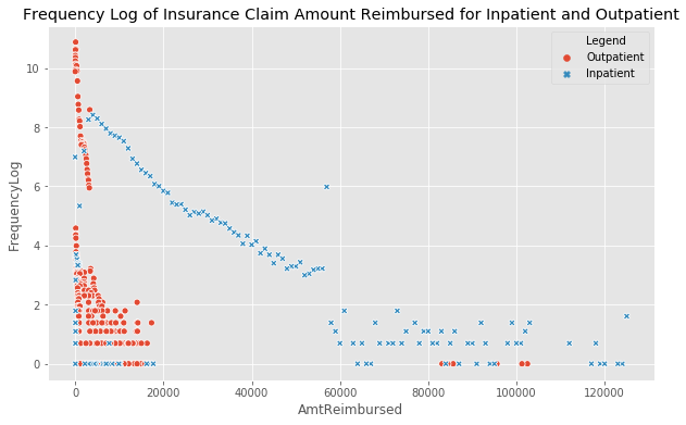
Analysis
As can be seen in the top graph, the inpatient deductible amount paid is consistent at a value of about $1100, whereas the outpatient deductible amount paid is more varied with greater distribution between $0 to $200. However, the most frequent value is still $0. The bottom graph shows that the outpatient insurance claim amount reimbursed also tends to be near $0, though with a distribution between 0 and 20,000 dollars.
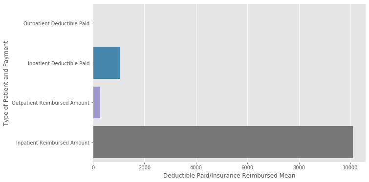
Conversely, the inpatient insurance claim amount reimbursed had a much wider and higher range of values with the maximum amount being reimbursed around $120,000. This indicates that inpatient services are significantly more expensive than outpatient services. The graph below summarizes the outpatient/inpatient costs based on averages.
After analyzing the data at the level of the patients and claims, we delved deeper by examining the data from the provider angle:
-
Is there a difference between potentially fraudulent and non-fraudulent providers depending on the types of services they offer?
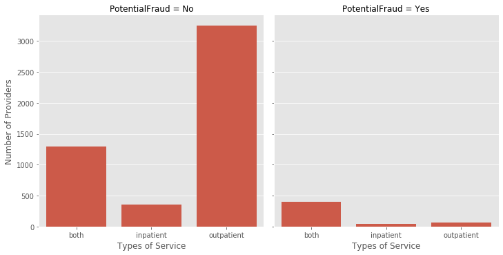
For non-fraudulent providers, we found that the number of providers offering solely outpatient services was significantly higher than those providers offering only inpatient services or those offering both inpatient and outpatient services. On the other hand, the number of fraudulent providers offering both inpatient and outpatient services is considerably higher than those offering either inpatient or outpatient services. This also indicates that, again, the larger providers are more likely to be fraudulent.
-
Are the total counts of claims for different claim admit diagnosis codes greater for potentially fraudulent or non-fraudulent providers?

As can be seen in the graph above, non-fraudulent providers surprisingly had the larger counts of claim admit diagnosis codes with exceptions to two codes: 486 and 78650. Thus, further research and analysis should be done on these two codes.
Data on Feature Engineering
One of our greatest tasks in this project was to create a useable data frame, which required an appreciable amount of effort as well as creativity. As was mentioned previously, we were presented with three datasets of features at the level of patients and claims, whereas the target was at the level of the providers flagged as potentially fraudulent or not. Thus, we had to aggregate and transform the inpatient, outpatient, and beneficiary data to create a new data set based on the providers. The merged datasets contained 79 features. The chart below displays the categorical breakdown of the features:

Examples
The following are some examples of how we transformed the features by combining/creating features from the above categories:
- Age: calculated age of patients based on their birth date and the claim start date; age was then mapped on to providers by determining the average age of patients served by the providers
- States: determined the number of states the providers operated in
- Counties: determined the number of counties the providers operated in
- Chronic Conditions: 12 chronic conditions were listed, which included conditions such as Alzheimer’s and Ischemic heart disease; examined the count of patients with certain numbers of conditions for each provider
- Type of service: dummified or label encoded variable indicating whether provider offered inpatient, outpatient, or both services
In-Depth Explanation
Now, we will provide more in-depth explanations for a few of our more important engineered features beginning with the features in the financial category.
As was seen in the EDA section, the outpatient deductible values clustered around $0, whereas inpatient deductible values were strictly at $1068. However, there was slightly more distinction for insurance amount reimbursed. We found that the median outpatient insurance amount reimbursed was $20 higher for fraudulent providers than non-fraudulent providers. The inpatient median was approximately $1,000 higher for fraudulent providers than non-fraudulent providers.
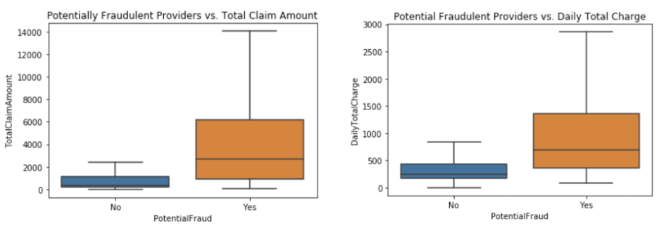
This distinction was not as robust yet, therefore, we decided to create new features combining this information with the information we learned regarding fraudulent providers being more likely to provide both inpatient and outpatient services. We created a new feature called “Total Claim Amount” which combined inpatient and outpatient, and deductible amount paid and insurance reimbursed amounts. We also created the “Daily Total Charge” feature by dividing the total claim by the number of days the patient was admitted.
Findings
After combining the features, we see a stronger distinction between fraudulent and non-fraudulent features within finances. In the left plot, the total per claim median is approximately $340 for non-fraudulent providers, and $2700 for fraudulent. On average, the total claim amount for fraudulent providers is $2500 more than the total claim amount for non-fraudulent providers. In the right plot, distributions for daily total charge are shown, and we found on average, fraudulent providers charge $470 more per day than non-fraudulent providers.
The results concerning the financial data are insightful as well as understandable. It is logical to hide the fraud within total claim to distribute the fraudulent activity and remain inconspicuous versus overcharging within one area where there is a fixed pattern that is more detectable.
Two more noteworthy features that we engineered were the “Unique Group Diagnosis Codes Count” and “Number of Unique Claim Admit Diagnosis Codes”. Group diagnosis codes classify patients into certain groups based on diagnosis and similar cost. Claim admit diagnosis codes specify the initial diagnosis upon admission. The individual features were created by counting the number of unique group diagnosis codes and unique claim admit diagnosis codes used in claims by providers.
Unique Codes

The median number of unique group diagnosis codes for fraudulent providers is 24, whereas for non-fraudulent, it is 0, and on average fraud providers have used 38 more codes. The median number of unique claim admit diagnosis codes for fraudulent providers is 57 whereas for non- fraudulent, it is 7, and on average, fraud providers have used 65 more codes.
Referencing back to the EDA, we found that the total number of claims per code was not higher for fraudulent providers. Instead, here we find that it is the count of the number of unique codes used that is an important signifier. This also ties into networks and types of services offered. Providers mostly flagged as fraudulent are operating at higher levels with greater networks in bigger hospitals and are operating within both inpatient and outpatient.
Thus, it definitely holds that the number of unique codes used will be greater for fraudulent providers. This was a very interesting find, and the unique group diagnosis codes count will be further explored in another section.
Once we created our first dataset, we ran Extra Trees Classifier for feature importance, and Lasso Regression for features recommended to be dropped. “Number of Unique Group Diagnosis Codes”, “Number of Unique Claim Admit Diagnosis Codes”, “Service Type”, “Total Claim Amount”, and “Daily Total Charge” were returned as our top five important features for detecting fraudulent providers.
Penalized Logistic Regression
We then wanted to test the validity/strength of our features, so we performed penalized logistic regression.

First, we ran the penalized logistic regression on our 2 worst performing features (number of duplicated beneficiary IDs and patients with 12 chronic conditions) and the fraudulent flag as the target. This model did not perform well with a train accuracy score of 0.65, and test score of 0.63, which was expected.
Then we added on one of our top features, total claim amount, and see that there is a drastic increase in performance with train and test accuracy scores at 0.76. Finally, we added our most important feature, number of unique group diagnosis codes, and train and test accuracy scores increased to 0.85. Thus, we were reassured of the strength of our features and that they provided valid models due to the progression of the accuracy scores. The train and test scores were also similar, so there was not a problem of overfitting, and we do not have near perfect accuracy scores at this stage, which was also expected.
After rounds of EDA, feature engineering, and modeling, we went into our final machine learning models with a final dataset of 42 features at the level of the providers.
Machine Learning Models
Before we fit the machine learning models, we needed to deal with the imbalance in the dataset. Fraudulent providers only accounted for approximately 10% of the dataset. To address this problem, we upsampled the minority class. We took a random sample of the minority class and added it to our original data set.
Linear and Non-Linear Classifiers
Next, we built linear and non-linear classifiers and compared their accuracy scores. To optimize the results, we tuned each models’ hyperparameters using Scikit-learn’s GridSearchCV.

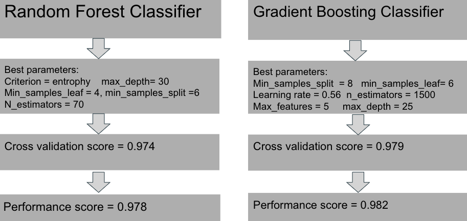
The stochastic gradient descent, a linear classifier, was outperformed by the non-linear models. The Random Forest and Gradient Boosting classifiers had better results.
K-Means
We also performed K-Means clustering on the unlabeled (test) dataset and appended those K-labels to that dataset. Then we did some analysis on this data to look at the most important features from the previous (labeled) data.

What we found was a solid distinction between the two classes labelled 0 and 1 within the unique group diagnosis codes and claim admit diagnosis codes features. The minority class here is the class labelled 1, and in the labeled dataset the minority class was the fraudulent class.
The important takeaway here is that this is a good confirmation that there is distinction in higher dimensions, that there are two different parts clearly separated by kmeans. This is valuable in understanding that there is structure in the data which is helpful in real life where we are not provided with predetermined labels. We will need to tune the model so we are not operating only on assumption, but this is at the least a testament to the strength of our features.
Final Analysis
We conducted a unary classification to check the accuracy of individual features and compared them to the most important features from the Random Forest and Gradient Boosting classifiers.

On the left, we see that Daily Total Charge, Total Claim Amount, and Total Annual Claim Amount had the highest accuracy scores. However, on the right, the Random Forest and Gradient Boosting classifiers both show that the Number of Different Group Diagnosis Codes was the most important feature.
Revisiting the Number of Unique Group Diagnosis Codes, let us begin with a more thorough understanding of the definition of a group diagnosis code. Diagnosis-Related Group Code (DRG) is a way of classifying patients under a particular group. Each DRG has a payment weight assigned to it.
For example, when performing an appendectomy, if a physician simply records the diagnosis as ‘appendicitis,’ the lowest or neutral DRG category will be applied. Recording the condition as ‘acute appendicitis’ means that a higher DRG category will be applied. A difference between these categories could mean double or triple the cost. This explains how the “numDiffGroupcode” feature affects the strength of the “DailyTotalCharge” feature and other related features in the financial category.
Where could a possible anomaly come from?
Upcoding
- A physician intentionally recorded a more critical diagnosis resulting in a higher DRG instead of the true diagnosis which would have resulted in a lower DRG
- A medical coder upcoded the group diagnosis code to make a patient seem to be in a more critical condition on the claim
Unbundling
- Generally, a DRG payment covers all charges associated with an inpatient stay from the time of admission to discharge. Unbundling is accomplished by billing several different codes for a group of procedures, even though the group should would have been billed under a single all-encompassing code.
Recommendations
It is difficult to detect fraudulent claims because there are so many codes and claims filed each day. Providers that are labeled fraudulent are clinics or hospitals that have a big network of doctors and a large number of patients.
We thought a market basket analysis and network concept map (shown below) could help by creating profiles of patients with chronic conditions. The profiles could then be used to determine inconsistencies of group diagnosis codes used.


Conclusion
Our most important features for detecting fraudulent providers were:
- Unique Group Diagnosis Codes
- Unique Claim Admit Diagnosis Codes
- Total Claim Amount
- Service Type
For future work, we would like to tune the hyperparameters of the K-means model to affirm whether our label assumptions are correct. We would also like to further analyze fraudulent providers using market basket analysis and use the correlations to create new features.

