Data Observation of Used Cars on U.S. Market
The skills the author demoed here can be learned through taking Data Science with Machine Learning bootcamp with NYC Data Science Academy.
This project aims to survey and observe some simple but interesting patterns based on the data collected for used cars on the U.S. market. As a car enthusiast and an owner of several cars (not simultaneous ownership; I am not rich), I feel I can give my insight, from the consumer side, to talk about what those patterns mean.
1. Data Source and Post-Scraping Processing
The raw data set is scraped (using the Python Scrapy suite) from www.carfax.com, which is like an Amazon.com for used cars. This website lists detailed information on cars/dealers. I decided to make this website the source of my data because it is reputable, comprehensive (you can virtually search for any cars at all U.S. zip codes) and provides clean-cut and well-formatted information. The website helps you locate the dealers who have cars you're interested in, which is information from seller side.
But recall I said I surveyed patterns from the consumer side. Is that a contradiction? No. The logic is this: Dealers of used cars stock vehicles based on their years of understanding of consumer needs/preferences so as to maximize sales volume. Thus, their stock information reflects consumers’ choices fairly accurately. I even feel their information is more objective than, say, from certain car review magazines whose ratings about cars are often strongly opinionated (e.g., based on magazine editors’ personal preference, catering to automobile manufacturer’s sponsorship, etc.).
Data Background
Prior to doing this project, I browsed what previous NYC-DSA alumni did for web-scraping projects and found one project authored by someone who was also enthusiastic about cars (quote: “I am a big car fan”). He looked at patterns from a different angle: comparing the East versus West Coast used-cars markets from seller side. His project resonated with me and inspired my selection of topics.
The following figure shows a typical search result from www.carfax.com. The key information to be scraped is listed as the boxed text in the figure. To locate those key pieces of information, the reader can look at the red-boxed texts in the lower part of the figure (to the right of Audi A6).
Data Filtering
After obtaining a raw data set (about 20000 plus vehicles), I added the cars’ manufacturer country information (e.g.: Audi: Germany). I also did a simple filtering:
based on practical consideration as well as my own experience. For example, I used mileage rather than years to judge the age of a car. One of the reasons for that is dealers rarely stock cars used more than 12 years anyway.
- The lower bound for filtering (5k miles) is set based on this thought: Any car with less than 5k miles has almost the same sale price as a new car. Consequently, buyers who have the budget to buy cars of this kind will just buy a new one. (I personally feel it is possible that there is some kind of “fishy” business when a car with mileage less than 5k miles is offered for sale.)
- The upper bound for filtering (90k miles) is set based on such domain knowledge: Typically, when a car has been driven more than 90k miles, no matter how good its brand name is, it will need major mechanical work due to wear and tear of running this many miles. Such mechanical work (e.g., replacement of steering system/braking system, major engine maintenance, etc.) is very costly, so 90k-mile is a tick mark by which owners sell no later than, dealers rarely stock, and buyers seldom consider.
My Audi
The following figure consists of pictures of the two Audi A4s I have owned, along with the odometer reading for each. I show them to convince you (the reader) that I -- despite being a pedantic math person -- do know something about cars and the above filtering consideration, as well as ensuing discussion, are based on my own experience.
- The left two pictures are for my very first car, which served as a training data set for me so that I became a good driver after the training. The lower left picture was taken when its odometer read 100k miles; indeed, it just went through major mechanical work on the engine and the steering system.
- The right two pictures are for my current car, which has been with me for seven plus years and is still running great. But it did cost me a lot when it hit 75k miles when it needed a replacement of the turbo (you can think of turbo as engine booster). The lower right picture was taken just after the turbo replacement. By the way, how can you tell roughly in what year a car was sold? (Another kind of so-called domain knowledge.)
- A quick answer is provided by looking at the color of the vehicle’s license plate! In 2010, New York state changed the background color of license plates from clean white (as shown on my cars) to golden yellow (as you can see abundantly nowadays on any NYC street). Thus, you can tell my cars are at least seven years old by now by looking at the colors of their license plates. Anyway, now at least you see why I set the cars’ mileage filtering bounds to be between 5k and 90k miles.
Data Records
After some data cleaning with the scraped information, we have a table shown as follows (here it displays information for ten randomly selected vehicles). You can also see that the table consists of 17,358 records. From this structured data table, we are ready to do statistics and make further observations.
2. Simple Data Observation: Top Fives
We can do a lot of summary statistics once data is structured as the table shown above, which any modern computational software (R, Python, Matlab, etc.) can do quickly. Let us focus on some simple but interesting observations. The first set of observations shows several top fives in terms of volumes available on market and arranged by descending order according to respective volumes. See the following table:
Alternatively, we can use bar charts to visualize the above information (volumes), but since here it is the text information (car makes/models) that matters most, we put the information in text tables directly. Here are some other interesting top fives:
What do we observe? At least two things: (1) Japanese cars are very competitive on U.S. used cars market. (2) The sale strength of U.S. made vehicles is in the large sized pick-ups and SUVs.
3. An Interesting Observation: Comparing Three Models of the Same Class
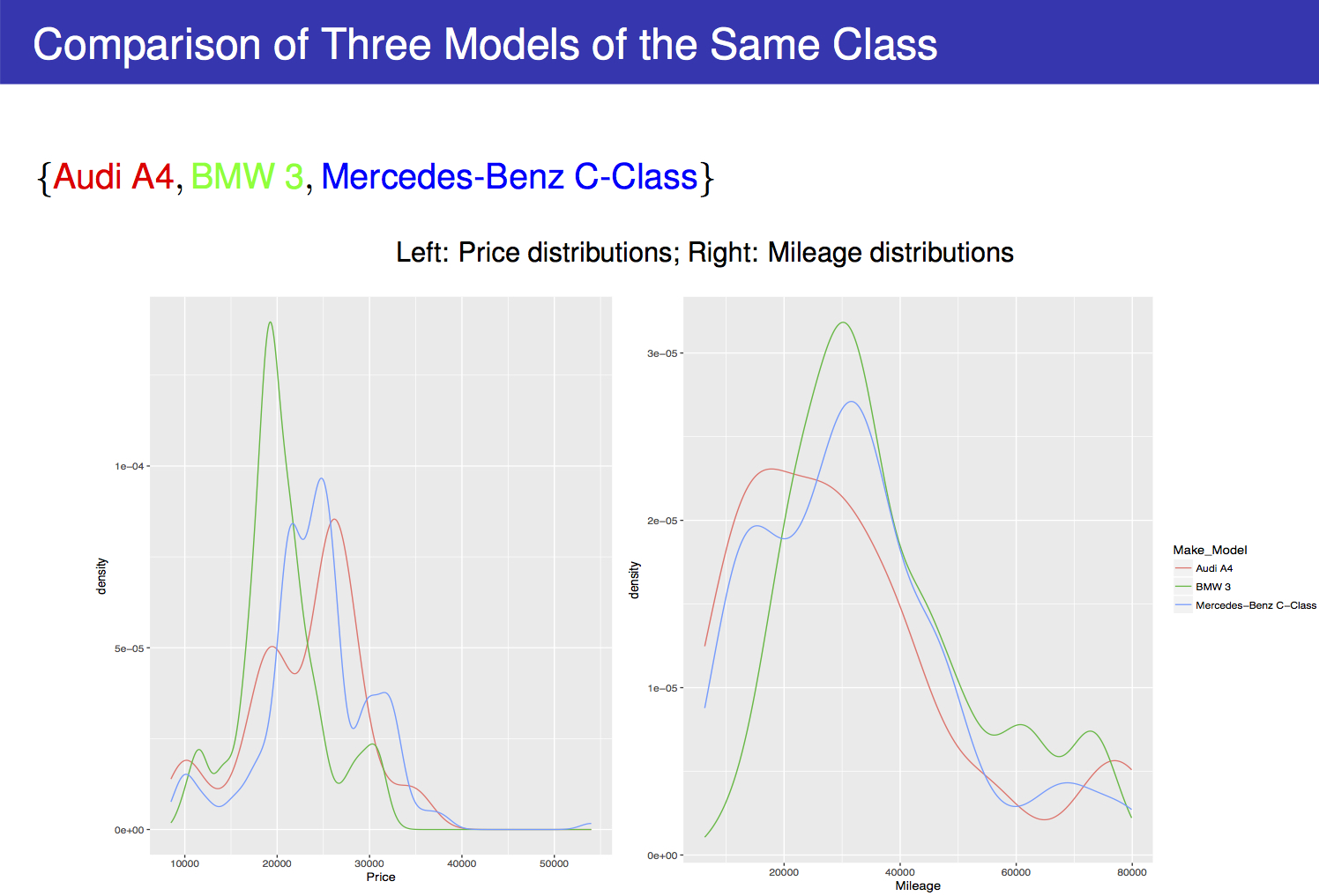
Usually, more interesting observation is made by doing comparisons. Here we compare three models of the same class: Audi A4, BMW 3-series, and Mercedes-Benz C-class. They are all made in Germany, compact, entry-level premium cars that are designed for personal rather than business use. As you read along, you will find we can even infer about the three car makers’ different design philosophies to target different categories of consumers. But let us observe some simple distributions to begin with:
Findings
- On the price distributions (left panel of the above figure), you can see all three models have more than one local maximum, which may be explained by the fact that those cars were loaded with quantized sets of packages (e.g., snow package, sport package, etc.; the more packages, the higher prices). The number of available sets of packages determine the number of local peaks (local maxima) in the price distributions.
- On the mileage distributions (right panel of the above figure), you can see for all three models, each has two main local maxima, with the major one located near 40k miles and the minor one near 75k miles.
- This pattern has to be explained with some domain knowledge. Young or middle-aged people, many of whom choose to lease their cars from sellers, are the major source of customers for these three models. The lease usually ends at 45k or 50k miles, and to save troubles, the drivers usually return their leased cars before 40k miles. When those cars are returned, the sellers pass them on to the used-car market. That’s why you see a major peak around 40k miles for all three models.
- Now for the secondary, smaller, peaks on the mileage distributions, I think those are mainly due to selling of cars by owners (instead of leasers), the number of whom (car owners) is less than the number of car leasers. Car owners usually sell their vehicles before reaching 90k miles so as to save themselves from the cost and trouble of bringing their cars for major mechanical maintenance, and to be safe they usually sell well before 90k miles (e.g. 70k miles, 75k miles).
- Having owned a car in a similar condition, I can testify that. Recall that my second Audi did go through a major mechanic work at about 76k miles (but I was too attached to it that I didn't sell it but gave it a maintenance).
Patterns
It seems there is nothing more to be observed, but, behold, when we compute a simple quantity
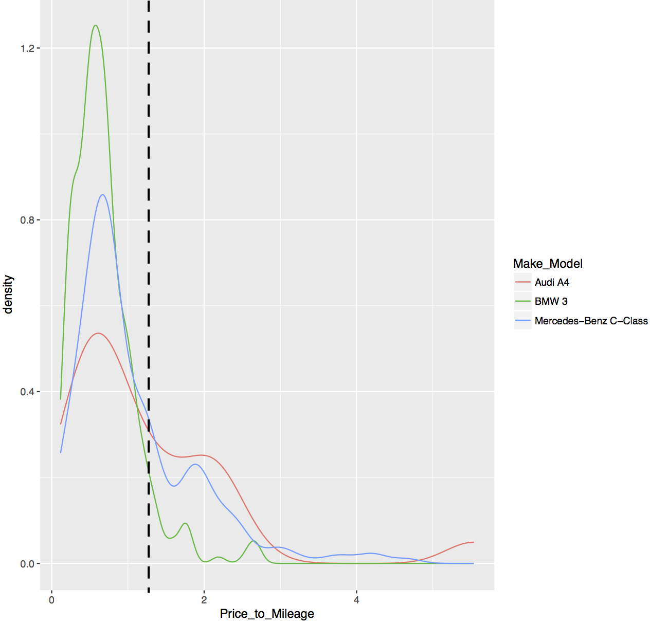
and plot its distributions for the three car models, that yields a distinct and interesting pattern, as shown in the following figure.
From the above distributions of the ratio price/mileage, you can observe that when the ratio price/mileage is small, BMW 3-series dominates; when the ratio price/mileage is higher than some threshold value, Audi A4 dominates; in both cases Mercedes-Benz C-class is in the middle place. In fact, this reveals those three car makers’ marketing philosophies. How is that so? Let us first understand what the ratio price/mileage suggests. Consider the following two sets of examples, in each case, blue-colored ratios give smaller values than the red-colored:
Analysis
First Set
- For the first set of examples, let the two buyers be Buyer Blue and Buyer Red. Both are willing to spend $30k, but Buyer Blue goes with older cars with 60k miles whereas Buyer Red goes with newer cars with 30k miles. Of course, Buyer Blue chooses an older car for some reason, as we now find.
- When we look up in the above figure for Buyer Blue’s category, characterized by smaller price/mileage ratios, or to the left of the black dashed line, we see that there it is BMW 3-series that dominates and Audi A4 bottoms. We know that BMW emphasizes driving pleasure and stylish outlook, which in turn means this category (with lower price/mileage ratio) of customers prefer cars with driving pleasure/stylish outlook. Again, the underlying logic is that dealers stock cars based on consumers’ preferences.
Second Set
- For the second set of examples, let the two buyers be Buyer Blue and Buyer Red again. For two cars of about the same level of wear (say both with 30k miles), Buyer Red is willing to pay twice ($30k) than Buyer Blue’s $15k. Of course, Buyer Red is willing to pay more for some reason, as we now find.
- When we look up in the above figure for Buyer Red’s category, characterized by higher price/mileage ratios, or to the right of the black dashed line, we see there it is Audi A4 that dominates and BMW 3-series bottoms. We know that Audi emphasizes well-rounded design (mechanical, electrical, interior, etc.) and low-profile outlook, which in turn means this category (with higher price/mileage ratio) of customers prefer overall or interior design and low-profile outlook.
- In both categories, Mercedes-Benz C-class ranks in the middle place.
Observations
The above inference is not surprising. Since I was in high school, I have noticed that BMW likes to advertise its “sheer driving pleasure” (quote, which also includes the pleasure of winning attentions on the street). But for Audi, its commercials focus on Audi’s calmness and steadiness, such as how it drives on ice steadily like a heavy ship. In fact, I think BMW’s philosophy is to make a car like a vanguard jet-plane, whereas Audi’s philosophy is to make a car like a stately ship.
For Mercedes-Benz, it takes a balanced philosophy, and, to be honest, I feel it does not care about making C-class that much; it merely introduced its C-class so as not to completely lose a foothold in this particular class of market. As a result, you can see Mercedes-Benz C-class ranks in the middle in both categories.
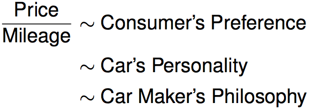
It is amazing to me that how such a simple calculation of objective and cold-blooded numbers (price/mileage) can reveal something that is subjective and human-related:
Important: It may seem that other readers need some domain knowledge (about cars here) to make useful observations. But the point is, as long as a data analyst can use his/her domain knowledge to invent metrics to bring about revealing patterns (fancier term is: feature engineering), the readers or co-workers or clients will notice those patterns and do their research to further. For example, I am not familiar with Japanese cars of the class discussed in this section (Acura/Infiniti/Lexus), but I can conduct a similar study as given above and infer about those cars’ characteristics and their car makers’ design philosophies.
4. Correlations between Car Features
We now look at how various quantities are related to each other in terms of the so-called Pearson correlation coefficient. The correlation coefficient lies in between -1 and 1, with positive (negative) values indicate positive (negative) correlations and larger (smaller) magnitudes indicate stronger (weaker) correlations. To visualize correlations, we generate a heat map. But before showing the heat map, let me introduce one more cooked-up feature that is simple enough to calculate, although it also reveals a lot:
The higher the ratio years/mileage, the gentler a car has been used. The reason is simple: Consider two cars A and B, both of which have been used for 5 years, but Car A has been driven for 5k miles and Car B for 50k miles. Obviously, Car A has been used more gently than Car B. Accordingly, I consider this ratio (years/mileage) an index for the Gentleness of Usage.
Year and Mileage Correlation
By the way, some may wonder when we cook up new features such as Years/Mileage, will the new feature be redundant with respect to old features such as Years and Mileage?
The answer is generally no, as long as we did not simply take linear combination of old features to derive new features. Everyone with elementary physics knowledge knows that from distance and time (two features), we can compute a new feature speed = distance/time. But (the new feature) speed provides a new dimension of information about the state of motion which cannot be known from (old feature) distance or time alone. In formal mathematical analogy: An integrand and its derivative in general have no direct proportionality.
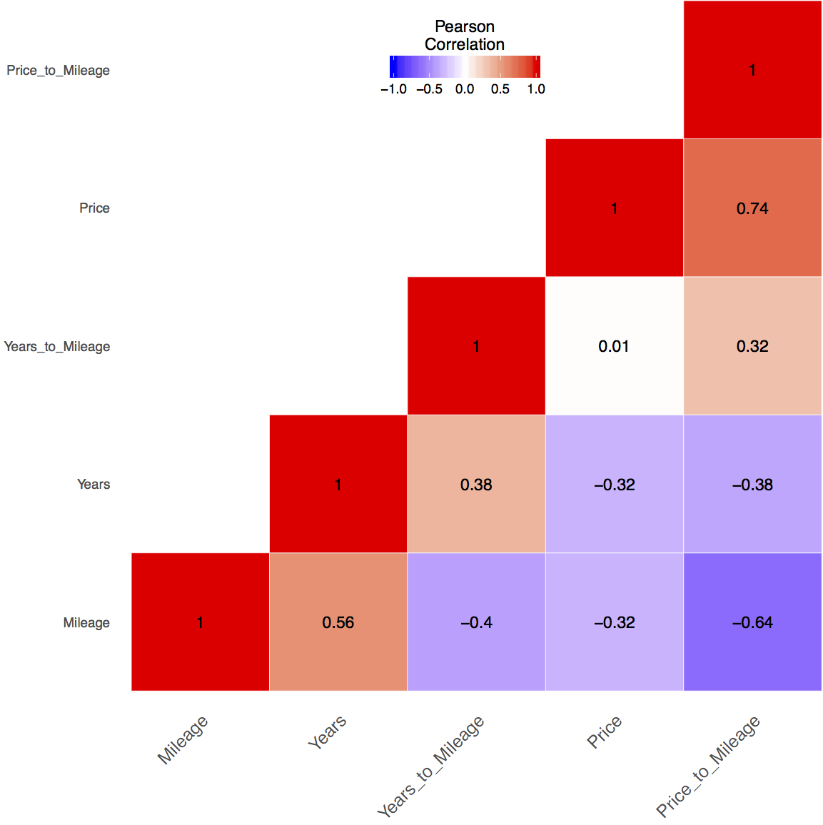
The correlations between various quantities are shown in the following heat map. Note that the calculations are done based on all the vehicles from the data table (17358 in total).
Some of the correlations are obvious. For example, the price of used cars is negatively correlated (-0.32) to mileage. Some of the correlations are interesting. For example, the ratio price/mileage (recall: it indicates consumer preference or car’s personality) is positively related (+0.32) to the ratio years/mileage (recall: it indicates the gentleness of usage of a car). This is understandable; consumers who prefer low-profile cars tend to drive more gently. But there are also some non-obvious correlations. I will leave it to the readers to find surprising correlations.
5. Future Improvement
This is merely a preliminary survey of the U.S. used-car market. A lot of improvements can be made in the future:
- We can refine the study to a smaller area, say the NYC area, Baltimore-DC area, etc.
- It may be interesting to conduct a time series study of how prices changes in time for different car models.
- We can quantify qualitative features (e.g., makes, colors, etc.) and formalize definitions of those informally defined features (e.g., years/mileage ~ gentleness of usage). We can then build a machine learning model to predict the price based on the carefully defined features.
The lists for improvement can be endless, but the goal remains discovering patterns that are simple to understand and make use of. To that end, I would recommend talking to car dealers, because they know what are the actual, interesting, and worthwhile business questions that call for analysis and answers. In other words, they have real domain knowledge on which to base the data analytics.


