Data Study on Leading Causes of Death in NYC
The skills the author demoed here can be learned through taking Data Science with Machine Learning bootcamp with NYC Data Science Academy.
Contributed by Hayes Cozart. He is currently in the NYC Data Science Academy 12 week full time Data Science Bootcamp program taking place between April 11th to July 1st, 2016. This post is based on his first class project - R visualization (due on the 2nd week of the program).
Leading Causes of Death in NYC
Hayes Cozart
April 29, 2016
Introduction
Death statistics can provide insights into many facets of modern life. The data I was working with explores the leading causes of death in New York City. I have pulled the data from the NYC Open Data site to explore this area of inquiry. The data was provided by the Department of Health and Mental Hygiene (DOHMH). This data had 5 different variables: year, sex, ethnicity, cause of death, count of deaths, and percent. I chose the years this data covered to be from 2007 to 2011. The causes of death had 32 different categories. The fact that almost all of the data was categorical meant that I could not visualize the data in many different ways other than through bar charts.
Objective
I looked at this data because I was interested to see if the leading causes of death for the US, heart disease and cancer, were the same as the top causes of death for New York City. I was also interested to see what causes of death would jump out from the data and might say something about New York City itself and the people who live there.
There are many reasons why knowing what the leading causes of death are, is important. It is important for health and life insurance companies to know so that they can make informed decisions on what prices to set for different kinds of insurance and coverage. Cause of death also provides information for public health planning and policy. Causes of death data can inform ideas as to what preventative measures the city should invest in to improve longevity in the city.
Data Set
One of the issues I had with the data was that it had a lot of duplicate rows. The chunk of code below shows how I removed all the duplicate values.
The next cleanup of the data I did was to change the labels of the causes of death to be more clear and understandable. Most of the causes of death in the data were referred to by their scientific names so I went through and changed the labels to be what most people know the disease names to be. Below is the code that I used to change the labels. I also created a top ten list of the top ten causes of death to be used for later sorting.
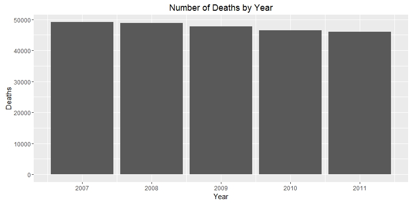
The first thing I wanted to do with the data was to look at how the number of deaths were changing each year. This was done using the code below and produced the graph under the code.
Number of Deaths
The main take away for this graph is that the number of deaths are going down. I then wanted to look deeper in the data to see if I could understand what the data was showing. One way I did this was by looking at how a person’s sex is associated with the drop in deaths each year, as demonstrated below.
Deaths by Sex and Year
When I looked at the data and broke it up by sex, it showed that both male and female deaths are decreasing. However, I could see that female deaths were decreasing at a higher rate. Also, I noticed that more females were dying than males overall.
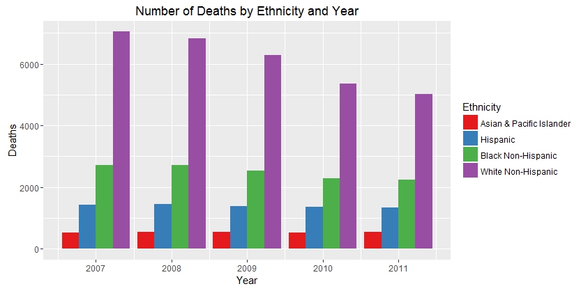
The next ways looked at the data was to see how the deaths by ethnicity changed over time.
Deaths by Ethnicity and Year
In this graph the data is now broken up by ethnicity. Here you can see that over time the number of Asian and Hispanic deaths are staying pretty constant. Most of the decrease in number of deaths is occurring in white ethnicity. I then looked at cause of death to see how it is associated with what we are seeing.
Percent of Deaths by Cause and Year
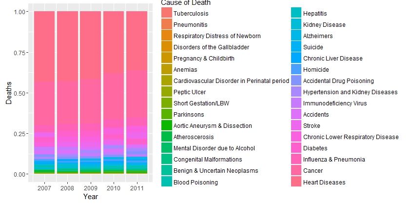
There is a lot of information in this graph, but the main take away I wanted to show is that the top two causes of death, heart disease and cancer, are 70% of the causes of death in NYC by year. We can also see that the percent of heart disease deaths are going down. Let’s look at this information by only looking at the top ten causes of death. Aside: Why you see the color fluctuations in the years is that the colors are ordered by the total deaths for all five years. During some years though the number of deaths for each cause changes the order for that year.
Top Causes of Death
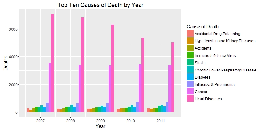
This graph shows what we saw earlier in a much simpler to understand way. We see that the top two causes of death are heart disease and cancer. Also we see that heart disease is steadily decreasing each year. Now let us see how this could be associated to what we saw earlier about the sex and ethnicity differences.
Heart Disease
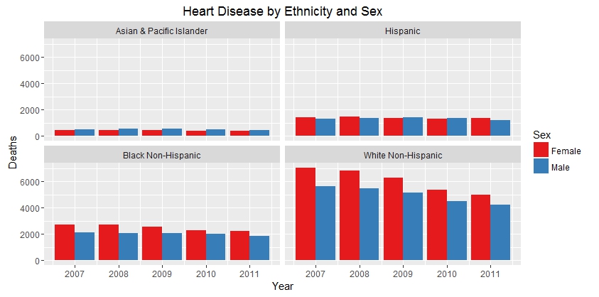
This graph shows that deaths caused by heart disease are going down year by year. We also see that for females it is decreasing at a greater rate than for males. Which is obviously associated with what we saw earlier when looking at the overall decrease in death. What we also see is that even though we are seeing large decreases for white ethnicity and a slight decrease for black, Hispanic and Asian deaths due to heart disease are staying mostly constant.
Heart Disease by Ethnicity and Sex
This graph is showing the same information as before. It just helps us to see the differences by year for heart disease deaths by ethnicity.
Conclusion
What can we conclude from all the information in these graphs. First, we can conclude that the overall number of deaths is going down in NYC. Second, this decrease seems to be mainly associated with the decrease in heart disease. Third, this decrease seems to be mostly occurring in white females. Finally the Non-White number of deaths are staying mostly constant.
Future analyses that I would want to look into are finding out the population breakdown of New York City to get a better idea of the trends that I saw. Then I would want to get age data for these deaths so that I could adjust the death rates by age to account for an aging population. As an older female population could account for the sex differences in death rate that were seen. I would then want to see what the leading causes of death were in other cities and compare them to New York City.
Then to better understand why we are seeing the decrease in heart disease deaths I would want to look at health care recent discoveries. I would also look at health care quality and access differences by ethnicity to see if that could explain why most of the deaths are staying constant.


