Data Study on NYC Safety
The skills we demoed here can be learned through taking Data Science with Machine Learning bootcamp with NYC Data Science Academy.
Introduction
Traffic collisions in New york city are all too common and can result in devastating injuries and death. Even so, New Yorkers and tourists travel around the city risking life and limb to get where they need to go. This R Shiny project is designed to give data insight in to when, where and how to best to travel around the five boroughs of New York, safely.
Follow the following links to view my Shiny app and the code on Github.
Data & Methodology
The dataset used for this app was provided by NYC Open Data and the NYPD. Every traffic collision that occurs in NYC where the police are called is recorded in to a database with associated data regarding location, time, persons and vehicles involved, and any injuries that occured. This data set has recorded collisions for 2015 through early 2017.
This app is designed to show trends in collisions as well as give the user the ability to filter for their specific neighborhoods, commuting path and time if desired. I filtered the data to involve only collisions with an injury or death having occurred. This provided enough data points to spot trends in collisions as well as being more relevant for the user.
In addition to the data that is provided by the NYPD, I added extra columns to break down the collisions in to:
- Weekday and Weekend
- Type of transportation
- Dangerous or Deadly
The App and Data Results
Map
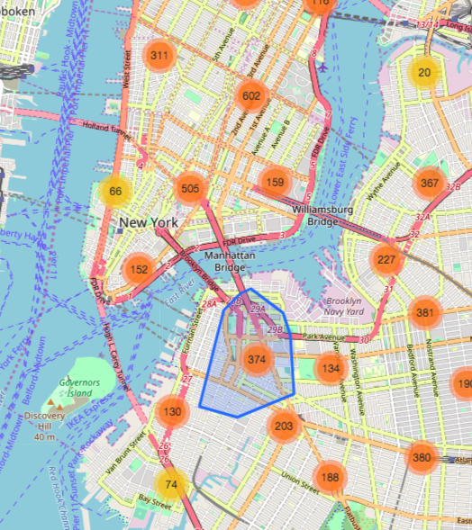
The map provides the user the ability to view groupings and trends of collisions filtered by:
- Weekday or Weekend
- Transportation type
- Time of day
- Time of year
- Number of collisions
The last slider provides the user the ability to "declutter" the map and more easily spot overall trends.

Some areas are hotbeds for collisions:
- Midtown Manhattan
- Bridge Entrances
- Busy Transfer points (Subway entrances leading in to vehicle traffic)
Weekend collisions are much less prevalent than weekday.
-

Weekend -

Weekday
Tables and Charts
The "Tables and Charts" tab gives more insight in to more relative differences in time and location.
Looking at collisions over the course of the day, "deadly" collisions are more clustered between the hours of 8PM and 6AM whereas "dangerous" collisions peak during morning and evening rush hour hour.
-

Deadly -

Dangerous
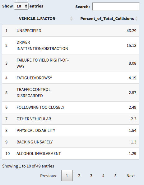
The tables below the graph update with the user inputs and show the most frequent types of each variable.
-

Reason for Collision -

Borough -

Hour of the Day
Many more insights and trends can be gleaned from the map, tables and plot by changing the variables and inputs.
Future Research
I look to further my app and research in to NYC collisions by adding more interactivity to the map and looking at correlations between types of drivers, age of driver, and seasonality.


