Data Study on The New York City Rental Market
The skills the author demoed here can be learned through taking Data Science with Machine Learning bootcamp with NYC Data Science Academy.
Introduction
New York City is a unique rental market due to its size and mix of old and new buildings. Data shows prices vary widely even within the same neighborhood, depending on proximity to transportation, view, building amenities, and other factors. This is what makes it so difficult to assess what is a fair market price for a particular apartment.
To help simplify the process, let’s have a look at rental listings (as of Jan 19, 2019) downloaded from renthop.com, a rental listing site focused on New York City. Though we downloaded approximately 54,000 listings, removing duplicates reduced that number by 30 percent to only 37,000. This highlights a pervasive problem in the rental market, namely, an absence of quality monitoring of listings. Certain information may be missing, or downright misleading, as is often the case with square footage. However, we have to work with the data that we have, so we examined the remaining listings.
Data
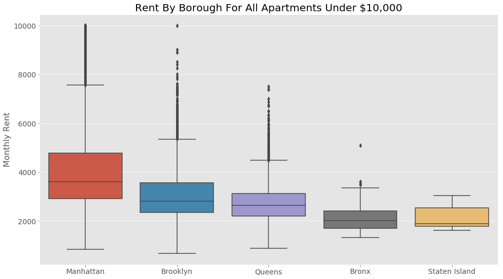
First, let’s look at the overall market through the five boroughs:

All apartments over $10,000 per month were excluded. We can see that the average monthly price of an apartment is in the range of $3,000.

Splitting it up by borough, we can see that Manhattan is the most expensive. Please note, though, that while Brooklyn is still generally cheaper than Manhattan, many apartments there are priced just as high, as can be seen from the dots above the box plot for Brooklyn.
While this top-down view is helpful, the best use of this data may be the bottom-up approach.
CASE STUDY 1:
HOW MUCH SHOULD A LANDLORD CHARGE FOR AN UPPER WEST SIDE STUDIO?
The studio is in a walkup building without a doorman or laundry services.
Here is a box plot of the neighborhood that shows the price difference split between the most important of the amenities, elevator and doorman.

As expected, we can see that elevator buildings with a doorman command a higher price. Surprisingly, apartments in buildings with an elevator but without a doorman are about the same price as walkup buildings. One reason for this may be that many walkup buildings in the neighborhoods are in Brownstones, buildings that have high ceilings and antique charm. Further investigation is needed to draw a firm conclusion, though.
Returning to our landlord, the 25th percentile of doorman elevator (red boxplot) buildings is around $2,400. This suggests that the landlord can ask $2,375 and be competitive. However, it is at the higher range of the walk-up buildings (purple boxplot), so he/she should be willing to compromise on price if the apartment doesn’t rent quickly.
Lastly, let us examine another amenity, whether or not the apartment has a washer and dryer in the unit.

We can see that there is a premium within walkups for laundry. Recall that the apartment we are discussing in this case does not have a washer and dryer. This graph also supports an initial asking price of $2,375 as it is below the 75th percentile of apartments offering the same amenities.
CASE STUDY 2:
3 ROOMMATES WANT TO LIVE IN BROOKLYN, BUT WHICH NEIGHBORHOOD?
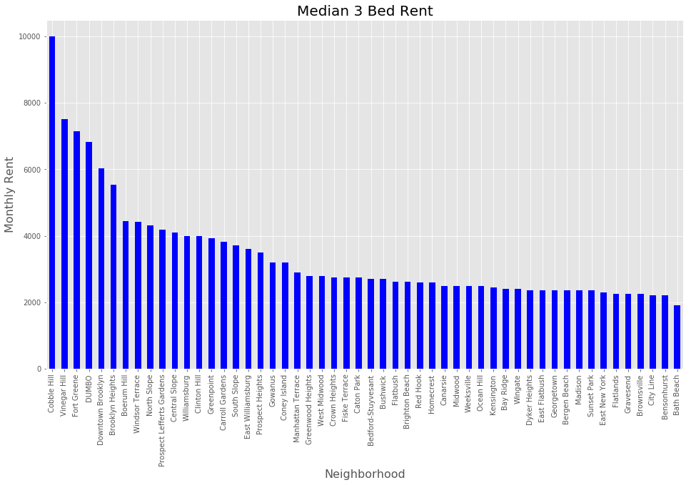
First, let’s examine the rents for 3 bedroom apartments across all neighborhoods.

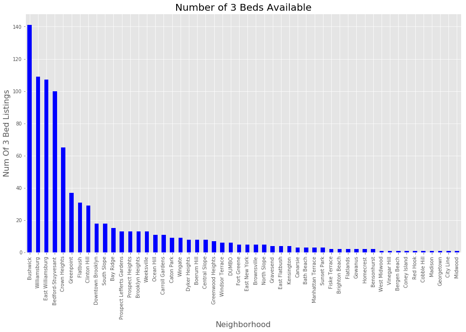
Looking quickly at the chart, we can see that there are many neighborhoods with median rents around $4,000 per month. Before picking one, let’s have a look to see where there are a sufficient number of 3 bedrooms available.

While more is probably better, please keep in mind that each area is a different size. Bushwick is rather large. In contrast, you can walk from one end of Cobble Hill to another in about 10 minutes.
With that said, let’s focus on Greenpoint, it’s in a reasonable price range for roommates and has a good number of units available.

Looking at this map, we can see immediately which units are close to the subway, which have a water view and which are on main roads.
An interactive version of this map showing all the info for each marker/pin is available here: http://mikesankari.com/map.html.
Conclusion
In conclusion, slicing and dicing the data depending on a user’s individual needs can make the analysis much easier with just a few graphs. It will provide the renter with more information on which to base his/her selection of apartments to check out in person, thus saving time, aggravation, and very possibly, money.

