FAANG Reviews Data Exploration (Facebook, Amazon, Apple..)
The skills the author demoed here can be learned through taking Data Science with Machine Learning bootcamp with NYC Data Science Academy.
Shiny App | Github Repository | Data set
Introduction:
In our internet age, data shows there are 311 million internet users in the US alone; that amounts to 78% of the total population in the USA. Online review website such as Yelp for food, Google My Business for any business on the map, and Glassdoor for companies and jobs provide different perspectives for buyers or viewers on choosing their products or company.
The purpose of my Shiny project is to provide quick visualized insight into reviews for Facebook, Apple, Amazon, Netflix, and Google. Without further ado, let's dive into the review.
Exploratory data analysis:
This data set contains a total of over 68,000 reviews on different companies from the year 2012 to the year 2018. The majority of the reviews are on Amazon. This number actually proportional to the total number of employees of these companies as of 2018. Amazon, Microsoft, Apple, Google, Facebook, and Netflix employed 600K, 13.5K, 13.2K, 98K, and 5.4K respectively.
Data on Current employee vs former employee:
This graph tells the ratio of response comparison from a current employee to a former employee. The majority of the reviews are from the current employee. It is not difficult to tell that Facebook has the highest current employee response ratio.
Questions to consider on these reviews include:
- Which category of review is more accurate and unbiased?
- Why does Netflix have an even ratio on current employee and former employee?
We cannot necessarily take all reviews at face value. Here is an article tells the story of an employee being forced to leave a positive review on their company online.
As we dive into the data set, we want to know what proportion of the data tells the unbiased opinion of the company. There is an option of anonymous response in this data set that may tell a different story.
As we click on the anonymous response option, we can tell that the ratio of the response from the former employee is slightly higher than the previous graph. Response from former Microsoft employee increased from 0.35 to 0.4. While response from Amazon former employee increased from 0.31 to 0.36. Response from Google increased from 0.37 to 0.43. All these numbers indicate that former employees tend to provide anonymous reviews.
Data on Ratings:
This data set consist of six options on the ratings:
- Overall ratings
- Work balance stars
- Culture values stars
- Career opportunities stars
- Company benefit stars
- Senior management starts
The user of my Shiny app can choose the data visualization plot base on their interest.
In here I am going to elaborate some interesting finding.
Correlation between different ratings:
Correlation plots indicate how strongly two variables correlate to each other. In this case, the overall rating has the highest correlation score to each other rating parameters.
Overall Rating:
These three graphs provide insights on rating distribution, rating over time, and the average rating. Google and Facebook have the general highest rating with the majority of 4 to 5 stars and some outlier in 1 and 2. Netflix has the lowest rating. We can take a closer look at it.
In 2012, Netflix has a low rating of 3.1 compared to other companies. Let's find out what happened to Netflix in 2012. I search on Google, Netflix 2012 stock shares had dive 25% and at the end of 2011, Netflix has lost 800,000 members of subscribers.
Work balance:
Work balance ratings for Netflix and Amazon are the lowest.
Culture Value:
The culture value and overall rating have the highest correlation score. The boxplot of culture value is almost the same as the box plot for overall rating. The plot shows that aside from other ratings, people tend to rate their company's overall rating base on the company's cultural value. That value is strongly correlated with senior management with a correlation score of 0.71. By following this logic, we can say that senior management is a very crucial factor in how employees review the company.
Career opportunities:
Facebook has the highest career opportunities, while Netflix has the lowest. In the time series, we can see that Google's career opportunities rating increase every each. If you are currently looking for a higher future career path, Google might be a good consideration.
Senior Management:
Senior management for Netflix, Microsoft and Amazon are relatively low with an average score around 3.2. Netflix is the only small size company compares with others.
However, Netflix has a higher top end proportion. This shows that the distribution of Netflix senior management rating is relatively polarized in the top and the lower end meaning, some people strongly like it and some people strongly disliked it.
We can dive into more review on this by combining other factors:
- Is the review anonymous?
- Is the review post by a former employee or current employee?
- Does the current employee tend to give a higher rating?
Wordcloud for review in text:
Four columns in this data set are in text format:
- Summary:
- Pros:
- Cons:
- Advice to management:
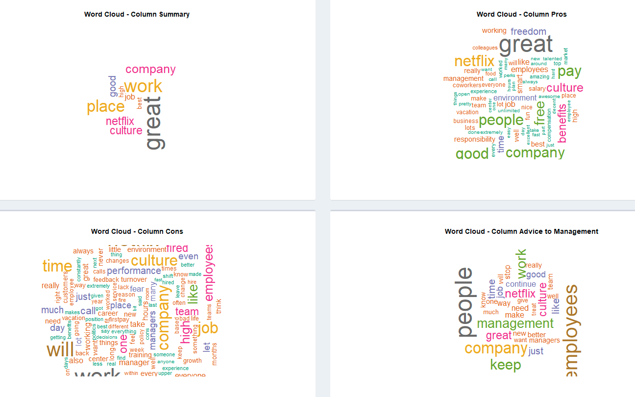
Word clouds show the word frequency in the review base on the word appearance frequency. Bigger the size of the word, the higher the frequency appearance rate in the review.
It is a tool for the user to see the overall feel of the review.
The user is able to play around on the Shiny app to adjust the min and max word frequency and choose the company that he is interested in.
In here, I am going to focus on the word cloud for Netflix.
Netflix:
Some big words in Pros are culture, freedom, benefits, and team. This indicates that Netflix is perceived as a new tech company and people like its cultural value. In contrast, there are many more words in the Cons section. Words like fear, managers, cultures, performance, and growth have high appearance frequency. Word cultures showed on both the Pros and the Cons section. This again has proved that the cultural value is strongly polarized in Netflix.
Data on Geographic location:
Map data shows where the review is coming from geographically.
User is able to choose the specific company he/she wants to review.
Most Amazon reviews are from Seattle, and most of Google reviews are from California. Surprisingly, not many reviews are from New York. Finally, most reviews are from the United States.
Conclusion:
This Shiny application provides an overview review of FAANG. Users are able to see the positive and negative side of each company. Although the reviews still contain bias, such as if the reviews are responded by a former or current employee. Is the review anonymous? How can we obtain an accurate unbiased review? Is there a better way to analyze and show the text portion of the reviews?
Future improvement and direction:
- Dive into more detail on review by the former, current employee, and by the anonymous response.
- Determine if there is a bias between different response. If yes, what is it? and how can we tell the trend on these reviews since the online review is just a review on another perspective?
- Use sentiment analysis on text review. Indicate positive and negative reviews.
Source:
https://www.kaggle.com/petersunga/google-amazon-facebook-employee-reviews
https://www.forbes.com/sites/lizryan/2016/02/08/our-manager-forced-us-to-leave-positive-reviews-on-glassdoor/#76120f0d605c
https://money.cnn.com/2012/07/24/technology/netflix-earnings/index.htm
https://nyti.ms/2jNwWgd


