IT Jobs Payment Data Statistics

Posted on Oct 25, 2017
The skills the author demoed here can be learned through taking Data Science with Machine Learning bootcamp with NYC Data Science Academy.

Motivation

How much is an IT job making in the data market? What is the overall current market demand for such position and relevant skillset? Which states have the highest needs for the job?

Those questions are often asked by IT Recruitment Agencies and HR Heads who are looking for IT resources. In addition, an IT professional would also want to see the Job Payment Report for their Job Title which would help them determine their worth on the market value, and so they will have a plan to keep up with the market demands.

Data scraped from IT recruitment websites was analyzed and a Shiny app was created to answer the questions above. I will continue collecting more data and improve the accuracy in the near future.

You can get your questions answered with my Shiny IT Job Payment Statistic App by following the link here.

Application Data Overview

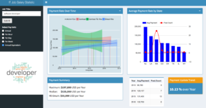
IT Jobs Payment Statistic - Dashboard

  • From the left panel, enter a brief job title. If you're uncertain about a full title, you can start with first keyword, e.g. "developer", "java", "manager", etc., and the app will show a Word Cloud suggesting other supporting words to be combined around the keyword so that you can have a more accurate Job Title that you'd like to have an analysis for.
  • The radio buttons let you select the Payment Unit of your interest, including "Annual", "Per Hour", "Per Daily", "Per Week" where the actual data is available. Otherwise, they are converted to "Annual Equivalent" rate.

Technical Highlight: Packages Used: "shinydashboard", "wordcloud","googleVis", "ggplot2", "tm", "dplyr"

The Data Statistical Charts

Payment Rate Over Time

 Payment Statistic

This bar chart shows you the past job posts and the associated payment rates.

The data points are grouped by the Employment Type, including Contract, Contract to Hire, and Direct Hire, and the Payment linear trends of each group.

Direct Hire Payment Statistic

This chart only shows the Direct Hire data and its trend.

Technical highlight: This chart is plotted by "ggplot2".

Average Payment Rate by State

Average Payment by States

This bar chart shows the Average Payment Rate of jobs with the Job Title for each state.

In addition, it also shows you the number of the Job Posts in each State so you can have the insight of what the Average Payment is based on, and the demand for the Job Title.

Technical highlight: This chart is plotted by "googleVis".

Dashboard Charts

The app also contains charts which provide you with more insights about the Demand, the Payment Range, and the Payment Update Trend over the past time period from 2013 to 2016.

Dashboard

The Data Snapshot

Snapshot of the Data

You can access to my Shiny IT Job Payment Statistic App by following the link here.

About Author

Related Articles

Leave a Comment

No comments found.

View Posts by Categories


Our Recent Popular Posts


View Posts by Tags

#python #trainwithnycdsa 2019 2020 Revenue 3-points agriculture air quality airbnb airline alcohol Alex Baransky algorithm alumni Alumni Interview Alumni Reviews Alumni Spotlight alumni story Alumnus ames dataset ames housing dataset apartment rent API Application artist aws bank loans beautiful soup Best Bootcamp Best Data Science 2019 Best Data Science Bootcamp Best Data Science Bootcamp 2020 Best Ranked Big Data Book Launch Book-Signing bootcamp Bootcamp Alumni Bootcamp Prep boston safety Bundles cake recipe California Cancer Research capstone car price Career Career Day citibike classic cars classpass clustering Coding Course Demo Course Report covid 19 credit credit card crime frequency crops D3.js data data analysis Data Analyst data analytics data for tripadvisor reviews data science Data Science Academy Data Science Bootcamp Data science jobs Data Science Reviews Data Scientist Data Scientist Jobs data visualization database Deep Learning Demo Day Discount disney dplyr drug data e-commerce economy employee employee burnout employer networking environment feature engineering Finance Financial Data Science fitness studio Flask flight delay gbm Get Hired ggplot2 googleVis H20 Hadoop hallmark holiday movie happiness healthcare frauds higgs boson Hiring hiring partner events Hiring Partners hotels housing housing data housing predictions housing price hy-vee Income Industry Experts Injuries Instructor Blog Instructor Interview insurance italki Job Job Placement Jobs Jon Krohn JP Morgan Chase Kaggle Kickstarter las vegas airport lasso regression Lead Data Scienctist Lead Data Scientist leaflet league linear regression Logistic Regression machine learning Maps market matplotlib Medical Research Meet the team meetup methal health miami beach movie music Napoli NBA netflix Networking neural network Neural networks New Courses NHL nlp NYC NYC Data Science nyc data science academy NYC Open Data nyc property NYCDSA NYCDSA Alumni Online Online Bootcamp Online Training Open Data painter pandas Part-time performance phoenix pollutants Portfolio Development precision measurement prediction Prework Programming public safety PwC python Python Data Analysis python machine learning python scrapy python web scraping python webscraping Python Workshop R R Data Analysis R language R Programming R Shiny r studio R Visualization R Workshop R-bloggers random forest Ranking recommendation recommendation system regression Remote remote data science bootcamp Scrapy scrapy visualization seaborn seafood type Selenium sentiment analysis sentiment classification Shiny Shiny Dashboard Spark Special Special Summer Sports statistics streaming Student Interview Student Showcase SVM Switchup Tableau teachers team team performance TensorFlow Testimonial tf-idf Top Data Science Bootcamp Top manufacturing companies Transfers tweets twitter videos visualization wallstreet wallstreetbets web scraping Weekend Course What to expect whiskey whiskeyadvocate wildfire word cloud word2vec XGBoost yelp youtube trending ZORI