KettleSpace - Utilization and Operations Analysis
Project GitHub | LinkedIn: Niki Moritz Hao-Wei Matthew Oren
The skills we demoed here can be learned through taking Data Science with Machine Learning bootcamp with NYC Data Science Academy.
Introduction
KettleSpace is a startup company revolutionizing the coworking space industry by partnering with venues such as restaurants, hotels, and cafes around NYC. Venues that have unused space or are closed entirely during the day are transformed into affordable coworking spaces where people can collaborate and connect. KettleSpace provides members with convenient locations, blazing fast WiFi, unlimited coffee and snacks, networking events, and an atmosphere where one can make meaningful connections.
Through our working partnership with KettleSpace we created a visual dashboard highlighting key data and providing them with insights into their venues' utilization and operations.
The dashboard was created using R and shiny and we were able to query up-to-date data from KettleSpace's database using postgreSQL.

Home

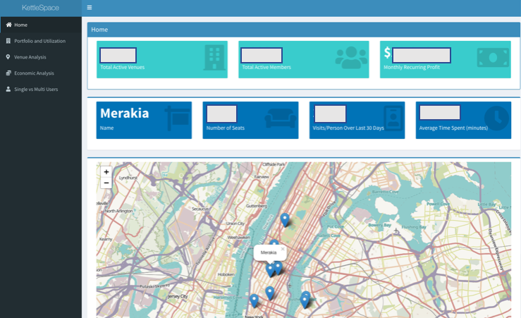
The homepage of the KettleSpace dashboard is designed for a quick snapshot of important KPIs. These value boxes update in real time anytime you open the app. We incorporated general KPIs for the company as well as giving the user the ability to view info about each individual venue by interacting with the map.
The first row of value boxes provides the total number of active venues, total active members, and overall monthly recurring profit. Although these numbers are not fluctuating much on a daily basis, they are good indicators of the “health” of the business and a good snapshot of the company's goals.
The second row of value boxes give more specific information about individual venues that are currently active. The information in these boxes update according to the user input on the map below. Clicking a specific venue will update the boxes to the most current values for that venue. These values are name, number of seats, average visits per person over the last 30 days, and the average time spent at each venue per person.
These boxes can be used to see which venues are being utilized by the customers more than others, while keeping in mind the size and location of the venue. The map below the value boxes gives the user the ability to switch between venues and quickly compare while looking at the relative location of each venue within the city.
Portfolio and Utilization
The second tab of the Shiny app we developed dives into the utilization of each venue in KettleSpaces' portfolio. Before delving into the details with the interactive graphs, we first highlight three key figures that constantly change with the real time data.
The first figure in the left box shows the total amount of people who became new KettleSpace members in the past 30 days. This can then be compared to the value in the second box which shows the average amount of new members per month in the present year. Finally, the box on the right shows the total historical amount of check-ins to any KettleSpace venue.

These three figures will remain at the top of the page as long as you stay on the "Portfolio and Utilization" tab. The bottom half of the page is a separate tab box with three different tab panels. The first tab panel shows a comparison of total and unique check-ins for each venue over any given date range. The data has been blocked out for confidentiality reasons, however, the values would have been shown using a bar graph with two bars for each venue (unique and total).

The above graph enables the user to observe how different venues compare with one another over a select time period. The observed values on the y-axis are the total check-ins and unique check-ins, where unique distinguishes one user checking in multiple times. The date range is very useful as different venues were opened/closed at different times and therefore by selecting the appropriate date you can observe a valid comparison between specific venues.
The second tab panel within this tab box is the ‘Check-in Comparison’.

This is similar to the first tab panel in that it takes a look at the total and unique check-ins. In this graph we compare the check-ins for each specific venue on a month-by-month basis in contrast to the first panel which compares check-ins across venues. This is particularly useful as it allows the user to single out a specific venue in any given year and see how its popularity increased over the course of that year. It also enables an insight into the seasonality of different venues and the portfolio as a whole.
The final tab panel makes an analysis of the percentage seat occupation of each venue throughout the day over any given time period.

As can be seen from the figure above, this tab panel lets the user select both the date range and also the specific venue to analyze. The graph shows the percentage of seats in the venue occupied at 15 minute intervals throughout the working hours of the day. It is possible, therefore, to change the date range to the current day and observe the live seat occupation of any particular venue.
This is a useful tool for the members as it enables them to find out which venues are currently busy or empty (quiet). In addition, this serves as a useful business tool as it provides an insight into the busy operating hours of a venue and enables the operator to accurately select its opening and closing times accordingly to optimize profit.
Venue Analysis
Venue analysis was organized into 3 viewable tabs: "Percent Visits", "Hours Utilized", and "New Members". "Percent Visits" gives a stacked percent bar chart, in which the x-axis shows the venue names and y-axis denotes percentage, that characterizes venues by their distribution of visit frequencies. The visit frequencies that are used for this bar chart are 1 visit, 2-7 visits, 8-13 visits, 14-19 visits, and 20+ visits with the aggregate of these categories summing to 1.
This chart illustrates how many users returned to each location following their first visit and how many users visited only once; furthermore, it offers start and end date range inputs that allows for the user to analyze each venues' performance over a certain time period. This is useful for determining which venues the community managers need to concentrate on for converting the "1 visit" users into multiple visit users.

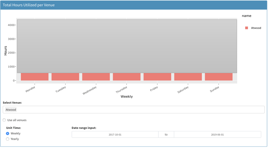
The "Hours Utilized" tab presents a bar chart titled "Total Hours Utilized per Venue" in which the x-axis can be day-of-week or month-of-year depending on if the user selects "Weekly" or "Yearly", respectively, and the y-axis represents the total hours utilized by the selected venues; a user may select as few or as many venues to view as they desire.
The user also has the date range input option to observe how the total hours utilized varies according to the chosen time period. Using this chart, one can determine the which venues in which day of the week or month of the year have the highest and lowest amount of total hours utilized.

The final tab, "New Members", shows a bar chart where the user can toggle between "Unit Time" options, "Weekly" or "Yearly", to determine whether the x-axis denotes day of the week or month and the y-axis represents the number of new members. This chart also offers the date range input option so the user may observe how the number of new member conversions changes based on the selected time period. One can analyze which days of the week and months of the year have the highest and lowest numbers of new members.

Economic Analysis
In the economic analysis menu item we explore and visualize the dollar aspect of KettleSpace. At the top of the page we displayed three KPIs including monthly recurring revenue, monthly recurring expenses, and monthly recurring profit. All three values are indicative of the present month of operation. Monthly recurring revenue takes into account the current members and their plan cost, monthly recurring expense is comprised of the cost of operations at all venues, and monthly recurring profit is obviously the difference between the revenue and expense.

In the “MRR” tab we explore the MRR utilization by venue. The amount of MRR that a venue is bringing to the company depends on the duration that members are spending at those venues. For example, if I have a membership that costs $50/month and I spend half my time at Baar Baar and the other half at McCarren hotel, the MRR gained by each venue from my membership is $25 each. This visual displays a stacked bar graph where you can see which venues are helping the company to bring in the most money. The user is able to filter by the year that they want to be shown.

The “Expenses” tab shows the total expenses spent on each venue at the present time. Again, the visual shows a stacked bar graph for each venue showing the expenses split between amenity cost, location cost, and manager cost per month. This chart gives great insight into how much the company is spending at locations and if the trade-off of how much the venue is gaining is worth it.

Lastly, we have the “Profit” tab which shows the company’s total MRR, total expense, and total profit over time. The graph is a time series line graph and the user is able to choose the year that they want to be displayed. This is the most useful indicator on whether the company is making money or not over time and how well they are doing compared to different months and years.

Single-Space Users VS. Multi-Space Users

The last menu item in our app is the “Single VS. Multi-Users”. The graph gives you the option to filter by location and year and displays the month and number of users in a bar chart. The comparison between single-space users and multi-space users is important in the optimization of the business.
If a venue has a majority of single-space users, meaning they solely go to one venue, if you were to close that venue it would have big negative repercussions compared to a venue who have a majority of multi-space users because in that case most the users of that venue could just go to the other venues they already visit. Exploring this type of trend will help KettleSpace maximize its profit.
Conclusion
We presented the visual dashboard to KettleSpace executives along with future suggestions on how to collect more efficient and useful data from their members. KettleSpace is quickly rising into a coworking powerhouse and taking advantage and learning from their data resources will be most valuable to their growth.

