Data Analysis on Stock Market Indexes after Trump's Win
The skills the author demoed here can be learned through taking Data Science with Machine Learning bootcamp with NYC Data Science Academy.
Introduction
This post is about the first of the four projects we are supposed to deliver at the NYC Data Science Academy Data Science Bootcamp program.
I framed the question for this project as, "How did world stock market indexes react to President Trump's win?"
What is a stock market index?
Let us begin with a simple example.
The ABC index is made up of four companies. As of the end of yesterday’s trading day, the ABC index was set at 4,123 points. Today, two of the companies went up in value, one company dropped in price and the fourth company stayed the same – the total value of those stocks went up by 2% so the ABC index is now 2% higher or 4205 points.
A stock market index (or just “index") is a number that measures the relative value of a group of stocks. As the stocks in this group change value, the index also changes value. If an index goes up by 1% then that means the total value of the securities which make up the index have gone up by 1% in value.
Major World Stock Market indexes
For analysis purpose, we divide the major world stock indexes based on regions: US, Global, Asia Pacific, Europe, Americas and others.
Before answering the question,"How did world stock markets react to Trump’s win?", it is also important to consider, "What did people predict about President Trump’s win and stock markets?"
Literature Review
CNN-money - October 24, 2016:
- “If Donald Trump wins the election, U.S. stocks (and likely many other markets overseas) will almost certainly tank”.
- Analysts bet on Clinton’s win.
The Telegraph, UK–Nov 5, 2016:
- “Global markets will be plunged into turmoil this week if Donald Trump wins the race for the White House, analysts have warned, with currency turbulence and a drop in US stocks not seen since the financial crisis”.
- “As Americans prepare to head to the polls on Tuesday, experts said a victory for the Republican presidential candidate would trigger short-term market ructions and inflict long-term damage on the world’s biggest economy”.
- Simon Johnson, a former IMF chief economist, said a Trump victory and the protectionist policies that might follow could take the world “back to the Great Depression in terms of the impact on trade and consequences”.
- Mr.Johnson, who has warned that a Trump victory could trigger a global recession, said that in a “nightmare scenario” the damage caused by the downturn would be “permanent ---on the economic side and in terms of the US in the world” .
The New York Times – Nov 9, 2016:
- Paul Krugman, “Still, I guess people want an answer: If the question is when markets will recover, a first-pass answer is never”.
What happened? Did their predictions come true?
This is my topic of interest. I collected data from Wall Street Journal (WSJ) for two years from Jan 2016 to Jan 2018. I used R, ggplot2, plotly and Shiny for analysis and visualization.
Source Data
I sourced the data from the Wall Street Journal. I had to collect two different kinds of data, on the one hand, daily data for the present scenario and on the other, ten years of data for comparison. For the first case, I downloaded the daily data for each major world stock index for two years from Jan 01, 2016 – Jan 18, 2018, directly from the website, whereas for the second case, I had to collect data for the period of ten years from 2008 – 2018 in order to compare the present scenario with the past history. This data was not available for download. I copied the tables to MS-Excel and then processed it using R.
The data was in very good quality so that I had to do almost no cleaning. Few of the index data were missing. But, as they were not major indexes, I removed those rows from the table. I converted dates which were in character format to date object, so they would become suitable for analysis.
Data Visualization in Shiny
The visualization of the data had to be done in Shiny, which is an open source R package that provides an elegant and powerful web framework for building web applications using R. Shiny helps you turn your analyses into interactive web applications . Furthermore, I used Shiny Dashboard to create a management dashboard-like application.
Start
First, I grouped the indexes, charts and maps based on regions and then added two more items for comparison. These are USA, Global, Asia Pacific, Europe, Americas, Others, Distribution Comparison and Comparison with the Past History (i.e., comparing 2018 with 2008-2017), which can be seen in the image below. Let us discuss them in detail.

Start
Region-based Tabs
Each of the tabs:USA, Global, Asia Pacific, Americas and Others are organized in the following manner.
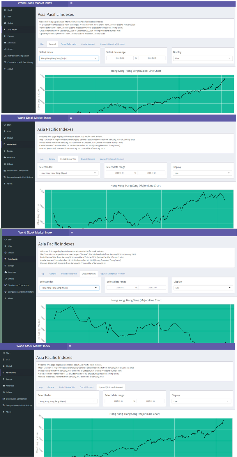
The main tab (region-based) page contains information about the respective region indexes. Each of the main tab (region-based) page has five sub-tabs.

Main Page of Region Tabs
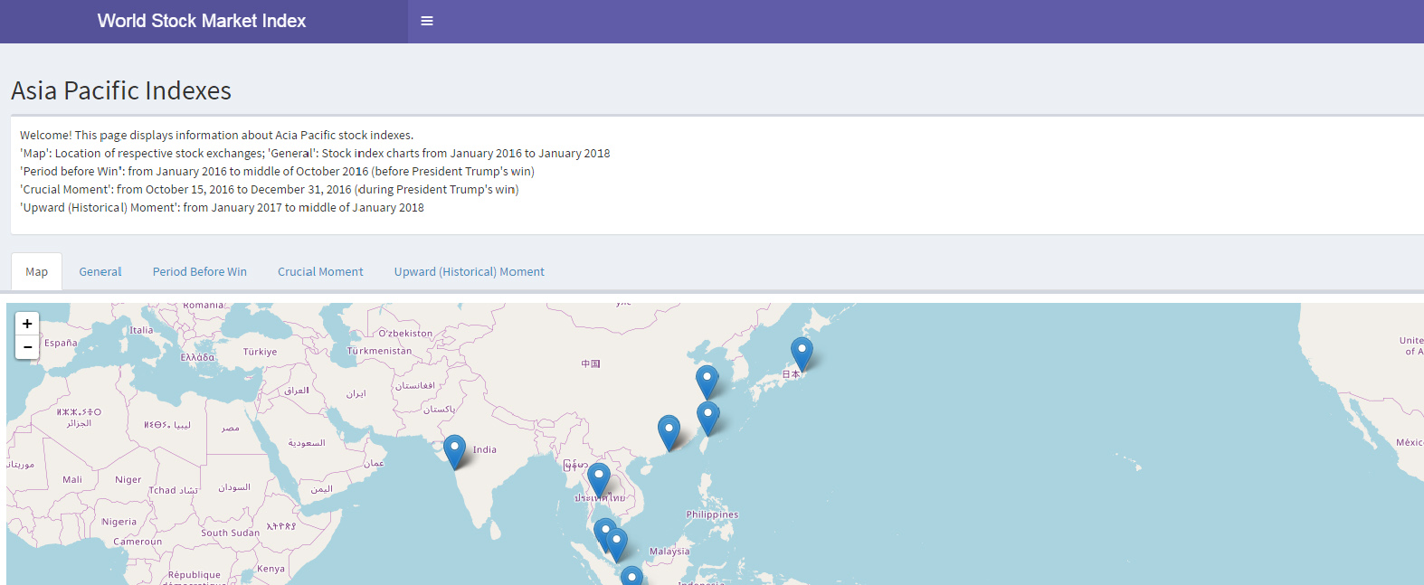
- The first sub- tab, 'Map', displays the location of the respective stock exchanges where the indexes are used. The other four sub-tabs display the closing price of respective region Stock indexes for different periods using various chart types.
- The second sub-tab 'General', gives information on the stock indexes for the entire period from January 2016 to January 2018.
- The third sub-tab, 'Before Trump's Win', displays information of stock indexes before President Trump's win, that is, from January 2016 to mid-October 2016.
- The fourth sub-tab, 'Crucial Moment', highlights the stock index values from October 15, 2016 to December 31, 2016. This period is the crucial moment of stock market because of U.S.Presidential elections and President Trump's win.
- The final sub -tab, 'Upward (Historical Moment)', gives information on stock indexes from January 2017 to the middle of January 2018. This period is the historical moment, because of the historical increase in stock market indexes over the period of ten years.
In each of the sub-tabs (except 'Map'), three select boxes are available, the first to select the index, the second to select date range and the third to select a chart to be displayed.
Different Chart Types

Sub-Tabs
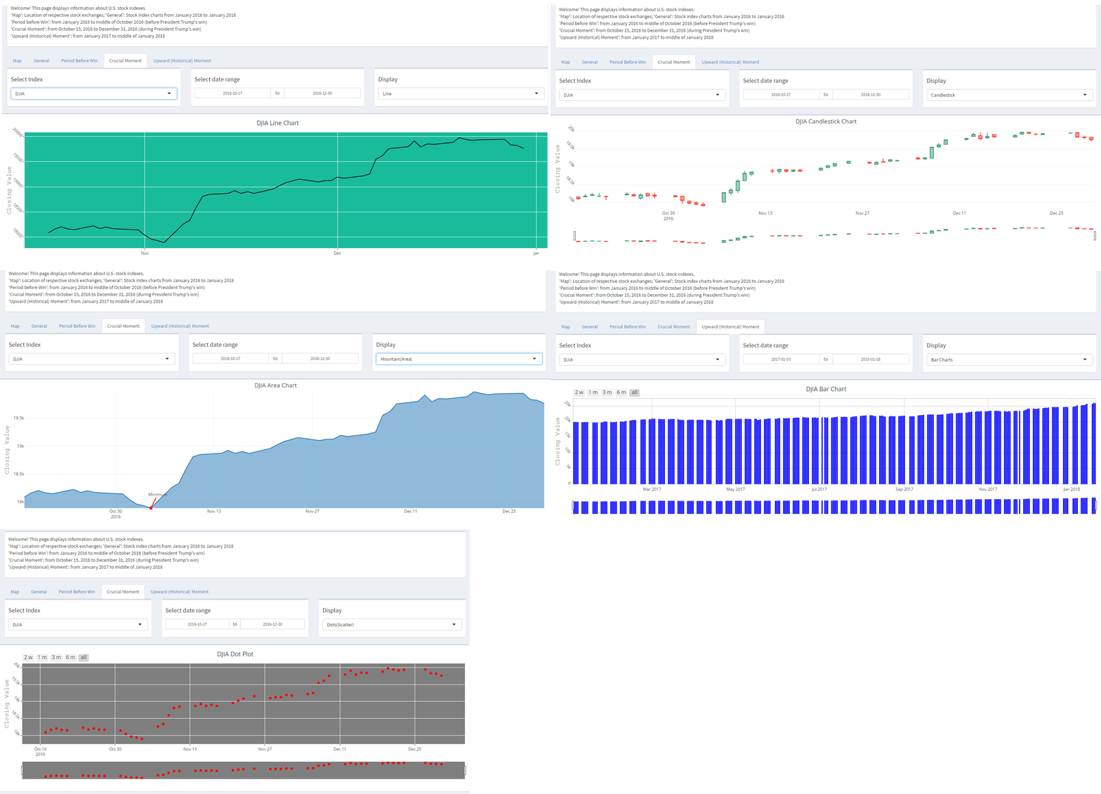
There are five different chart types available for display, which are line, candlestick, mountain (area), bar and dot (scatter) plots.
- Line charts display the line graph of Closing points of the index for various periods.
- Candlestick charts display the OHLC (open, high, low and close) values for various periods. In addition, sliders are available below the charts to zoom in and vary the periods for users choice.
- Mountain (area) charts display the area graph of closing values for various periods.
- Bar charts display the bar graph of closing values for various periods. In addition, sliders are available below the charts and selectors are available above the charts to vary the periods for two weeks, 1 month, 3 months, 6 months and the entire period.
- Dot plots display the scatter plot of closing values for various periods. In this case, sliders and selectors are available for users to interact with as well.

Various Charts for Display
Data Distribution Comparison
This tab allows users to compare the line graph of various major indexes simultaneously. This tab has four sub-tabs to compare the indexes in general period, before Trump's win, during 'Crucial Moment' and during 'Upward Moment'. This gives a clear picture of what was happening during the election week, how much the indexes went down, when they did recover and so on.
Some observations from this tab for the whole period:
- Almost all graphs follow an increasing trend, with ups and downs here and there.
- The exceptions are China Shanghai Composite and Mexico IPC, which also show an increasing trend but with lots of fluctuations.
We can’t just stop with an increasing trend. I wanted to get some more deeper insights. So, I focused on the 'Crucial Moment' and 'Upward Moment'.
Observations for 'Crucial Moment':
- Almost all curves have a dip during Nov 4, 2016 – Nov 10, 2016.
- US and global indexes, Euro Stoxx, indexes of Japan, France and Canada follow an S-shaped curve, i.e., they started to increase immediately from the week after the election. The S shape is uniform but the difference is that some curves started to increase from the week after the election, while some other curves, two weeks after the election and some Europe indexes started to increase from December 7, 2016.
- On the other hand, indexes of Asia Pacific and Americas show a decreasing trend, i.e., they could not recover at all until December 2016.
- The exception is China Shanghai composite, which showed a normal distribution, i.e., it increased immediately but then decreased. It could not maintain its state of level.

Crucial Moment Comparison
Observations for 'Upward Moment':
All curves show an increasing trend but with difference in shapes of the curves, that is, they took time to settle down.
Some indexes showed steady performance from Jan 2017, some from July 2017, while others (e.g., DAX in Germany) showed steady performance from Oct 2017. The exception is Mexico. It could not recover at all until Dec 7, 2017, but then it started to increase from Dec 11, 2017 on.

Upward Moment Comparison
Comparison with Past History
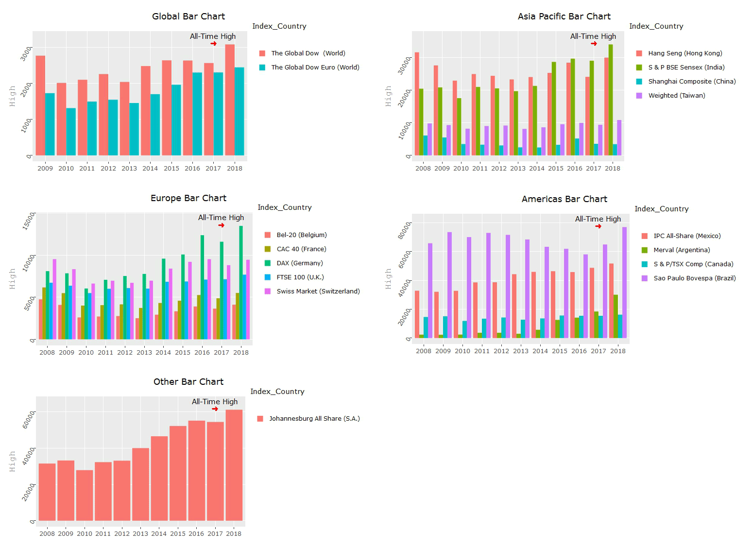
This tab displays bar charts of region-wise high values and percentage changes, for ten years, i.e., from 2008 - 2018. It has two select boxes, one to select the region and the other to select the variable (High or Percentage Change) to display for comparison.
This tab highlights what is so special and unique in Trump’s win.

All-Time High
Observations:
Almost all major indexes (with some exceptions) reached an all-time peak during this period (Jan 2018). This is the uniqueness in Trump’s win.
Advantages
- Even small companies around the world have gained a substantial amount.
- Majority of the investors have gained more than before in this period and in fact, some investors who might have waited patiently for ten years, must have reaped an unexpected huge gain in this period.
Conclusion
Almost all major indexes
- Show a dip during Nov 4, 2016–Nov 10, 2016, but the dip was not the minimum (except for Denmark and Iceland). The markets just reacted to uncertainty, but the dip did not become a historical calamity.
- Started to show steady performance uniformly from Oct 2017
- Reached all-time peak in Jan 2018
I collected data until Jan 18, 2018. The indexes were increasing (with fluctuations) until that period, but, some of them have started to decrease from last week. This leads to the following future directions.
Future Directions
- President Trump has recently set a target for Dow Jones Industrial Average (DJIA) to achieve 30000 points.
- Analyze the trend using various ML algorithms and predict...
- if DJIA will achieve his target
- when it will happen
- if it will go above the target
- how other world stock indexes would react
The data set provided a great way to apply Shiny. It was a great experience to work on this project. Thanks to NYC Data Science Academy for providing me a wonderful opportunity to work with ggplot2, Plotly, Leaflet Maps and Shiny Dashboard.
Code and data can be found on Github, while the app itself is online at shinyapps.io

