How safe is driving around New York City?
Contributed by Arda Kosar. He graduated the NYC Data Science Academy 12 week full time Data Science Bootcamp program took place between April 11th to July 1st, 2016. This post is based on his first class project - R visualization (due on the 2nd week of the program).
I moved to New York City (NYC) in October, 2015. I wanted to explore around the city however after some limit it is difficult to commute by public transportation, therefore I decided to apply for my driver's license.
Starting from March, 2016 I have been in the process of getting my driver's license. I was looking for a dataset for this project in NYC Open Data and when I saw this dataset I thought that this will be a good analysis especially thinking about the fact that I will get my license in one month and start driving and exploring around the city. This will be a beneficial analysis for me in order to get the idea of death rates caused by motor vehicle collisions around NYC.
I downloaded the dataset from NYC Open Data website.(Link for the dataset)
Before starting my analysis I had three questions in mind:
- How does number of deaths effected by Borough
- How does number of deaths effected by specific driving time in the day?
- How does number of deaths effected by the driving location (according to zipcodes)?
The dataset has 769054 observations and 29 variables.
Note 1: Also at this point it is important to mention that the data for the years 2012 and 2016 is incomplete therefore trend-wise I will compare 2013-2014-2015 however from the death count point of view I still wanted to see how the boroughs included in each year.
Note 2: This analysis is just for exploratory visualization for the dataset.
Note 3: The whole code for this exploratory analysis can be find here.
I imported the dataset to R. The required libraries were as follows:
After importing the data, I grouped it relating to my exploration questions:
1.HOW DOES TOTAL DEATHS CHANGE BY BOROUGH?
For the first section I analyzed the data by year and boroughs since I was exploring the change in total number of deaths by boroughs.
From the graph we can see that there is a decreasing trend for the past 3 years; 2013-2014-2015. Also from the stack sizes, Queens and Brooklyn seem to have the most number of total deaths. Staten Island seem to have the least number of total deaths however this results were not normalized by the population.
In my dataset I also have the data about total cyclist, pedestrian and motorist deaths. For exploring more I dig down and plotted the total death numbers for cyclists, motorists and pedestrians.
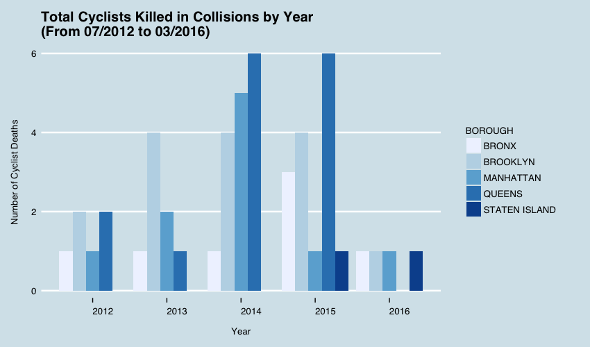
1.1 Total Number of Cyclist Deaths by Borough
Cyclist deaths in total is low. The maximum death / Borough is 6 people and again Brooklyn and Queens seem to have the highest number except for the year 2014, in which Manhattan had a higher number compared to Brooklyn. But for the past three years Brooklyn seem to have a constant rate and Queens' death rate is also tripled for the past two years compared to 2013.
1.2 Total Number of Motorist Deaths by Borough

If we examine this graph, we can easily observe some trends in the motorist death rates of Boroughs. Both Staten Island and Bronx have an increasing number of motorist deaths for the past three years. In the same period Brooklyn and Manhattan have a decreasing trend and Queens also decreased between 2013-2014 however remained constant after that.
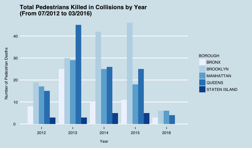
1.3 Total Number of Pedestrian Deaths by Borough
When we take a look at the Total Pedestrian Deaths by Year graph we can again interpret some trends among the Boroughs. Manhattan has a decreasing trend for the past three years. Queens and Bronx had an important drop in total pedestrian deaths in 2014.
I think the important trend in this graph is Brooklyn. As one can recall from the previous graph, Total Motorist Deaths by Year, Brooklyn seem to have a decreasing trend however total pedestrian deaths increased. Although this point can be analyzed further in future analysis, as a starting point an interpretation can be made. For the years 2013-2014-2015 the number of total people killed in Brooklyn is 67 people/year and total cyclist killed is also 4 people/year. We have a decreasing trend of motorist deaths and an increasing trend of pedestrian deaths. We can say that maybe the accidents in Brooklyn for the past three years, involve more car-pedestrian collisions instead of car-car collisions. An increase of 10 person/year, I think, is not a small number so I think this point should be analyzed further.
2- HOW DOES NUMBER OF DEATHS EFFECTED BY SPECIFIC DRIVING TIME OF THE DAY?
For my second exploration question I wanted to analyze total death numbers by some time ranges during the day. For this I used the package Chron. Because the class of my TIME column is "character". By using "times()" function in Chron package I converted my character TIME data to actual time data. The times are in 24 hour format since Chron is handling the TIME data in that way.
After that I filtered my original table according to following four ranges:
- Morning - (05:00 - 11:59)
- Midday - (12:00 - 16:59)
- Evening - (17:00 - 23:59)
- Night - (00:00 - 04:59)
From the Time of Day graph we can observe some peak ranges for each Borough. Evening time range which is between 17:00 - 23:59 seems to be the highest in most of the years for each Borough. Further analysis can be carried out for this point and for a starting point I thought there can be two reasons for this. First one is the evening rush hour which includes a high volume of cars, pedestrians and cyclists on the roads. The second factor can be irresponsible driving. Since I have "Contributing Factors" variable in my dataset, analysis of this variable connected with other variables can lead to some valuable insights about the contributing factors to the accidents in the evening time range.
2.1 Monthly Seasonal Analysis
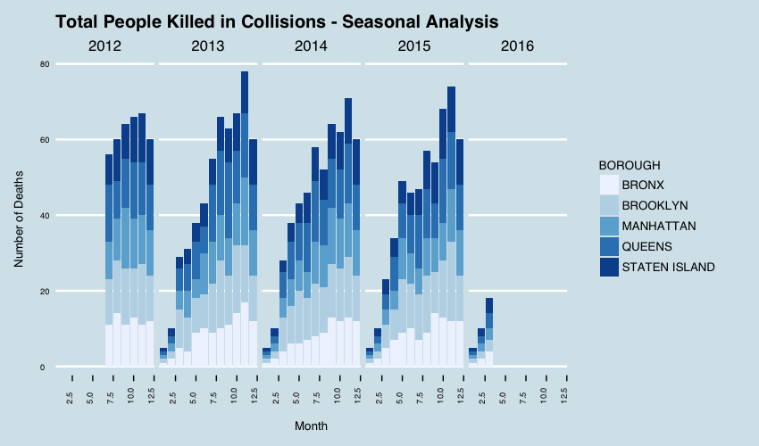
As an extension to my second exploration question, I wanted to explore if there is a trend going on in different seasons. In order to do this I grouped my data according to months and then filtered them according to the months of the seasons.
What I was expecting before plotting this part was that there should be a trend towards the end of the year, since the weather condition gets worse. The graph confirms that. We can see a trend towards the end of the year and it reaches its peak at the end of the Fall and at the beginning of the Winter.
3 - HOW DOES NUMBER OF DEATHS EFFECTED BY THE DRIVING LOCATION(BY ZIPCODES)?
For my last question I wanted to see the numbers on a map since from the first part of my analysis I concluded some interesting numbers for Brooklyn and Queens. I wanted to see how the number of deaths are distributed to the boroughs.
I used choroplethrZip since I have the zipcodes of the collision locations.
If we recall the analysis for the first question, Brooklyn and Queens have the highest number of deaths among the Boroughs and that we can also confirm from the Zipcode analysis. South East Brooklyn seem to have the highest number compared to other parts of Brooklyn, however the remaining part also has a high number compared to other Boroughs.
From the first part Queens also has a high death number however the north part of Queens seem to have 0 -2 total deaths which is low compared to other parts.
I was curious about the distributions of cyclist, pedestrian and motorist deaths on the map therefore I created 3 seperate maps for these 3 categories.
3.1 Total Cyclist Deaths by Zipcodes
In part 1 we said that the total number of deaths for cyclists were really low. From the map we can confirm that interpretation. Light blue represents zero deaths which we see all around the city. Some parts in Brooklyn and Manhattan has the most number of deaths in cyclist category.
3.2 Total Pedestrian Deaths by Zipcodes
We can see a cluster around south-east Brooklyn in which we also saw that the total number of deaths were higher compared to other parts of Brooklyn and also other Boroughs. South West Queens also has a higher pedestrian death rate compared to other parts. Manhattan, Bronx and Staten Island are at the low ends compared to Brooklyn and Queens.
3.3 Total Motorist Deaths by Zipcodes
We expect to see more deaths in South-East Brooklyn and from the map we can see that this is the case. Since Brooklyn also has the highest rates for the other two categories, I think it is worth inspecting Brooklyn and Queens deeper.
4 Conclusions and Further Analysis
As a conclusion, just from our initial exploratory analysis we can draw the following conclusions:
- The total number of death because of Motor Vehicle Collisions in NYC has a decreasing trend for the past 3 years.
- Brooklyn and Queens have the highest total number of deaths among NYC Boroughs.
- From the initial exploration there seem to be a change in the collision types in Brooklyn since the pedestrian death have been increasing and motorist death have been decreasing. Brooklyn collisions seem to involve more car-pedestrian type of collisions.
- A seasonal analysis showed that the number of deaths increases towards the end of the year and the maximum number of deaths occur generally at the end of the Fall and beginning of Winter.
Regarding my initial exploratory analysis there are a couple of points that can be explored further:
- In my dataset I have the data for where the collisions occur, as a Longitude and Latitude data. On top of this data there is also the information about the street collision occured and if it was an intersection the names of both streets. From this data the most dangerous intersections around NYC can be plotted on a heat map and this will clearly give a better idea.
- Another part of my dataset was the contributing factors to the accidents. I have the contributing factors for all sides who was involved in the accident. A contributing factor analysis can give a better idea what is causing most of the accidents. This can be further extended by Boroughs and by this we can get a clear view of especially Brooklyn and Queens


