Scrape My Professors: Comparing Institutions of Higher Learning by Department
Introduction
Choosing where to pursue or continue your education is a daunting task.
According to the Digest of Education Statistics, for the 2014-2015 academic year, the United States boasted more than 4600 institutions of higher learning. While there are many rankings available for colleges and universities (e.g., U.S News and World Report, Forbes, Business Insider), these rankings are based on the campuses as a whole, providing little insight into how similar departments compare across schools. An understanding of departmental quality is important because ultimately, students will spend a majority of their time in college enrolled in classes offered by a single department for their major. Therefore, the ability to compare schools both by overall quality and department would provide prospective students with the potential to make a more informed decision about their educational future.
This was the inspiration for Scrape My Professors, a Shiny app I created from student-submitted instructor reviews scraped from RateMyProfessors.com. The app allows users to compare:
- the differences in quality and difficulty ratings,
- how gender and attractiveness affect ratings,
- the most commonly used descriptive tags, and
- the most frequently used words in reviews
for professors in each department of the five New York City area community colleges with the highest enrollments: Borough of Manhattan CC, Nassau CC, LaGuardia CC, Kingsboro CC, and Queensboro CC.
See my GitHub for access to the code for this project.
The Data
RateMyProfessors.com (RMP) is an educator and institution ratings website designed to provide prospective students with information regarding overall campus life and current students with the ability to make decisions about which professors to take (or avoid).
Students are able to rate each institution on 10 metrics, including such attributes as happiness, food, safety, and reputation, and can rate each professor based on overall quality and difficulty. Additionally, students can attach up to three (of 20) descriptive tags to characterize their instructors, such as "Inspirational", "Tough Grader", and "Hilarious." They are also able to rate whether their professor is attractive by adding the famous "chili pepper" icon to their review. Finally, students can submit a 350-character review that is entirely open-ended.
Using Selenium with Python, I scraped the above professor attributes and the department to which the professor belonged for instructors with at least 50 reviews in each department of the five colleges. I set this threshold of 50 reviews because many campuses employ part-time or adjunct faculty that teach less often and likely have fewer reviews; thus, these professors may not accurately reflect each department. The sex of the professors is not listed on RMP, but I deduced the instructor's sex by enumerating the male and female pronouns found in the open-ended reviews.
In total, I scraped data from more than 50,000 reviews, including 633 professors in 55 departments. Because the student-raters themselves input departmental information for their professors, many similar departments were given different names, e.g., Biological Sciences and Biology. Therefore, after grouping department names, the final data set included 35 departments.
Analyses and Visualizations
For brevity, the following figures will only include reviews for the Accounting departments of each college. See my Shiny app to view more departments, and even different combinations of departments.
Below shows a comparison of the average difficulty and overall ratings of professors in the Accounting departments for each college. Overall, most schools show higher average overall than average difficulty ratings with the exception of Nassau CC, where average difficulty rating is more than 1 point higher than average overall rating.
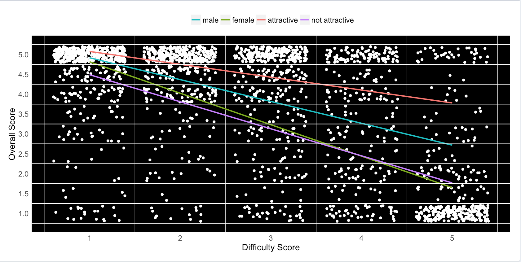
Unsurprisingly, difficulty rating is negatively correlated with overall rating for professors in Accounting. Unexpectedly, however, the strength of this relationship changes in the contexts of different personal attributes of the professor. In general, male professors and professors rated as attractive (irrespective of sex) are seen as better, less difficult instructors compared to female professors and those rated as unattractive (irrespective of sex). This figure is inclusive of all campuses, but users can toggle through each school on the app.
A complementary figure to the one immediately above shows the same data in a different way: difficult professors have a much lower average overall rating than less difficult ones.
Up to three descriptive tags can be attached to each review. Below shows the proportion of the "Lots of Homework" tag relative to all submitted tags for professors in the Accounting departments of all schools. Of the 20 available tags, this tag was submitted for nearly 25% of the reviews for Nassau CC Accounting professors, which is almost five times as often as Queensboro CC professors. Users can toggle both tags and departments on the app.
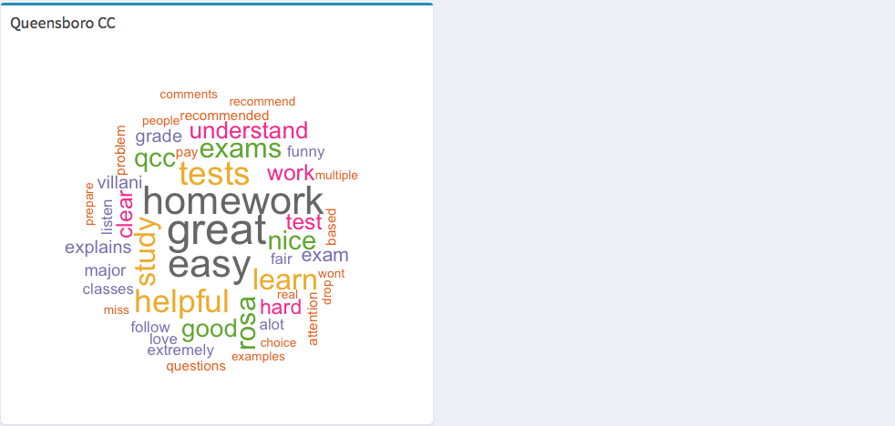
The figures below are called wordclouds. They are visual representations of the frequencies of different words found in a body of text. Each wordcloud represents the most commonly used words (with a frequency of at least 10, and a maximum of 100 words per cloud) in the open-ended student reviews for professors in each college's Accounting department. Larger text indicates higher frequencies of those words in the reviews. Following the trend from previous analyses, most campuses are viewed favorably with a majority of the largest words associated with each school relating to a positive sentiment, e.g., "good", "understand", "great", and "easy." Also following previous trends, the wordcloud for Nassau CC's Accounting department includes many large words relating to a negative sentiment, e.g., "worst", "horrible", "fail", and "hard." Kingsboro CC's wordcloud has fewer words because only a single professor was rated; thus, fewer words were used at least 10 times among that lone professor's reviews. Users can toggle through departments on the app.
Conclusions
The visualizations from Scrape My Professors provide users with a valuable tool to help them decide the college and department of major that are best for them. Through the examination of the Accounting departments of the five NYC community colleges, Nassau CC was consistently rated negatively, whereas LaGuardia CC and Queensboro CC were typically viewed most positively by students.
A criticism of the app, and of RMP, is that there is no method to regulate fabricated reviews. At RMP, credentials are not required to leave reviews, so the raters do not have to be students, and there is no limit to the number of reviews one individual can submit for each professor, possibly driving up or down a professor's ratings. However, in 2007, a study conducted by researchers at the University of Maine (UM) showed that RMP's overall and difficulty ratings significantly correlated with responses to similar questions found on UM's university-wide, formal instructor evaluations. The correlation coefficients for these comparisons were 0.68 and 0.44, respectively. These modest relationships reveal that RMP's ratings are, at least moderately, accurate representations of student opinion of UM faculty.
Future Directions
While Scrape My Professors can provide useful information for comparing colleges, it is limited in the volume of institutions that can be compared. With more time, future versions of the app should include a much larger pool of schools and professors across a larger region, perhaps one that is inclusive of all institutions of higher learning in New York.
Additional information from RMP, including the grade students received, whether the rater recommends their professor, or if readers found the review helpful, could be incorporated in the app to add more breadth to the analyses.
Finally, combining data from Scrape My Professors with information from RMP's institutional ratings, as well as data regarding cost of attendance, student performance (i.e., test scores), graduation rate and post-graduation success, and other common metrics of student success could lead to a powerful college recommendation system.


