Senti-Meter applied to US Governors
The skills the authors demonstrated here can be learned through taking Data Science with Machine Learning bootcamp with NYC Data Science Academy.
Background
What do you measure with a senti-meter? Sentiments, of course. In recent years, social media outlets have become a platform on which anyone can express emotions publicly. As per the information posted on Pew Research Center, 68 % of US Adults use Facebook, and about 21 % use Twitter. Social Media platforms can be viewed as vast reservoirs filled with information on human emotions. The purpose of this web scraping project is to assess if tweets could be used to measure the approval ratings of US Governors. The main objectives are as follows:
- Scrape tweets using Selenium.
- Quantify the sentiment in the extracted tweets.
- Provide insight on performance as a function of age, party affiliation and gender of governors.
- Identify key topics that are of interest to various states.
- Rank the governors (states) based on the sentiment analysis and compare the rankings with the recently published Morning Consult Governor Approval rankings.
The subsequent sections present the methodology including which data in the tweets are extracted, visualized and subsequently analyzed to come up with a sentiment score used to rank every governor.
Methodology
The methodology employed in this study is summarized in Figure-1. The first part of the study was focused on scraping tweets. Although, Twitter provides tweets extraction using API, it poses rate limits on a per user basis. Hence, a decision was made to use Selenium for web scraping due to its reliability even though it can be slow at times. To filter out irrelevant tweets from individuals with similar names as the governors, the tweets were sampled only if they had a reference to twitter verified @Governor handle.
For example, the official Twitter handle for the governor of New Jersey is @GovChristie. Once the Twitter handle was identified, it was used as the Twitter search term, and the resulting Uniform Resource Locator (URL) was used to scrape the tweets pertaining to the Governor of New Jersey. Tweets were not directly read from @Governor handle since this may be overwhelmingly positive or neutral.
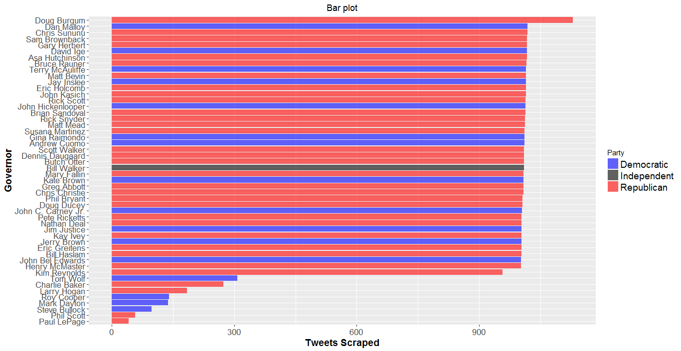
A similar process was adapted for the governors of the remaining 49 states. The objective was to extract roughly about 50,000 tweets (1000 tweets per governor and 50 states), but the program ended up scraping a total of 43,737 tweets (see Figure-2). This is partly because some of the @Governor handles were not very active on Twitter and generated fewer than 1000 tweets. The extracted tweets were saved in a csv file with a tag name identifying each governor.
Figure-1: Methodology
Figure-2: Visualization of total tweets scraped—a) by State (top); b) by Governor Name (bottom)
Once the data scraping was complete, postprocessing (Sentiment Analysis and Data Visualization) of the data was done on R-Studio. For the Sentiment Analysis, each tweet was cleaned up (using the functions ‘gsub’, ‘tolower’, ‘str_split’) and the individual words were matched with a word repository [1,2] with approximately 2006 positive and 4784 negative words (see Figure-3) to obtain a sentiment score [+1 if positive, 0 if neutral and -1 if negative]. For example, the sentiment analysis function would return the following scores (see TABLE-1)—
TABLE-1: Sentiment Score
| Example Tweet | Score |
| “Web scraping is exciting and fun” | 2 |
| “Web scraping is okay” | 0 |
| “Web scraping can be challenging at times” | -1 |
Figure-3: Some of the positive and negative words included in the word repository
Every tweet had an associated sentiment score that generated a statistical distribution for all the tweets for a governor. This approach was repeated for all the governors, which resulted in fifty sentiment distributions. The mean of every distribution was called the mean sentiment score, which was used to rank the governors. More details can be found in the Source codes posted on GitHub.
Data Visualization & Analysis
Several visualization tools are employed to better understand the effect of each variable on the sentiment score and are discussed as follows:
a) Political landscape: We begin the discussion by first identifying the states with Republican, Democratic or Independent governors. This is best visualized on a US map using the function ‘gvisGeoChart’ (see Figure-4). Clearly, there are 16 states with Democratic governors, 33 states with Republican governors and just one state with an independent governor.
Figure-4: Party affiliation of current governors [Republican, Democrat, Independent]
b) Mean Sentiment Score: Keeping Figure-4 as a reference, the mean sentiment score for every governor is plotted on the US map as seen in Figure-5. Green regions in this plot highlight an overall positive sentiment score highlight that the governor is doing well as per the analysis on the tweets. Red regions represent an overall negative sentiment score. Clearly, states like Iowa, Delaware, North Dakota and Utah are doing very well, while states like Minnesota, New York, Connecticut and New Jersey are not doing so well in terms of the sentiment score. This is better visualized using bar plots (Figure-6).
Figure-5: Mean Sentiment Score for current governors
Figure-6: Mean Sentiment Score for current governors (bar chart)
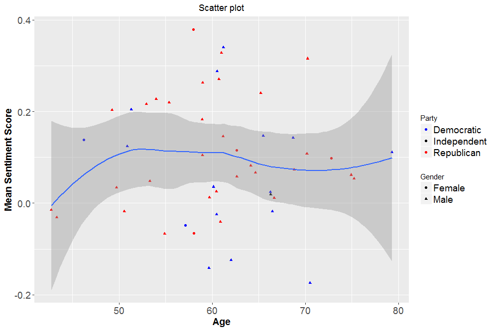
c) Effect of age, gender and party affiliation: With the complete data at our disposal, it is now possible to seek further insight on performance of the governors as a function of various groups [age, party affiliation (Democratic, Independent, Republican) and gender (Male, Female)] as seen in the box plots (Figures-7a,b,c). Under the assumptions of homoscedasticity, sampling independence and normality an ANOVA test was conducted with a null hypothesis claiming similarity between the means of mean sentiment scores between various groups. In each case, the resulting p-value was significantly greater than 0.05, thereby failing to reject the null hypothesis.
Figure-7: Mean Sentiment Score as a function of—a) Party affiliation (top); b) Gender (middle) and c) Age (bottom)
d) Analysis on the best and worst scores: The stage is now set to examine the tweets of governors with the highest and lowest sentiment scores. For the sake of this blog post, the focus will be only on the tweets of top three and bottom three governors (Even though Minnesota was at the bottom of the list in terms of the sentiment score, it is excluded from discussion in this section since the total number of tweets scraped was only 138, indicating that the sample size may not be representative when compared to other governors).
The resulting word cloud (minimum frequency=25 words) and the distribution of sentiment scores for these governors is plotted in Figure-8. It is interesting focus on the second tallest skyscraper (tower-2) in the distribution. Clearly, for the top governors, tower-2 is on the right side (positive) of zero and for the governors at the bottom, tower-2 is on the left of zero (negative).
Figure-8: Sentiment scores of —a) top three governors (top); b) top three governors (bottom)
e) Keyword search: Using the tweets scraped, it is possible to analyze the specific issues pertinent to individual states. The tweets were mined for four key words: health, tax, education and jobs. The results for the top three states are summarized in TABLE-2. From the analysis, it appears that while Ohio and Kentucky care most about health, Kansas and Idaho are focused on tax. Similarly, education is a high priority to Oklahoma, whereas Alabama and Michigan residents are focused on jobs.
TABLE-2: Keywords that are important to individual states
f) Rankings based on sentiment score and comparison to Morning Consult: TABLE-3 and TABLE-4 highlight the top-10 and bottom-10 list, respectively based on the Mean Sentiment Score. Also included is the governor approval rankings based on an independent study by Morning Consult, who surveyed 195,704 registered U.S. voters from April 1 through July 10 to determine these ranks. It is interesting to note that there is an overlap of 60 % on the top-10 list between Morning Consult and the current study based on tweets. Along similar lines, there is a 30 % overlap in the bottom-10 list with two other rankings being very close.
TABLE-3: Rankings (from top)
TABLE-4: Rankings (from bottom)
Conclusions
We can draw the following conclusions:
- Tweets can be used as a quick way to gauge the approval of governors (screening). It only takes few hours of coding and data processing when compared to conventional polling techniques that require significant funding and resources.
- The analysis presented can be further improved by taking inputs from multiple social media platforms, especially Facebook (with 68 % of US adults registered).
- Sentiment analysis can also be improved by constantly updating the list of positive and negative words as the society evolves with time.
- There is always a segment of population who do not use social media platforms to express emotions. This will have an impact on the data analysis.
- It would be interesting to study how predictions change as a function of the sample size of tweets.
- This study can be readily extended to gauge the sentiment towards presidents and presidential candidates as well.


