NYC Data Science Academy| Blog
Bootcamps
Lifetime Job Support Available Financing Available
Bootcamps
Data Science with Machine Learning Flagship 🏆 Data Analytics Bootcamp Artificial Intelligence Bootcamp New Release 🎉
Free Lesson
Intro to Data Science New Release 🎉
Find Inspiration
Find Alumni with Similar Background
Job Outlook
Occupational Outlook Graduate Outcomes Must See 🔥
Alumni
Success Stories Testimonials Alumni Directory Alumni Exclusive Study Program
Courses
View Bundled Courses
Financing Available
Bootcamp Prep Popular 🔥 Data Science Mastery Data Science Launchpad with Python View AI Courses Generative AI for Everyone New 🎉 Generative AI for Finance New 🎉 Generative AI for Marketing New 🎉
Bundle Up
Learn More and Save More
Combination of data science courses.
View Data Science Courses
Beginner
Introductory Python
Intermediate
Data Science Python: Data Analysis and Visualization Popular 🔥 Data Science R: Data Analysis and Visualization
Advanced
Data Science Python: Machine Learning Popular 🔥 Data Science R: Machine Learning Designing and Implementing Production MLOps New 🎉 Natural Language Processing for Production (NLP) New 🎉
Find Inspiration
Get Course Recommendation Must Try 💎 An Ultimate Guide to Become a Data Scientist
For Companies
For Companies
Corporate Offerings Hiring Partners Candidate Portfolio Hire Our Graduates
Students Work
Students Work
All Posts Capstone Data Visualization Machine Learning Python Projects R Projects
Tutorials
About
About
About Us Accreditation Contact Us Join Us FAQ Webinars Subscription An Ultimate Guide to
Become a Data Scientist
    Login
NYC Data Science Acedemy
Bootcamps
Courses
Students Work
About
Bootcamps
Bootcamps
Data Science with Machine Learning Flagship
Data Analytics Bootcamp
Artificial Intelligence Bootcamp New Release 🎉
Free Lessons
Intro to Data Science New Release 🎉
Find Inspiration
Find Alumni with Similar Background
Job Outlook
Occupational Outlook
Graduate Outcomes Must See 🔥
Alumni
Success Stories
Testimonials
Alumni Directory
Alumni Exclusive Study Program
Courses
Bundles
financing available
View All Bundles
Bootcamp Prep
Data Science Mastery
Data Science Launchpad with Python NEW!
View AI Courses
Generative AI for Everyone
Generative AI for Finance
Generative AI for Marketing
View Data Science Courses
View All Professional Development Courses
Beginner
Introductory Python
Intermediate
Python: Data Analysis and Visualization
R: Data Analysis and Visualization
Advanced
Python: Machine Learning
R: Machine Learning
Designing and Implementing Production MLOps
Natural Language Processing for Production (NLP)
For Companies
Corporate Offerings
Hiring Partners
Candidate Portfolio
Hire Our Graduates
Students Work
All Posts
Capstone
Data Visualization
Machine Learning
Python Projects
R Projects
About
Accreditation
About Us
Contact Us
Join Us
FAQ
Webinars
Subscription
An Ultimate Guide to Become a Data Scientist
Tutorials
Data Analytics
  • Learn Pandas
  • Learn NumPy
  • Learn SciPy
  • Learn Matplotlib
Machine Learning
  • Boosting
  • Random Forest
  • Linear Regression
  • Decision Tree
  • PCA
Interview by Companies
  • JPMC
  • Google
  • Facebook
Artificial Intelligence
  • Learn Generative AI
  • Learn ChatGPT-3.5
  • Learn ChatGPT-4
  • Learn Google Bard
Coding
  • Learn Python
  • Learn SQL
  • Learn MySQL
  • Learn NoSQL
  • Learn PySpark
  • Learn PyTorch
Interview Questions
  • Python Hard
  • R Easy
  • R Hard
  • SQL Easy
  • SQL Hard
  • Python Easy
Data Science Blog > Machine Learning > Understanding Class Imbalance and Ensemble Modeling in the Two-Sigma Connect: Rental Listing Inquiries

Understanding Class Imbalance and Ensemble Modeling in the Two-Sigma Connect: Rental Listing Inquiries

Glen Ferguson, Emil Parikh and Jason Chen
Posted on Mar 12, 2017

Introduction

The Two-Sigma connect challenge was to predict interest-level—high, medium, or low—of RentHop apartment listings in the New York City area. This is a classification problem that could ideally be solved using supervised learning. To understand the data, we plotted the interest levels to understand the relative number of each interest level. As can be seen in the plot below, the data has a class imbalance with a significantly higher number of low-interest listings than medium- and high-interest listings combined.

Picture1

An apt example of this imbalance is the ratio of the height of the tallest mountain in the world (Mt. Everest) to the height of the tallest building in the world (the Burj Khalifa). The Burj Khalifa, while extraordinarily tall, is dwarfed in comparison to Mt. Everest, as can be seen in the image below (the Burj Khalifa is in the orange box!). Thus, the crux of the project is how to classify the high- and medium-interest properties while still capturing the mountain of low-interest properties.

Picture2

Exploratory Data Analysis

Simple Features

One of the most interesting facets of the data was the effect of price on interest level. As can be seen in the chart below, the higher priced properties were much lower interest and had a significantly larger variation than those in other categories.  This difference indicates that the price is likely to be a significant variable in the data.

Picture3

Along with price, other “simple” features like a set number of bedrooms or bathrooms could be examined immediately. Those proved not to have as much impact on interest as price.

Involved Features

There were also factors that, while data rich,  were not quite straightforward and so could not be examined immediately. We needed to conduct feature engineering before extracting value for factors like photos, features, descriptions, and manager ID. While the number of photos, number of features, and word count of the description could be immediately calculated, the human interpretation of photo content, feature importance, and description content called for the application of advanced techniques in image processing and natural language processing.

Photos

To transform the photos into data, we first classified images using the Inception Model found in the Tensorflow Neural Network. While we were successful at classifying items in the images, the process was slow. To classify all ~300,000 images would have required more time than was possible to complete the project. In a second attempt, we used luminance, but this failed to differentiate among the photos. Finally, we used the mean and standard deviation of the red, green, and blue colors in the photos.

Features

The first step in extracting feature importance was standardizing names, e.g., “hi rise” and “highrise” needed to be grouped together as a single term. This standardized list was then transformed to a count using term-frequency-inverse document frequency (tf-idf). The result of this was 400 columns (for 400 terms) of tf-idf values. However, we had to reduce these 400 columns because, with our limited resources, our models would not run with so many predictors. To reduce these 400 columns in the final model, we used logistic regression with the 400 columns as predictors of interest level to form three columns that were predicted probabilities of high, medium, and low interest. These 400 columns were then combined with the remaining predictors to fit models by.

Description

The description column was transformed using two methods. First was to separate standard terms in the description by n-gram (a sequence of “n” contiguous words). The NRC library used to determine the n-grams. The most popular features included stainless steel appliances. The values were transformed using tf-idf and categorized using an SVM. This model failed to differentiate the interest levels and was not used in other calculations. The second method used to transform the description column was sentiment analysis, also based on the NRC Library and the tidytext R package. The sentiments used were positive, negative, anticipation, fear, anger, trust, surprise, sadness, disgust, joy, and anger. For each description, the number of words corresponding to each sentiment was counted and added to each sentiment column. These columns were then used in future models.

Manager ID

Another column that could have held significant value was the manager ID column. To use this column, we followed a Kaggle Kernel that classified the managers based on interest level. These values significantly improved our predictions in the validation portion of the training set but significantly increased the logloss (reduced accuracy) for the test set. We believe the inclusion of the output, interest level in the determining the values for the predictor resulted in leakage. The resulting models were over-fit to the data.  These features were removed in subsequent models.

Models

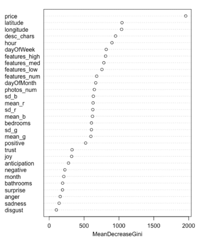
Using a random forest model, we calculated the relative importance of each variable (contribution to decreasing the Gini Index). The price variable, as expected from the EDA, was the most important variable, while the location (latitude and longitude) followed. The number of characters in the description was also important and the hour and day the listing was created were also critical. The sentiment features tended to be the least important.

Picture4

To check for correlation between the variables, we performed a Pearson correlation plot for the numerical variables. As can be seen in the chart below (strong blue is a higher positive correlation, and stronger red is a more negative correlation), the photo variables have a significant correlation.

Picture5

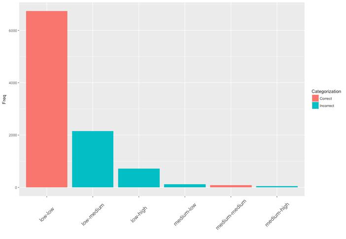
The models chosen for analysis included logistic regression, random forest, gradient boosting, and extreme gradient boosting. The use of increasing complexity was used to determine if simple models could predict the results and if increasingly complex models would capture different aspects of the data that could be combined. The logistic regression model used regularization including, ridge and elastic net. As can be seen in the bar plot of the confusion matrix below, logistic regression with elastic net failed to capture any of the high-interest values but performed well for the low-interest properties.

Picture6

We used the Ranger implementation of the random forest algorithm due to its improved speed. This model, using up to seven predictors for each decision tree, also did not perform well.

Picture7

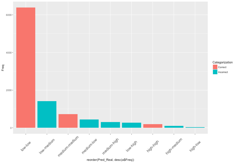
The gradient boosting method as implemented in the H2O R-package was also used. This model required some parameter tuning, but changes in these values did not result in a significant increase in accuracy. The values are shown below. While more high and medium values are predicted correctly, a significant number of low values were incorrectly predicted.

Picture8

XGBoost was implemented to due to its popularity and successful track record with previous Kaggle competitions. Although the model made decent predictions with its default settings. Tuning the model proved to be difficult, due to their large number. To save time, we experimented by manually tuning the learning rate and depth of trees until we minimized the error between the training and validation set. Like the other models, XGBoost proved very accurate in predicting listings with low-interest levels but did not perform as well in predicting high-interest listings.

Picture9

To improve these models by directly addressing the class imbalance, we used up-sampling and down-sampling. These methods respectively increase the number of observations for the minority classes and decrease the number of majority classes by random sampling. The number of observations is equalized in the resulting datasets before model training and could result in better predictions. The predictions from up- and down-sampled data did not significantly improve most models. For logistic regression, far more high-interest properties were correctly predicted, but a larger number of low-interest properties were incorrectly predicted. Final models only used the XGBoost method.

The final prediction was created from an ensemble of weighted XGBoost models. A base model, an up-sampled model, and a down-sampled model. The base model categorized most of the low-interest models correctly but predicted few of the high-interest models correctly. The up-sampled was the reverse, and the down-sampled was intermediate. A weighted average somewhat improved the accuracy overall but was comparable on logloss to the base model.

Conclusion

The lesson learned is that class imbalance and a lack of differentiating features resulted in difficulties in categorization. The use of up-sampling tended to improve the correct prediction of high-interest properties but tended to be poor at predicting low and medium interest properties. While a significant amount of time was spent on feature engineering, more time finding features that clearly differentiated between low, medium, and high-interest properties was critical to making the most accurate predictions. Model tuning, stacking, and ensembling did little to increase the accuracy of the predictions. For this competition, it would have been wise to spend significantly more time on feature engineering and less time tuning models.

About Authors

Glen Ferguson

Glen is an experienced professional who has used data to solve problems in many domain areas. He is currently a data scientist at NYC Data Science Academy, where he has used real-world data to solve problems. Glen worked...
View all posts by Glen Ferguson >

Emil Parikh

Data Scientist with professional experience in web scraping, predictive modeling, data visualization, and big data with intensive software development experience. Strength in interpreting and converting business needs into solutions. Quick learner and thorough planner with a passion for...
View all posts by Emil Parikh >

Jason Chen

View all posts by Jason Chen >

Related Articles

Capstone
Catching Fraud in the Healthcare System
Capstone
Acquisition Due Dilligence Automation for Smaller Firms
Machine Learning
Pandemic Effects on the Ames Housing Market and Lifestyle
Machine Learning
The Ames Data Set: Sales Price Tackled With Diverse Models
Meetup
Machine learning Uber vs. Lyft price prediction modeling

Leave a Comment

Cancel reply

You must be logged in to post a comment.

No comments found.

View Posts by Categories

All Posts 2399 posts
AI 7 posts
AI Agent 2 posts
AI-based hotel recommendation 1 posts
AIForGood 1 posts
Alumni 60 posts
Animated Maps 1 posts
APIs 41 posts
Artificial Intelligence 2 posts
AWS 13 posts
Banking 1 posts
Big Data 50 posts
Branch Analysis 1 posts
Capstone 206 posts
Career Education 7 posts
CLIP 1 posts
Community 72 posts
Congestion Zone 1 posts
Content Recommendation 1 posts
Cosine SImilarity 1 posts
Data Analysis 5 posts
Data Engineering 1 posts
Data Engineering 3 posts
Data Science 7 posts
Data Science News and Sharing 73 posts
Data Visualization 324 posts
Events 5 posts
Featured 37 posts
Function calling 1 posts
FutureTech 1 posts
Generative AI 5 posts
Hadoop 13 posts
Image Classification 1 posts
Innovation 2 posts
Kmeans Cluster 1 posts
LLM 6 posts
Machine Learning 364 posts
Marketing 1 posts
Meetup 144 posts
MLOPs 1 posts
Model Deployment 1 posts
Nagamas69 1 posts
NLP 1 posts
OpenAI 5 posts
OpenNYC Data 1 posts
pySpark 1 posts
Python 16 posts
Python 458 posts
Python data analysis 4 posts
Python Shiny 2 posts
R 404 posts
R Data Analysis 1 posts
R Shiny 560 posts
R Visualization 445 posts
RAG 1 posts
RoBERTa 1 posts
semantic rearch 2 posts
Spark 17 posts
SQL 1 posts
Streamlit 2 posts
Student Works 1687 posts
Tableau 12 posts
TensorFlow 3 posts
Traffic 1 posts
User Preference Modeling 1 posts
Vector database 2 posts
Web Scraping 483 posts
wukong138 1 posts

Our Recent Popular Posts

AI 4 AI: ChatGPT Unifies My Blog Posts
by Vinod Chugani
Dec 18, 2022
Meet Your Machine Learning Mentors: Kyle Gallatin
by Vivian Zhang
Nov 4, 2020
NICU Admissions and CCHD: Predicting Based on Data Analysis
by Paul Lee, Aron Berke, Bee Kim, Bettina Meier and Ira Villar
Jan 7, 2020

View Posts by Tags

#python #trainwithnycdsa 2019 2020 Revenue 3-points agriculture air quality airbnb airline alcohol Alex Baransky algorithm alumni Alumni Interview Alumni Reviews Alumni Spotlight alumni story Alumnus ames dataset ames housing dataset apartment rent API Application artist aws bank loans beautiful soup Best Bootcamp Best Data Science 2019 Best Data Science Bootcamp Best Data Science Bootcamp 2020 Best Ranked Big Data Book Launch Book-Signing bootcamp Bootcamp Alumni Bootcamp Prep boston safety Bundles cake recipe California Cancer Research capstone car price Career Career Day ChatGPT citibike classic cars classpass clustering Coding Course Demo Course Report covid 19 credit credit card crime frequency crops D3.js data data analysis Data Analyst data analytics data for tripadvisor reviews data science Data Science Academy Data Science Bootcamp Data science jobs Data Science Reviews Data Scientist Data Scientist Jobs data visualization database Deep Learning Demo Day Discount disney dplyr drug data e-commerce economy employee employee burnout employer networking environment feature engineering Finance Financial Data Science fitness studio Flask flight delay football gbm Get Hired ggplot2 googleVis H20 Hadoop hallmark holiday movie happiness healthcare frauds higgs boson Hiring hiring partner events Hiring Partners hotels housing housing data housing predictions housing price hy-vee Income industry Industry Experts Injuries Instructor Blog Instructor Interview insurance italki Job Job Placement Jobs Jon Krohn JP Morgan Chase Kaggle Kickstarter las vegas airport lasso regression Lead Data Scienctist Lead Data Scientist leaflet league linear regression Logistic Regression machine learning Maps market matplotlib Medical Research Meet the team meetup methal health miami beach movie music Napoli NBA netflix Networking neural network Neural networks New Courses NHL nlp NYC NYC Data Science nyc data science academy NYC Open Data nyc property NYCDSA NYCDSA Alumni Online Online Bootcamp Online Training Open Data painter pandas Part-time performance phoenix pollutants Portfolio Development precision measurement prediction Prework Programming public safety PwC python Python Data Analysis python machine learning python scrapy python web scraping python webscraping Python Workshop R R Data Analysis R language R Programming R Shiny r studio R Visualization R Workshop R-bloggers random forest Ranking recommendation recommendation system regression Remote remote data science bootcamp Scrapy scrapy visualization seaborn seafood type Selenium sentiment analysis sentiment classification Shiny Shiny Dashboard Spark Special Special Summer Sports statistics streaming Student Interview Student Showcase SVM Switchup Tableau teachers team team performance TensorFlow Testimonial tf-idf Top Data Science Bootcamp Top manufacturing companies Transfers tweets twitter videos visualization wallstreet wallstreetbets web scraping Weekend Course What to expect whiskey whiskeyadvocate wildfire word cloud word2vec XGBoost yelp youtube trending ZORI

NYC Data Science Academy

NYC Data Science Academy teaches data science, trains companies and their employees to better profit from data, excels at big data project consulting, and connects trained Data Scientists to our industry.

NYC Data Science Academy is licensed by New York State Education Department.

Get detailed curriculum information about our
amazing bootcamp!

Please enter a valid email address
Sign up completed. Thank you!

Offerings

  • HOME
  • DATA SCIENCE BOOTCAMP
  • ONLINE DATA SCIENCE BOOTCAMP
  • Professional Development Courses
  • CORPORATE OFFERINGS
  • HIRING PARTNERS
  • About

  • About Us
  • Alumni
  • Blog
  • FAQ
  • Contact Us
  • Refund Policy
  • Join Us
  • SOCIAL MEDIA

    © 2025 NYC Data Science Academy
    All rights reserved. | Site Map
    Privacy Policy | Terms of Service
    Bootcamp Application