US GDP Shiny App
In this blog post we introduce our US GDP shiny app. The purpose of this shiny app is to provide a tool for the general public to better understand the US economy. This app uses visualization to highlight the growth of the US economy, to understand the different growth paths among the different states, broader geo-regions, and different industry sectors. Having experienced an internet bubble and a gigantic financial crisis in the past 20 years, it is quite interesting to walk through the ups and downs of our economic development and to review the impact on different parts of our society.
Our data, downloaded from the Bureau of Economic Analysis, consists of several years of data from 1997-2015. Data is grouped in three ways: by state, by geographical region and countrywide. Data includes: GDP/GDP growth, personal income, population data, as well as the GDPs of the 20 major industry sectors on mining, constructions,..., government, etc.
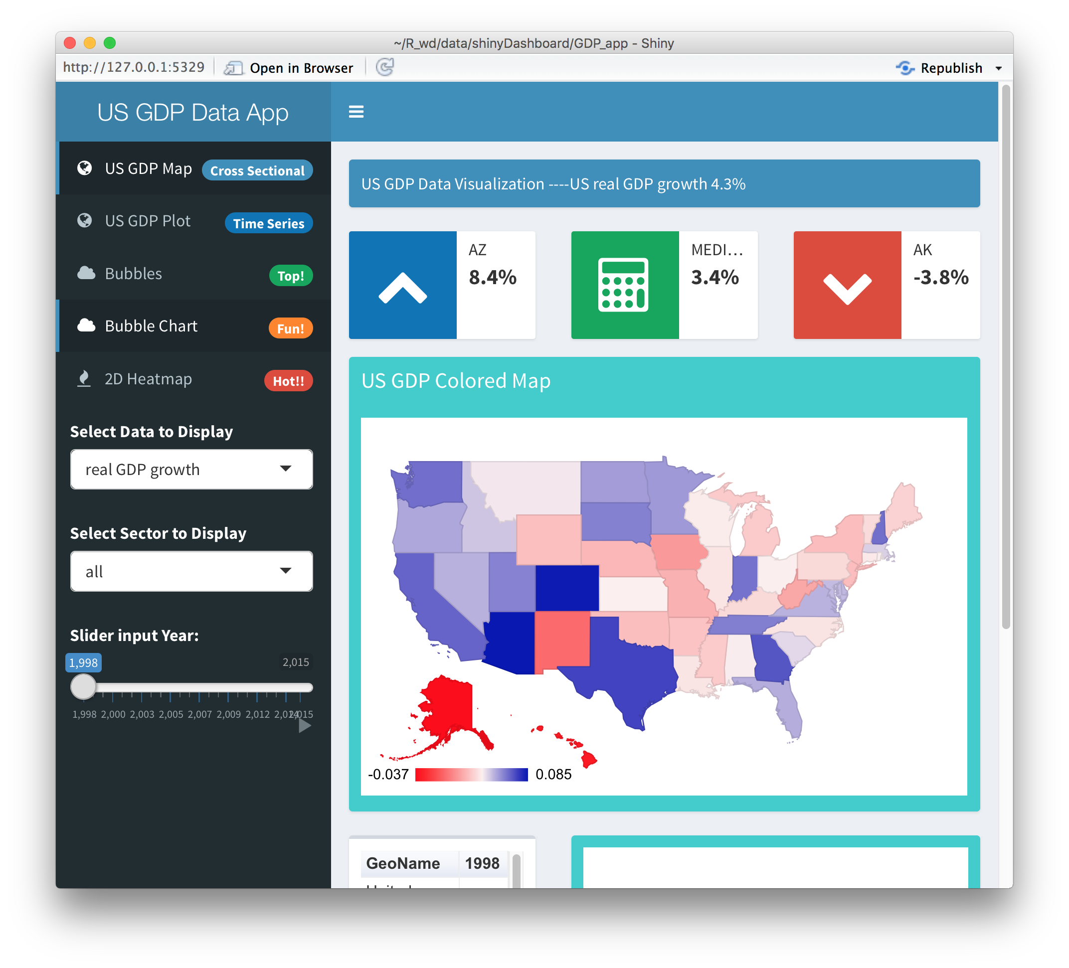
The US GDP Map
To visualize the geographic distribution of GDP growth, the front page of our app displays a colored US map, showing high GDP growth (blue) and low GDP growth (red). The user can choose from the drop-down input menu among nominal/real GDP, personal income per capita, etc. A slider controls the year variable to be plotted on the screen. Depending on whether the selected drop-down menu item has the sector attribute, a new sector selector will pop-up or disappear.
Through this map tool, we can visualize the economic strength of different states with ease. For example, it is easy to see that New York state is particularly strong in finance, Texas is strong in the mining/oil industry, and California is strong in agriculture, information industry, etc. We also notice that California, even though it has the largest GDP among the states, it does not have the highest per capita GDP. This may be due to its fast population growth.
On the second page, economic data is presented in a time series format. To avoid over-plotting the data, we only allow the user to choose between either two states or two regions and the time series plot compares their trends.
In the above screenshot, we display the joint plot of Texas and California real GDP. Due to its higher population, California has the upper hand throughout the duration of the data, 1997-2015.
2D Heat Map and Correlation
In the following discussion, we switch to a different angle, using our 2D heat map tool to investigate the time evolution of the GDP (growth), as well as the correlations among the different states, or the different sectors.
We illustrate this by displaying the state vs years 2D heat map below.
The reader will definitely notice a dark horizontal band across the heat map. This is a visualization of the 2008-2009 financial crisis!
The brightest segment on the heat map is North Dakota between 2007-2012. When the whole country suffered for the worst financial crisis since the great depression, North Dakota had an economic boom due to the rise of fracking.
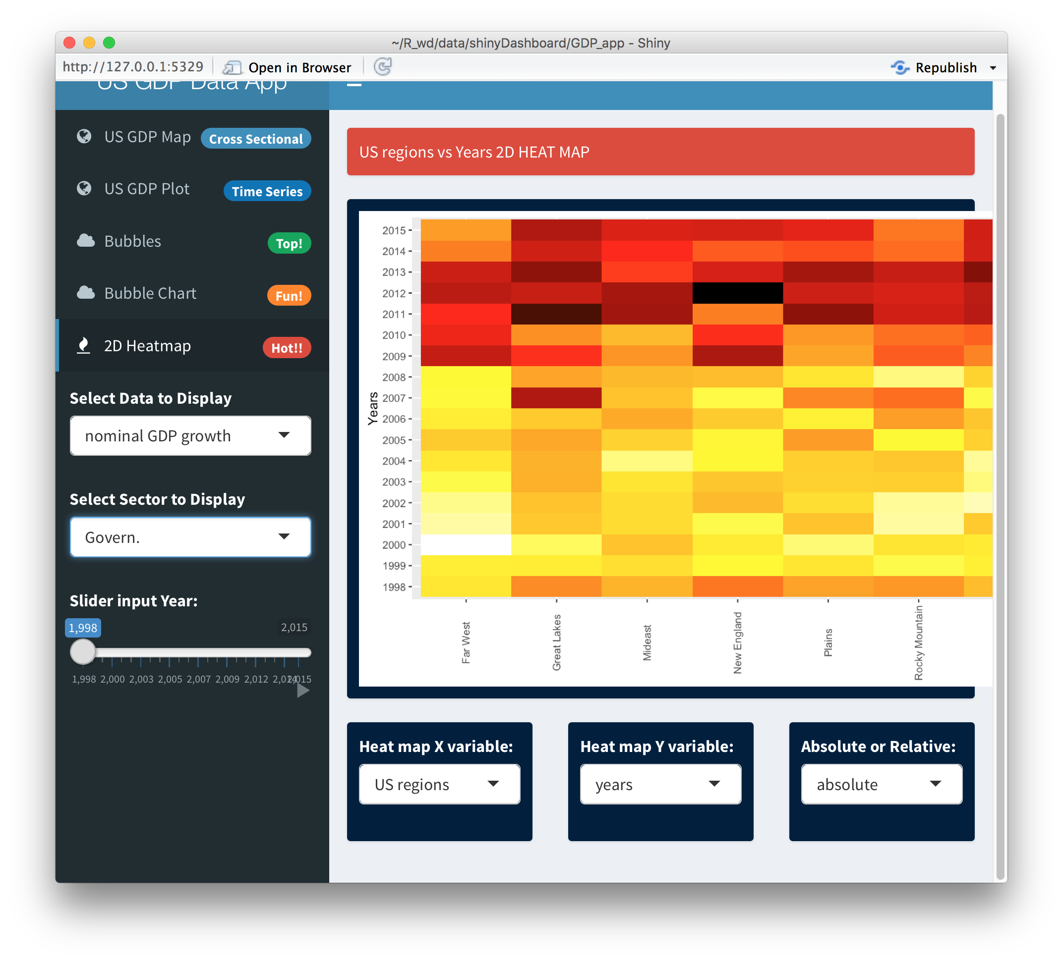
To demonstrate that the financial crisis has left a permanent mark on our economy, we display the region vs years 2D heat map for the government sector.
One cannot help but notice that the economic growth of the government sector (including the federal as well as the local and the state governments) was crippled after the financial crisis and has shown no signs of recovery.
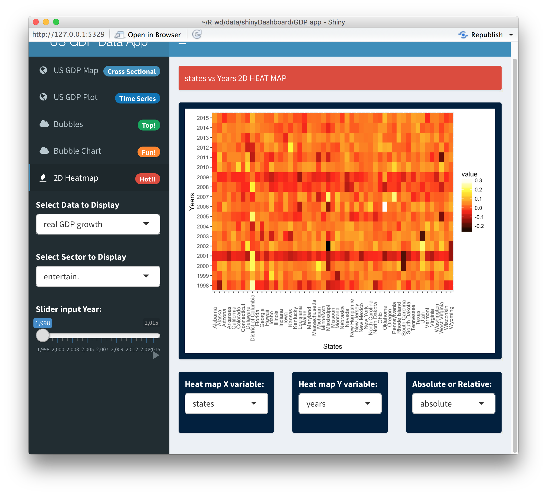
Another unusual example is the entertainment/movie industry.
For the entertainment industry we notice in the screenshot above that both the internet bubble and the financial crisis had severe negative impacts. This is not quite consistent with the common view that the financial crisis was more severe in magnitude than the earlier internet bubble. This is probably because people often cut their entertainment budget first when they face financial hardship.
The drop down menus below the 2D heat map allow us to choose combinations like state vs state, regions vs regions, or sectors vs sectors. When both of the X-Y variables are identical, the 2D heat map switches gear and displays the correlation matrices across different states, different regions or the different sectors. For example, we learn from the state vs state correlation matrix that most of the states' GDP growths are positively correlated. The only big exceptions to this observation are Alaska and North Dakota.
Alaska's economic dislocation from the rest of the country is probably related to its remoteness and the lack of the direct geographic contact with the mainland. North Dakota's unusual booming while the rest of the country went through an economic nightmare can be seen in the negative correlation in this particular time period (1998-2015).
Three sectors stand out in the sector vs sector correlation plot below.
The mining/oil sector has a very strong negative correlation with the other sectors' economic growth. Not as strong as the mining sector, the education and healthcare sectors have neutral or mild negative correlations with many other sectors. Both the commodity/energy sector's and healthcare sector's “out of sync” with most economic trends have been well recognized by the finance industry. In fact the finance industry has utilized the anti-correlations of energy/commodities with most other industries to establish commodity/energy funds, hedging away market risk.
The healthcare sector is known to be a 'defensive' sector, which tends to have lower drawdown when the economy is in recession. This is related to the constant demand on medical services even if the economy is in bad shape. These observations stand out in our visualization!
We finally remark that we also include two additional sections in the app, the bubbles and the bubble motion charts for a more dynamic visualization experience. The former allows us to use the animation slider to display a movie of the top N (with a user selectable N) states. For nominal or real GDP growth, we allow the user to choose two states and two sectors of interest and project GDP growth.
Our Main Conclusion
The US GDP data provides a wealth of insights about our country's recent development. The US GDP numbers are widely tracked by the world, which can be seen by the 50 million “US GDP” google search results! Beyond the superficial nominal GDP numbers often popping up on news headlines, it is not well known to the public that there are internal dynamics within different states and different industry sectors that can vary greatly from the major trends. Through building the shiny app, we hope that the general public and web enthusiasts, not only the economists or finance professionals, can appreciate the rich dynamics of the US GDP data and its influence on our day to day life.
For the younger generations who have not experienced the financial crisis first hand, this could be an educational tool.
The following link points to our shiny app,
We have adjusted the plot size using google chrome at its full screen mode.
The R Codes
We develop the Shiny app using the R language. Following the convention,
our codes are grouped into global.R (which handles the build-up of the environment), ui.R and finally the server.R.
For the global.R, it can be found at
For the design of the user interface, ui.R, it can be found at
To change the sliders, input depending on the user choices, we have to set up a
sequence of observers listening to the user's input,
To prepare the data set depending on the user's input, we have a section of reactive expression,
The section of codes plotting the US map and the info-boxes at the front page,
To plot the GDP time series, we have
To plot the various 2D heat maps and the correlation matrices, the codes are slightly lengthier,
We have two animation sections using bubbles to plot the states with top N (user chosen) GDP values,
and the bubble motion charts on the sector GDPs,


