Space Oddities – Where do Satellites Come From?
Contributed by Thomas Kolasa. He is currently in the NYC Data Science Academy 12 week full time Data Science Bootcamp program taking place between January 11th to April 1st, 2016. This post is based on his first class project - R visualization (due on the second week of the program).
For my data visualization project, I looked at artificial satellite data from the Union of Concerned Scientists. It concerns the 1,305 operational satellites orbiting Earth as of the 31st of August, 2015. While there have been fascinating visualizations of space debris done by Google Earth and others, the UCS data contain satellite origin locations and ownership information useful for analyzing the overall industry.
The Dataset
- Country of Origin
- Country of Operator
- Users
- Purpose
- Class of Orbit
- Type of Orbit
- Longitude of GEO
- Perigee & Apogee (km)
- Inclination (degrees)
- Period (minutes)
- Launch Mass (kg)
- Launch Date and Site
- Expected Lifetime
- Contractor
 (company or state)
 - Country of Contractor

- Launch Vehicle
Launching Countries
The data is collected from multiple sources. First, the Convention on Registration of Objects Launched into Outer Space requires that countries report satellite information to the United Nations Office of Outer Space Affairs. Even so, some countries neglect to report launches of covert satellites. However, other countries act as watchdogs, reporting when they detect a foreign satellite launch. Amateur astronomers also fulfill this watchdog role.
Next I examined the launching state of these satellites. While 25% of satellite origin countries are labeled “NR” (Not Reported), many of these are new satellites that are not yet labeled. These values are therefore missing at random (MAR) with respect to time and do not severely undermine the analysis. Using dplyr and ggplot2, I grouped the most active satellite origin countries and plot them on the world map:
group_by(sat_data, Country.Org.of.UN Registry) %>%
summarise(count_from_orig_country = n()) %>%
arrange(desc(count_from_orig_country))
## Source: local data frame [46 x 2]
##
## Country.Org.of.UN Registry count_from_orig_country
## (fctr) (int)
## 1 USA 399
## 2 NR 321
## 3 Russia 117
## 4 China 114
## 5 France 65
## 6 Japan 47
## 7 United Kingdom 32
## 8 India 30
## 9 Germany 22
## 10 Luxembourg 20
## .. ... ...
ggplot(data=new_world_map_df_sorted, aes(x=long, y=lat, group=group, fill=origins_per_country)) +
  geom_polygon() +
  theme(legend.position="bottom",
    axis.title.x=element_blank(),
    axis.title.y=element_blank(),
    axis.ticks=element_blank(),
    axis.text.x=element_blank(),
    axis.text.y=element_blank()) +
  scale_fill_continuous(name = "Origins per Country") +
  coord_equal() +
  ggtitle("Satellites by Country of Origin")
Launch Sites
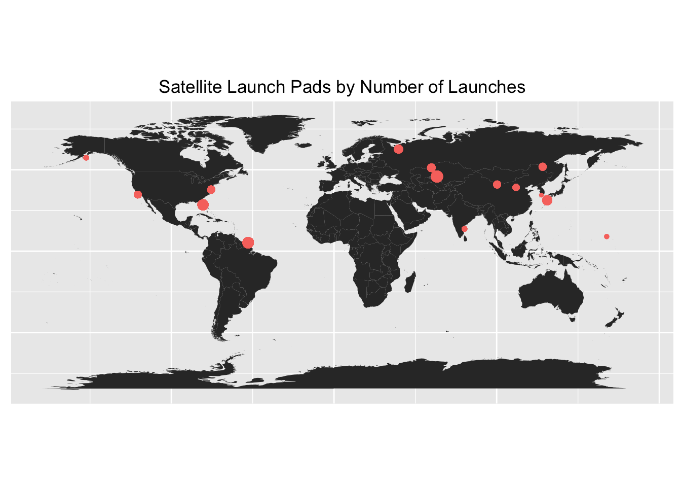
The launch site with the most satellites currently in orbit is the Baikonur Cosmodrome in Kazakhstan, one of the main launch sites of the Russian space program. The second busiest launch site is in French Guiana where the European Space Agency performs most of its launches.
group_by(sat_data, Launch.Site) %>%
summarise(Launches_per_site = n()) %>%
arrange(desc(Launches_per_site))
## Source: local data frame [23 x 2]
##
## Launch.Site                       Launches_per_site
## (fctr)                            (int)
## 1 Baikonur Cosmodrome             253
## 2 Guiana Space Center             210
## 3 Cape Canaveral                  187
## 4 Vandenberg AFB                  142
## 5 Plesetsk Cosmodrome             88
## 6 Dombarovsky Air Base            67
## 7 Taiyuan Launch Center           58
## 8 Xichang Satellite Launch Center 51
## 9 Jiuquan Satellite Launch Center 47
## 10 Wallops Island Flight Facility 41
## .. ... ...
And here are launch locations on the world map:
launch_site_df = group_by(sat_data, Launch.Site) %>% summarise(Launches_per_site = n())
ggplot() + geom_polygon(data = map_data("world"), aes(x = long, y = lat, group = group)) +
geom_point(aes(x=sat_data$Launch.Longitude,
y=sat_data$Launch.Latitude,
col="red",
size=launch_site_df$Launches_per_site[sat_data$Launch.Site])) +
theme(legend.position="none",
axis.title.x = element_blank(),
axis.title.y = element_blank(),
axis.ticks = element_blank(),
axis.text.x = element_blank(),
axis.text.y = element_blank()) +
coord_equal() +
scale_size_continuous(range = c(1, 3.5)) +
ggtitle("Satellite Launch Pads by Number of Launches")
Other Launch Sites
There are currently 26 working satellites in orbit launched from Odyssey, a mobile drilling rig turned launch pad.
Source: https://exploringbeyondfinalfrontiers.wordpress.com/tag/eutelsat/
Four other sea launches took place. While the dataset lacked more details, submarines are also capable of launching small satellites into orbit. Since a submarine can launch from nearly anywhere in the open ocean, this is currently the most likely way that a completely anonymous satellite can enter orbit.
One current satellite was launched from an L-1011 Aircraft, as shown here:
Source: https://i.ytimg.com/vi/m7_yyvGxwrE/hqdefault.jpg
24 satellites were launched from the International Space Station. While I originally thought this classification was due to human error, small research satellites do launch from the ISS (shown below). The data show they are research satellites of approximately 4kg of mass each and are in polar low earth orbits.
[youtube https://www.youtube.com/watch?v=AdtiVFwlXdw&w=560&h=315]
The dataset groups the uses of satellites into civil (academic or amateur), commercial, government (meteorological, scientific, etc.), or military. I next looked at these purposes by the three largest satellite launching countries and others. I also looked at the “Not Reported” country of origin of satellites to identify any trends.
Orbits
The types of artificial satellite orbit are Low Earth Orbit (LEO) under 2,000 km in altitude, Medium Earth Orbit (MEO) between 2,000 km and 35,786 km in altitude, Geosynchronous Orbit (GEO) at 35,786 km in altitude, and Elliptic Orbit which deviates from the previous near-circular orbits. The majority of working satellites are in low Earth orbit, but they are also the most likely to first burn up in the atmosphere. With the exception of the Apollo missions, astronauts have only flown low Earth orbits.
## Source: local data frame [4 x 2]
##
##   Class.of.Orbit number_per_orbit
##           (fctr)            (int)
## 1            LEO              696
## 2            GEO              481
## 3            MEO               87
## 4     Elliptical               41
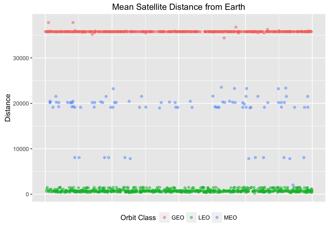
I estimated the distance of a satellite from the Earth to be the mean of its Perigee and Apogee. While excel has conditioned many of us (including me) to simply plot group means on bar charts for comparison, the following plot presents more facets about the data. By presenting a scatter plot with jittering, it visualizes each orbit type’s mean distance from Earth and its distance variance.
ggplot(orbit_class_df_small, aes(1, Distance, col=Class.of.Orbit)) +
  geom_point(alpha=.5, position=position_jitter(width=1)) +
  theme(legend.position = "bottom",
        axis.title.x = element_blank(),
        axis.text.x = element_blank(),
        axis.ticks.x = element_blank()) +
  scale_colour_discrete(name = "Orbit Class") +
  ggtitle("Mean Satellite Distance from Earth")
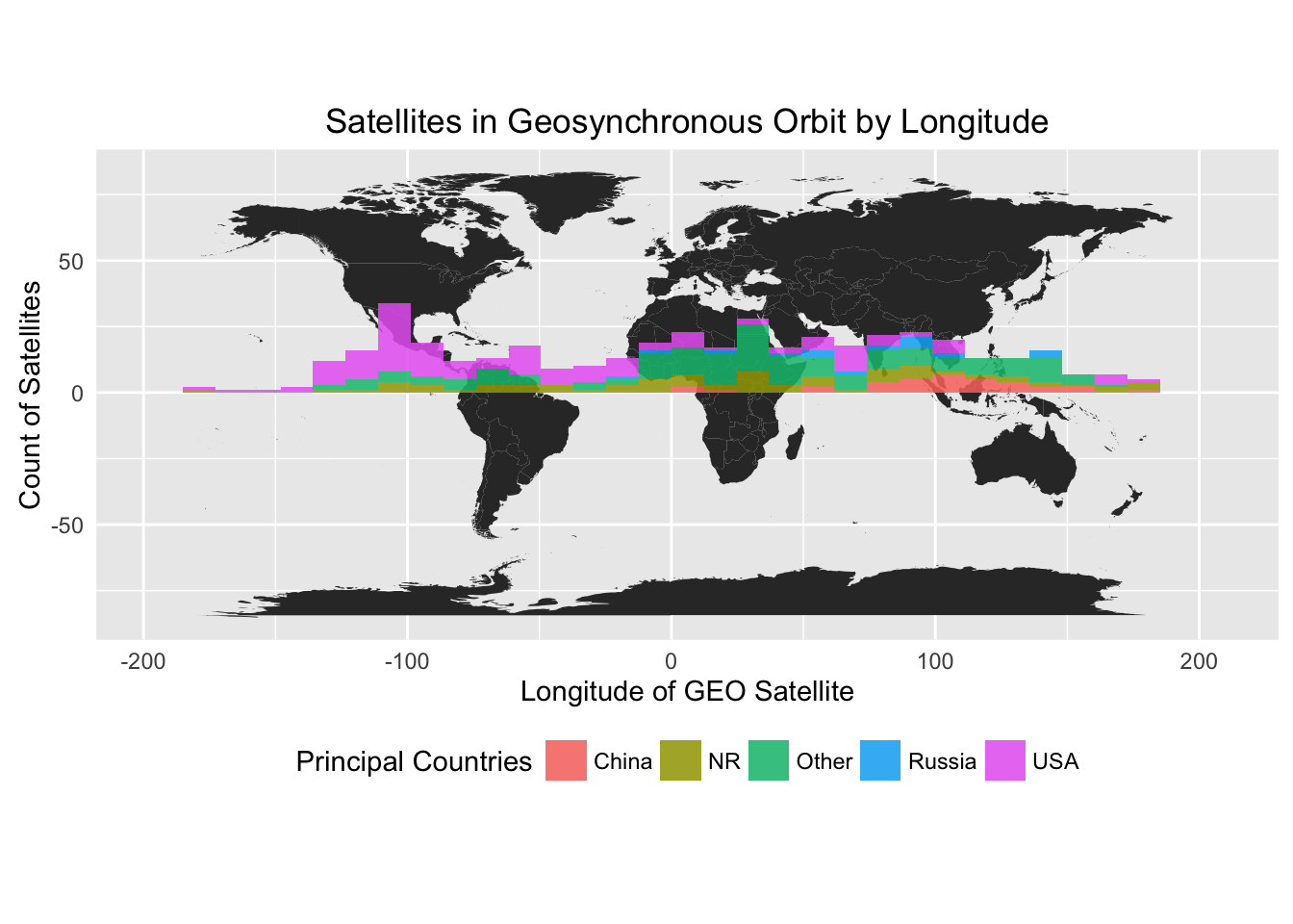
The majority of geosynchronous orbiting satellites are ± 1 km of the equilibrium distance of 35,786 km. Even though the UCS dataset claims not to give enough information to find a single satellite’s exact location, it does contain the longitudes of geosynchronous satellites. Since geosynchronous satellites orbit above the equator at the same rate as the Earth’s rotation, I was able to plot the locations of geosynchronous satellites based on their longitudes. Positive longitudes correspond to “degrees east” and negative longitudes correspond to “degrees west”.
Visualizing Satellite Distance Using a D3.js Scatter Plot
My next exploration of the data tried out the JavaScript library D3.js. The following visualization once again shows satellite distance from Earth randomly jittered along the x-axis, this time with detailed satellite information on hovering. Selecting specific countries allows the user to investigate specifics about a country’s satellites, including a satellite name, country of origin, overall use, and detailed purpose.
Although I formatted the plot for an R Markdown, WordPress does not support JavaScript. You can see the scatter plot here and the corresponding code below.
See the R data cleaning and visualization code in its GitHub Repository
See the D3 code's Github repository


