Voyage to the intelligent music streaming service: Ep 1. The analysis of Top ranked Songs and Artists
Prologue
Previously in 2012 and 2013, I had worked on developing a Music Recommendation System algorithm based on gathered information from sensors of smart phones. There were some reasons not to be implemented in mass production, but the critical one was processing time of big data and its clustering, which was not efficient for applying real-time engine at that time. Now I am rebooting this project from the scratch by myself. This journey will cover not only for the music recommendation system but also for all the smart artificial intelligence system. Even though I am not aware of where the end of this travel is, enjoying it would enough.
My journey start with an analysis of the current music streaming trend by using database from Spotify.
Why Spotify ?
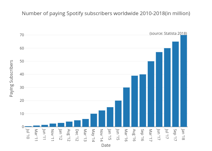
The Spotify is a music streaming service founded in 2006 in Sweden, which provides convenient user interface to listen to music and share playlists with other users in two ways: one is free of charge with advertisements, the other is to purchase a subscription for unlimited ad-free music streaming. According to the recent statistic provided by Statista gives information on the number of paying subscribers to Spotify's music streaming service. As of January 2018, Spotify had 70 million paying subscribers worldwide, up from 60 million paying subscribers in July 2017. This rapid and steady growth of paid subscribers give a good reason to investigate current trend of music for many data scientists.
Data Source
Spotify data set in Kaggle has been used for the analysis.
- spotifys-worldwide-daily-song-ranking (for this analysis)
- top-tracks-of-2017 (for additional information)
- every-song-you-have-heard-almost (for lyric analytics)
- world-cities-database (for city mapping)
The first data set has been mainly used here. This contains the daily ranking of the 200 most listened songs in 53 countries from 2017 and 2018 by Spotify users. It contains more than 2 million rows, which comprises 6629 artists, 18598 songs for a total count of one hundred five billion streams count. Each row contains a ranking position on a specific day for a song. For instance, the first 200 rows present the ranking for the 1st of January in Argentina. The following 200 rows will contain the ranking for the 2nd of January in Argentina. The regions are alphabetically sorted. To build an interactive shiny app efficiently, every 100 ranking songs and artists in each country are filtered out. The reduced data set is as below:
| RANKING | TRACK_NAME | ARTIST | STREAMS | DATE | REGION |
| Min. : 1.00 | Length:1874422 | Length:1874422 | Min. : 1001 | Length:1874422 | Length:1874422 |
| 1st Qu.: 24.00 | Class :character | Class :character | 1st Qu.: 4004 | Class :character | Class :character |
| Median : 49.00 | Mode :character | Mode :character | Median : 12341 | Mode :character | Mode :character |
| Mean : 49.25 | Mean : 70325 | ||||
| 3rd Qu.: 74.00 | 3rd Qu.: 44110 | ||||
| Max. :100.00 | Max. :11381520 |
Motivation
The trend analysis will give us to explore how artists and songs' popularity varies in time. By using the daily ranking of the 100 most listened songs in 53 countries listened by Spotify users,
- track the current trend of music and forecast the next trend;
- track the flow or influence of top ranked musics from one country to another, then make some insight of business model for commercial service such as localized advertisement;
- make a distribution/influence map by region, country, genre(music categories), and other information (such as season, weather, social event, etc);
- check a possibility to develop a music recommendation service based on user-preference.
Insights
Predict
- what type of songs will be popular in the future?
Forecast
- what is the next trend of music in this country?
Share
- how are popular songs propagate country by country?
Pattern
- can we categorize countries by their music trend?
Dominant factors
- something common in lyrics, ranks, or artists ?
Business Models
- what kind of features make a tendency or trend in this field?
Influence Map
- how long does a top ranked songs take to get into the ranking of neighbor countries?
Recommendation Service
- is this possible? Any pattern? Any user-preference country by country?
All of these queries will be anwered one by one during this journey, and the visualization app built in this episode would be the first set foot for an intuitive grasp.
Data Analysis
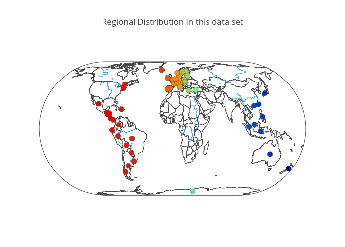
There are 53 countries categorized to 'region' in this data set. Nine of them are in Asia, 26 in Europe, 16 in South America, and 2 is Canada and the United States. Currently no countries form Africa and Middle East are included. The distribution is as shown in the below map. This data set has been provided by Spotify, and it is probable that when the countries have more influential local music streaming service provider, the subscriber of the Spotify could be too small to be counted on the data statistics. For example, there are three major music streaming service companies in South Korea, and their market-share is more than 90% in total.
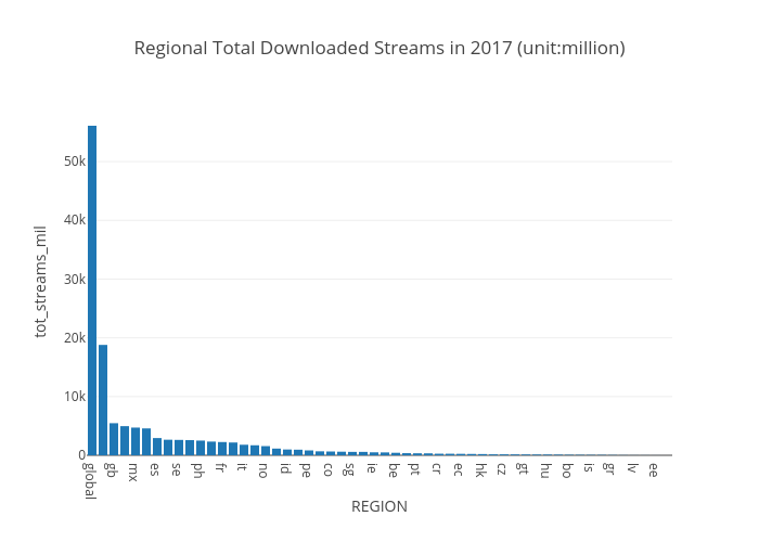
Total aggregating result of the number of all 'streams' by countries shows that a streaming power - the number of streams downloaded a year - is concentrated on some of countries such as the US, Great Britain, Brazil, Mexico, etc. When we see the top 10 countries - 'The USA', 'Great Britain', 'Brazil', 'Mexico', 'Germany', 'Ecuador', 'Netherlands', 'Sweden', 'Australia', 'Philippines' - not all the countries speaks English as a first language. So the streaming power has nothing to do with a language, however we can think that the Spotify is a powerful streaming-service provider in these countries. This makes sense why Sweden is in top 10. For an in-depth analysis on the trend and tendency, the first top 7 to 10 countries will be in initial research stage.
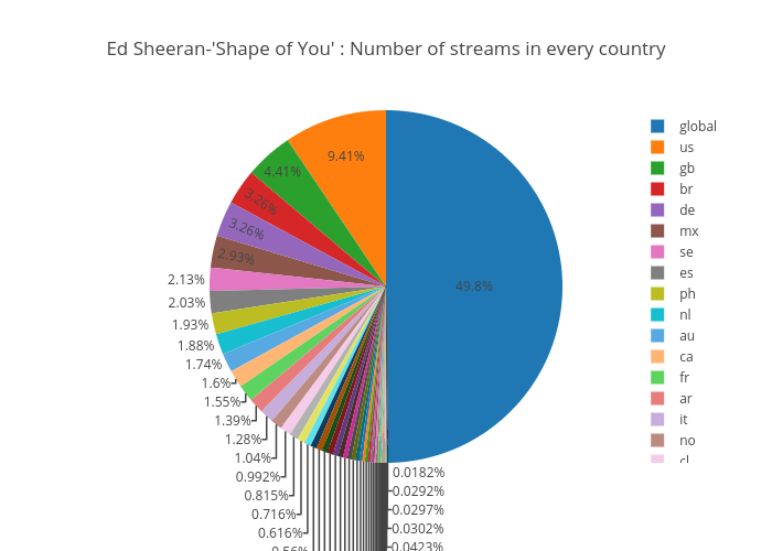
In a wide common sense, there is strong correlation between top songs and top artists, so the "Shape of You" and Ed Sheeran does. They were both very popular on Spotify in global 2017 based on the below table which is calculated by maximum downloaded stream.

* global, us, gb(GreatBritain), mx(Mexico), br(Brazil), de(Germany), es(Ecuador), se(Sweden)
When we aggregate the number of download-streams for the 'Shape of You' in each country, the top rank of countries described in below pie chart is almost same for the calculated streaming power list. There is only a small amount of order difference.
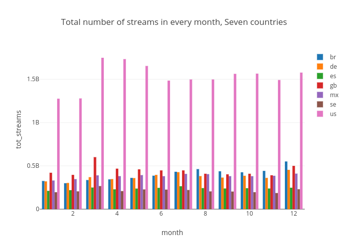
To find out some patterns in the time series, the number of streams are measured in monthly basis over top seven ranked countries for streaming power. There isn't a big significance but we can see that the number of streams in January and February are significantly lower than other month. Why? Are people too busy to listen to music in January and February ? Or not many music has been newly released ? With this data set, it is difficult to say there is a significant tendency in the first quarter of the year. This may happened only in 2017. For a clarification, further data set will be explored later - at least for 2015, 2016.
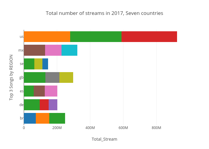
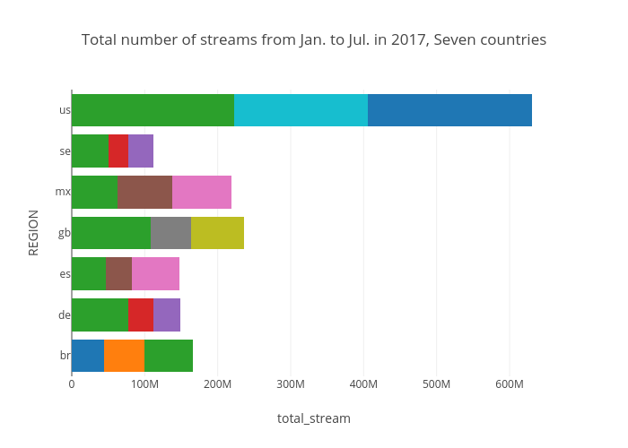
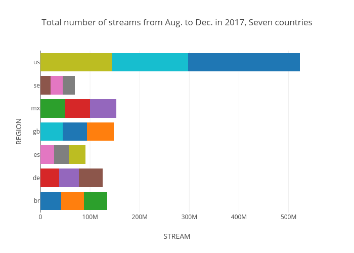
To trace the popular music trend, periodic popular songs are calculated and top 3 songs for each country are listed as shown in below three figures. Date for first one is whole 2017 year, second is from Jan.2017 to Jul.2017, and the last is from Aug.2017 to Dec.2018. It can be seen that some songs were loved in global, but some are only for specific country. When the song or artist are really loved in specific country, it will be most likely the homeland of the artist. For example on the 'shape of you' by Ed Sheeran, even though it is a great hit across all over the world, the number of streams in Great Britain are almost twice than other country, and Sheeran was born in Halifax, West Yorkshire. And the next is linguistic factors. It make sense that the 'shape of you' has been so popular in the US. Language reflects a culture and music cannot be fully understandable without the cultural consensus.
As you can see, the data set looks simple but getting insight form this data requires lots of trial by changing date, artist, steams, and selecting various countries, which has regarded as redundant time consuming. For this reason, interactive visualization tool are designed to analyze this. In fact, all the above findings had been from the visualization tool as introduced in the next chapter.
Data Visualization Tool
This app is specially designed not only to visualize for better understanding but also to analyze and find insight form the Spotify data set.
ShinyApp
Data Table
Number selector is provided for any numerical columns such as Ranking, Streams, and DATE for sorting whereas string-based filter function is provided for the categorical columns such as Track_name, Artist, and Region.

Chart
Four types of graph can be plotted with facet_wrap by selecting countries. Start and End date can be selected from 2017-01-01 to 2018-01-31. Whenever the Artist and related Track_name is chosen, corresponding plot will be drawn immediately. When you don't select Region, countries - the USA, Great Britain, France, Ecuador) operate over the simulation by default.


Graph
This section show two graph with corresponding selections. One is a trend curve for the Artist, another is a trend curve for the Track over selected countries. This graph really helps to understand how long the song sustain in top rank and when a new trend come up.

Status
Selecting cutoff rankings, the amount of streams of songs in the ranking calculated and compared with others over respective countries. This can give a insight for an analysis of a music streaming similarity presenting precise number of downloaded streams.

Word Cloud
Originally this is intended to forecast next trend of music genre by analyzing the statistics of lyrics used in popular music. Currently, this word cloud shows a characteristic of trendy name of songs and popularity of a artist. When the lyric data set has been cleaned and transformed, the forecasting service will be provided. You can find that 'Drake', 'Chainsmokers', and 'Sheeran' were the most popular artists in the USA from January to March in 2017.


Takeaway
Through this app, several insights has came up with results.
- Whatever the reason may be, The Spotify has not many subscribers in Middle East, Africa, China, and South Korea.
- A streaming power - the number of streams downloaded a year - is concentrated on some of countries, but not only English-speaking countries.
- 'Shape of You' is the most downloaded, and streamed song by Spotify users all over the world in 2017, and so Ed Sheeran is the artist.
- Spotify users had not used streaming service as much as usual in January and February in 2017.
- Music reflects culture, so it is highly correlate with its language.
- 'Drake', 'Chainsmokers', and 'Sheeran' were the most popular artists in the USA in 2017.
- Popular music had been spread out across borders without much delay. Why? Ecosystem of On-line streaming ?
Next Place for Visit
The start point is important. There are several steps for data science, and the very first and the most important part is data selection and its reliability. The next episode deals with the journey to find a reason why the Spotify's data is one representative sample for music streaming trend analysis.
Epilogue
"We've only just begun this journey" by Carpenters.