Voyage to the intelligent music streaming service: Ep 2. Comparative analysis on the reliability of Spotify’s music ranking data
Prologue
Are you enjoying listening to music? You may or may not; we can easily find people who put on headset or earphone everywhere. I can arguably say that most of them are listening to music. Do you ever think about the world without music? Commercials without music, movies with no soundtracks, and Broadway shows without songs, ... we even cannot imagine that. Music makes people more comfortable, stress-less, joyful, and relaxed. That's why music streaming service should be more intelligent and to be customized individually. IoT (Internet of Things) ecosystem for this kind of smart service - sensors, information, data, devices, cloud service, connectivity - is around the corner. All we need to is connecting them in a well-organized way. I hope I may encounter one of the good solutions for this in my journey.
My first voyage have been started from the analysis of the contemporary music streaming trend (refer to Episode 1), where it had been used Spotify's database. It was a pretty easy start because I could get a data - from the Kaggle - with low efforts. During the journey I had a concern whether the data was reliable or not, but I didn't have any alternatives at that time so I put it aside and just concentrated on the analysis. Now I am considering a suitability of this data.
Motivation
Last trip, I visited the trend of mostly streamed music source which can give us to explore how artists and songs' popularity varies in time. By using the daily ranking of the 100 most listened songs in 53 countries listened by Spotify users, we could find some significant facts which are not enough but give a good insight. But has the data been proven to good to be used? Today's visit will be on the questions as follows :
- Why many people uses Spotify’s data for analysis ?
- Does the Spotify actually represent a contemporary music trend ?
- Are these data from the Spotify reliable?
Revisit: Why Spotify?
Referring to the report published on 10/20/2017 by MIDiA, total music subscribers globally grew to 162.6 million in June 2017, over 22% from the end of 2016. Even though the topic of this report was on the rapid growth of the Amazon music, the Spotify seems to be undoubtedly sustainable music stream provider. ( To my surprise, the MelON - which is dominant music streaming service provider in South Korea - was ranked on sixth. About 80 % of 5.6 million active subscribers is reportedly in Korea. Now we can guess why Korea is not in the list of Spotify dataset dealt with in episode 1. ). Data set from all these provider will be the best for a trend analysis, but taking one from Spotify may seems to be the next best thing. Now let's tour into this data to check its reliability and usability for the music trend analysis.

source : MIDiA Research (https://www.midiaresearch.com/)
Comparative Analysis
To evaluate whether the data from Spotify can represent a tendency of contemporary music trend, I decided to do a comparative analysis of top 100 rankings between data from Spotify and other references. I had to set reference data which has high credibility and reliability. According to the infographic - major music streaming services compared (last updated on 3/3/2018) - presented by David McCandless as shown in below, it's out of question that the YouTube is the most influential market leader in this field. Even though most of users are free-user, we have to admit its leverage through scale economics. The second dominant provider is of course the Spotify, and followed by the Pandora. I found that the YouTube provides daily music ranking website listed as of September 2017.

source : informationisbeautiful.net (https://informationisbeautiful.net/)
Another reference can be found in the Billboard Hot 100 which is also known as a music industry standard record chart in the United States for singles, published weekly by Billboard magazine. Chart rankings are based on sales (both physical and digital), radio play, and online streaming. I looked into other web sites for references - as illustrated in below figure - based on web site's popularity, but unfortunately most websites provide ranks in a short term period such as one week or several days which are not enough to refer to. So I decided to scrape those two web sites - the YouTube and the Billboard - to get a reference data.
Data Sourcing by web-scraping
As mentioned above, the analysis will be done by comparing music ranking trend from the Spotify with two most popular and acknowledged musical websites - the YouTube and the Billboard. Additionally, I get the genre data for top 100 songs in iTunes website. The data was not given, so all the data has been web-scraped by using Scrapy and Selenium packages.
- Spotify Weekly Top 100 (12/23/2016 ~ 02/09/2018)
- YouTube Music Chart Top 100 ( 09/15/2017 ~ 02/01/2018 )
- Billboard the hot 100 ( 01/07/2017 ~ 20/10/2018 )
- iTunes Top 100 Songs Chart ( 2/12/2018 )
Scrapy
Scrapy is a powerful application framework - consist of major three modules such as items, spiders, and pipelines - for extracting structured data from web pages. Spotify's Top 200 chart pages can be normally scraped by using a this Scrapy framework.
I noticed something strange in this web scraping.
In general, we don't include the <tbody> tag when we compose target object path including Xpath. It is because <tbody> is not included in the raw html source code but rather created by the browser itself. Scrapy, on the other hand, does not modify the original page HTML, so you won’t be able to extract any data if you use <tbody> in your xpath expressions.
In the Spotify's charts page contains this <tbody> inside <table> which have all lists I have to scrape as shown in the next figure. However, when I ignore this <tbody> tag in my xpath expression, I cannot scrape any contents in the <table>. Finally I get the data when I decide to include the <tbody> in my path as :
rows = response.xpath('//*[@id="content"]/div/div/div/span/table/tbody/tr')
I will study for this issue later (not in this trip) in detail.
Selenium
Spotify and iTunes could be scraped using scrapy framework, but YouTube and Billboard had to be done by Selenium. Scrapy's spiders have difficulty to deal with sites that use a heavy amount of JavaScript. When you get an empty list from scrapy shell and if you are pretty sure the xpath you typed is correct, this usually means that part of data is retrieved by making Ajax calls. When I got an empty list for the YouTube page, I couldn't remind of this fact, and spent almost half an hour to see what the problem is. After that, I realized that I had to use a selenium framework which is more powerful but slow.
Everything was good to go. In this analysis, I've only used ranking lists in the US, data of which proven to have a largest number of users than other country in previous Ep 1.
Data Analysis
Data Table
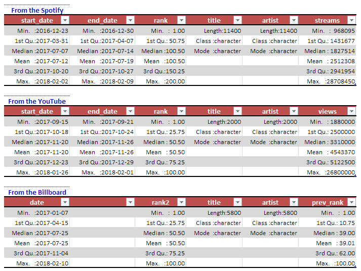
Data had been collected for as many weeks as the site provides, which the scraped items are total five elements from each site as shown in following table:
Note that the final analysis based on these data set should be limited to the time period from September 2017 to February 2018 for fair comparison, which is due to the limit of YouTube data set.
Number selector is provided for any numerical columns such as rank, and streams for sorting whereas string-based filter function is provided for the categorical columns such as start_date, end_date, title, artist, and Region. (start_|end_)date might be changed into date format for time series analysis.
Why many people uses Spotify’s data for analysis ? To my surprise, answer was so simple. I easily found the reason during this web scrapings as follows:
- Easy to web-scrape - The Spotify's ranking pages are quite open to web scrape. Oh my god. Spotify is so cool, and smart. They show a lot of generosity on data they've got - I can easily get data which contains top 200 stream rankings over 53 countries, which is mostly similar to data used in the Kaggle competition. They are smart enough to utilize the advantage of opening data source which is not too critical for company but very useful for data scientist and analyst. (There are many data scientist in the company, they how this works.) Of course this would be based on their pride and confidence as a leading music streaming service provider in this field. Did I scrape it? Yes, I did it, because one of important thing in this journey is a web-scraping.
- Easy access to data (without web-scrape) - Well, the amazing fact is that they provide data sheets as a csv format which can be download by anybody. Even if the analysts are not familiar to web-scraping, it doesn't matter at all. Everybody can get it and analyze it. Eventually this kind of open data strategy makes the Spotify more popular and viral to people.
- Well organized - Regional, daily, weekly ...., in specific, the data covers regional (from 53 countries include worldwide) daily and weekly rankings. People can use all or part of it by their needs. Regional data is provocative of curiosity on comparison. This is a good fit for competition.
- Affordable size - The data is at most 1 million lines, not too small not too big, the prefect size to deal with.
Okay. Now let's put the data altogether and see-mails what I can find.
Data Cleaning
Even the data was given by scraping, it was quite clean. Almost data has no NAs. The missing ranking can be imputed by using simple linear regression but missing titles and artists must not be imputed, In this case I didn't impute it, just dropped it.
Handling Text and Categorical Attributes
All characters have changed into lower case. start_date and end_date converted to date class by using as.Date() to calculate order by Date and flow. To fair comparison, the start_date and end_data are trimmed and synchronized through all data sets. When titles and artists contains foreign language characters on its name, were changed with similar English characters.
Preliminary Analysis
To outline a rank balance among three data set, I drew the bar plot for the first week start with 9/15/17, respectively. Start and End date was selected from 2017-09-15 to 2017-09-21 (i.e., one week). To get clearer insight, temporary top 10 songs will be compared.
Even though I extract only 10 songs in columns, it's difficult to find which one is a entry in top 10 ranking in common. When I rearrange y axis as a artist and put the bar graph together, now we can easily find which songs are exist in common across all three of ranking charts. Artists who have three bars in common are Taylor swift, Logic, and Cardi B.
The rankings for each artist in three websites are as follows:
| Artist | Title | Billboard | Spotify | YouTube |
| Taylor Swift | look what you made me do | Rank 1 | Rank9 | Rank 2 |
| Logic | 1-800-273-8255 | Rank 9 | Rank 2 | Rank 6 |
| Cardi B | bodak yellow | Rank 3 | Rank3 | Rank 1 |
Using this table, I cannot say which one is reliable, but if I roughly say, Billboard and YouTube seems to share the ranking in common, Spotify is slightly far from them.
Target Feature Selection - Frequency mining
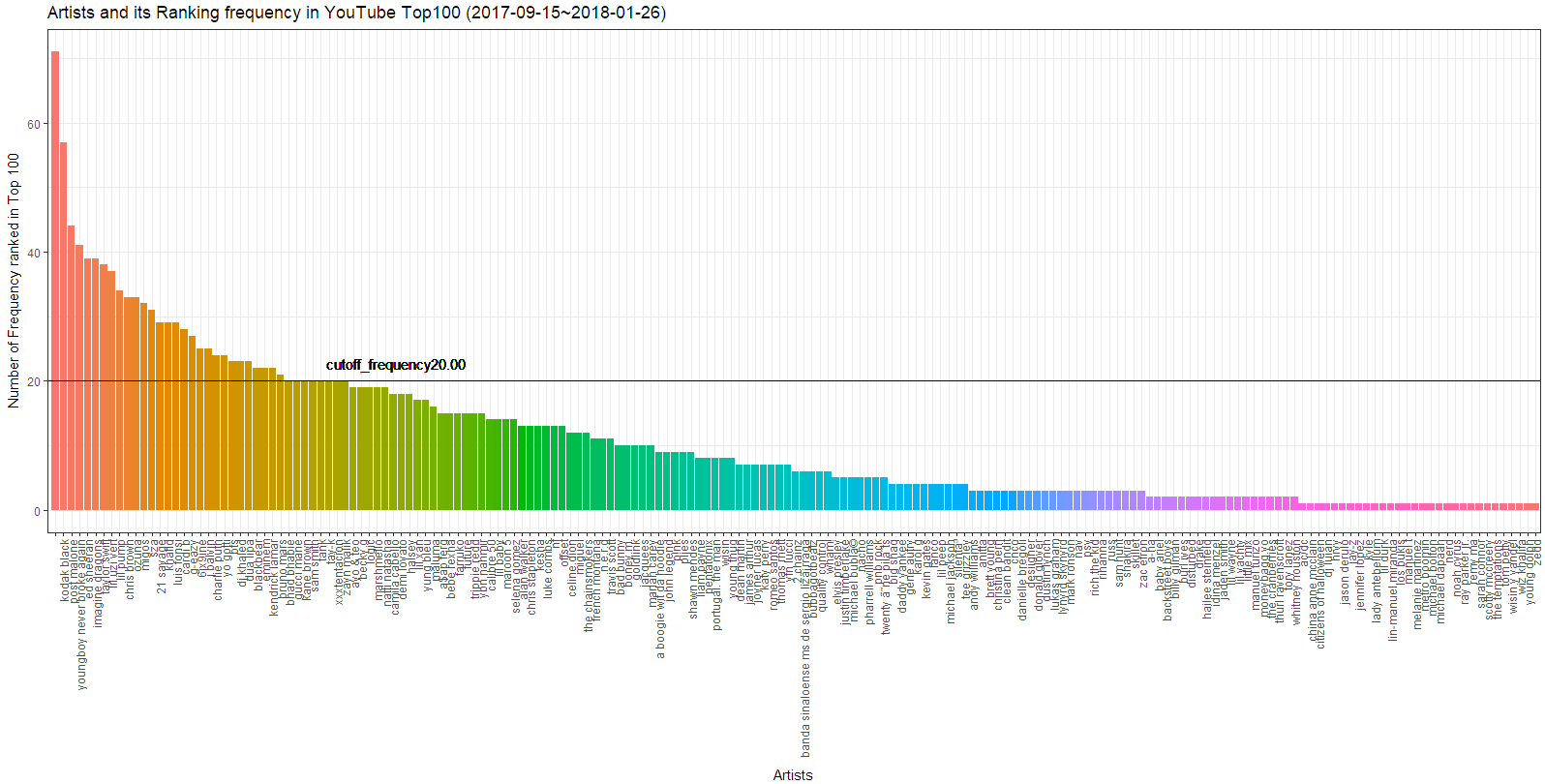
As mentioned above, one day spot analysis gives only a blur insight, and does not explain any phenomenon. So I decided to draw a trend line within a year by selecting some songs which are ranked in these three-Top 100 ranking-websites in common. If the song has a great hit, the song stays longer than couple of month in top 100 ranking. Most popular songs stay at most a month in top 100, in general. So I counted the frequency of artist in each top 100 ranking data of each websites.
Just simple word cloud splits the words and show what is frequently mentioned in the table. This visualizes who is listed in common in all of data sets. But all input words had been broken down to strings, then each string's frequency had been counted. That's why you can see "lil" in a big letter, which might came from 'lil uzi vert', 'lil pump', 'lil skies', 'lil xan', ..., etc.
The table function in R is a very useful function to perform data analyses. It simply creates tabular results of categorical variables. It uses factors to target objects, so all artist names can be preserved when they are declared as factors. I utilized this function to count frequency of every artists as shown in below table. As you can see, it's still difficult to find which artist are ranked in three of the websites at the same time with this table.
Bar chart of the table illustrates it more intuitively.
Inner join from the above helped to find artists who are ranked in common as illustrated in the following table. Now I can select some of them to compare each trend by time. Note that here are famous artists who can hit several popular songs a year, so all the frequency cannot be exactly same when we deep dive into the title.
Now we can see the whole artist name in the word cloud, for visualization
| spotify | youtube | billboard |
 |
 |
 |
Pie chart shows relative ratio of the Top 11 artists who were ranked in Top 100 more than 20 times in 2017 on all three web sites simultaneously.
Change of Target variable
All data manipulation has been done for trend analysis, but applying these variables is not a good idea. Every singers, especially , popular singers had released several songs during the year, so even though some singers got high ranking many times, it is not true their songs were in the high rank many times. Then the trend analysis by comparing popular singers' song couldn't be reliable.
In a similar way - more cautious data-cleaning techniques were required for text mining of titles than that of singers - the popular titles in common can be listed as follows:
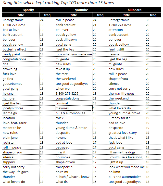
Numbers in above table is the number that how many weeks the song was in a rank top 100. Note that the observation time window is only about five months (i.e., 20weeks). Hmm.. what did it happen to the song named 'unforgettable'? It couldn't be possible to get numbers more than 20. Looking into the data set, there were two singers - 'French Montana' and 'Thomas Rhett' for the same song 'unforgettable'. If this song is distinguished by singers, the week counts would be split into half of them.
All songs had been divided by singers, grouped by title, and then counted again. Song titles with more than 15 weeks of top 100 ranking which are listed in common by three music sites are shown as below:
Trend Line Analysis
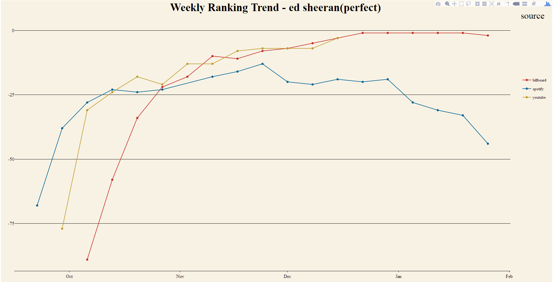
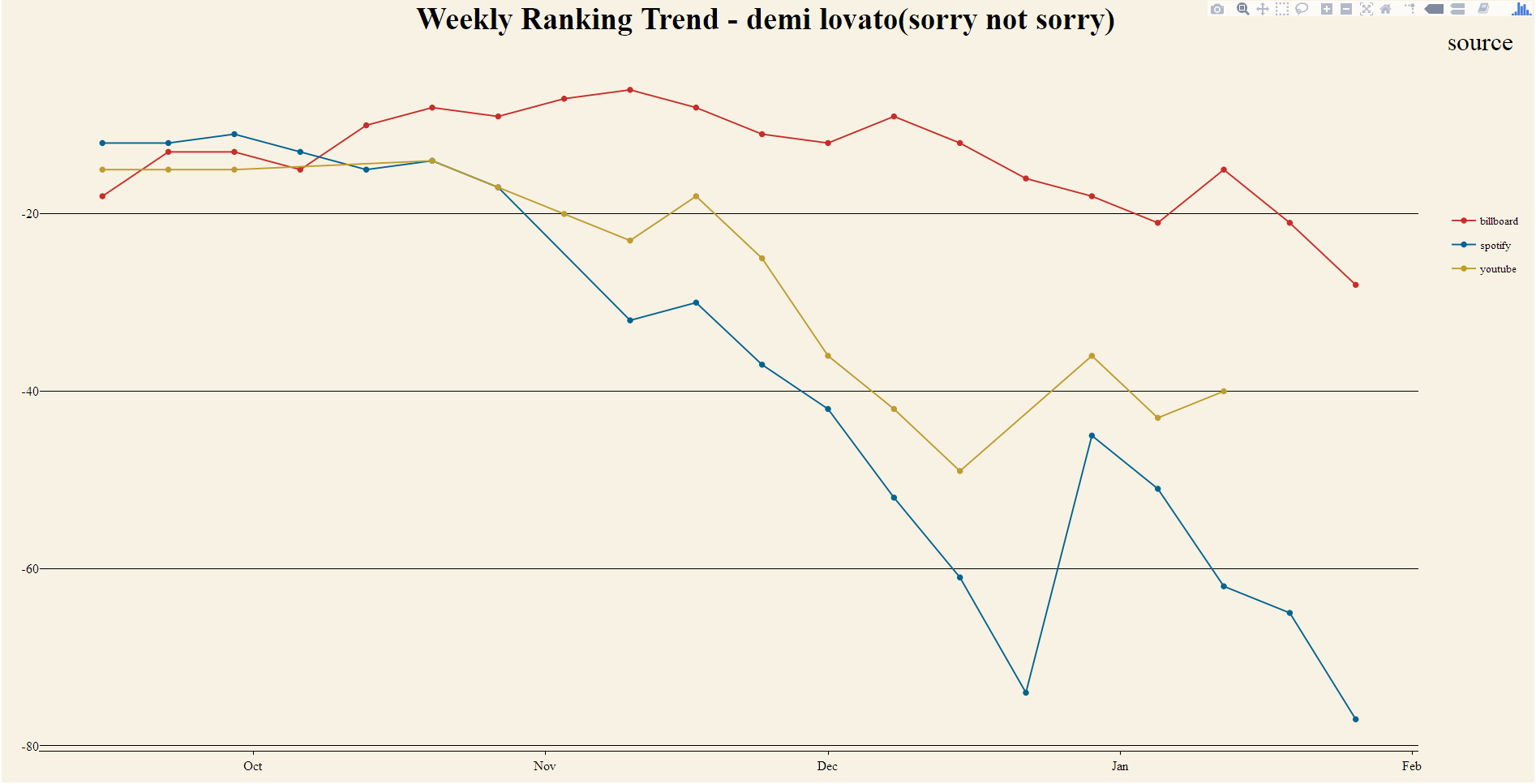
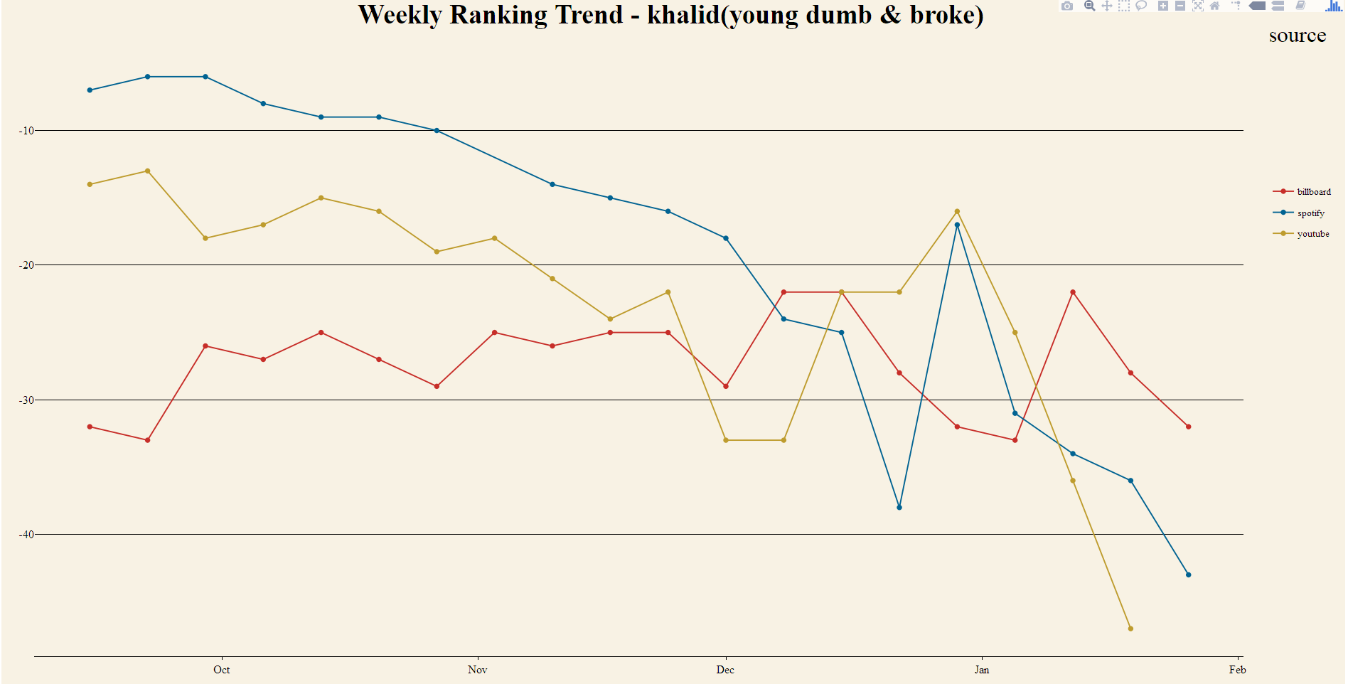
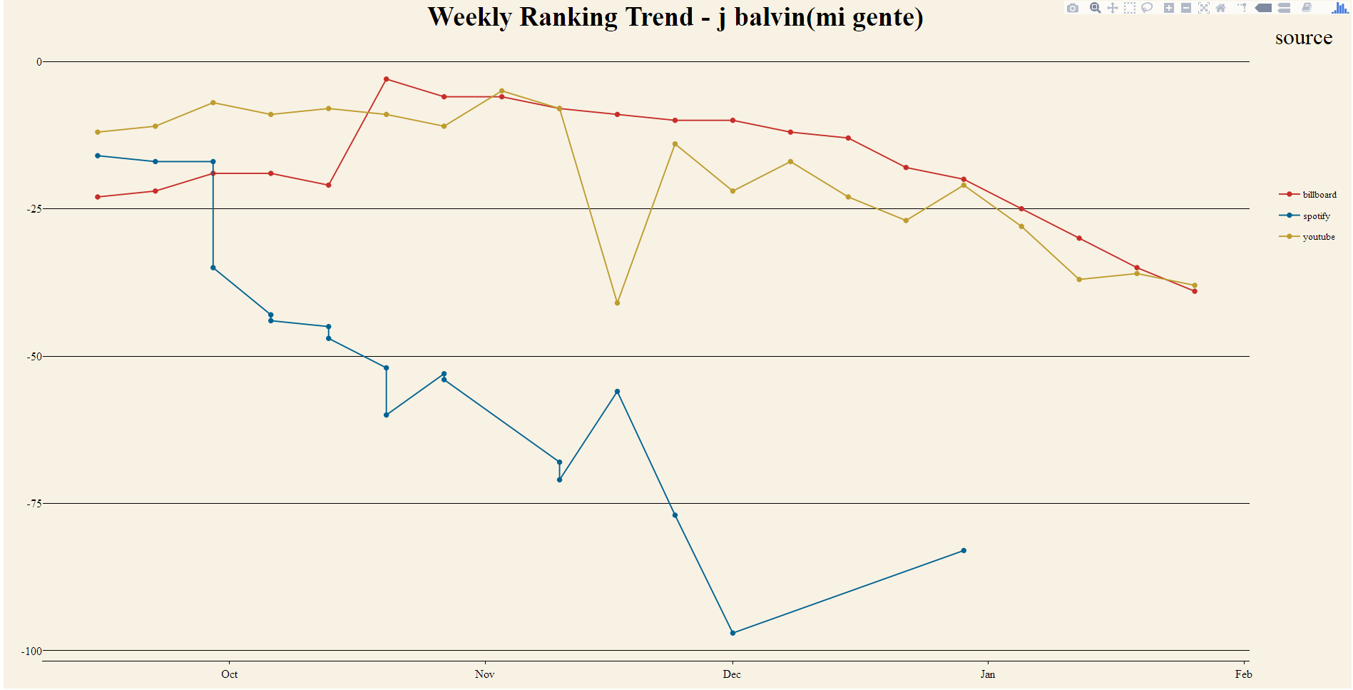
In this section, we will explore ranking variations of listed songs by timeline as shown in below figures. Blue line shows a ranking trend from the Spotify, yellow line comes from the YouTube, and red line shows for the Billboard.
Due to the limitation of the data set, the whole observation time-window is only five months (2017-09-15 ~ 2018-02-01), but most trends of individual ranking of songs can be monitored within the time period. Of course, if the song was so popular to sustain in the top 100 ranking more than 20 weeks might have no significant falling or rising trend during this period. For example, the Havana sung by Camila Cabello, or the Rockstar by Post Malone, both in the rising trend curve groups seem to be last more than 20 weeks in Top 100.
Comparing the ranking variations of each songs listed above, most of them from those three sites have similar ups and downs by time, which means ranking mechanisms of the Spotify are appropriate and reliable to utilize the data form it. However, when you take a closer look, it can be seen that there is a small amount of time-skew among the ranking variation lines. For more clear analysis, figures were categorized by two groups as illustrated in below; one is a group has rising trend lines for ranking variations, another has a falling trend lines for it. In total 22 songs which had hit more than 14 weeks in rank top 100 by all three sites, 21 songs had a significant tendency. (This results will possibly be updated whenever more data gathered afterward.)
-
Rising Trend Curves
These figures have a rising curve for their ranking variations. A rising trends can be interpreted that each song had been started to be popular and entered the ranking Top 100 from that time. As I selected songs which kept a ranking top 100 more than 15 weeks, their trends can be traced with a full range of window.
Songs with rising trend curves show a similar tendency that Spotify’s ranking line (blue color) starts on the left-most side than that of YouTube music and Billboard. It seem that the Spotify provides first viral ranking hit for a song and other two sites' ranking are followed. This situation is way too much to be just a coincidence. Over the most of songs in this rising curve group, it can be seen that blue line start rising early, then red or yellow starts to follow up.
-
Falling Trend Curves
These figures have a falling curve for their ranking variations. A little bit opposite to the rising trend group, these falling trends can be interpreted that the song popularity is going to fade out, or the ranking of current song is decreasing by the other songs getting more popularity than current song.
Under the inference with the analysis of rising trend curves that the Spotify mentions songs' popularity first, and under the assumption that a popularity of most songs lasts not more than 20 weeks, the Spotify have to describe a downward tendency earlier than other two sites. Most songs in the falling trend curves have a similar tendency that the Spotify’s ranking of songs (blue color) declines first - blue lines go downwards early - ,and then reds or yellows ends on the right most side of the graph or still on higher ranking.
Not only the rising group but also the falling group provide strong tendency that song's popularity had been led by the Spotify. Why? I found that the ranking system itself can be one reason of this. It could be easily found that the ranking system of these three sites were quite different.
How to rank
- The Spotify : Total number of downloaded stream --> Simple, but fast and effective !
- The YouTube : Total number of viewed music on YouTube by video, artist, track, and viral score.
- The Billboard : Radio airplay audience impressions as measured by Nielsen Music, sales data as compiled by Nielsen Music and streaming activity data provided by online music sources.
These explain that why the Spotify can reflect a real-time song popularity of the people immediately, and there is a time delay among three music ranking sites. These also note that the YouTube and the Billboard gather a lot of reliable sources to establish rankings of songs, so it can be regarded as a reference of music trend.
Takeaway
Target samples and observation period is not enough to conclude any strong decision on this. However, through the comparison with well-known reliable ranking systems such as the YouTube and the Billboard ranking charts, it has been verified that the Spotify's ranking system works well and reflects current music preference of people.
The fact coming to my knowledge via this trip answers the question as below:
1) Why many people uses Spotify’s data set to their analysis ?
- Easy to web-scrape
- Easy access to data (without web-scrape)
- Various data set : Regional, Daily, Weekly
- Long term monitored data
- Prompt update
2) Is the Spotify really making a music trend?
- Arguably 'yes'
- Immediately reflects current music preference of people
- Leads song's popularity compared with the other reliable ranking sites
3) Is this reliable to use its ranking?
- Ranking trend supported by the YouTube and the Billboard
Further work
Verification of error - the fallacy of hasty generation
- data resampling - short range data resampling and nonlinear interpolation
- data transformation - discrete Fourier transform and impulse response for phase comparsion
- similar streaming sites comparison - smoothing and cross-correlation for pattern matching ratio
Additional Data Survey & Preparation
- more than 20 weeks window
- more ranking sites to compare
- similar streaming sites comparison
- regional subscriber distribution
- airplay data
- free vs. charged subscriber
- by age, gender, occupation
- weather data, time data, social events, geography to verify sudden changes in trend curve
Data Exploration
- the singularity analysis - songs which are Not ranked In Common over all sites
- the similarity analysis - songs which are ranked in common using feature analysis among popular titles
Data Analysis
- Regression and time analysis for the next trend prediction
- NLP (natural language processing) on the lyrics of titles which have relatively longer popularity poll
- Data up-sampling (non-linear interpolation) for statistic analytics
Visualization
- Setup a visualization app such as shiny on the trend analysis to get more insights easily
Epilogue
Have you ever thought about a type of music you like? People categorized music in genre, but this is only for a classification. We human being is not that simple. Do you have any experience that when you happen to listen to one music which is really great but is not your favorite genre? When you make your own playlist from various genre, can you find that all the songs has similar color on them? If then, your musical preference is not limited by its genre, but the color of the sons. The next trip is going to find what this means and how we can get some significant insights on it.


