Revenue and Marketing Insights from Customer Segmentation
Introduction
Stores can use in-depth understanding of their customers to maintain customer loyalty, target campaigns, and thereby generate more revenue. For example, an insight that a certain group of key customers values in-store experience and relies on a catalog can lead the store to investigate and further improve its in-store experience and catalog from the perspective of the key customer group. An insight that some campaigns are unsuccessful while other show seeds of promise can lead the store to answer more questions about the distinguishing characteristics of successful campaigns, thereby improving future campaigns. To provide a sample of these and similar insights, I use a Kaggle data set on a deli store's customers. I first inspect the data, clean it, generate more features, and wrangle it into shape for machine learning. I then perform principal component analysis, KMeans and Gaussian mixture models clustering, and finally derive insights from the resulting clusters. For all of the key results, I conduct statistical tests such as ANOVA, chi-square test of independence, and especially two-sample t-tests for differences in means.
Findings and Methodology Overview
The findings mentioned in this overview are statistically significant.
- There are three main clusters: the middle class, the wealthy, and the low income. The first two contribute the most to company's revenue and, in absence of income data, can be best differentiated by the number of children. Namely, the wealthy customers rarely have kids. The wealthy customers are also less recent, on average, and spend the most per day.
- Suggestions for deals and campaigns
- Cater to the middle class with well-aimed deals, ideally on the web
- Cater to the low income customers with discounted promotions
- Cater to the wealthy class with well-orchestrated campaigns. Concentrate on creating an effective catalog and pleasant in-store experience for these customers.
- The two clustering techniques, KMeans and Gaussian mixture models, provide the same qualitative conclusions. I used two methods to establish that the main results are robust to the type of the relative clustering algorithm.
- The data has a small number of extreme outliers, which I remove to improve clustering results. In addition I impute missing values, engineer variables to account for the time a customer has been with the store, standardize the features, and derive principal components from numeric variables. The principal components account for over 80% of the variability in the data and help escape the curse of dimensionality.
Data and initial visualizations
The data spans 796 days (2012-2014) and consists of 2240 individual observations on
- Customer characteristics (year of birth, education, income, number of children, etc.)
- Aggregated amounts spent by each customer on each category (aggregated amounts spent of wines, fruit, sweets, etc.)
- Promotion acceptance for 5 campaigns
- Number of purchases done on the web, using catalog, or in store, as well as the total number of web visits
It contains about 16 missing income observations and a few extreme outliers in income and age.
The following graph provides a glimpse at the store's main revenue drivers, namely wine and meat products.

From the graph below, it is clear that the greatest number of purchases occurs in-store, followed by web purchases. There are also many web visits that are not necessarily tied to a purchase.

While these visualizations provide some insights, a much richer analysis results from clustering analysis discussed in the following sections.
Machine learning
Variable selection
To perform clustering analyses of our customers, it is crucial to scale and choose the variables correctly. Distance-based clustering techniques such as KMeans and GMMs are heavily influenced by outliers and skews. To mitigate this, I removed a small number of outliers in income and age (dropping 11 observations in total) until these variables no longer had any visible outliers. I then focused on selecting the less skewed variables among those that were strongly correlated, and logged all features with long right tails. For example, all the variables in the box plots above were logged. Finally, each variable was standardized by subtracting its mean and dividing by the standard deviation. Since non-ordinal categorical variables do not have a logical notion of distance, I did not use their results in clustering, instead choosing to examine them with respect to cluster labels. Finally, even with the 15 variables remaining, clustering based on 2229 observations would not yield reliable results due to the curse of dimensionality: with each additional variable to cluster on, the number of observations would need to scale exponentially for algorithms to have enough variable density in high-dimensional space to form the clusters. Thus I chose to reduce the number of dimensions using Principal Component Analysis (PCA) prior to clustering, and I will discuss this next.
Principal component analysis
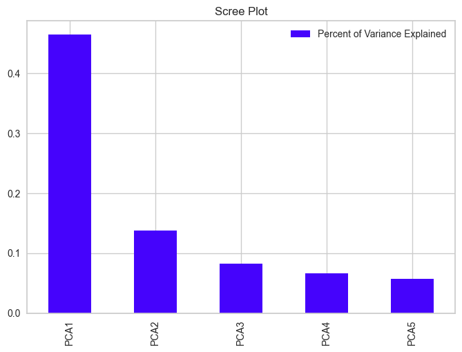
PCA first de-correlates the data by rotating it and centering it at zero. The main components will be those in high-variance dimensions of the original features. We can then look at the dimensions explaining the most variance and perform the next machine learning steps using those as features. The 5 principal components (PCs) explain 81% of the variance and are shown below mapped against the original features.

This diagram of the so-called Principal Component Loadings along with the scree plot below provide useful insights about the data, especially once clustering results in the following section are taken into account. First, though, I will discuss the general meaning behind each of the components. The first principal component accounted for about 46% of the variance, was positively correlated with number of children and number of web visits, and negatively correlated with income and spending. The second principal component is most strongly correlated with the number of deals purchases, number of web visits and purchases, length as a customer, and number or children. As clustering analyses will indicate, the first two components correlate negatively with highest-spending customers. the third principal component correlates negatively with length spent as customer and positively with age and number of children The forth component is strongly and negatively proportional to recency of last purchase. Finally, the fifth component is dominated by age and length as customer, being positively correlated with these. I will return to looking at the principal components once our clusters are formed.
KMeans clustering and Gaussian mixture models
I choose to use KMeans clustering and Gaussian mixture models as the main clustering techniques. Part of the reason for using two techniques is to show that the key patterns that are robust to the type of clustering used. Both techniques have been found to be successful in clustering applications of this type, and are based on notions that are intuitive to customer clustering domain. I have tried agglomerative clustering as well, but the results did not appear to be useful.
KMeans clustering
The key idea is to derive the labels from clustering over the principal components on the original data, then look for business insights in the original feature space. Since I had no additional business background regarding the correct number of customer clusters, I turned to machine learning to help determine it. Machine learning can help in this regard, however, as clusters can be discovered based on geometric closeness in feature space.
As a side note, if clustering is performed on the original features rather than principal components, 6 clusters result, many of which are small and have similar business meaning, implying that they should probably be grouped together.

Clustering on the principal components, we produces 3 clusters that are distinct and have clear business implications.

KMeans clustering algorithm starts by randomly initiating the number of centroids equal to the number of clusters (3 in this case), labels each data point with the closest centroid to that point, moves the centroid to the middle of the resulting clusters, relabels the data based on closest distance to the new centroids, etc. These steps are repeated until convergence. The resulting clusters are separated by their principal components, as the graph below shows.


Visually, there appears to be more separation in the clusters along the fourth component.
Gaussian mixture models
Gaussian mixture models (GMs) work somewhat similarly to KMeans, but instead of re-fitting centroids and reassigning points into clusters closest to those centroids, they fit normal distributions around cluster means. There is thus richer covariance structure they can model, allowing clusters to be elliptical as opposed to circular KMeans clusters. They are also a soft classification algorithm, with each point labelled with probabilities of belonging to different clusters. For a more in-detail comparison of KMeans and GMs, please see this article.
To get an initial idea for the number of clusters to use for GMs, I examined 3 metrics: Silhoutte Scores, gradients of BIC scores, and distance between train and test GMs, which can be found in the Github repository for this blog. There appeared to be a bias towards lower numbers of clusters, with possibility that 2 and 3 may be good cluster choices. I decided to choose 3 clusters since this lead to richer insights about our customers and more visual separation in the original feature space.

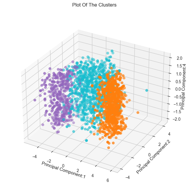
Some points were clustered differently, with a few points that would have been unambiguously assigned to a closer cluster by KMeans being assigned to a farther away cluster. This attests to the soft classification nature of GMMs, and I will be comparing the results of both methods during the next stage of analysis.
Observations at the aggregate level
From the graphs below, it is evident that while cluster 1 has many customers (37%-40%, depending on the clustering method used), it is responsible for only a small fraction of the store's revenue. On the other hand, cluster 2 is responsible for most of the store's revenue while being only 20-26% of its customer base. In addition, I have verified that most of the customers from both techniques were placed in the same clusters.
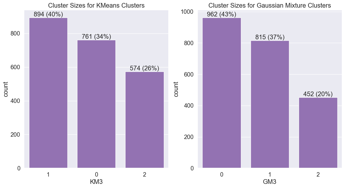
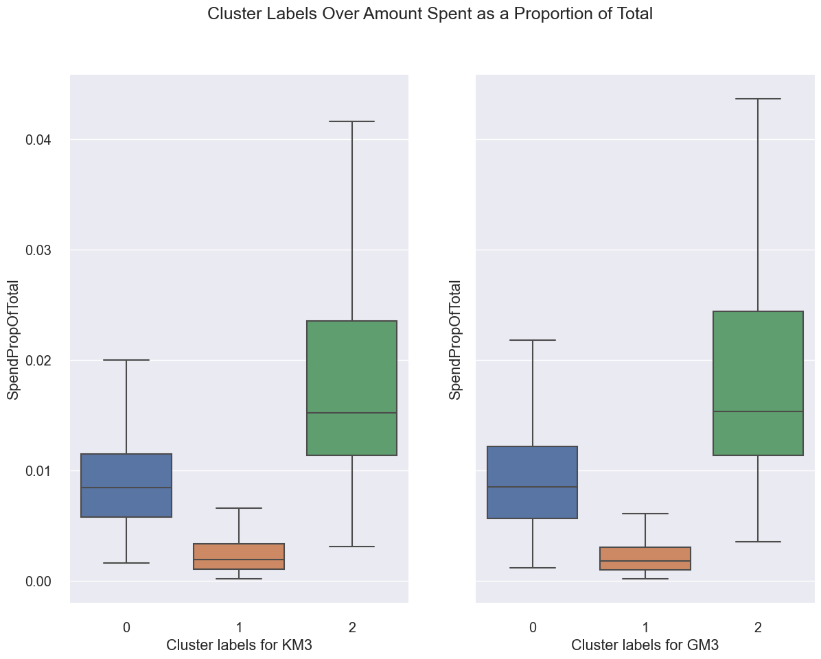
An interesting observation can be made about GM clustering results. When normalized by length spent as customer, it appears that there is a slight reversal between customers in cluster 0 and cluster 2. I believe that this is a consequence of aggregating a normalized statistic rather than a true pattern. When we look at individual spending by customers, cluster 2 customers always emerge as the biggest spenders regardless of normalization or clustering technique.

Below are all overlaps between KM/GM clusters where there were more than 5 customers in each overlap:
- Number of customers in KM cluster 0 and GM cluster 0: 759
- Number of customers in KM cluster 1 and GM cluster 0: 79
- Number of customers in KM cluster 1 and GM cluster 1: 815
- Number of customers in KM cluster 2 and GM cluster 0: 124
- Number of customers in KM cluster 2 and GM cluster 2: 450
Generally, clusters 0, 1, and 2 in KMeans map strongly to their counterparts in KMeans. However, some of KMeans cluster 1 and 2 customers are marked as Gaussian moments cluster 0 customers. Overall, cluster 2 ends up being smaller if Gaussian moments are used. To obtain more insights regarding spending and campaign effectiveness, I examine the results at a more granular level in the following section.
Business insights
Overall spending and income
For the following analysis, I've added the cluster labels to the original data, which allows me to examine the clusters even over variables not used in the original clustering, such as the categorical variables. For what follows, KM3 stands for KMeans clustering with 3 clusters and GM3 stands for Gaussian mixture models clustering with 3 clusters.
First, I'll continue examining the patterns above, but at a higher granularity level. From the scatter plot below, it is clear that clusters are separated by income and total amount spent. People with higher incomes generally spend more, and are placed in cluster 2. GMs establish even a clearer separation between highest income earners/spenders and cluster 1, which at the first glance appears to consist of the middle class.

Below is a more in-depth look at cluster incomes:

I conducted analysis of variance tests (ANOVA) for income and totals spent for each clustering technique, finding F-statistics over 2500 and p-values close to zero, indicating that income and spending are different between clusters. To further establish the that cluster 2 consists of the biggest spenders and earners, I conducted t-tests with the following alternative hypotheses:
- Cluster 2 spends more than cluster 1
- Cluster 2 spends more than cluster 0
- Cluster 0 spends more than cluster 1
In each case, the p-values were between 1.470932e-125 and 2.177205e-273, indicating that we can reject the null hypotheses in favor of our alternative hypotheses. There is statistical evidence to believe that cluster 2 customers spend more than the remaining clusters, and that cluster 0 spends more than cluster 1. Similar conclusions can be drawn about income.
The following box plots further confirm that cluster 2 customers spend the most, over $1200 during the 796-day data collection period. Nonetheless, this amount to spending only about $3 per day. The middle class cluster, cluster 0, spend a little over $1 per day, and cluster 1 spends less than $100 at the store for the 796-day period.


Interestingly, cluster 2 customers are more recent than cluster 0 customers according to the box plots below as well as t-test results. However, while there is less evidence to believe that cluster 2 customers are most recent, as we do not have enough statistical evidence for this claim in the KMeans case (p-value=0.194163).

However, even cluster 2 customers spend only about 1.5% of their income at the store.
Cluster spending and recency
The graph below shows similar means (marked with circles) across clusters, perhaps indicating a slightly higher recency for cluster 2 than other clusters. However, the difference between times since the last purchase (recency) across clusters is not statistically significant. The p-value is 0.181473 for difference between GMs clusters 2 and 1 and 0.456555 for difference between 2 and 0. Interestingly, recency was driving the fourth principal component, and there does appear to be significant variability along this dimension as the interquartile range is quite large. There is just no significant difference between the average difference by cluster as the means are similar.

Spending by category
The spending per category patterns are similar: Cluster 2 leads, followed by cluster 0, then by cluster 1, who only spend a small amount. The results are significant with very small p-values (p-value=1.626019e-34 in favor of cluster 2 spending more than cluster 0 on wine, for example).

Deals and total spending
There are strong statistically significant differences in number of deals accepted, with cluster 0 customers accepting close to 4 deals on average compared to cluster 2's 1 deal.

Thus cluster 0 customers have shown a strong interest in deals, much more so than clusters 1 and 2. The data appears to indicate that the middle class is trying to shop at a bargain. The following graph helps confirm this suspicion: cluster 0, the middle class, actually made more purchases than cluster 2, the wealthier class.

Indeed, cluster 0 customers make 25 medium purchases compared to cluster 2's 23. This result is statistically significant with a p-value of 2.974196e-14. However, as previous analyses indicated, cluster 2's aggregate spending is greater than cluster 0's if KMeans is used and about the same as cluster 0's if Gaussian mixtures are used. We don't have the exact number of orders per category made by each customer, which would have helped establish the following claim unambiguously, but I suspect that in addition to deals, cluster 0 customers buy cheaper items than cluster 2 on average.
Another statistic related to the observation above is the number of purchases normalized by length spent as customer. When this length is taken into account, cluster 2 emerges as both higher-spending and more active cluster.

The average spending per purchase further confirms that while they make fewer purchases cluster 0, cluster 2 customers make up for it by spending more per purchase. They spend around $60 on average per purchase, compared to cluster 0's spending in mid-20's.
Customer cluster demographics
Cluster 2 median customers are in their mid-40's, older than cluster 1 customers, who are in their early 40's and younger than cluster 0 customers, who are in their late 40s. The differences in age are statistically significant according to t-tests.

A key distinguishing characteristic between the clusters is the number of children. With GM3 clusters, cluster 2 customers have fewer children than cluster 1 customers, who in turn have fewer children than cluster 0 customers, a result which is statistically significant.

When KM3 is used, there is a similar pattern, except that the difference between clusters 0 and 1 is no longer statistically significant (p-value =0.175131). 
There are small differences in education, which are statistically significant according to a chi-squared test for independence. Overall cluster two customers appear to be slightly better educated than the other cluster customers, especially those in cluster 1.
Similarly, there are small differences in having a partner, which are statistically significant according to a chi-squared test for independence. Overall cluster two customers appear to be slightly less likely to have a partner than the other cluster customers.
Since differences in clusters along these dimensions appear to be too small to be useful in distinguishing between the customers in a store setting, I chose to not investigate these further with t-tests on pairwise proportions. Overall, the number of children and differences in age appears to be the large distinguishing characteristics in the demographics dimension. Number of children also features heavily in principal components 1-3 and age features heavily in components 3 and 5. In essence, these components jointly help us distinguish between the clusters, and we can even see statistically significant differences in the feature space.
Campaign effectiveness
First, campaigns appeared to have relatively low acceptance rates. For example, no customer accepted all five campaigns, very few accepted 4 campaigns (and those customers were in cluster 2), and the majority of customers in each cluster accepted no campaign.

Given this observation, were there any campaigns that were more successful? According to a chi-squared test for independence, there were statistically significant differences between campaign 1 (or 5) acceptance rates among clusters. The following graph shows that campaigns 1 and 5 gained higher popularity with cluster 2 customers.


Campaign 2 (graph not shown) had almost no acceptance, and campaigns 3 and 4 have shown some success, especially with cluster 0 (the middle class cluster). The differences between campaign acceptance rates among customers in different clusters were significant according to a chi-squared test for independence. 

Web, catalog, and store purchases
While this was not stated in the data set description, there are four ways for customers to shop: in the store, over catalog, and two ways of shopping over the web. It is unclear what the difference between 'web visits' and 'web purchases', however, the arithmetic at the bottom of this section will demonstrate that these are two ways used to label purchases done over the web.
There are clear patterns with regards to web visits/purchases, as well as catalog and store purchases; all of these patterns are statistically significant according to t-tests. Cluster 2 customers do not visit the web to browse, as do clusters 0 and 1 (are they looking for discounts?)

In addition, cluster 0, our middle class customers, make more purchases on the web than cluster 2, our wealthier customers. 
However, cluster 2 customers make about 1 more in-store purchase and 3 more catalog purchases than cluster 0.

For easier comparison, here are the box plots for deals.

The graph for KMeans and Gaussian moments are almost identical for per-channel spending, so I'm only presenting the KMeans graph below. 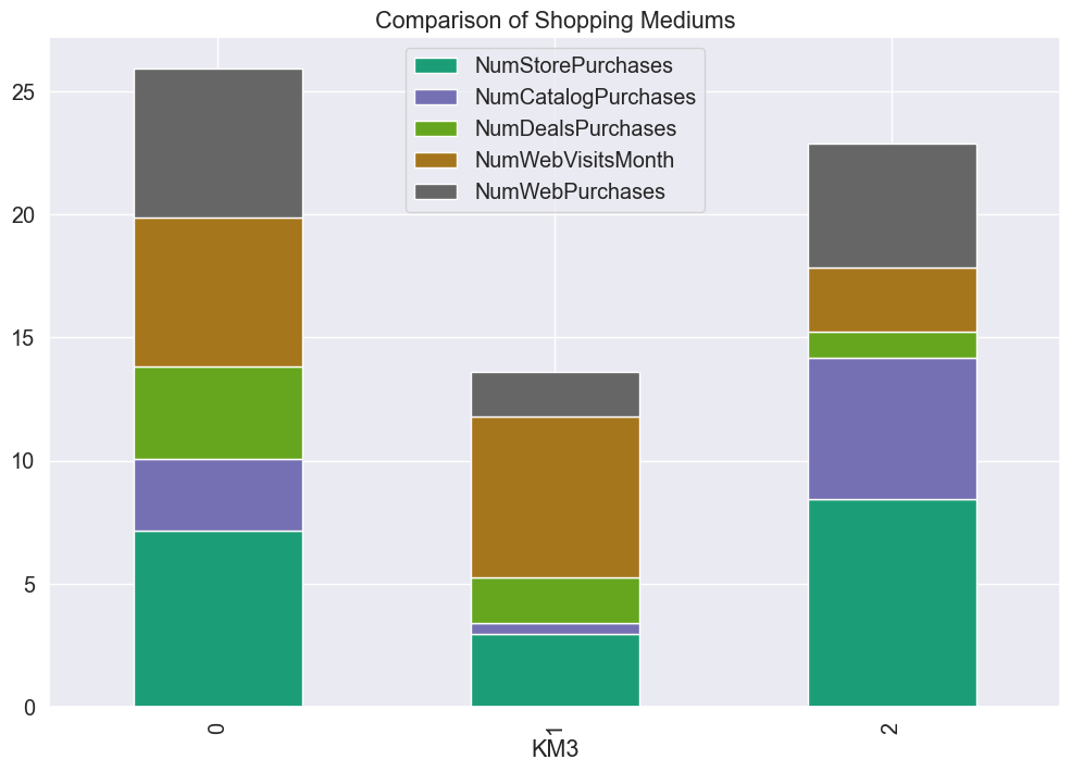
It is clear that if we add all channels for cluster 0, for example, we get 26, the total average number of purchases by cluster 0 already observed in this blog.
It is not clear if the deals are in-store or online deals, and along with the remark regarding the labeling of web purchases, it would be helpful to obtain this information from the original data source. However, we can conclude that cluster 2 customers make the majority of their purchases over the catalog and in the store, while cluster 0 and 1 customers make more purchases over the web. Thus the store can focus on providing a positive in-store experience and an effective catalog to attract and retain cluster 2 customers. Similarly, the store can target their web offerings to cluster 0.
Conclusions and future work
Here are a few characterizations of the store's customers:
- Cluster 0 customers: This is a key cluster for our store, accounting for almost half of the revenue. They are the middle class in their late 40's with more children than cluster 2. Depending on the clustering type, these customers contribute about the same to the store's revenue as cluster 2. They have historically been active, but are less active per day than the more recent cluster 2. They will participate in deals and some campaigns, and the store should cater to them on the web.
- Cluster 1 customers: Lower income customers in their early 40's on the median. These customers prefer to shop for deals and on the web. Since these customers likely have less disposable income, the store could reach out to them with discounted promotions.
- Cluster 2 customers: This is another key cluster for our store, accounting for almost half of it's revenue. They are high earners and high spenders. These customers rarely have children and have median age in mid-4o's. They are more recent than cluster 0, are not active deal shoppers, but will participate in a well-orchestrated campaign. They shop most in the store and over the catalog, and the store should concentrate on creating an effective catalog and pleasant in-store experience for these customers.
Here are some suggestions for future work:
- The store can use the suggestions above to perform A/B testing to target different deals to different customer clusters with a focus on profitability.
- It is crucial to keep Cluster 2 customers engaged (by targeted campaigns, positive in-store experience, and other solutions that are yet to be observed) and to boost future engagement of Cluster 0 customers by similar or even better targeted measures.
- Get more granular data on store purchases.
- Resolve the labeling ambiguity with respect to web purchases.
- Get more data on profitability rather than just revenue, as profitability is the store's key objective
Here are some questions to be answered:
- What do we know about the rationale behind each campaign? What distinguishes the campaigns?
- What more can we learn about our customers? Specifically, are there factors not in the data that can help differentiate the customers?
- What else can be learned about the way the store is making customers in-store and online shopping experience pleasant? Are there ways to improve?
For an exploration of a supervised learning marketing problem, please see my blog on bank marketing campaigns.


