Data Analysis on the Imbalance of COVID-19 Vaccine Coverage
The skills I demoed here can be learned through taking Data Science with Machine Learning bootcamp with NYC Data Science Academy.
INTRODUCTION
COVID-19 is an infectious disease caused by a newly discovered severe acute respiratory syndrome coronavirus 2 (SARS-CoV-2). To date, data shows COVID-19 pandemic has claimed more than 3.5 million lives among 169 million people afflicted worldwide. In order to curb the disease, government agencies and pharmaceutical companies have meticulously worked together to develop, test and approve a vaccine in the shortest timeframe possible. As COVID-19 vaccines have become available, decision makers are striving to deliver them to the masses.
However, distribution and vaccine coverage has remained disproportionately stunted in some states. Several reports have pointed to varied COVID-19 outcomes in different racial groups.1,2
More recently, researchers from Massachusetts General Hospital and Harvard Medical School conducted a smartphone based study to investigate whether racial and ethnic background of a community had implications on vaccine uptake by minority communities in the US.3 Their results demonstrated greater hesitancy in minority communities, which they have attributed to community’s mistrust in the medical system. Nevertheless, they have acknowledged that since they had primarily used volunteered information, it could be subject to measurement and reporting bias.
Themes
As federal government is trying to zero-in on factors that may be responsible for observed disparity, Surgo Foundation recently developed an index called CVAC, which could help in responding to the pandemic.4 CVAC or COVID-19 vaccine coverage index provides a measure of expected difficulty a county may face in achieving widespread vaccine coverage. The expected difficulty is estimated from evaluation of 5 overarching themes in each county. The 5 themes captured in the CVAC index are-
- Historic under-vaccination - a measure of population’s refusal rate and coverage of mandated vaccines such as MMR, flu, Polio etc.;
- Sociodemographic barriers - a measure of median income, unemployment, lack of higher education, poverty, and internet and smartphone access;
- Resource constrained healthcare system - a measure of healthcare system capacity
- Healthcare accessibility barriers - comprises of barriers due to (a) cost and (b) transportation and;
- Irregular care seeking behavior reflected in lack of routine care visits.
Index Range
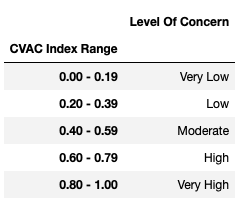
Each theme is rated on the scale of 0 to 1 representing very low to very high concern based on the extent of its prevalence in a particular county. Individual theme scores are combined to come up with a composite CVAC score. As can be seen from the table below, counties that have their CVAC score fall in the range of 0 - 0.19 are categorized as “very low concern”. Counties with CVAC ranging from 0.60 - 0.79 and 0.80 - 1.0 are categorized as counties with high and very high concern, respectively.

Inspired by miscellaneous findings around racial disparity in vaccine coverage, I wanted to see if I could refute these conclusions. Accordingly, I hypothesized that disparity in vaccine coverage is likely not racial but due to other cultural, regional, or state-wide factors. That the lack of coverage in a particular state had nothing to do with the ethnicity of people residing in that state. Thus, I approached this question with two objectives - (i) to determine if the noted disparity has racial ties, and (ii) to identify the exact factors that are causing lower coverage in certain states.
THE DATASETS
I used 2 datasets for this analysis. The first one was obtained from Center for Disease Control and Prevention (CDC).5 This dataset contains a total of 21 attributes with observations spread across 3142 counties within the US. For this study, I used observations across 9 attributes as listed below-
Attributes used in data analysis :
- FIPS - numeric code assigned to states and counties by the National Institute of Standards and Technology (NIST)
- State
- County Name
- CVAC
- Percent population by county of the following ethnicities-
- White
- Black
- Hispanic
- Asian
- American Indian
- Native Hawaiian
The second dataset was obtained from Surgo Foundation’s website.4 This dataset presents 8 attributes corresponding to FIPS, state, county, CVAC, and individual scores of the 5 themes as discussed above in each county.
METHODS AND Data ANALYSIS
To begin with, I calculated the percentage population quartiles for each of the ethnic groups and plotted them against the CVAC level of concern. In Fig. 1, the x-axis represents 4 quartiles in which population for each ethnic group was split up and y-axis represents the CVAC level of concern. A clear trend is noted in White population with median CVAC going down from high to low as we move from counties with relatively lower population of White to those with higher numbers.
Trends for Black and Hispanic appear to be mirror opposites of the CVAC trend observed in the White population with counties occupied by higher percentage Black or Hispanic showing high concern for vaccine coverage. Not much trend was seen in American Indian and Native Hawaiian groups while Asians display a similar trend to white population with CVAC going down as the percentage of occupants increase in counties.
 Figure 1
Data Analysis
After seeing this, I decided to narrow down the results obtained for White, Black and Hispanic groups to determine precisely what factors are responsible for reduced vaccine coverage in counties comprising bigger chunk of these 2 minorities.
Finding Trends Among the Data
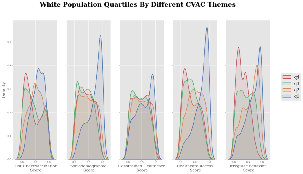
For this, I merged the 2 datasets on FIPS code and generated a larger dataframe containing county percent population for each of the ethnic groups alongside factors posing barriers to vaccine coverage in those counties. I then created density plots of Black (Fig. 2A) and White (Fig. 2B) population quartiles against different CVAC themes. The x-axis in these plots represent scores of individual themes in these counties while y-axis represents percent population.
Analyzing the data with respect to individual themes, it can be noted that sections showing sociodemographic and healthcare accessibility barriers in Fig. 2A, have the red peak skewed towards right. This represents fourth quartile Black population indicating greater socio-economic and healthcare accessibility barriers in counties inhabited by higher percentage of Black people, likely responsible for raising the CVAC concern for this mass.
With respect to historic under-vaccination, the first 3 quartiles in Fig. 2A seem to resemble each other but the upper quartile stands out implying that more counties with greater share of Black population have under-vaccinated people. For resource-constrained healthcare, quartile 2 and 3 are more or less uniform.
Quartile 1, is slightly peaking towards left indicating that most low-populated Black counties do not have resource-constrained healthcare while more counties in the upper quartile seem to be resource-constrained. Again, in the last one there seems to be some irregular care seeking behavior in counties with greater number of Black. Interestingly, the 1st quartile counties also seem to have higher instances of irregular care seeking behavior.
 Figure 2A
Figure 2 Findings
From a similar analysis of Fig. 2B, plots were found to be mirror opposites of the Black quartile plots, supporting the idea that ethnicity may have some bearing on vaccination coverage. For example, as can be seen, the 4th quartile representing majority White counties are skewed towards left on factor-specific level of concern in all 5 themes indicating low to moderate concern. Only counties that have lower White population are showing high concern in some themes.

With some leads from this analysis, I wanted to see if the 2 factors i.e. socio-demographics and healthcare inaccessibility were ethnicity related or was it a state-wide phenomenon. In order to address this, I needed to isolate counties that were predominantly Black and those that were predominantly White in those very states and see how they performed on these themes.
Data on Distribution of Ethnicity
To achieve this, I first looked at the percentage population distribution of each ethnicity in the 4 quartiles to get an idea of a good cut-off value to use to find enough counties that would be either predominantly Black or majority White. From table 2, it appears that most counties in US have black population fall in the range of 0.6 -10%, there are probably few that have numbers higher than these upto 87%. So, I used a cut-off of 50% to filter out a decent-sized subset of predominantly Black counties. This gave me about 96 counties for analysis.
 Table 2
In order to examine which CVAC theme had a greater role in which county, I plotted histograms of the 5 factors (Fig. 3). There doesn’t seem to be a very strong evidence of historic undervaccination, resource constrained healthcare or irregular care seeking behavior in these communities. However, sociodemographic as well as healthcare accessibility barriers seem to be posing a big hurdle in vaccine coverage in at least 50% of the counties, considering the fact that theme scores are pretty high here.
 Figure 3
Data on the States
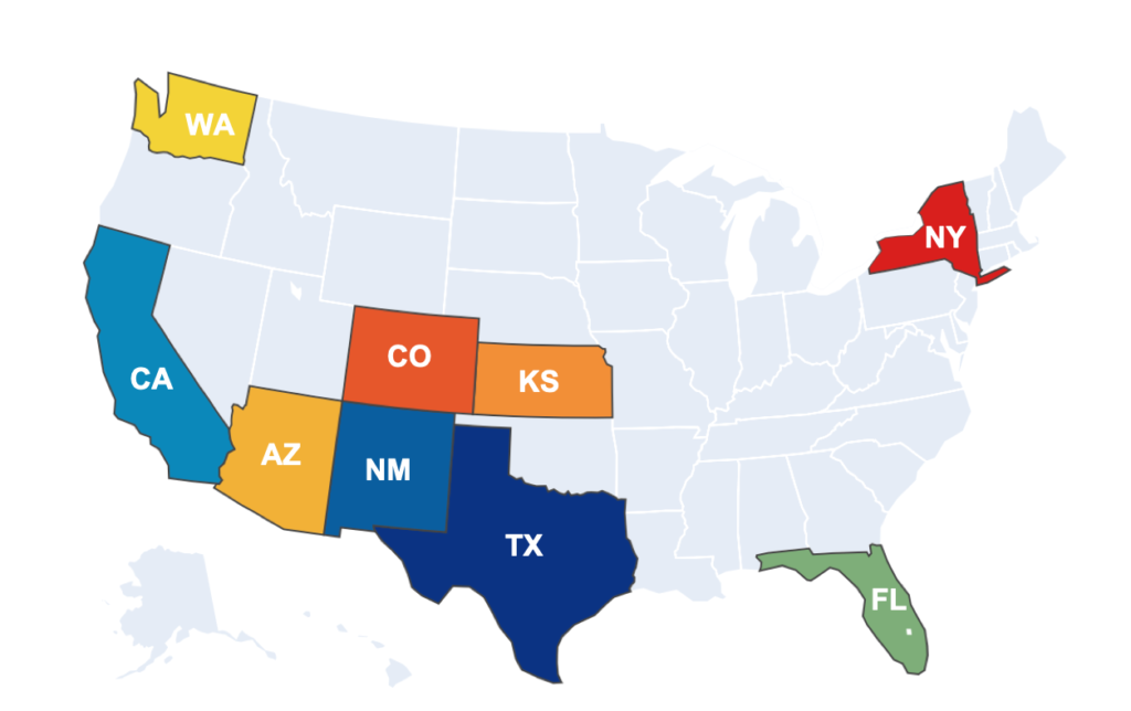
Further, continuing the analysis, I identified the states that had these counties and found that it was mainly the 11 southern states (Fig. 4).
 Figure 4. States with Predominantly Black Counties
Now, to address the question if it was state-wide or ethnicity-specific, I filtered out the counties that are heavily white, with population >90% in the same 11 states and obtained a subset of 118 predominantly White counties. I then made the density plots comparing predominantly black and heavily white counties on the 5 CVAC themes (Fig. 5), and noticed that predominantly Black and predominantly White counties do not differ much with respect to historical under-vaccination, resources constrained healthcare or irregular care seeking behavior.
Sociodemographic Data
However, there is a marked difference in scores in the sociodemographic and healthcare accessibility barrier classes. Several Black predominant counties score high on sociodemographic and healthcare accessibility barriers while white counties not as much. This supported the stance that variability in vaccine coverage does have some correlation with ethnic background and it may not be a state-wide phenomenon.
 Figure 5
Hispanic Population
I then conducted a similar analysis on Hispanic population. A density plot of population quartiles against 5 CVAC themes (Fig. 6 ) showed that although most factors are not as strongly represented in this population, the irregular care seeking behavior is highly prevalent in counties with higher population of (more than 10%) Hispanics as can be seen from peak representing last quartile skewed towards right, the high concern region of the theme.
 Figure 6
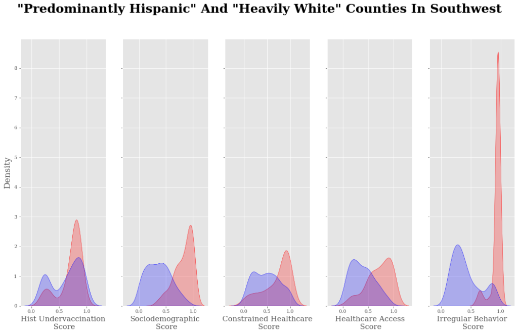
Again, I filtered out a subset of predominantly Hispanic counties with population greater than 50% and obtained 101 counties. Plotting histograms of 5 theme scores against percent population of Hispanics in these counties (Fig. 7) further substantiated irregular care seeking behavior of this ethnicity although historic under-vaccination, sociodemographic barriers, resource constrained healthcare also strongly emerged here.
 Figure 7


CONCLUSION AND DISCUSSION
From here, I conclude that variability in vaccine coverage does have some correlation with ethnic background and it is likely not a state-wide phenomena. A further in-depth analysis is needed to precisely identify which sub-factors inside the sociodemographic theme, i.e. lack of higher education, unemployment, median income, internet and smartphone access or a combination is predominant in which county to further hone in on potential county-specific strategies.
In addition, one should look at correlation of vaccine coverage index with population density in these counties as higher population density could potentially lead to higher incidence of infections. Further, one should also look at the percentage of co-morbidities in people from different counties in order to adequately direct vaccine coverage efforts.
This analysis would plausibly give insights to policy makers, public health care workers and the US government in general into the driving forces behind the current situation. This might help them to target the communities in an informed manner for an equitable vaccine coverage. And of course, it will help us, the people of United States. We are all interdependent- what happens to one person on the other side of country impacts each and every individual. Restoring a safer society by acquiring population-scale immunity will help us restore our own health and peace of mind.
SUGGESTED MEASURES
- In counties with poor accessibility to healthcare, mobile testing and vaccination plans should be implemented;
- Door-to-door campaigns could help in informing people about the potential benefits of vaccination;
- Trusted messengers/health care workers should act as counselors for people mistrusting the system.
REFERENCES
- Gross, C. P. et al.(2020) Racial and ethnic disparities in population-level COVID-19 mortality, J Gen Intern Med, 35(10):3097–9. doi: 1007/s11606-020-06081-w
- Mackey, K. et al.(2020) Racial and ethnic disparities in COVID-19 -related infections, hospitalizations, and deaths: A systematic review. Ann Intern Med,174(3):362-373. doi:10.7326/M20-6306
- Nguyen, L.H. et al. (2021) Racial and ethnic differences in COVID-19 vaccine hesitancy and uptake, BMJ. doi: https://doi.org/10.1101/2021.02.25.21252402
- https://vaccine.precisionforcovid.org
- https://data.cdc.gov/Vaccinations/Vaccine-Hesitancy-for-COVID-19-County-and-local-es/q9mh-h2tw/dataEFERENCES

