Data Study on Manhattan Traffic Collision Insight
The skills the author demoed here can be learned through taking Data Science with Machine Learning bootcamp with NYC Data Science Academy.
Motivation
Data shows vehicle collisions have increased in the last decade. Currently, road crashes are ranked as the ninth leading cause of death in the world.
Thanks to computerized data, the detail of every single crash is easily open to public. I try to analyze the crash data in Manhattan in 2016 and shed light on the cause of the vehicle accidents. Feel free to play around my shiny app to check out some cool graphs. All the codes are available on my GitHub.
The Data Set
I used the NYC Open Data Portal to obtain the NYPD Motor Vehicle Collision data. and analysis the of the 15,205 crashes that occurred in Manhattan in 2016.
I correlated that with weather data obtained from Kaggle to find the weather conditions when a crash happened. The geographic information system (GIS) data of VMT was obtained from NYSDOT.
Vehicle Miles Traveled(VMT) data is defined as a measurement of miles traveled by vehicles within a specified region for a specified time period. It is a traditional index to represent traffic volume.
Main Goal
In this project, I want to visualize the crash data in Manhattan and help the people who are interested in the vehicle accidents gain insight into the space and time distribution. For every crash, I record the type of the vehicle, the cause of the crash and the weather condition when that crash occurred as the option combination. One can select any combination of options to take a look at one aspect of the data set.
The Hot Map Data
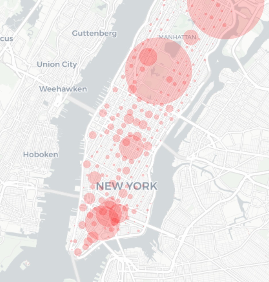
With over 15,000 data points, it is not practical or even necessary to visualize them all in the map.. I divided Manhattan area by 281 districts and use the red circle to represent the crash density in each district.
I set three modules. The origin data” shows the number of crashes happened in the district visualized by the radius of a red circle..
The second module is called “normalized by number.”. For some option combination, the total number of such kind of crashes are very small, and the red circle would be invisible in the map. In that module, the radius of the circle is the number of the crashes in the district given by the options selected divided by the total number of crashes with that options, which represent the relative crash density.
The original data hot map and the normalized by number hot map:
Both pictures show the crash distribution when the weather condition is rainy. The left is the normalized one. After the normalization, the relative crash accident strength is clearer.
We may also consider the traffic volume. The high frequency of car crashes in some area may be due in part to high traffic volume. In the view of a driver, one may be more concerned about the crash rate per vehicle. To show the crash density normalized by traffic flow, I made the third option called ‘Normalized by VMT.’ In the third module, we can find that the red circle in central park is very large. Although there are fewer crashes there, the driver should be extremely careful because the crash rate per vehicle is high.
The hot map normalized by traffic flow: A bigger circle in central park indicates that the chance that a driver involved in a car accident is higher even though the traffic flow is low there.
The heat map data
A shortcoming of the hot map is that it doesn’t show the extract location of every crashes. In the heat map, one can locate the accident at street level.
The heat map: the picture is the crash distribution when the weather condition is rainy. The redder the point, the higher the accident density there.
The hourly data
The hourly data of crashes: the picture shows the hourly distribution of crashes with the crash causes listed on the left.
The time distribution is also very important. I group the data by hours and analyze the time distribution of different crash causes, weather condition and vehicle type. For most conditions, the number of crashes start rising in the morning and reaches a peak around 16:00. There are some type crashes, eg. caused by driving under the influence and the like, which have a different time distribution and reaches the peak at night.
The hourly distribution of crashes caused by drunk driving: the number of crashes rises from evening and reaches the peak around 12 pm, which is different from other kinds of crashes.


