The Dendrotrons: Allstate Claim Severity Kaggle Competition
Project Scope
What do you do when, as a member of a team called ”The Dendrotrons" in a Data Science cohort, have a two-week timeframe to work on the Allstate Claims Severity Kaggle challenge (predict the loss for Allstate claims) and present your results and insights? This article will walk you through our team’s journey for the Allstate Kaggle competition covering our experience in:
- Team structure
- EDA (Exploratory Data Analysis)
- ML (Machine Learning)
- Business insight gained from the competition
Team structure
Team Members
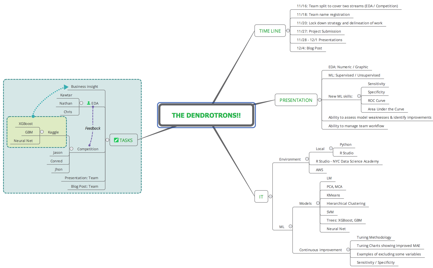
The team consisted of six members, with individual strengths in business, engineering, development, project management, production support, and academic research. This blend of skills and experience provided a good influx of ideas and early experimentation to determine if strategy and tasks were aligned with objectives. The role of PM (Project Manager) was assigned to a team member to ensure the project timeline and deliverables were being tracked and making progress.
Communications
Having strong communication skills is core to achieving success either as an individual contributor or when working in a team. For our team, we agreed that having a communication protocol was a primary focus to ensure deliverables met timelines during the two-week project schedule. The topic was discussed during initial team meetings to ensure an agreed upon protocol would work for all team members. The communication process included daily scrum sessions (max 15-minute meetings to sync up and discuss project status / updates), continuous feedback via a team channel in Slack and file management in Google Drive and GitHub.
Schedule / Timeline
Working with a two week timeline required for the team to operate under assumptions and expectations that typically take more time to formulate in a team environment. In referencing Agile team development process, the team had to transition quickly through the first three phases of Form, Storm, Norm by agreeing that trust / respect / accountability had already been established given our experience as peers and individual project contributors during the past two months of training and project work in our cohort. This precondition allowed the team to agree on strategies and operate within the Perform phase, thus, helping the team achieve the core objectives by the project submission times. The scheduling process maintained a continuous delivery of tasks, with very little bottleneck across task interdependencies.
Tasks: Prioritization / Delineation
The team was evenly split into two subteams of three, working on two major tasks in parallel: EDA and the Kaggle submissions. This allowed for Kaggle submissions to happen within the first week. ML was used for exploratory analysis and XGBoost was the preferred model used for prediction. The early experimentation process between the sub teams produced continuous feedback within the team; thus influencing the next steps for EDA / prediction. The feedback loop led to synchronization, discovery, and insight.
EDA
Given the relative large number of features and observations, the first step in the EDA process was developing a method to visualize the dataset as a whole. To this end, a novel visualization tool was developed which generated grayscale images from every 25 or 50 observations after the dataset was sorted by increasing log loss. This high level view easily allowed patterns in the dataset to be seen. Furthermore, being interactive in nature, it allowed the user to simple click on a region in the image to generate traditional box or scatter plots for more detailed insights. This process is illustrated in the figure below.
Visualizing the Dataset
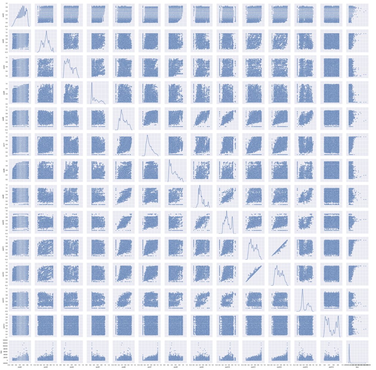
The continuous features (cont1 to cont14) were plotted together with the response variable loss. All features exhibited skewness including the response variable loss. To handle the skewness of the response variable, we log transformed the data and performed a Box-Cox transformation for the continuous features.
Missing variables in attributes
The train claims severity dataset has 188318 instances and 132 features or attributes. 116 of these features are categorical variables and 14 are continuous variables.
For this case study, we need to predict the 'loss' based on the dataset features. Since we can’t use unique categorical features from the test dataset to make predictions, an interesting part of our analysis is to determine if our test and train set have the same categorical variables.
We found that 45 variables are presents in the test dataset and not in the train dataset. This analysis could be beneficial in the feature engineering FOR THE PURPOSES OF THE KAGGLE COMPETITION in order to incorporate this variables to our machine learning model to better predict these cases. Figure.1 shows an example of missing variables in the test and train dataset for the categorical variable cat111. The variable F is missing in the train data and the variable D is missing in the test dataset.
Continuous attributes – Correlation
We first determine the correlations between continuous variables. Fig.2 shows an overview of the correlation matrix of all continuous variables (the darkest color is for the most correlated variables) and Table 1 shows some of the most correlated variables.
This correlation analysis represents an opportunity to reduce the features through transformations such as PCA.
Continuous attributes – Dimension reduction Principal Component Analysis (PCA)
From the correlation analysis, we can see that we there is a potential possibility to reduce the number of continuous feature set. We use PCA, to determine how we can use describe our continuous features in a reduced dimension subspace. Fig.3 shows the cumulative explained variance or variability from our PCA analysis and the number of components describing the continuous variable data. We can see that with 7 components we can explain 90% of the continuous data, i.e, half the total of the continuous features in the dataset (total of 14 continuous attributes).
Categorical attributes- Correlation
In the claims severity dataset, we have 72 categorical variables that are represented by 2 labels, A and B. We transform these labels A and B into 0 and 1 respectively to transform them to numerical features so we can determine the correlation. Table.2 shows the most correlated 2-labels categorical data.
As we can see from Table.2, and as we did for continuous variables, This correlation analysis represents an opportunity to reduce the 2-labels categorical features through some dimension reduction transformation.
Categorical attributes- Dimension reduction Singular Value Decomposition(SVD)
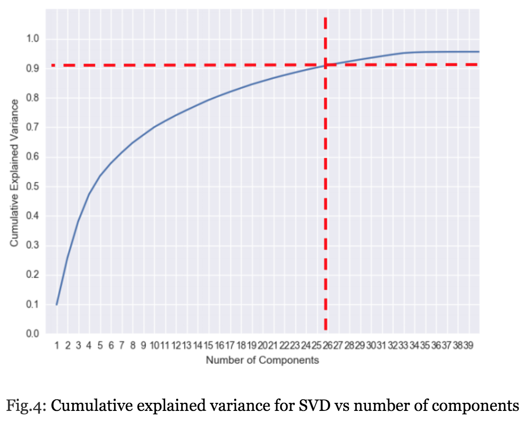
Since our 2-labels categorical features are transformed to numerical 0 and 1 variables, we use SVD for this kind of “sparse” data in order to determine as we did for continuous attributes the reduced components that describe these categorical features. Fig.4 shows that 90% of the of the 2-labels categorical attributes are described with 26 components, i.e 36% of the total number of the 2 labels attributes (in total we have 72, binary categorical attributes).
Hierarchical Clustering
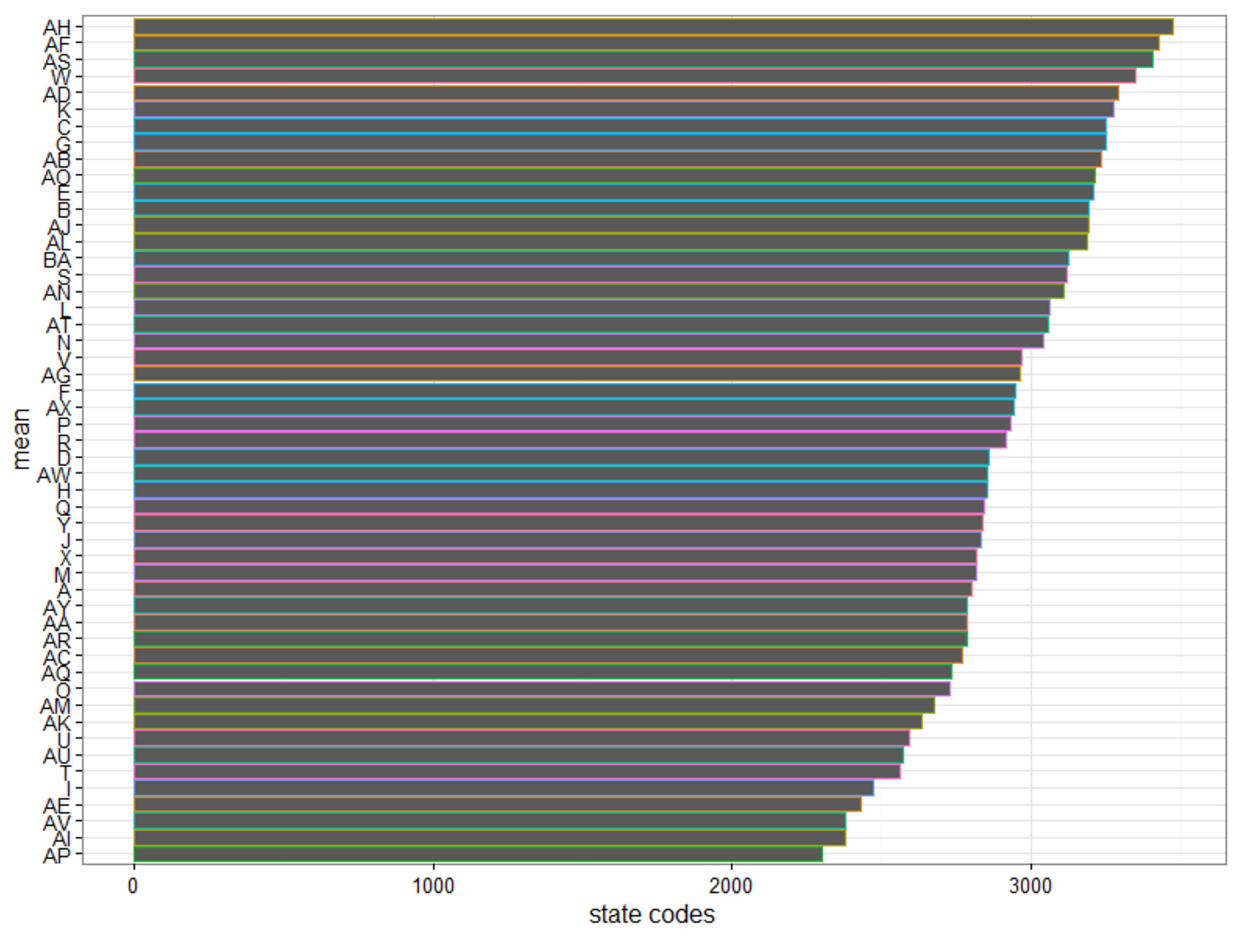
As Allstate did not reveal the true meanings of their predictors, any attempt to find relationships among those predictors against the outcome (i.e., the loss) seemed meaningless. However, it is reasonable to speculate that the categorical variable “cat112” is the “State” indicator as it had 51 different values. With such speculation, we attempted to find some possible grouping of states, based solely on the basic statistics (mean, median, 25th and 75th quartiles, min, max) on each state’s loss.
Visualizing the "cat112” column with loss, the group finds that 20 of the states have mean loss exceeding the national loss. On a business perspective, this is a helpful indicator for AllState to consider calibrating its policy pricing in these 20 states to minimize future losses.
With such speculation, we attempted to find some possible grouping of states, based solely on the basic statistics (mean, median, 25th and 75th quartiles, min, max) on each state’s loss.
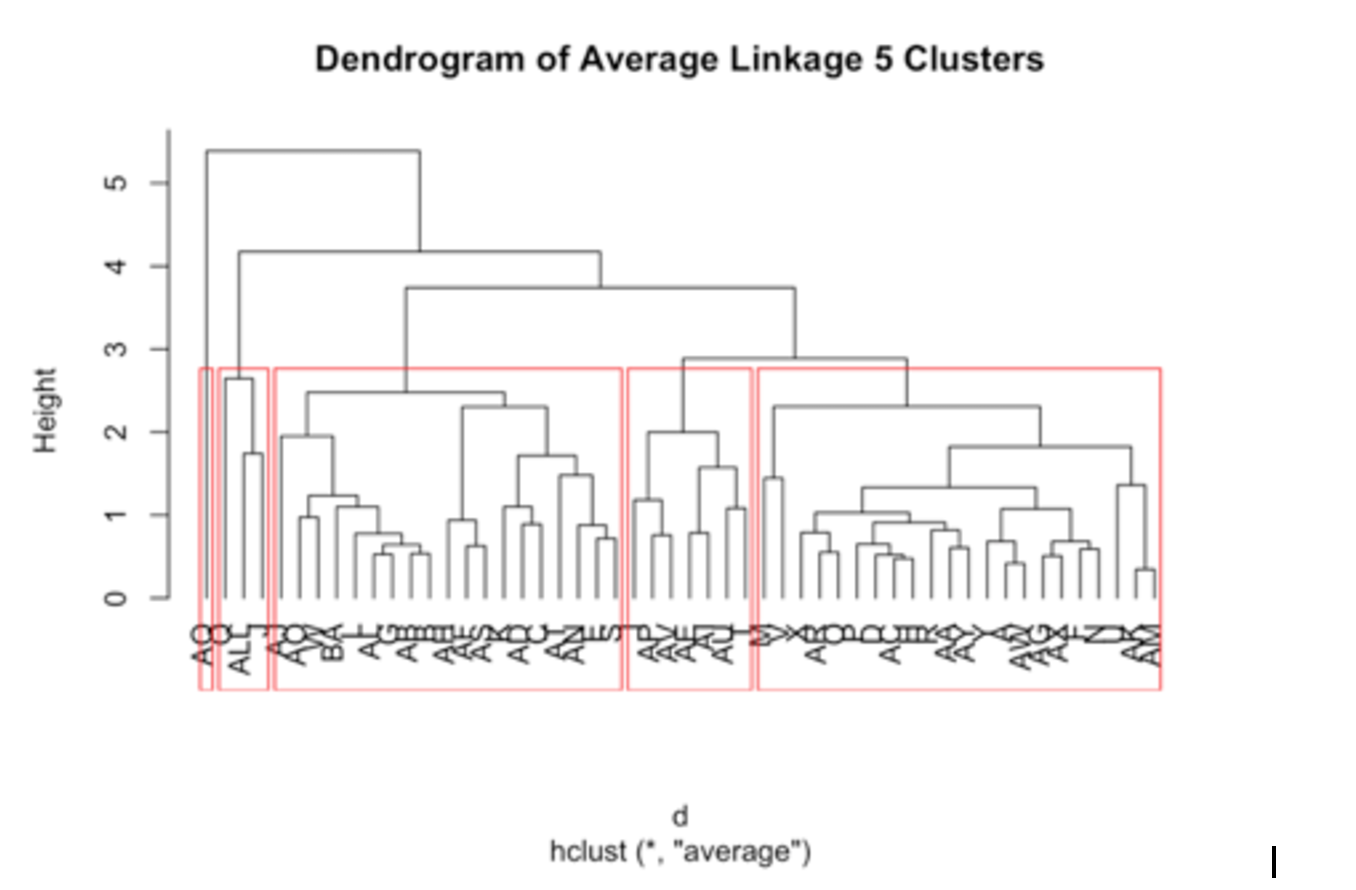
We chose Hierarchical Clustering as our unsupervised machine learning for this exploration. Following is the dendrogram of average linkage into 5 groups:
The first cluster (shown inside the second red box from the left) only has two states (Q & J, as ALL is NOT a state). When we compared the statistics of this cluster against the other four clusters, we discovered it had the distinctively shortest distance/range from min to max.
The fifth cluster (shown inside the first red box from the left) had only one state (AQ), When we compared the statistics of this cluster against the other four clusters, we discovered it had the distinctively longest distance/range from min to max as it contained the min and max of the whole dataset.
We thought we could fold the first and the fifth clusters into the second cluster (shown inside the third red box from the left) for two reasons:
- The Average dendrogram visually provide us the hint for such fusion.
- Numerically, by comparing the median and mean of the first and the fifth groups against the other three clusters, the second cluster exhibits greater similarity.
With such an arrangement, we could attempt feature engineering based on only three groups.
For details, please review [Appendix A: Hierarchical Clustering] below.
Supervised Machine Learning
For this project we tested several models, both regression and classification. But due to the sheer number of features and observations, we tried to reduce the size of the data set to speed up the processing time for a first pass of model training. For example, we used Caret’s near zero variance function, and we also leveraged a quick-and-dirty linear regression and selected features for more computing-intensive models based on their p-values. Because most of the features were categorical, we also tried reducing the number of factor levels prior to one-hot encoding. For example, cat116 had over 300 levels, but because it didn’t have much predictive capacity we reduced the number of levels to three.
To reduce the number of rows, we used random sampling. We first created an 80/20 train/test split out of the Kaggle training data in order to test our results before running the trained model on the official test data. However, within this training set we further reduced the number of rows for initial tuning rounds of new models. For example, we might only take 40 features of 30% of the training observations in order to do a quick first pass of a random forest or to test how efficiently Caret can parallelize the training on our 16-core Amazon Elastic Computing machine.
We tested a linear regression model, boosted trees (of which XGBoost performed the best), and a single-layer neural network. For classification we used logistic regression, boosted trees and a support vector machine. Overall we found that XGBoost was the best single model with a Kaggle MAE of $1126, and a 50/50 average of the Neural Net and XGBoost gave us an MAE of $1124.
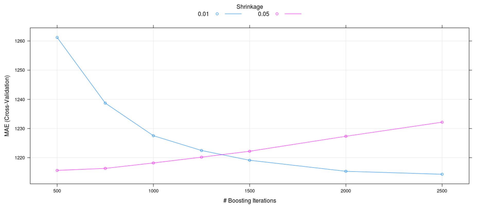
It proved very difficult to deploy any regularization or observation sampling when fine-tuning a model. We found that after all but the most cursory training passes, we had to use all the data and all the features to tune model hyperparameters. The below chart illustrates this point.
The tuning grid, which was run for XGBoost on about 50% of the training observations, makes it appear as though a learning rate of 0.01 was superior to 0.05. However, when we used all the training data we found that a learning rate of 0.05 with a smaller number of trees was superior for both out-of-sample testing and Kaggle results. This point is further illustrated by the below variable importance chart.
The second column, “Other” is comprised of the remaining 110 observations that are not depicted on a standalone basis. Though each of them individually is less important that cat113 on the right, their collective importance is the second largest contributor to variance reduction. Therefore, any reduction of features or observations (via increasing sparsity) is bound to reduce the predictive power of the model.
After plateauing at about $26 away from the best ranking Kaggle competitor, we tried to determine exactly where our model was underperforming. The below chart shows the cumulative absolute error against the observed log loss. We can see that most of the loss was accumulated against observed log losses of about 6 to 9.5. In other words, there wasn’t much to be gained by trying to improve the model for very small or very large observed losses.
Therefore, when we first plotted this below chart we weren’t overly concerned with what first looks to be very extremely poor predictive power on large losses. For the purposes of the competition, it wasn’t important.
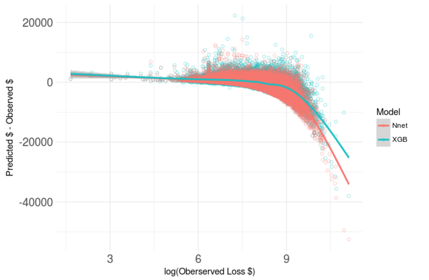
Below is a detailed view (on a log scale) of the range of observations for which an improvement in model tuning would have the largest impact on the MAE.
This chart depicts two main points. First, the overestimates are generally larger than the underestimates. And second, the underestimates get worse for larger observed losses. Therefore, a good strategy to follow would be to seek out a model that is skewed in the opposite direction. Also, we tried to use this information to engineer a new feature to help the model compensate for itself. However, this was unsuccessful.
Ultimately, though we were only $26 away from the best Kaggle score, this best score was still a $1000 MAE. And this is on a data set where most losses are around $3000. To zoom back to the big picture of what we were doing, we plotted a linear regression on 6 features (blue) versus our best XGBoost model on the total set of features. XGBoost is certainly better, but its predictive capacity is still limited. This gave us an idea...
This insight led us to a classification problem!!
We revisited the original motivation for the Kaggle competition. This passage is part of the competition description:
“When you’ve been devastated by a serious car accident, your focus is on the things that matter the most: family, friends, and other loved ones. Pushing paper with your insurance agent is the last place you want your time or mental energy spent. “
If the goal was to use predictive modeling to reduce paperwork, then we thought maybe a classifier question might be useful. After all, a major reason you have to go through so much paperwork for an insurance claim is that it protects the insurer against fraud. If we could split the claims into “big” and “small” categories, maybe we could identify claims that look “fishy”, meaning claims that look as though they ought to be small, but were, in fact, big (the opposite is also a problem, but not for the insurance company). If you were reasonably sure that a given claim amount was in the right bucket, perhaps Allstate could reduce the amount of paperwork that the lion’s share of customers goes through This improves service for the customers and a reduces cost for Allstate. However, if you weren’t sure you could classify the claim correctly, the customers would have to go through the same process they do now.
We found that half the claims by value were made by 80% of the customers, so (following the 80/20 rule) it seemed that creating a categorical feature “isSmall” and splitting the data at the mean was a good starting point.
We ran a support vector machine, a gradient boosting classifier, and logistic regression. As we were running out of time and running into model errors on the logistic regression, we pared down the number of features to about 30. We found that all the models had a high accuracy (and not much different from logistic regression with only 30 features!), but we needed to optimize for sensitivity (i.e., “fishy claims”). Logistic regression was the best choice under the circumstances because it expresses its classification as a probability. We found that a cutoff of 50% probability to distinguish a small claim from a large claim may not be suitable due to too high a number of false negatives (claims the model predicted as being large, but were in fact not), because that cutoff point yielded only a 50% sensitivity. Rather, we needed to minimize the false positive rate.
We first grouped a series of confusion matrices into different sets of customers. The customers who “gain” are the ones who get to do less paperwork; in other words, they would have to do less paperwork than they do now because the model would label their claim as not fishy (true positive or true negative). The customers who are the “same” have to do the same amount of paperwork they do today (false negative). They are comprised of large claims that were incorrectly labeled as small-looking. The ones who are “risks” are the customers who have fishy-looking claims (false positives). The below table summarizes the categorization:
The below plot depicts the tradeoff that has to be made in an intuitive way for a decision maker. Starting on the left, we can see that if we set the cutoff very low for the logistic regression, more people gain, but Allstate is exposed to fraud risk on 20% of their customers. As we move to the right, you can see that the fraud exposure is reduced, but people move from the “gain” bucket to the “same” bucket. This rate of swapping buckets starts to increase significantly after about 0.7-0.8. At that point, there needs to be a 70-80% chance that a claim looks like a big claim to be classified as such. This means that some genuinely large claims may be misclassified as “fishy” and have to undergo the current paperwork process. To determine the cutoff point, you would need a subject matter expert to express the “gain” and “risk” in dollar terms, and then the decision of where to set the cutoff point would be more clear cut.
Customer Impact on Varying Sensitivity Cutoffs
Conclusion
Recognizing the strength of individual team members and establishing a communication protocol that promotes continuous feedback during the project initiation phase is crucial for mapping tasks to resources, successfully integrate the contributions and deliver quality work and service on time. Working as a team on a Data Science problem was the first for many of the team members. Thus we walked away with many lessons learned to be applied to future team-based projects.
Working on Kaggle competitions as a team allows for many ideas and experiments, but it is important to manage timelines and expectations so that all team members remain on track progressing towards the same end goal. We discovered that using machine learning could lead to further model experimentation through feature engineering. Also, that reducing cross-validation folds is a mixed blessing: useful initially, but becomes easy to overfit. The constant flow of communication is what led to the discovery of a business insight and further exploration of the idea with classification models.
Follow ups
Given more time:
- Tune classifier model by imputing missing categorical values into the training / test set
- Explore to what degree could we continue to improve performance versus overfitting the test data
- Continue to fine-tune models to improve scoring (mean absolute estimate) in Kaggle
Acknowledgements
- Kaggle competition guidance: Shu Yan and Alexander Ryzhkov
- Blog editor: Thomas Kolasa
--
Appendix A: Hierarchical Clustering
As Allstate did not reveal the true meanings of their predictors, any attempt to find relationships among those predictors against the outcome (i.e., the loss) seems futile. However, it is reasonable to speculate that the categorical variable “cat112” is the “State” indicator as it has 51 different values. With such speculation, we attempted to find potential grouping of states, based solely on the basic statistics (mean, median, 25th and 75th quartiles, min, max) on each state’s loss. We chose Hierarchical Clustering as our unsupervised machine learning for this exploration.
We compiled a data frame with 52 rows (51 states plus statistics of the whole dataset “train.csv” denoted with row name as “ALL”):
We scaled above figures before we calculated pairwise distances. Then we plotted three dendrograms with three different types of linkage (single, complete, average). The Dendrograms of Complete linkage and Average linkage both visually show balanced fusions starting from the bottom. As Complete linkage is sensitive to outliers, we chose the Average linkage for further exploration and we cut that dendrogram into 5 groups:
We found the first cluster only has two states (as ALL is NOT a state) and the fifth cluster has only one state:
| Cluster # | 1 | 2 | 3 | 4 | 5 |
| # of States | 3 | 22 | 19 | 7 | 1 |
We further investigated the basic statistics of each cluster:
Our findings:
- The fifth cluster has a much shorter range (distance from min to max) than other four clusters. In addition, it only has 30 observations.
- On the contrary, the first cluster has a much longer range than other four clusters as it contains the Min and Max of the whole dataset.
We thought we can fold the first and the fifth clusters into the second cluster for two reasons:
- The Average dendrogram visually provided us the hint for such fusion.
- Numerically, by comparing the median and mean of the first and the fifth groups against the other three clusters, the second cluster exhibits greater similarity.
With such arrangement, we can attempt feature engineering based on only three groups.


