Secret Beverage Data Science Research
The skills the author demoed here can be learned through taking Data Science with Machine Learning bootcamp with NYC Data Science Academy.
Would an angry person prefer sour flavors? When beverage makers use corn sweetener instead of sugar, do people like the drink better or worse? Do they even have a reaction to this change? The questions you start with are often different than the answers you find, but when you have real data to work with, even the unexpected can prove highly useful.
Our team recently presented our data findings to a major beverage company for whom we signed an NDA. Names of beverages and flavors in this write up as well as technologies used have been intentionally left out to protect the innocent and the guilty. Just kidding. Names and other details of our research have had to be excluded to honor our NDA agreement.
Problem Statement
The “sexy” side of Data Science is machine learning and model building, but there is another aspect that easily comprised half of this project. In the real world, data is not always clean, properly organized, and ready to go. For this project we were presented with two data tables:
- Beverage Dispense data reflecting volumes of different beverages dispensed
- Image Capture data for people who passed in front of a camera mounted on the beverage dispense machine
The data model includes a unique user id for each person identified in the image capture table, a unique recipe name and id for each combination of drink dispensed, and date/times which comprised the best candidates for joining the two tables. “Image Capture” data was really numbers reflecting machine intelligence evaluations of the images captured to determine: human emotion, gender, and age.
Due to privacy concerns, photos were kept just long enough to create the data and then the images were destroyed. The two systems, though deployed like a single machine, were completely separate. Date/Time stamps were not properly synced up to the central server and were not synced to each other at all. A preliminary look at the data revealed that the time stream of the Image Capture data started and ended about one day earlier than the Beverage Dispense data.
3 Main Challenges
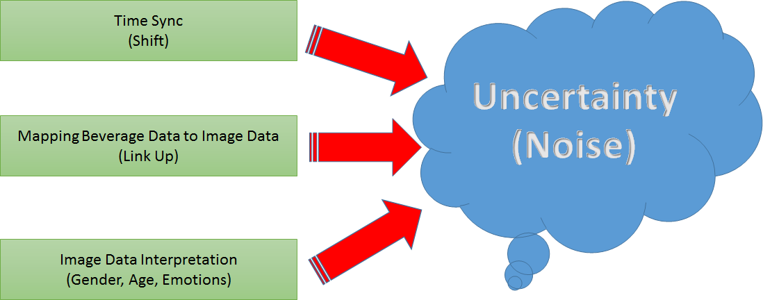
To get insights and value out of the data we identified three main challenges. Even when implementing the best possible resolution to each challenge, each one of them adds uncertainty to the overall interpretation:
- Time Sync: find a way to sync two time streams (beverage data and image capture data) to form a date/time key between the tables
- Mapping: records were not one to one so we needed to understand the range of records to join in any "key mapping"
- Interpretation: the same beverage event could have multiple contradictory record values concerning: age, gender, and emotion.
Data Cleaning And Preparation
The problem of linking and syncing the data was explored from many different angles and even ended in a final brainstorming session with the whole team. To sync the two different timelines of the beverage and image capture data, a delta or shift value is needed. When the shift value is added to one table, the timelines lie in the same zone (in the other). The question was, how to find the optimal shift value?
Method To a Optimal Shift Value
We played around with likelihood and gradient descent methods but finally chose an error based approach where the shift with the lowest error is searched via brute force. As an error function we defined the sum of seconds of all beverage events to the nearest image capture event.
After syncing times we moved forward to link the beverage events with the most likely image capture event. In more detail, we sought to rank image capture events for how likely they are to observe the person which is responsible for the beverage event. The strongest indicator is if the two events are in the same time window, but which time window should we use?
A fun side note to all of this: We located a machine for our team to visit that was like the one used to create the source data. All members of our team visited this machine many times as we were thinking about the data. Each of us ran our own tests that probably created outliers in its data for whoever is collecting it. One member of our team actually did a stake-out of the machine for two hours and recorded forty-five observations of how long it took for people to dispense a beverage. The minimum was 7.5 seconds and the average was about 44 seconds.
But there was a lot of variance in the data, and this observation set was rather small. To compensate for this, data was randomly sampled 10,000 times thus creating a larger mixed distribution from which the standard deviation (sigma) could then be used for linking.
Formula
We assumed the time needed to get a beverage is normally distributed and used a 4 sigma time window to do a first filtering on the image capture events for linking them to a beverage event. Within the time window of a beverage event, we used a formula to rank the image capture events which determines which persons are most likely to be the customer. Better results and insights could have been obtained with more research, but we were limited in both the source data we had to work with and time was a factor. Consequently, we simplified the join formula down to the following:
-
- Time distance from beverage observation to first Image Capture Observation (Closeness in time for potential join records)
- User duration in front of camera (how long were they there?)
- Number of user frames in the time window (how often were they there?)
- Face size bonus: a number recorded closeness to the camera at time of observation. Larger was assumed to be better for data capture in this context.
- The top 5 results (Image capture events) were used to filter the join between the tables.
Age and Gender
For age and gender: the system could record a person as male in 8 frames and female in 2. It could have contradictory ages (some records saying one age / some saying another), and for each age recorded, an “age_c” confidence interval of +/- 5 years or in the extreme +/- 12 years was provided. To clean the gender field, it made sense to either take the value that came up more, or when this was impossible to determine (or missing completely), rely on domain knowledge for a default. For this data, male was more likely than female.
To clean up the age data, the process gets a bit more complicated. A missing-ness analysis of the data proved useful not just for imputation but for coming up with an overall strategy for the emotion data.
Emotions
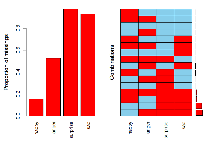
Charts like these can be generated in R. In this case, if you focus on blue (present) versus red (missing), you will quickly see that the most complete data of the 4 emotions is for Happy / Angry.
Drilling into the data itself to investigate, we saw that surprise was barely there, often only appearing for a single frame. If we wanted to use sad or surprise data, the sparseness would be a real challenge. Note too that current research holds there are 6 main emotions that psychologists now combine into 22 combinations.
This system simplified emotion to just the 4 basic ones shown: Happy, Angry, Sad, and Surprised. They were presented as numbers on a scale of 1 to 100 (almost like “percent happy”), but each record was independent of each other. The machine could believe a person was 80% angry and 80% happy based on two image frames captured within seconds or fractions of a second of each other.
Taking into account the missing-ness and uncertainty of the emotions data, our team decided to employ clustering as a strategy to simplify the data into three categories: “Positive” emotions, “Negative” emotions and “Unknown.” This made working with the data overall much easier and helped facilitate the analysis results which follow:
The x/y axes show the dominant emotions driving the Positive / Negative colors in the clusters, but really, each data point in a given cluster becomes a hybrid of the different values melding into the cluster (Happy, Angry, Sad, Surprise in this case).
Getting Results From The Data
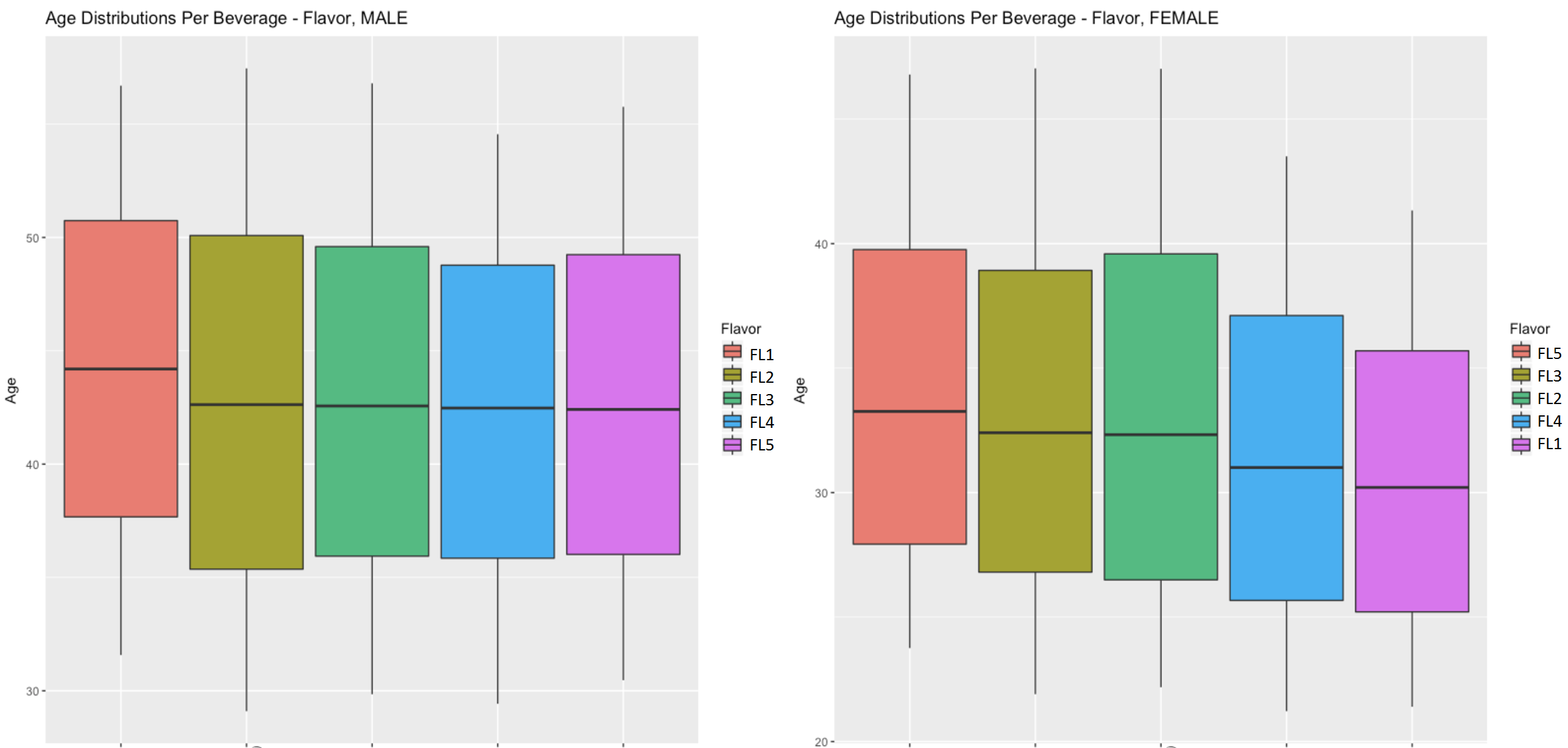
One of our more fun observations: The oldest males in the demographic and the youngest females seemed to prefer the same flavor in their mixes. This was presented to the beverage company in box plots like the one shown here:
In this case, the red box in the top plot represents the same flavor as the purple box in the bottom box plot. There was a median age in this data set that hovered around the middle 40’s, and the range of ages present was mostly between the mid-thirties to mid-sixties. Data was skewed so that about 75% was male while only 25% was female.
When creating and presenting visualizations like the one above, the code included a label for how many records from each source table underlied the observation. Only a small number of records from our already somewhat limited sample were at the core of this particular finding. So while the male/female flavor correlation is interesting, it cannot be generalized to larger groups of people.
Trend in Older Beverage Consumers
There was also an overall trend in the data that older beverage consumers seemed to like flavors that were less sweet than younger beverage consumers. Experimentation with mixing of flavored syrups with a core beverage tended to happen more when the offerings were carbonated than when the offerings were not carbonated.
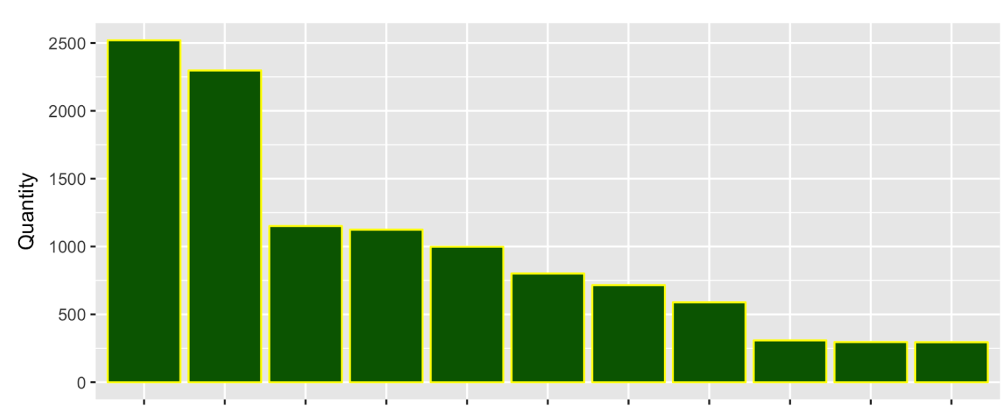
Only 4 flavors were offered to mix with 14 base beverages. Beverage consumers (in this data sample) opted to try 74 distinct recipes or mixes. Over 90% of this mixing occurred within the top 10 choices and as you progress down the list of mixes the numbers drop off sharply rather quickly. The x-axis of this chart had beverage names that have been omitted out of respect for our NDA:
Observations
When we revealed the top choice of beverage and/or beverage and flavor mix, our research seemed to agree with research already performed by the data science and marketing teams of the company we presented this to. Diet was preferred by older drinkers over younger drinkers and seemed to be preferred by women over men in our sample. Women in general seemed to like sweeter flavors, but an association to positive emotions did occur for a sour flavor in the youngest age group for both genders. Women also had a stronger preference for water than men; ordinary water was the number 5 choice out of all recipe / mixes selected.
As an experiment, data was enhanced with an ingredients table downloaded from a website relating this data to the same or similar beverages as those in our sample. There is known bias in the data and the R square values confirm that the linear models used hold no predictive value. But the goal of this research was more descriptive in nature. Multi-linear models were used to identify what ingredients might represent significant factors for consideration, and this significance is backed up by the p-values produced by the models. In this context, there were some interesting findings to share with the beverage company:
- The same flavor that seemed to correlate to positive emotion for males correlated to negative emotion for females.
- Corn syrup seemed to correlate with positive emotions for men and negative emotion for women.
- Acesulfame Potassium appeared to correlate with users our image capture data suggested were angry.
- Calcium Disodium EDTA appeared to correlate with users our image capture data suggested were sad.
Final Thoughts
In presenting these final findings, we remind the reader that we had the most data on Happy/Angry and that the way this data was collected, we really have no way of knowing the causal relationships behind observations:
- Emotion could have caused a particular drink selection.
- Trying a particular drink combination could have caused the emotion.
- There could be other unidentified factors influencing both.
- We just have no way of knowing.
It should also be stated that data came from a single machine and was collected over a 4 day period. A limited sample such as this may not be representative of larger populations (the American marketplace for example). In statistics, we say the data has bias, but in this case, the bias is a simple reality of the opportunity for data collection behind this particular experiment. The opportunity for “non-biased” data is not always available.
Conclusion
Given all of this, findings should be treated as descriptive rather than predictive. They provide useful insight into the data collected and can still be used in that context. The process and code behind these findings can also be used as a proof of concept should a larger more representative data sample become available.
When conducting data science research, you can’t help but construct a wish list of what would make this research better and more useful if it were possible to do this in the future. For this particular area of research:
- More data from a wider population would make it easier to generalize from samples to larger populations
- Finding a way to change the capture method so that it could be known how emotions changed over time
- before,
- after,
- during the beverage consumption event
- Just linking the trigger event from the camera to the beverage dispense event would make all of this research go better in the future.
We acknowledge, however, that these ideas may be harder to do in the real world then they may seem. Limitations in equipment and budgets can create challenges and complexity not readily apparent to an outside observer.
Acknowledgements
We wish to end by thanking The NYC Data Science Academy and the beverage company who provided this data for this intriguing opportunity to problem solve a real world data scenario and ultimately explore this data. We all learned a lot from the experience and are grateful to have had this opportunity.


